Ahhh, the 2017 design trends. Last week, I attended Sherwin-Williams ColorMix 2017 presentation, hosted by Pottery Barn. If you’ve never been to one of these presentations for design professionals, let me just say that every year paint companies and color predictors draw some pretty tenuous connections between social and cultural happenings and the colors that will be trending. Words and phrases like “eco-travel,” “voluntourism,” “radical transparency,” “sustainable design,” “into the cloud,” “healing retreats,” “fair luxury,” and “global consciousness” somehow translate into color trends.
Or so they say.
I like to think that I’m a deep thinker, but I’m not one to float around in the intellectual cloud hovering above the masses. I take what I see, read, and learn, and then sift through the predictions with my “colander of reality:”
 you know you wanna pin it
But seriously, I see it as my job to cut through the mumbo-jumbo and help you make good decisions that will last you more than a fleeting season. With the help of Sherwin-Williams and Pottery Barn, I’m going to share some of my realistic 2017 design trends. And then leave the rest of the predictions to collect in the bottom of my colander.
2017 Design Trends
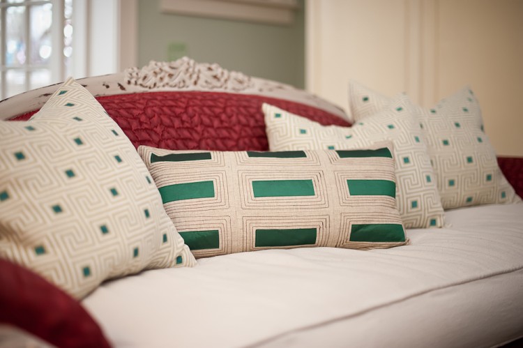
Building on last year’s trend of mixing metallics in the same room, we will be seeing a mix-match of shiny and matte finishes in both fixed elements as well as room decor. You can also think of this 2017 design trend as mixing rustic + industrial or even natural + glam.
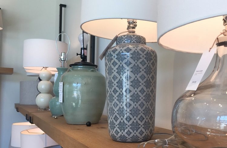
Ceramics + organic textures and finishes are the perfect marriage of feminine and masculine. You’ll also be seeing lots of tone-on-tone wood color and lighter veneers on furnishings.

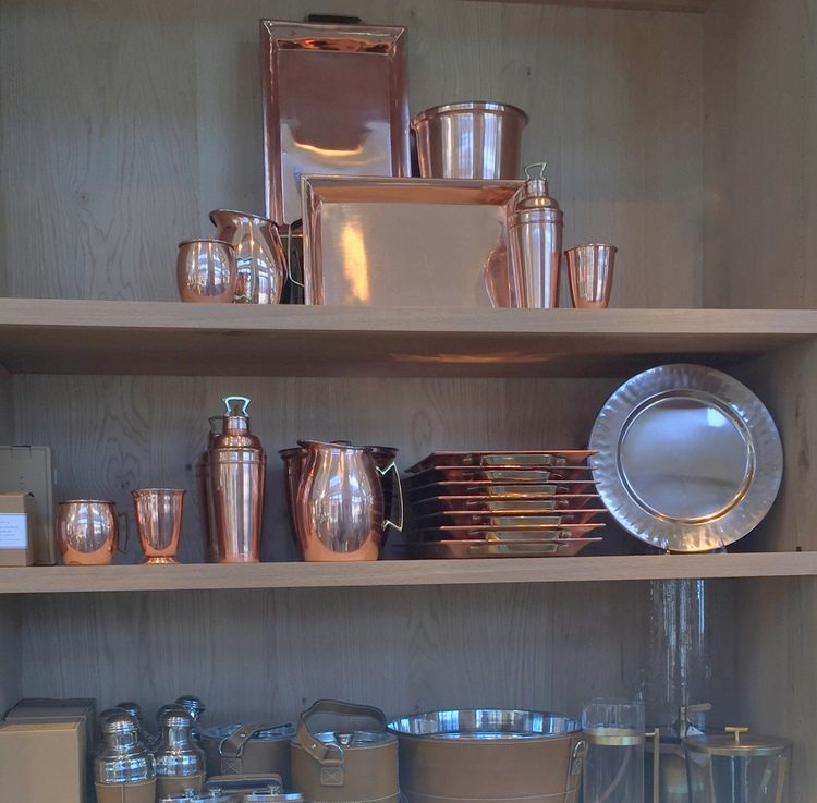
Look for warmer metals – copper is the hottest metallic this year. And you’ll see a definite mix-match of finishes: copper, brass, silver, charcoal, and dark metals will be purposely used in the same rooms. What once seemed disparate and haphazard now looks like intentional and layered design. But beware trying this at home, folks. Sifting through my colander of reality, the key to order and balance in mixing metals is mixing EITHER cool or warm metals with iron or blackened metals – mixing cool and warm metals will feel disparate in most interior settings. (You can quote me on that.)
mixed metals at Pottery Barn
While grays and taupes are said to be the hottest neutrals, I wouldn’t bet on taupe walls this year. Sherwin-Williams chose Poised Taupe as its 2017 Color of the Year, but it’s better chosen for a nail polish color than for a wall color. In fact, the lovely Sherwin-Wiliams rep, Amanda Farris, sported this color on her toes at the event:

I even scored a little goody bag with the nail color and a Sherwin-Williams nail file/buffer. LOVE this color for nails. Not walls.

As for wall color – we all understand what beige and gray are.
But “taupe” is a browned gray, with a pink or purple undertone. And “greige” is a beige with a splash of gray.
In regard to neutrals, I’m recommending grays and greiges for 2017.
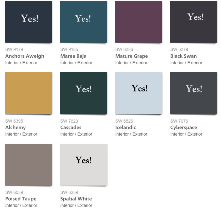
Sherwin-Williams has 4 new color palettes/sets for 2017: Noir, Holistic, Intrepid, and Unbounded. I believe Noir and Holistic have more truly usable colors than the other two palettes, especially in regard to interior WALL/CEILING/TRIM COLORS, which is what most of us are concerned with. Right? So those are the two sets I’m going to show you, as well as pointing out which specific colors I like best.
The Noir collection contains lacquer jewel colors, which look fresh with with gray/black/white backdrops. Don’t use these with beige, please.

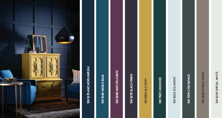
I’ll make clear which colors I think are the best pick with a resounding “yes!”
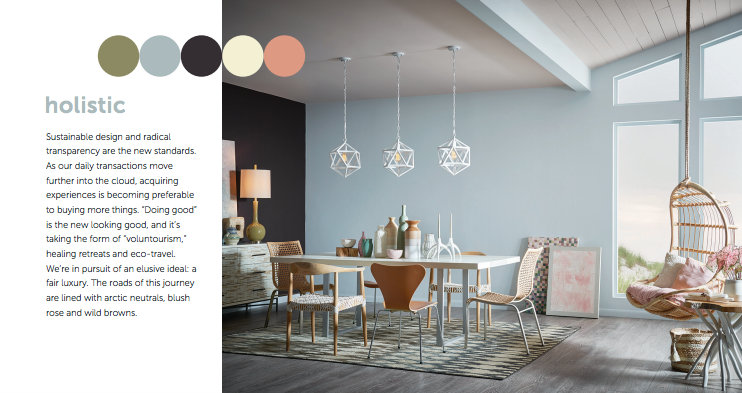
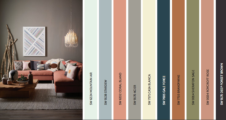
The Holistic collection is fresher and more family-friendly, but you’ll see there are only a few colors in this set that I would use right now:
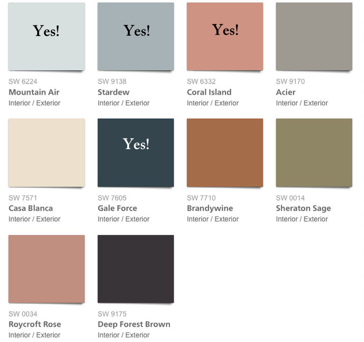
Ok, I might use Acier, but I’m not sure yet. While whites and blush pinks are still trending, whites will be paired with more COLOR and pinks will be moving into a peachier realm. I’ve done lots of white interiors over the last two years, but I always try to sneak in some contrast to keep it from being too snoring boring.
Tropical greenery, including palm fronds, succulents, and “living” walls is a 2017 design trend.
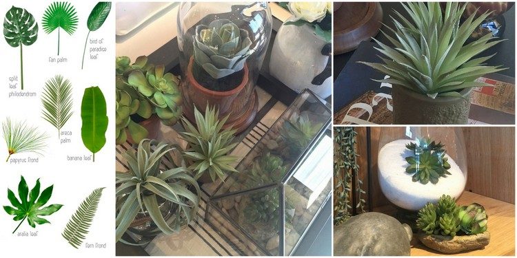
Pottery Barn has realistic faux plants and specimens, but you will also be seeing plenty of tropical greenery in fabrics and wallpaper, along with an abundance of canes, twigs, and raffia textures.
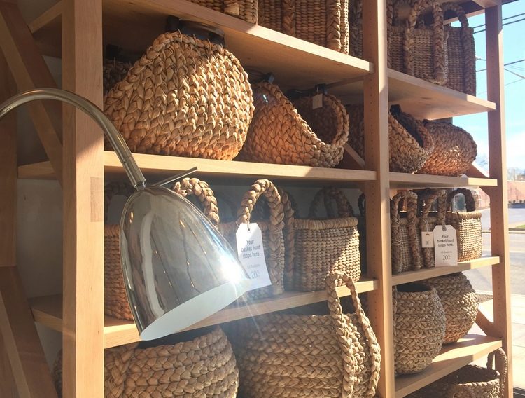
Retro is always in, the decade just changes! The decades to watch now span the 1970s through the 1990s. Call it nostalgia if you will, but we’ll be seeing 1970s inspired textures like wicker, as well as geometric wallpaper and room dividers. THEY SAY that 1980s influence will be seen in rounded, squishier furniture, but I’m not buying it. I recommend you keep those furniture lines straight or slightly rounded. But I agree that you’ll see (and LIKE) 1980s mathematically correct geometrics and puzzle-type tile options, as well as some “classic” 1980s patterns in ceramics and fabrics.
Oh yeah, also some 1980s vibe florals – remember Laura Ashley? There’s also lots of talk about post-modern 1990s, rock/roll “riot girl” influence, but I think we’ll see that in fashion rather than home decor. At least for now.
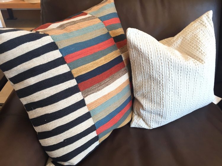
Here’s a few more 2017 design trends to keep your eyes open for: imperfect wallpaper and fabrics that look like misprints, Cuban art, heavily-patterned tile (encaustic and ceramic), synthetic patina on intricately inlayed materials like tile and ceramics, colored wood stains, and patchwork patterns. Oh yeah, and of course there’s hygge. That’s just an academic’s uppity way to say you’re enjoying living mundanely on purpose. I’m thinking it’s kinda like normcore, but for interior design.


Lots of great info. Thanks for sharing it all here!
Thanks, Nancy! I hope you were able to see the images – we’re trying to figure out why the post had such trouble loading.
Love your commentary! Sometimes the marketing scripts are soooo pretentious! Don’t know how you can sit through their spiels with a straight face 🙂
Sharon,
Thanks so much! Our Sherwin-Williams rep is so great – she did a beautiful job presenting the material. But, as you point out, the material from corporate is so not relatable to most of us. I would break out in hives if I had to read that script – good thing I can say what I want 😉
Great post Kristie!
Thank you, Sheri!
Enjoyed your post and enjoyed meeting you in Ft Lauderdale at IAHSP
Thank you, Karen – enjoyed meeting you, too!
I agree with you! Some colors make great nail polish but for neutral backdrops for staging real estate – NO!
YES, Amanda! That reminds me – I need to paint my nails . . .
Great response to the Sherwin Williams presentation. I don’t know why they have to make it so hoity toity(not sure if I spelled that correctly). Thanks for the great recap and design trend information.
Aimey,
I don’t know how to spell that either, but you are right! Thanks for chiming in 🙂
Hi Kristie,
Love how real you are about the upcoming design trends! I see you are predicting a return of florals a la 1990s Laura Ashley. What’s funny is less than an hour ago I finished decorating my guest room in the Laura Ashley set I bought for my little girls in the 90s! I have never stopped loving that set and am delighted I can use it again. I think it is the only retro thing I’ve kept after 3 moves in 18 months! Thanks for sharing your experiences with us. I am always fascinated by these peeks into your world!
Loved reading your post. Doesn’t seem like 2017 is that exciting. I’m thinking of using Casa Blanca or useful gray in my family room/kitchen. Any thoughts?
Great post Kristie, love how you navigated through the forecasts to get to what will be more realistic and comprehensive! What a valuable post, thank you!
Thank you so much for stopping by, Ginny! Always good to hear from you 🙂
Woowww very nice handmade, the article is very useful for me and I gained knowledge by reading this article
Totally agree with your picks from the Noir and Holistic color palettes!
I wouldn’t put Poised Taupe on my nails or my walls though. 🙂
Not even your nails, Molly??
So you say you are recommending grieges for 2017 , but none of the ones you marked yes in the two palettes are griege. I am in the process of picking a color for my whole interior house and am wanting a “griege”. I like Palisade from Sherwin Williams. Do you have recommendations for which of theirs you think are the nicest?
“hygge” = cosy and comfortable, like snuggling up under a blanket with your loved ones.
Word that doesn’t translate well to English.