Many homes don’t have a thought-out plan for the interior paint color palette. It seems that most people just decide, for example, to paint one room a color they like. Then at some point they decide to try out some other color in another room, without much thought to the colors that are in the adjoining room. Then they decide they love dark red but are afraid to paint the whole room that color, so up goes the ever-popular accent wall. This lack of planning results in a choppy look, or lack of “flow”.

So, take a look at the “before” state of this entry. Notice the pinky beige on the large wall, the green on the left, the two shades of brown in the adjoining dining room, and the orange hardwood. That’s four paint colors + orange that you see when walk in the front door. This home is way too traditional to have this kind of color blocking going on. Not to mention the dated ceiling light fixture.

Choppy Entry “Before”
This view from the adjoining dining room show yet another color – a light blue in the front office. Out of all of these colors, the homeowner likes that color the best and really wanted to keep it. So with that in mind, how do you create a color palette that flows in this entry area?

Too Many Paint Colors!
The light blue, pinky beige, and medium green just don’t flow, do they?

Before
We decided to keep the light blue in the office, but we needed to make it feel like it flowed with the entire color palette and wasn’t just an afterthought. By choosing an updated neutral with on-trend undertones that work well with the orange hardwood, the entry looks instantly fresher.

Entry After
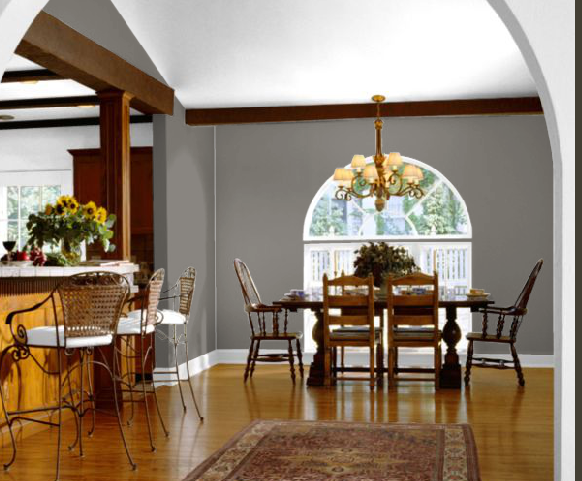
We extended the same on-trend neutral throughout the hall into the family room to the rear, as well as on the wall above the chair rail in the adjoining dining room.

Come on in!
Then we did something fun that tied in the office color – painted the ceiling and area below the chair rail in the dining room a darker version of the office color across the hall.

Dining Room
Let’s back up – I should show you the “before” of the dining room. It was very brown – dark brown below the chair rail, light brown above the chair rail, and the same light brown on the ceiling (which appears a shade lighter than the wall color, so there are three shades of brown). Not to mention the brown furniture.

Dining Room Before
So again, the neutral above the chair rail is the same as the entry color, but we added a darker version of the office color to the ceiling and below the chair rail.

Dining Room After
One more time – here’s the “before” view from the dining room:
The Choppy “Before”
Here’s the new view from the dining room into the entry and the office across the hallway. Are you feeling the flow?

Creating Flow in the Color Palette
Who wouldn’t feel welcome walking into the fresh, updated entry? (Notice the fab new lantern light fixture – what an improvement!)

Entry After
Guess what? I got an email last night from the homeowner – after the paint update and staging I did the day before I left for vacation last week, this house was under contract in 5 days – before I even got home! More proof that great staging – and the right colors – sell homes!


Awesome! Can we get the paint colors, pleeeeeease?! With sugar on top. 🙂
Ok, ok, Brandi! The new neutral is Ben Moore’s Manchester Tan. The office was already painted in Ben Moore’s Come Sail Away. The new dining room color below the chair rail and on the ceiling is Ben Moore’s Wythe Blue.
VERY pretty, Kristie!
Hi Kristie,
this looks amazing. New colors don’t seem so different from old ones, but the effect is great. Everything looks much more sophisticated and elegant. Great work.
Great work! What a dramatic transformation. I bet they are thanking their lucky stars they hired you! Bravo, my friend.
Abby
I definitely felt the flow 🙂 , very nice.
It’s a pity that a lot of people wait for updating the house till they are planning to leave — why is that? why they wouldn’t do all the updating earlier so themselves can enjoy it every day instead of leaving all the goody to the new owner? sigh…
i know, that kills me! but that’s what most people do, and they always say “why didn’t i do this 4 years ago?”
This is a wow Kristie and how soothing the new updated paint colors are for the home – no more choppiness. And a quick sale – I think you did your job quite well 🙂
Bravo Kristie! It looks fabulous! Since it sold right away I guess the idea of painting her entry hall mirror and or chest with Annie Sloans duck egg blue is not necessary! Those colors are just gorgeous!
thanks, amy – i agree that annie sloan’s duck egg blue would be lovely!!!
Great improvements, Kristie. In particular I like your treatment of the dining room with the banded effect of colors on ceiling and lower walls.
Wow. Such an improvement! I’m always impressed with what you do. Congrats on such a quick sale. I’m betting that much of it had to do with the staging. I think staging was one of the reasons that we bought our condo. I could visualize the potential AND they chose my favorite color green for our living room.
What a difference paint makes, this is a stunning transformation and a great inspiration!
The AFTERS look great!! Much better flow for sure!
Wow!
Have a PRETTY day!
Kristin
It now looks very welcoming! Much, much better! The dining room now looks so fresh and updated. Great job Kristie!
Well done! Kristie to the rescue! I would have never thought you could keep the drapes in the DR! But they’re fine. If the home owner’s reading this, I hope you’ll think about a new geometric patterned entry rug. That would be the icing on the cake!
Kristie,
What a great post, and I love the color choices!
Hi,
I want to use green and red for walk in area of the house. I tried using the accent wall technique (one wall green and one wall red) but it doesn't give me satisfaction…something is missing. Please advise on how to blend the two colors.
Thanks
Krisitie–I LOVE IT!!!
I am sooo tempted to forward this to a busy young family that has it’s home painted in at least 5 conflicting colors that are visible as you enter their front door. This seems to be what happens when people read too many decorating articles and can’t decide which ones they like–so they do them all!
The feeling of peace that pervades this home that you did is palatable.
What a wonderful gift you have! Hope everyone in Nashville finds you that needs help BEFORE they
decide to move…..
Thank you, Paula – your praise and encouragement brightens my day every time!!!
Hi,
I want to use green and red for walk in area of the house. I tried using the accent wall technique (one wall green and one wall red) but it doesn't give me satisfaction…something is missing. Please advise on how to blend the two colors.
Thanks
Hi Kristie, I just came across this old post while looking for ideas for my dining room – which in my mid- century California bungalow opens up right next to the living room. My colors are browns, tans, neutrals and blues/blue-green. I love the Benjamin Moore Wythe Blue and was trying to figure out how to utilize it in my dining room to make it flow but at the same time provide contrast and separate the room – without making the color overbearing. Your palette with the Wythe Blue on the wainscot and ceilings separated by the neutral is perfect and that’s what I’ll be doing!:)