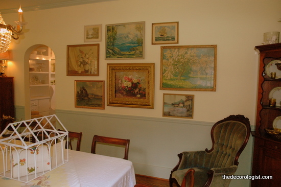
The last time you saw my dining room walls, I had created a salon-style art grouping of landscapes on the long wall opposite my windows.
What I love about salon-style groupings is that they can be added to and expanded upoon when new art comes in.
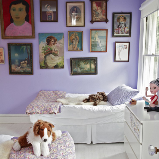
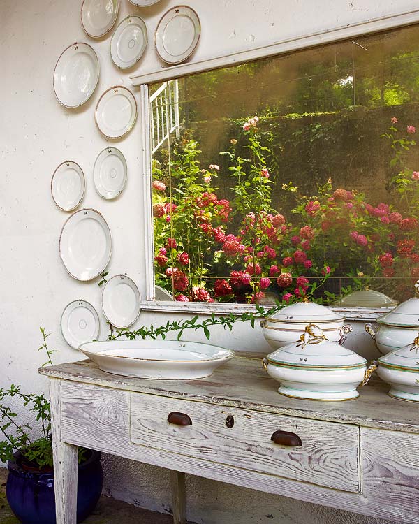
I was inspired by plate groupings that I had seen that felt a little rambling and abstract, like I blogged about here.
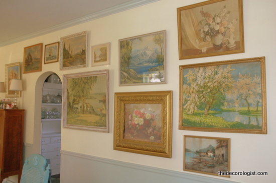
So I decided to ramble on across the wall, and this is what I have now.
My 10-year-old thinks I took it too far. She said, “OH MOM, that is just TOO much!” But I really love it. I realize it IS a bit much – but if you can’t express yourself in your own home, where can you?
So, I guess the question is: how much is TOO much when it comes to decorating your home? I’d love to hear your thoughts and comments!

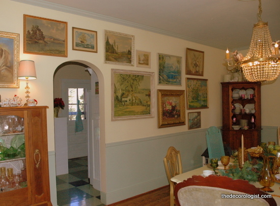





I do think space is just as important as what you like to display in spaces. Personally I think your room would accentuate the pictures better if there was a space to accentuate the doorway and then two groupings of art…one on either side of the doorway. I think a space around an object or piece of art or group of artwork can make that object or group of objects really stand out from the crowd.
I totally get what you’re saying, Carol. It is important to have a place for the eyes to “rest” in a room. It’s good to have a stretch of wall in a room that has nothing on it. Although you can’t see from the pictures, the other walls of my dining room are more spare. Also, when you are trying to accentuate an important piece of art, this kind of grouping distracts from that piece. All of these pieces are yard sale and flea market finds. I was looking to create a gestalt in this particular situation – looking at it as a whole rather than its individual parts. I’ve been thinking and reading a lot about personal expression through home decoration . . .
Ultimately it is about personal expression in your own home, I agree. It is very hard to get the whole picture too, with just photos as often in ‘real life’ the space feels and looks completely different. I trust your judgment!
I don’t think it’s too muchl..I love it
I love it Kristie!!! It looks beautiful. I have done the same, through out my home. I didn’t know it has a name (salon- style). I love the fact, you can keep adding to it . I also, love the flooring going into the room with the arch! Is that your kitchen? What type of floor is that? XoXo
Thanks, Katie – the flooring is inexpensive VCT tile (vinyl composite tile). It harkens back to the old linoleum tile that was used originally in my 1939 home. You usually see it in commercial settings, like schools, churches, and office buildings. But it can be used creatively in residential settings due to the color variations and ease of installation. I blogged about it here: https://thedecorologist.com/feathering-your-nest-frugal-kitchen-flooring
I think I like it even better. Aesthetically, it really compliments the to-die-for arched doorway.
Lately, I’ve been helping several clients with modern aesthetics to accentuate the architecture with their placement of art – the focus becomes the architecture rather than the art itself. I think that can work with other kinds of styles as well. Although it’s much more risky on my PLASTER walls!!! You should see the pock marks and holes behind all these pictures!
i like it more!! ive been wanting to do something similar in my dining room. i was thinking of mixing vintage plates with artwork? what do you think? would that work?
Absolutely! Start by laying out all your pieces on your living room floor, working on possible arrangements until it feels right to you. I always take a photo of the floor arrangement so I can refer back to it as I’m working – that is VERY important!
I love that you have a 10 year old who freely expresses her opinion. Way to go, Kristie (and dad), on empowering your beautiful girls to have a voice!
thanks, Lezlie! but we couldn’t stop her if we tried, haha!
Hmmm…what do I think? I think that if you love it, that is what matters. Too much for one person, may be too little for another. That is what makes it your home, your style, your taste, otherwise all homes would look the same. Have a great day!
I think we will be able to tell better if you shoot an overview of the area, including walls next this group. It’s It’s hard to tell just to this wall of groupings.
Our first home was 1100 sq’ and when we first saw it the owners were still living there. An elderly couple with a passion for collecting Ethan Allen wood furniture. The house was so crowded with large, dark wood shelving, armoires, china cabinets, etc. THAT was too much! Each room was nearly unnavigable due to the heavy, expensive furniture. Your beautiful landscape collection does not impede the function of the room but rather enhances the form in a way that brings joy and color.
Hi Kristie,
I love it. I think it lifts your ceilings even higher byelevating the paintings. I would never manage to measure it correctly so that the paintings were centered above the doorway and manage to have it centered above the peice of furntiure to the left of the doorway! I was never very good at MATH! 🙁 It is very clever and different and makes you think…..”I should do that!” 🙂
Merry Christmas to the Barnett’s! Leif
I love salon groupings, I’ve got a mini version in my hallway with wedding photos. I think the key to making it work is having a common theme or element to everything. Either the same frame style, the same kind of art, or a common color. With your group, they’re all traditional style landscapes and still-lifes. The one thing that’s off to my eyes is the small painting at the bottom on the far right. I feel like the balance is off-either a heavier frame or switching places with the one directly above it. But overall, you successfully avoid the cluttered look they all go together.
You’re right, Erin. I think I need one more smallish piece on the far side of the grouping, kinda toward the top but further out to the right.
I think that would be perfect!
I love salon style walls…but I see you have arched doorways like I do in my home. I’m guessing your house is vintage. Mine was built in 1931. Anyway…I’ve noticed that too much art on the walls with the arched doorways really distracts from the arch. So…I keep it simple on those walls. I love your salon wall in the dining room and I think I would like it continuing on to the to the otherside but I do not like it over the arch…for me it makes the arch less special.
I struggle with even putting up a picture on either side of mine. I have one that goes from the breakfast nook to the kitchen and I put something up in the nook and didn’t like the way it detracted. I also put up something on either side in the kitchen and look at it all the time thinking I should take it down.
Looks like we are into similar color schemes. I saw your post about gold being in and it does look fresh these days. But I have ALWAYS loved silver…so doubt I jump on this trend….although…I really like mixed metals. That used to be a nono but now it works.
Hi Nita,
Yes, my home is also vintage – 1939. We have been here 10 years and have completed restored it. If you’d like a little tour of the house, it was featured on Apartment Therapy last January:
http://www.apartmenttherapy.com/chicago/house-tours/kristies-thirties-tennessee-treasure-house-tour-105084
Thanks for your thoughts and input!
I love it! Don’t worry, she’ll probably ascribe to the “less is more” school of design and you will love it because it is “so her.”. This is so you!
I love how you ‘rambled’ over the doorway and spilled into the next wall space. Doing so really emphasizes the ‘ramble’ part of it. With less, it’s not as obvious. I really like it.
Gorgeous! I love it!