Ballard Designs is one of my favorite online sources for my decorating clients. You might say it's a lighter, more feminine version of Pottery Barn. Prettier and more colorful, but of similar price and quality as good ole PB. Ballard Designs features beautiful wall colors as a background to their products, and here are some you might be interested in knowing! Here's one of my personal favs:
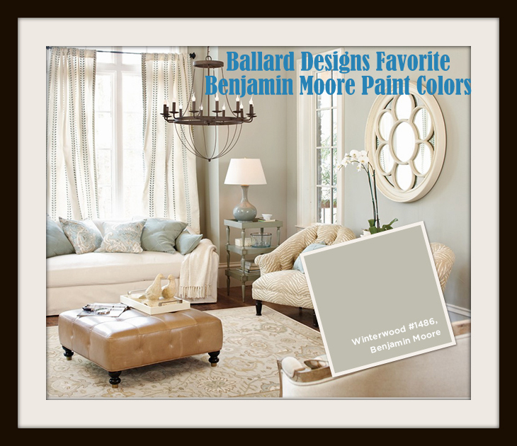
I've used Benjamin Moore's Winterwood in several projects this year – it's a great super-neutral that works great in somewhat contemporary spaces. It is not quite as "fresh" as it appears in the photo above, however – it's a bit more grayed down than this.
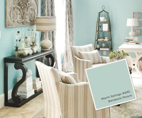
Honestly, I've never used or spec'd Warm Springs. I'd say it's one of those colors that works best in a young girl's room as it is really clean and vibrant. It would be too much and too bright for most people in a living room like this one.
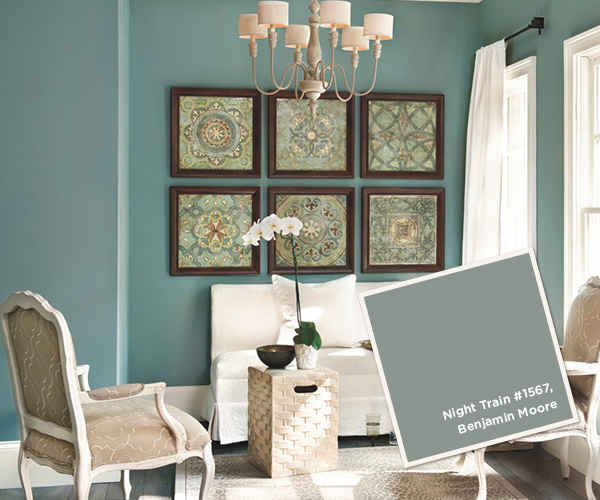
I really like Night Train, as well as a few of the lighter versions of it on the same swatch in the Classic Collections fandeck. You can probably tell this from the difference between the small sample and the actual wall above, but it is NOT as bright and vivid as the room photo portrays. It's more murky and dark, rather than what you see above.
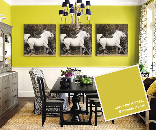
Now this is a wall color you don't see everyday! I must tell you, I actually HAVE used this on one focal accent wall for a client who is all about bright color and art. It is not for the faint of heart, but it can certainly give you a "wow" factor.
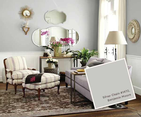
Now here's a good choice for a neutral backdrop – Silver Chain, a light gray with a blue-green undertone. Just remember: most "neutral" grays have sneaky undertones that may not read as neutral as you think when it goes up over the entire space. So you should be prepared for a room that could read light blue, in this case. Or if you have blue accents in the space, it could read green. Or, it could read just gray.
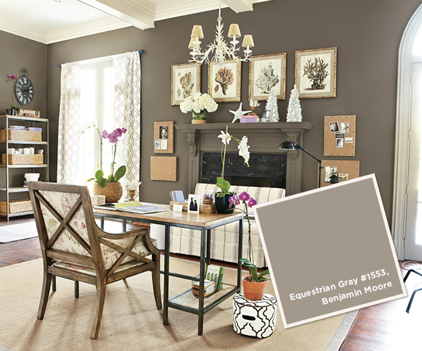
Benjamin Moore Equestrian Gray
This dark grayed brown has a slight green undertone and looks an awful lot like the nail polish I am wearing at this very moment! It will give you a rich, masculine look that needs lots of creamy white to balance it.
Here's an important tip to keep in mind if you are one of those people who scour magazines, catalogs, and blogs for images of the "perfect" paint color. Often colors in magazine layouts are enhanced to make them pop and contrast for best effect. Catalogs like Ballard Designs and Pottery Barn use background color to bring attention to the products they are selling – so they have reason to tweak the paint colors to make it work for their product styling purposes. They are trying to sell the furniture, not the paint color – so don't rely to heavily on those images as being an accurate representation of a given color. It's really to choose your color while in the room you are painting, in the context of the existing finishes and furnishings that will live there. When in doubt, a really good professional color consultant can help you choose just the right paint color for your specific situation and space.
If you are interested in learning more about choosing just the right color for your home, you'll be glad to know my Just the Right Color Workshop will soon be available for purchase on the website! Sign up today for my emails to get subscriber-only deals on my workshop and other upcoming products from The Decorologist.


Love the choices Kristie! So true that it's wise to choose your color in the room you are actually painting with the existing furnishings.. This seems to be the one mistake people make over and over again.
So what to do when that isn't a possibility? We are building a new home and have to pick paint now, before it is complete. I'm having a terrible time choosing b/c it all just has to be imagined!
Misty, that is when the $300 (for a 2-3 hour consultation) you spend with a qualified True Color Expert color consultant is especially worth its weight in gold! It will be the best money you spend in your new build.
Oh I really loved citrus burst, it can visually lift up the room in an instant. But don't you have to have a lot of natural light coming in for that? I mean, that would really help…
Great colors, I've got to try Winterwood and Equestrian gray. They look great, thanks for sharing!
Great post, Kristie. I agree, I think Ballard does a really good job of merchandising their products through the use of color. And it is very good advice to your readers to never pick paint colors based on these, or any pictures for that matter! Especially catalogs, with their photo shoot lighting, and a good possibility of photo editing/color adjustment in order to best highlight their product through photography. I have a feeling they dialed up the saturation on Night Train big time!
I love night train! I have not used it but in the photo it is a beautiful color. Thanks for sharing Kristie!
Kristie, you truly are a masterful interior designer! But I stand in awe of your ability to choose the perfect color/s for rooms in clients' homes. So when I read that you are planning to offer "Just the Right Color Workshop" in the future, I was so excited. Now, I can hardly wait for the forthcoming information . . .
Thank you!! I always want to know what paint colors Ballard Designs has used in their catalog so it is fun to now pull out my fan decks. I just painted one room BM Metropolitan AF-690. Love it sooooo much I'm now inspired to repaint the entire the house and want to first plan a whole new color scheme!
Isn't it fun to know what the actual colors are? I love Equestrian Gray, actually used it on a built-in recently, to help the client's white wedgewood dishes pop – and it was amazing! Fab post as always – Cris
That is so funny that I was just looking at my latest issue of Ballard Design! Great resource!
What is the wall color in the bedroom featured on page 6 in your February 2016 Catalogue?
Thank you
Cathy Gillman