I’ve been doing a little research about color trends for fall and 2010. Lots of big ideas for what’s gonna be hot. But there’s a big difference between what the “trendsetters” are pushing and what the public will embrace. This is my personal forecast for the hottest colors and trends in decorating.
 |
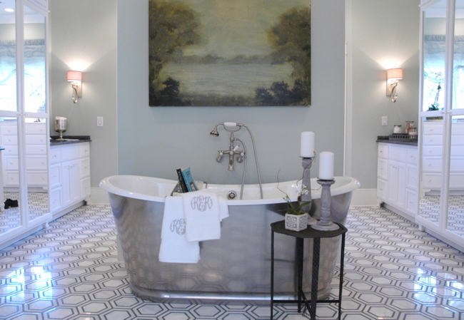
Gold, gunmetal, and copper will be the favorite metals over the next year. Designers predict a re-emergence of the 70’s Brady Bunch harvest gold, greens, and orange. I’m not buying that, but I do think avocado green is making a come-back, but paired with teal/peacock blues and fuschia. All this recession talk is setting us up for the yearning for some opulence in our homes, even it that just means opulent colors. So think jewel tones, dark and rich. Like European royal kind of colors. Or maybe exotic bohemian. Your choice. |
Purple is supposed to be the next big, hot color. But I predict that a lighter lavender will be more palatable for the masses. Lavender will be the new blue. Gray-lavender, tone-on-tone. All shades of gray will continue to be hot, hot, hot. Painted furniture will also be hot, but not in whites and pastel colors. More like those jewel-tones – peacock blue, emerald green, dark gray, mulberry. That’s what I think. Let me know what you think!


Here are some Benjamin Moore paint colors you might want to check out. Check them out on their website’s Virtual Fan Deck and order a few samples. They offer 2 ounce samples for $4.99 each, so you can try them out before committing to a dramatic color.
Blues:
Blue Nose 1678, Bedford Blue 1679, West Coast, 1671, Mozart Blue 1665, Blue Toile 748, Rendevous Bay 726, Charlotte Slate AC-24, Wilmington Spruce 754, MillSprings Blue HC137
Purples/Lavenders:
Sleepy Hollow 1454, Vintage Charm 1455, Frozen in Time 1448, Deep Mauve 1265, Mulberry Wine 1251
Dark Rose/Pinks:
Fashion Rose 1356, Drop Dead Gorgeous 1329, Vibrant Blush 2081-30, Raspberry Glaze 2078-20, Royal Fuchsia 2078-30, Pink Corsage 1349, Milano Red 1313, Deco Rose 1328, Sweet Rendevous 1341
Avocado Green: Medieval Times 530


Do you prefer Benjamin Moore paints, KB? Are you loyal to a particular brand?
I agree about the gold. I can’t believe how my preference in my home has bent toward brushed gold fixtures (50s) to blend with camels/browns/blues/bloody reds. Along with your gold/copper predictions — does this include kitchen hardware/appliances? I was so sure stainless was starting to fade into copper in the kitchen — but I don’t see it in the mags at all. I think I misjudged that one!
It is definitely time for the jewel tones to come back around. I agree. Orange has already made a huge comeback, dontcha think? Often paired with aqua — very pretty and fresher than a pairing with avocado! Deep eggplant and orange are EVERYWHERE in fashion. It will be the same in decor.
I used to love Porter Paint Colors, but they changed their whole palette last year. Some stores won’t let you use the old colors, which makes me mad. So I tend to rely on my Benjamin Moore colors, but I also like Sherwin Williams. Now, BM and SW do have very good paint – but I usually just have their colors made up in Lowe’s Valspar or Home Depot’s Behr unless it’s a really high-end project. It’s cheaper and does a good job – and they have the custom color codes for BM and SW on their computers.
Home decor is usually a season or three behind clothing fashion -they like to see what “sticks” in the fashion world – so, yes, it’s likely that eggplant and orange will be hot sometime next year. And I will be interested to see what direction kitchens will go – I, too, thought there would be more copper coming down the pike, but I think this recession has thrown a kink in that (copper is quite expensive right now)- the masses still love their stainless steel! – great comments, Andrea!
The scoop from my professional painter- Ben Moore & Porter great paint! Covers well and applies nicely. Ben Moore has gorgeous colors!
Sherwin Williams splattered quite a bit with the roller. (This was noticeable also in a bathroom we painted ourselves with Sherwin. Don’t look closely at my guest bath baseboards.)