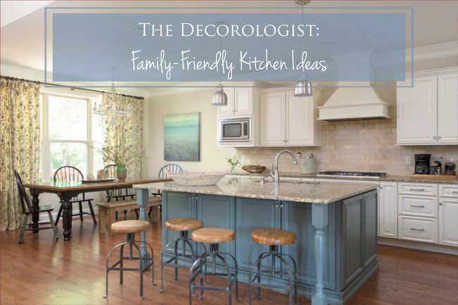
Kitchen designs are some of the most-pinned photos on Pinterest. We LOVE beautiful kitchens, don’t we? I suppose it’s where many women spend much of their time. Well, not me, but MANY women . . . Today I’m sharing a recent family-friendly kitchen project of mine that may inspire some ideas for your own kitchen design.
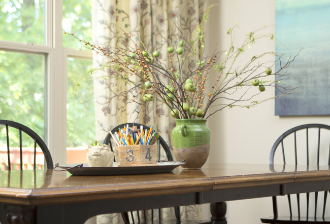
A farmhouse breakfast table is an ideal choice for a young family with children.
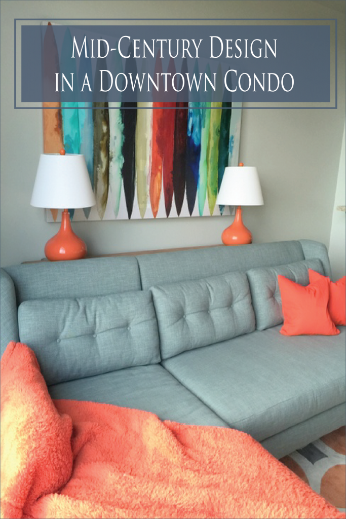
The Decorologist
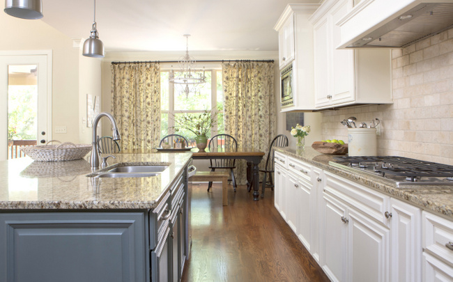
The semi-custom drapery softens up the space and makes it more homey. Did you know that drapery and upholstery fabric help absorb the footfalls and voices of boisterous children in a house with hardwood flooring?
Kids love a wood bench – just be sure to do what I did here and place it on the front of the table, rather than the back. When a bench is positioned behind a table, it just looks like the chairs are missing!

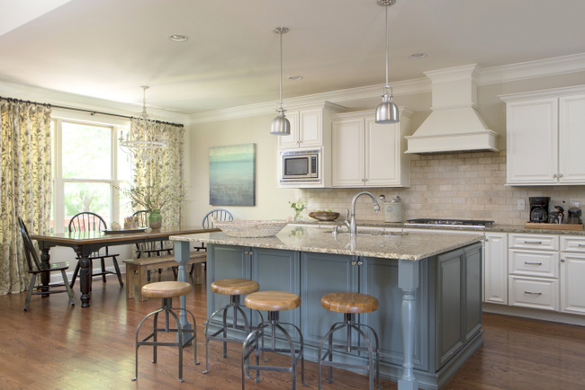
We mixed two metals in this kitchen – nickel/stainless (appliances, lighting, faucet, cabinet hardware) and iron (curtain rod and bar stool bases). Notice how wood elements are repeated in the breakfast tabletop, bench, stool seats, and fruit bowl on the countertop. Every surface is low maintenance and easy to clean.

find similar counter stools here
The best way to downplay the fact that your cabinets don’t go all the way to the ceiling is to choose a wall color that blends with either the cabinets or the backsplash tile. A contrasting color would have made this kitchen appear choppy, while a coordinating color expands the sense of size. Notice the family dog in his favorite spot of the house – near the action!

I love to put the sink in a large island like this one. Mom gets to keep an eye out on the adjoining family room while she works in the family-friendly kitchen – much more so than if the sink and all the countertop space were along the perimeter.
I hope you enjoyed touring this family-friendly kitchen! Did I mention a family of seven lives here?
Don’t forget to PIN this:
The Decorologist


Thank you SO MUCH for confirming what I have been saying/doing about cabinets that do not go high or are just plain not good. I try to make them disappear by choosing very close paint color. Your confirmation gives me the confidence to continue with that philosophy!
You’re welcome, Vickie! High contrast between cabinets that don’t go to the ceiling and wall color is NOT the way to go!
Lovely kitchen. Your mentioning why the sink is in the island helps me understand why this (to me) annoying feature of modern kitchens is so prevalent. The purpose of an island, in my view, is a surface for eating and making pastry, so for me a sink or range in the middle would be seriously in the way.
Wow, you sound like a serious baker, Kay!!! I’m (sadly) unable to relate . . .
Beautiful and functional kitchen!
Thanks, Christy! 🙂
Hi Kristie, I am new to your site but I am in serious need of help picking a stain for my hardwood floors. We experienced a water leak from our fridge last week that damaged the hardwood floors in our entire kitchen. The silverlining is that we now get to replace/sand and refinish our entire downstairs which is all hardwood. Our cabinets and floors are a mix of Cherry and honey oak in my opinion. I would like to update the floors by going a little darker but feel nervous to go too dark. We are supposed to pick a stain color from Minwax. I have been recommended from my realtor friend to go with dark walnut as that is not their darkest stain but could be a happy blend between updating by going dark but not too dark if that makes sense…. would dark walnut completely clash with my cabinets as pictured? I do think we will eventually update our cabinets but after this flooring mess, I might need a year to recover. lol! ( we basically have to move out of our entire downstairs for a week and a half starting on Tuesday and we have four little kids.!)
Any help or recommendations would be greatly appreciated! (Please excuse the kitchen disaster- I snapped this photo in the mix of home from school/dinner prep!)
Katherine,
Minwax Dark Walnut is one of my favorite stain colors. I think it’s an excellent choice – it’s not TOO dark, but it offers a nice, neutral contrast with your lighter, honey tone cabinets. I think you’ll realize like the result! I’d love to see the outcome, if you could send me a photo of the “after.” 🙂
Here is a sample of the dark walnut on our floors
I love the family kitchen. It’s so warm looking, isn’t it? Another thought on putting the sink in the island is that the island so often will have a messy array of dishes sitting there. Either they are dirty and waiting to be rinsed or washed, or they are coming out of the sink clean and will be waiting to be dried and put away. Even with a dishwasher, dishes tend to accumulate in and around the sink and I would hate for that to be what you see first when entering the kitchen. That’s my way of looking at it. But, truly, it’s a lovely room otherwise.
Very pretty! I love the blue on the island!
Kristie,
I love absolutely everything about this kitchen……EXCEPT the pendants over the island:( In the spirit of full disclosure, I am a lighting designer and own my own lighting showroom, and have been designing lighting for almost 30 years. I’m not trying to be critical, I’m just trying to understand the process involved in a project like this for you. Do you choose all of the elements, including the lighting, or does the owner sometimes insist on using a certain (sometimes incorrect for the application) item? I really do love your blog, and you’ve taught me a LOT about furniture placement and paint colors that I have been able to share with my clients. You did a blog a few months back on lighting that I also really enjoyed, and I agreed with 100% of your design ideas. Which is another reason I was a bit surprised to see these pendants. Would love to hear your reason for using them:)
Susan,
Thank you for your question! I did not choose the pendant lights in this kitchen – the builder chose and installed them, and the homeowners liked them. We changed out some other light fixtures in the home, but not these. If I had to choose pendant lighting for this kitchen, they would have been larger and hung lower 😉 However, I think they work fine here – there is, of course, always room for improvement!
I try to be flexible when I take on interior projects – sometime’s I’m working from scratch and choosing most or all elements, but most of the time I’m working with what someone has and changing what’s within budget, adding the right paint colors, furnishings, and decor.
I often have clients that insist on a certain item that I am forced to work with, even though I would not have chose it myself. I’ve yet to have the luxury of a client who allows me to choose everything and/or who doesn’t have a budget. That’s just my real world! 🙂
I think this kitchen turned out lovely. I would gladly paint my kitchen like this if I were to go to sell my home. I disagree that the wall color has to have little or no contrast with the wall color. I have seen so many beautiful examples of colored walls from top designers, Pinterest, Houzz, and magazines. I have 11′ ceilings in my kitchen and in no way do I want to have any type of illusion my cabinets go to the ceiling! I can’t reach the top shelves on the existing cabinets! Is there some type of cut off height ceiling wise where you feel a contrasting color would work? I don’t think there is a one size fits all approach to decorating. I know I’m probably in the minority here. I enjoy reading your blog.
Hi Ann,
You are definitely fortunate to have such tall ceilings in your kitchen. 11 foot ceilings in a kitchen are not something I see everyday. This ceiling is a few feet shorter than that, so we did want the ceiling to appear taller (like yours does)! I didn’t mean to say I never use a contrasting color – every room and kitchen are different, so it totally depends on your specific goals for any given space. So let’s put it this way: if your goal is to make your kitchen appear larger or taller, then use less contrast between cabinets and wall color. Thanks for adding to the conversation! 🙂
That makes a lot of sense and helped me understand the goal you were looking for this kitchen. Thank you for responding back and clarifying. I would get so bored if there wasn’t variety, I love to see a homeowner’s personality shine through their home!
I painted my kitchen a contrast color because I have other architectural features through my house that tend to bring the eye up and it seems to work for balance. I don’t have to worry about ceiling height, but I do have to worry about scale. : )
What colour didn’t you paint the walls? It seems to have yellow green and pink undertones depending on the angle where the photo is taken from!
What colour did you paint the walls? It seems to have yellow green and pink undertones depending on the angle where the photo is taken from!
Yep, that’s about right, Elizabeth! It’s Ben Moore’s Manchester Tan.
What color are the cabinets? Trying to sell my inlaws house. They have Manchester Tan walls and dark cabinets but we need to lighten them up. Thanks!
Hi Krissi. I am new to your blog and love it and was wondering if you could answer a question for. I am moving into a new home,new build, and plan on painting the island a dark blue, almost navy. It’s an open concept layout and was thinking of pulling that color blue on the wall at the desk area, which is not large and has white plantation shutters and in between the upper and lower cabinets, which are on the other end of the kitchen. Again not a large area. I have white cabinets, white and silver backsplash and Kilim Beige walls. Painter is coming in 2 wks and would appreciate any feedback. Thank you so much for all the work you put into your blog. Much appreciated.
Hi Ronnie, I’m not sure about the question regarding the desk area (it’s hard to tell without photos), but I might suggest you go with a different wall color than Kilim Beige. Your white cabinets, silver backsplash, and navy island would be much nicer with a cool (vs. warm and muddy) color. Like Ben Moore’s Gray Owl or Gray Cashmere? I hope I didn’t open up a can of worms, but that’s my advice! Thanks so much for reading 😉
Hi. Love the kitchen! What color is the island?
What is the blue paint color of island?