The House for Hope Designer Showhouse turned out beautifully and is open for tours!
*sigh of relief*

You might imagine that choosing the paint color palette and placement for the home was a quick and easy task.
If only.
 paint colors are Sherwin-Williams and specified by The Decorologist
I created the paint color scheme prior to the designers submitting their plans for their spaces. The truth is, most of them did not like the paint colors I chose for their rooms. The majority of the designers requested all white paint for their rooms. There was a lot of pushback throughout the last 11 months since this process began. The hardest part is the fact that if you change colors or the color placement in one space, it impacts the adjoining spaces and the flow of the house as a whole.
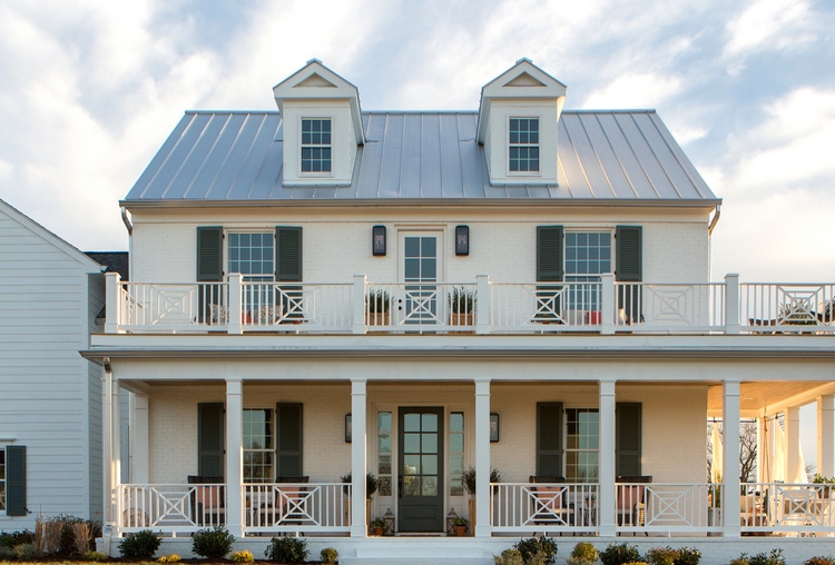
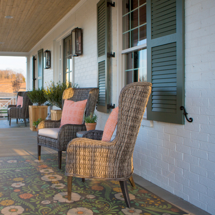 Color by The Decorologist – SW Pure White on brick, siding, and trim – SW Pewter Green on shutters, doors
White seems to be the default for farmhouse style these days, but the modern farmhouse doesn’t have to be just white + wood. It doesn’t have to be simply shiplap + barn doors.
As you will soon see, the interior is NOT all white. And like most things, it all worked out in the end.
The living room walls, ceiling, and trim are SW Pure White. The fireplace brick and mantel is SW Iron Ore, which ties in with the Iron Ore french doors and adjoining kitchen with its Iron Ore island. The ceiling beams are an Iron Ore paint stain at 80%.
 living room design by Julie Couch Interiors
The entry, hallways, master bedroom and bath, and bonus room are painted a light gray green. This color serves as the anchor neutral™ for the home’s color palette.
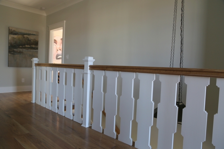 baluster design by Chad James
The color I chose for the study is a dark gray green. It’s on the walls, trim, and bookcases. I love the fabulous light fixture here:
 study design by Trot Home
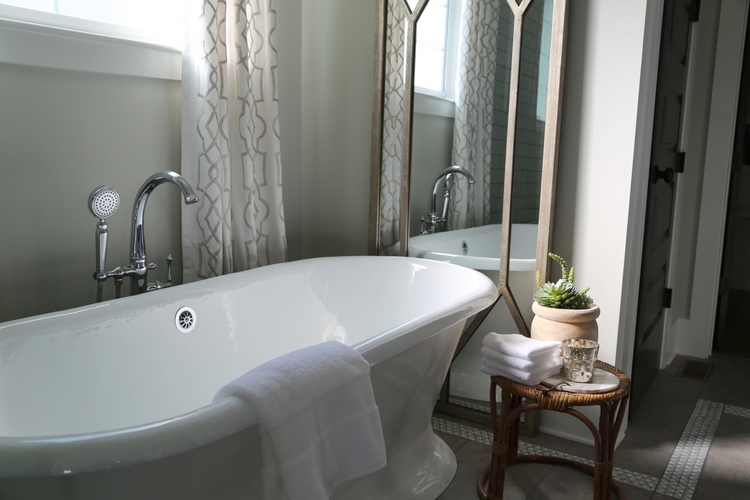
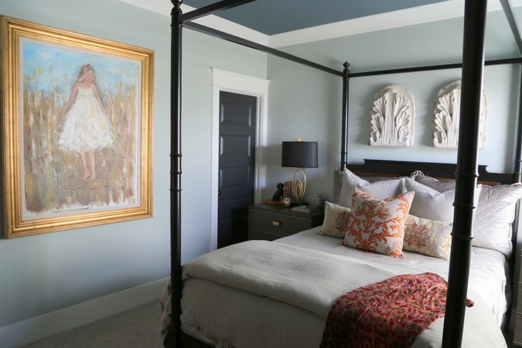
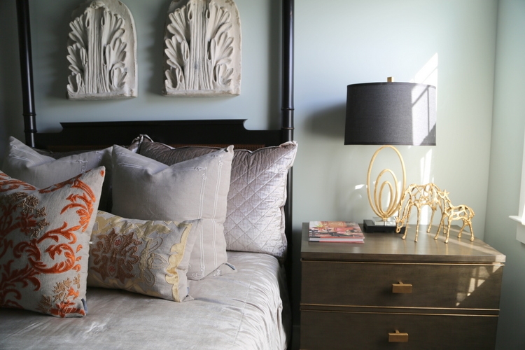
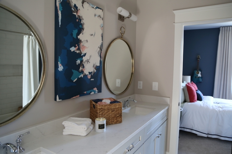
The anchor neutral continues on the walls of the master bedroom and bath:
 master bedroom/bath design by Refresh Home
You’ll notice all the interior doors are painted dark, which I love to do! SW Iron Ore are on the doors and master bathroom cabinetry.

Let me take a second to bring you this public service announcement about testing paint colors!
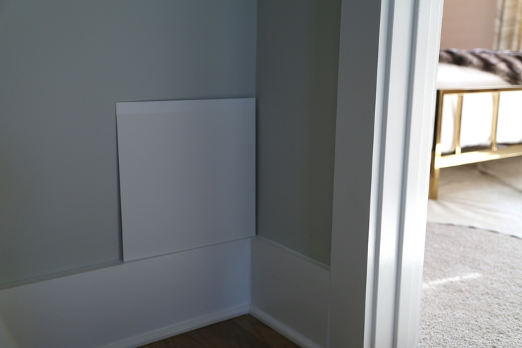
The first thing I do is paint samples up with real paint on my 12×12 SmallWall® boards that are available at Sherwin-Williams. These boards are the closest thing to painting on drywall that you can get, plus with their adhesive strip on the back you can move them to different walls in different lighting so that you make better paint color decisions. Their design is patented, and I haven’t found a better product for sampling paint colors.

You get a much more accurate read on what the color will look like with these large samples than you can with a teeny-tiny printed card in a paint company’s fan deck surrounded by other colors. I placed a few of the samples I have with me all the time in the master bathroom to give you an idea of how you should test paint color – NOT by painting directly on the wall!

Oh, and always test against trim to make sure you are going to get the contrast (or lack of contrast) that you are going for!
Ok, back to the paint colors that I chose for the House for Hope Designer Showhouse. Here is the mudroom and laundry room:
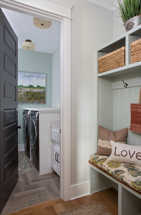 design by Rhoda of Southern Hospitality
Here’s the bonus room with the anchor neutral. The custom bookcase/entertainment center is Pure White like the trim in the room, but has a dark dusty blue in the back of the unit only. I like to do entertainment units with dark back walls so the television blends in a little better. You will see this color used again in the home, but in different placements.
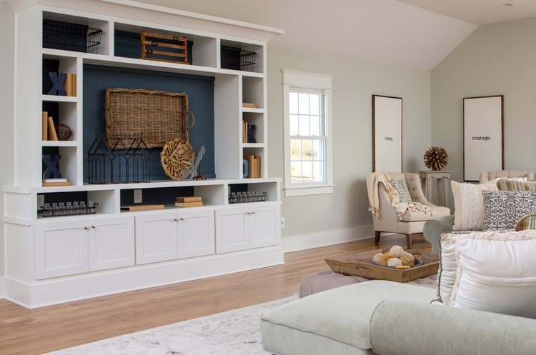 bonus room design by Kari Ann from Thistlewood Farms
The sophisticated guest room is where you’ll see a combo of two of our memory colors™ for the home.
 design by Angie Forte and Jerome Farris of Peddler Interiors
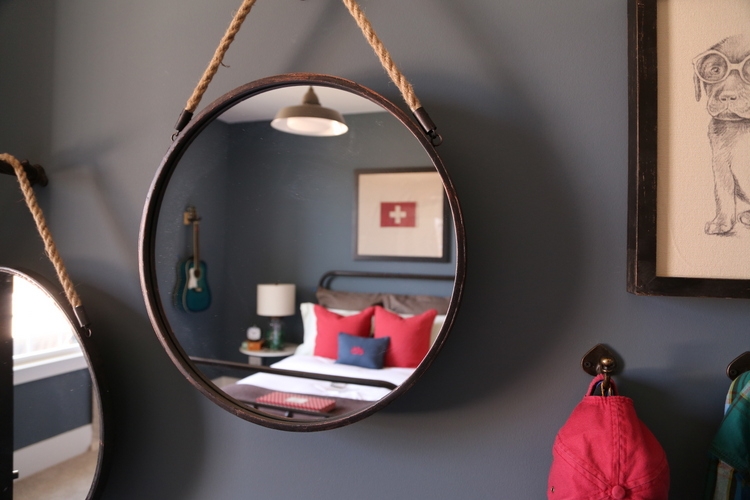
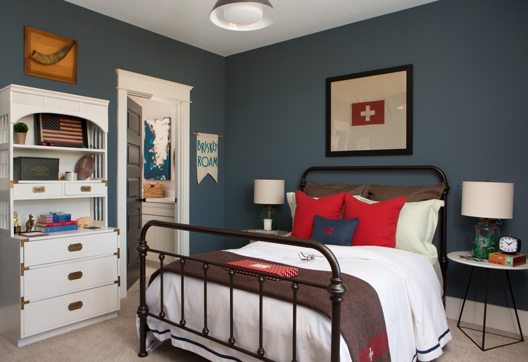
Down the hall is the boy’s bedroom was designed by Amanda Carlson of Amanda Carlson Interiors. I specified the dark blue for the walls this time, which is a perfect rich color for an evergreen boy’s room.
 design by Amanda Carlson Interiors
What’s an “evergreen” room, you ask? It’s a color that will take a child from early boyhood to young gentleman without having to repaint! I love taking photos through a mirror – doesn’t this round wall mirror capture this room’s cool vibe perfectly?
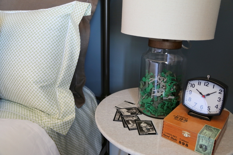
Look at how Amanda put army men inside the fillable glass lamp bases – how cool is that? She initially tried matchbox cars, but she thought it looked too busy in photos!
Amanda is an interior designer who took my Expert Psychological Stager™ course a couple years ago to help relaunch her career after staying home with her kiddos for quite a few years. I love to see the cool things she is doing in Nashville!
This is the Jack and Jill bathroom between the boy’s room and the girl’s room. As you will see in a moment, the art in the bathroom marries the two bedrooms perfectly:
And now for the girl’s bedroom designed by artist Gina Julian. Imagine the daughter who loves coming home from college to hang out in her very sophisticated digs.
 design and art by Gina Julian
I chose SW Malted Milk, a sophisticated blush pink, for the walls of this room. Bella Tucker Decorative Finishes created a special effect by applying a higher-sheen finish on the applied stenciled pattern that makes me think of teardrops. How appropriate is that for the teenage years??

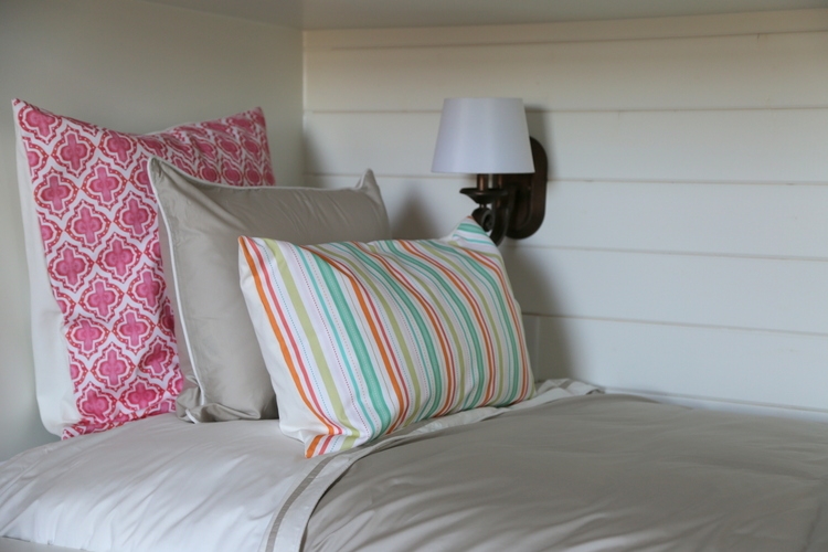
The kid’s bunk room was a big hit in the House for Hope Designer Showhouse. Don’t you just love that built-in bunk bed???
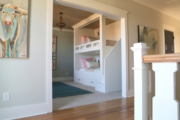 bunk room design by The Handmade Home

 majority of photos taken by SqFt Photography for The Decorologist, a few taken by The Decorologist
There’s more to see at the House for Hope Designer Showhouse! Be sure to tour it for yourself if you are local – all of the proceeds go to a myriad of children’s charities! Here are some of the ones that will benefit from your visit and the sale of the home (maybe you should buy it!):
Young Life Capernaum, Camp Will, Special Olympics, Big Brothers Big Sisters, Hospital Hospitality House of Nashville, Tennessee Baptist Children’s Home, Boys & Girls Club, AGAPE, Saddle Up!, GraceWorks, My Friend’s House, Narrow Gate Lodge, Waves – Early Learning, High Hopes, Make-A-Wish Foundation, Bridges Domestic Violence Center, and Franklin Open Hearts.
I’m happy to see three of the wonderful organizations that I personally support on the list. All are great charities that benefit children in need in the middle Tennessee area.
I also want to make note of the fact that all of the designers and sponsors involved in the showhouse were NOT compensated and have donated their time, effort, and money for this fundraising effort to benefit these charities. YOU CAN HELP by attending the tour and checking out the EBTH sale after the tour. It will include items from the house, as well as additional items donated by those involved in the House for Hope.
The House For Hope Designer Show House
Open through March 12 from 12:00 – 5:00
Southern Preserve neighborhood, 2045 Lewisburg Pike, Franklin, TN 37064
$15 per person
Realtors presenting a business card are free throughout the tour!!!
And by the way, if you’d like to learn more about paint color, design, or home staging, find out how you can learn from me here.


Lovely paint color choices, and thanks for the tip on the SW 12-inch square sample boards.
That light fixture in the homburg gray study is amazing – I’d love to see a photo with it on.
Sandy,
I don’t think I took a pic with it on (I usually keep lights off to get the most accurate shots of paint colors). But it uses Edison bulbs, so you get that cool retro effect with the curly wires!
Kristie, your paint colors were so fresh and created the perfect jumping off point for this beautiful house design. Thanks so much for donating your time, expertise, and God given talents to the House for Hope. Thanks for mentioning our stencil 🙂 xoxoxoxo
Thank you, Dana.
Can you tell me who’s light fixture was used in the Study?
Susan,
I don’t know, but you might try looking up the designer and asking her. Colleen Trot from Trot Home!
Absolutely fantastic! Love the color scheme but didn’t see pictures of the kitchen? Was really curious about that….
I didn’t include everything in the post! BUT, you can see the kitchen in my previous post about kitchen trends: https://thedecorologist.com/2017-kitchen-trends/
I love the colors you used. What confuses me is that I thought paint was the last thing to be selected when designing a space. Here, it sounds that paint was first. Will you please comment on this?
In new builds, paint typically goes up before most hard finishes. It’s more expedient so that you don’t have to worry about getting paint all over everything else, especially because it’s mostly sprayed on. I typically choose finishes in tandem with paint colors so it works out just fine. The tricky part for a designer showhouse is coordinating all the different finishes that are chosen by separate room designers (and there are always changes along the way), so in this case we started with the paint color palette and worked the other direction.
What color did you choose for the garage doors ? Did you use the iron ore color? Fabulous transformation. Thank you for sharing
No Kim, because there was no Iron Ore on the exterior, we kept the garage doors Pure White like the trim and siding so they would blend in.
If this house had the garage doors in the front , instead of on the side of the home , would you have chosen to paint the garage door to match your main exterior door? I only ask because I am curious as to what the general rule for this is and what looks best ?
Thank you
Good question, Kim – it all depends. If the doors are lovely carriage doors, I could see painting them Pewter Green to accent them. But if they are very plain, I would paint them body color to make them fade away. So it totally depends if they are worth highlighting!
So, so great! I’m glad you stuck with what you knew needed to happen with the colors. That’s a strong woman, right there! 😉
I did try to make adjustments, especially towards the beginning of the process when other things were not yet set in stone. But there were requests for color changes as recent as a couple of months ago, which was pretty frustrating. I’m learning you can’t make everyone happy. And even when you try to, the results are not so great.
Fabulous, Kristie! Those toned/murky/light green/grays are my fav for an “anchor neutral”. Also twisting clients’ arms to go with the right off-white as an alternative to the “Houzz/Pinterest default Revere Pewter” for an anchor. #grayoverload
Yes, Jean – the struggle is real!
Looks beautiful Kristy. A great job for a great cause!
Very beautiful Kristie! You are very talented!
Love the colors – everything flows beautifully – and the guest room SW Slate Tile ceiling – squeal! I was a client about 5 years ago & I have a lovely Charlotte Slate AC-24 dining room ceiling thanks to you. Question – on the dark doors – how do you decide if a house’s style can support that look or could anyone pull it off in their home?
The colors are beautiful! Great job! I only wish I lived closer to view in person. The entire house looks like it was very well done.
Kind of puzzled that Comfort Gray looks green-blue, or is that just my computer monitor?
It’s definitely green-blue. Are you puzzled because of the color’s name? Those names mean NOTHING. Don’t let them fool you.
Yes, it was the name that puzzled me. Why would they name a blue-green paint, gray?
I have so enjoyed reading your blog. I have been renovating a tiny NYC apartment and I truly appreciate all the free information you so generously share.
Thank you for sharing your story – I have never bought from Rugs Direct. But I’ve had good experience with Rugs USA 🙂
Oh boy, don’t get me started on paint color names!!! The people who name them are in marketing, they aren’t color experts. If a color is “grayed down” a bit from a bright color, it may get the word “gray” in its name, but that doesn’t mean it’s really a gray. And you also have to keep in mind that grays have different undertones, including green, blue, or red/violet, so one person’s idea of gray may be quite different from another person’s idea of gray. All that to say, don’t pay any attention to the names of colors, but rather compare them against other colors to get a sense of how they will “read” on the wall. And always test them in your space, as they often read differently depending on surrounding colors. Best of luck on your remodel, and thank you for reading!!!
Hello, what color did you use in the Jack and Jill bathroom between the boy’s room and the girl’s room?
Thank you
Hi! What is the light gray green color in the master bedroom?
This is gorgeous! Thanks for sharing. Can you tell me the name of the light gray green paint you used? I feel like it’s either Sea Salt or Filmy Green lightened. Looking for that exact shade for my new home. Thanks!