It’s another chilly morning here in Nashville. We even saw a bit of snow yesterday, which is unheard of before Thanksgiving! It’s the perfect day to share my client’s warm and cozy bedroom makeover.
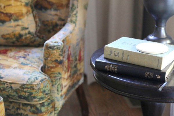
cozy reading spot
I’ve always thought it would be dreamy to have a fireplace in my bedroom! This bedroom is part of the same home I featured earlier in the week, and the fireplace is made of the same stone you saw in that living room. Here’s a before photo of the room:
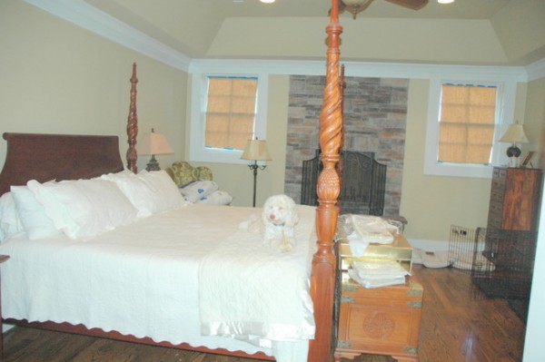
bedroom before
I must tell you: the first thing I wanted to do was get the yellow color off the ceiling – I hated the way the trim chopped the color in half and made the whole wall look like a FACE (can you see that???) I think it’s looking at us! You’ll see the difference in a minute, but let’s talk about the paint color first. The paint color I initially specified for this room was a grayed brown that looked heavenly with the fireplace.
But in the end, my client felt it was too gray for her personal taste. With a little tweaking, we chose a similar color but with a bit more green and gold. This color met the needs of the room – to enhance the fireplace stone, as well as the needs of the client – to live her spirits on a cold winter’s day.

My goal as a paint color consultant is to find the “paint color sweet spot.” That means identifying the colors that will work best in a given space, then finding just the right one that makes the client’s heart sing. That can be a challenging task, but I aim to please! Here’s an after photo of this cozy bedroom:
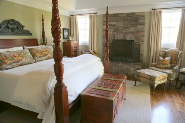
bedroom after
The wall color still has the hint of gold that my client loves, but this version works so much better with the fireplace. And it makes the wood in the room look richer. In areas where there is less light, it appears more green as you can see in this photo:
bedroom fireplace
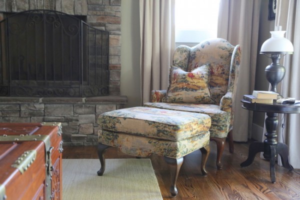
The new fabrics we chose for the chair upholstery, bed pillows and curtains look so beautiful in this peaceful, cozy bedroom. And just in case you are wondering, this color is NOT the same as the color we chose for the great room on the other side of this wall – but the color transitions beautifully from that space into this one. I know it’s difficult to tell in photographs, but this color is less gold and more green than the color in the great room. And I really hope you notice how the change in color placement (all white above the trim) makes the architecture look so much better. Bye, bye, FACE!

The Decorologist
Every room is different, and every client is different. That’s why it’s so important to create custom paint palettes that address the unique needs of both. One size does not fit all! Here’s one more before photo of the bed:

bed before
Keeping the bedding neutral allowed the pillow fabrics to take center stage. Notice how the new lampshades update the lamps, too.

updated bedding and lamps
Here’s a hint: If you have white bedding, make sure your lampshades are white. If the bedding is cream, the lampshades should be cream. That simple tip can really pull a bedroom together so that it doesn’t feel a bit “off.”
If you want to learn how to choose the paint color that makes YOUR heart sing, find out more about my Color Workshop Video.


Love the tip about the lampshades! I always learn something when I read your blog 🙂
Missed you at the Southern Living Idea House party last night! I hope you are feeling better 🙂
That sums it up perfect Kristie. Everyone is different with different tastes. It is our job to find the colors that work best in the room and then tweak until the homeowner loves.
Thanks, Kelly 🙂
Kristie, the new paint color is great! The ceiling is looking much better too. Great job.
Thank you so much, Jann!
I love how warm and rich the wood looks with the paint and fabric you chose. This looks like the perfect room to snuggle and read a good book!
haha I can see the FACE that was scary!! haha Great job!! I love the new fabrics
SUCH an improvement! The drapes are wonderful, and using the two separate colors really does help. The “Face” effect is something most people probably wouldn’t think of until it was too late!
I didn’t even notice the fireplace in the first picture – just the windows and ceiling! Nice, cozy bedroom! Very pretty.
The end result is a very inviting, cohesive room. Great job. 🙂
Fabulous job (as usual) Kristie! Sweet, clean yellows NEVER complement stone. The murkier neutrals work beautifully and the ceiling is lifted without that white crown splitting the room in half. We done!
Thank you, Jean! That means a lot coming from someone as talented as you 🙂
Love the pillow fabric!!
Beautiful job, Kristie…..could be a B& B now–so classic!
Hi Kristie,
Good call on the ceiling! I hated it before. And the fabrics are so great too. I love the traditional choice for this home. The room looks much, much better!
Warmly, Michelle
I have looked at this several times. I just don’t like the color of the bed and trunk in this room. I love the style but the wood is off to me. What am I missing?
Sylvia,
This was not a “from scratch” design. The furniture was existing, and all of the furniture (including the trunk) has special family meaning. That’s the difference between decorating for real people and creating something simply to put in a magazine layout. It’s REAL. It’s layered and not perfectly-matched all the time. That’s what makes it HOME.
Beautiful job Kristie. Such a difference when you tie in the stone and look at the “fixed elements”. I also love the all white ceiling. The room looks much less choppy.
Good article! We are linking to this great post on our website.
Keep up the great writing.
The wall color you agreed on harmonizes well with the fireplace. What a huge difference! Also, adding the long coordinating drapes helped fill out that wall and not make the fireplace look so out-dated. I have a similar problem in my family room with an antique red brick fireplace that definitely does not go with my blue/grey coastal theme. (I’ll probably reface it or paint it!) It’s nice to see you “salvaged” the centered fireplace feature and made it much more appealing.
I would have preferred an ivory or tan color for the bedspread/duvet to blend more with the other tones in the room. Nothing too dark, but definitely not harsh white but maybe it’s just the camera shot. Then, again, I prefer bolder colors and might have even gone with a gold or green tone.
Also, I like the added piece above the headboard to round out the straight line and fill in the space without using a picture. And, it brings in more grey.