This home was featured in the latest issue of Country Living. It’s an eye-catcher, to be sure. But on closer inspection, I began to question whether I loved it or hated it. I don’t mean to be brutal, because it is a fun family home and everyone is entitled to their own sense of style. But as a design-junkie, it’s fun to really dissect a space and figure out what I like and don’t like – what seems to work and what seems not to – and why. Stick with me here.
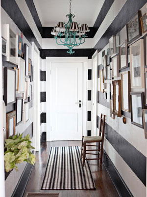
Wowza! I love this entry hallway. Graphic, bold, modern – with just the right touch of traditional (it is an old home, afterall). Love the art groupings on either side of the striped walls. It totally creates a gallery effect. I kind of like the chandelier, because the color is a surprise. Not sure about those striped shades, though. Overall, a pretty awesome space. What do you think?
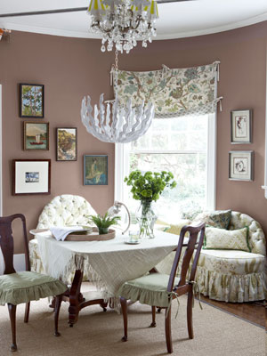
You don’t see a lot of dining rooms painted brown, and there may be a good reason why you don’t. The chandelier is something the homeowner created for their new West Elm collection (they are artisans). I’m not understanding the relationship between the bottom half and the top half of this light fixture. And did they forget to change those yellow-striped shades when they changed the colors in this room? I think they are going for a juxtaposition of modern and antique, but it feels too heavy on the antique side in this room. The fabrics are too traditional, maybe? And a different wall color would really bring it to life. It just feels off-kilter to me.
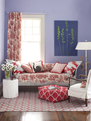
So this is sitting room that is featured on the cover of the magazine. Surprisingly, it’s in the same house as the previous photo. It’d be interesting to walk through this house – I can’t imagine the rooms flow together, but rather shock you as you enter one into the other. There’s even a giveway in this issue of Country Living, where you can win most of what’s in this room – valued at $6000. Ok, I really love this rug and the puffy ottoman. I also am digging the white fois bois (fake log) side table. But $6000? I don’t think so. It’s a cute room, but I sure wouldn’t put it on the cover of a magazine. I can’t see the relation between the wall color and anything else in this room. I like the way the furniture is arranged in and of itself but NOT the way it relates to the window behind the sofa.
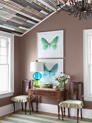
Now THIS is cool. Love the interesting use of materials on the slanted ceiling. Nice juxtaposition of new and old here. But this thought keeps running through my mind that Elle Decor and Country Living are wrestling each other throughout this house. And I’m not sure who’s winning.
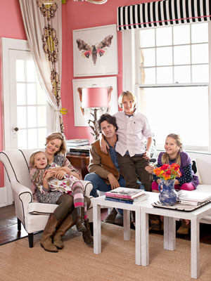
What a cute family! They look like a lot of fun. What do you think about this pink living room? I love that they were brave enough to paint a room this color. I’m not really getting the really highly-hung vintage panel over the door in the context of the black and white 1980-ish window valance. I do love that lamp with the pink shade and the butterfly art.
So, do you think you could live in a house like this? More importantly, why or why not? Analyzing what you like and don’t like in other spaces helps you understand what you’d like to integrate into your own home – as well as what you want to avoid for yourself.








I completely agree with your assesments. I have this magazine and I am going to paint that art (green stems on blue) for myself…but the red family room is the only one I like…..that funky(ugly) 2 piece chandelier is a disaster! the aqua chandelier should have sold aqua shades,,not stripes…too busy…in fact most of this house is too busy/miss-matched….aren’t we so classy? ha
I definitely love pieces of most of the rooms…but don’t share the love for others. I think Travis would kill me if I tried to hang that weird chandelier in our house. And I think it would be justifiable.
What I like about this house is that the owners knew what they liked and were not afraid to give it a try. This kind of thing always impresses me. But for my own personal tastes, I think that entryway would really stress me out. Those big stripes down that hall would make me feel like I had to RUN in and out the door every time! LOL! Of the pictures you posted, the room I like best is the one with the interesting slanted ceiling, brown walls, butterfly prints, and coordinating lamp. That lamp is fun. That room has a real peaceful feeling, and I am finding that what I really need is a home that gives off a peaceful, tranquil, comforting vibe with lots of light.
Good post – gets the reader to really think about things and SEE. Thanks!
yeah, that slanted ceiling is really cool and is definitely modern country. thanks for sharing your reactions to this space!
This is a funny post Kristie. We love something but then something is “off”. Having the hardest time with my bedroom, the more I do the more things feel off…you start redoing things and it’s like playing domino…
maybe it’s more a matter of editing? like putting things you love in one room and not being able to edit well enough to pull off the look. i know that’s one thing i’m always struggling with!
things I liked – the butterfly and botanical art pieces, the green and blue bubble lamp, the ceiling in the slanty room
things I didn’t like – any of the window treatments or chandeliers
this is another one of those examples of if I did this in my house it would look disorganized and odd but since it is artfully photographed for a magazine there is the tacit approval that it must be ok.
This is a little too much for my style. I like more earthy tones and a natural comfortable feel. But there are elements I love, such as: the colorful glass globe lamp in the slanted-ceiling room and the purple color on the wall in the sitting room (if it were used in a little girl’s room). But I commend her creativity and sense of style! Right on for her, but this one is a miss for me, personally! Thanks for sharing, Kristie!
thank you for sharing your thoughts – again, i think they are obviously creative, and i always think you should feel free to do your thing in your own home!
I completely agree with you. Usually I love houses I see in magazines, or I can simply say that it is great but not my style. This home is neither. It has a few cool details, I love the entry but like you said, not the stripes on the lampshades. I didn’t see anything I like about the dining room, especially knowing it is in the same house as the rest of the rooms! I don’t hate the pink livingroom, but I would never do it. All in all, I wouldn’t want this house how it currently looks. But it looks like it has great bones!
no doubt about great bones – it was built in the 1880’s!
Great post. I think in general we (the public/design junkies) are all to apt to say it’s great just because it’s in a magazine. No way! To be true, it’s not my style but I don’t love anything about these rooms. I like to learn and feel inspired when I see homes in magazines and this one makes me feel smothered and put off. I do like the striped foyer but hate the chandelier with the striped shades. I think a crystal piece here would be much prettier and substantial for the space.
As for the dining room chandelier~ whoa awkward! It is truly awful. I can’t quite get the scope of the photo but it looks to my eye like maybe the one they created is hanging over the table while the crystal, shaded piece might be slightly in the foreground, only teasing our eye to make them look attached? I can’t tell from this angle or photo but maybe…
great insites, ally! you may be right about the light fixtures – it’s hard to tell. but if they are separate, they are hung waaayyyy too close together.
I’ve been trying to decide all day whether or not to leave a comment because i can be pretty judgemental when it comes to design. i’ve realized that i am pretty particular to my own aesthetic. maybe that comes from being an artist and makes me think i wouldn’t be a very good designer. but you have stated all of your opinions so tastefully here.
i would agree with your assessment on the window treatments, the paint colors and the chandeliers. along with your clever prediction over the combined Elle Decor and Country Living aesthetic.
overall, i don’t draw inspiration from these rooms. but it causes me to wonder if this house is some sort of bastion to the design world trends or just a miss for Country Living.
heather, i went back and forth about writing this post. i think i’m being more judgmental towards Country Living for choosing this as their cover and featured story than I am this home and the homeowners. you know i really feel we should all embrace what we love and just do it in our homes. the homeowners are obviously are fun and creative people and they are living the life they love – which is awesome. i think Country Living is so afraid of becoming irrelevant in a modern world that they are trying to recreate what country is for fear they will lose readers. i think their latest issue is a reflection of that fear.
What a wacky world – as I always tell my decorating clients – everyone has a different tolerance for mixing … these are VERY tolerant people! I would put red shades in the entry to tie some red in, and I would spray those Queen Anne chairs in the dining room the same color that is in the stripe in the chandelier shades, or one of the greens in the window treatment fabric. That chandelier combo is just wrong. The slipcover skirt pads on the dining chairs would have been better without the ruffle – just a simple pleated drop would have mixed better. They look like fun people and I really do appreciate their bold choices. As long as they’re happy, who are we to judge??
Thanks so much for your sweet comment today. Just wanted to say that I love your blog. I’ve been doing lots of google image searches because we’re doing quite a few projects around our house. They’re all hitting at once and I instantly need to make decisions. It’s fun, but kind of overwhelming. Thanks for the inspiration. Oh.. and I have that keep calm sign in the exact same color for my laundry room. 😉
I saw almost exactly same entry way — horizonal stripes in Three man and a lady’s blog, and only hers is lighter color, white and tan.
Now that you mentioned, I took another look at the two tierred lights in second room and yes, they are indeed two separate lights and were shot in an angle which makes them appear to be overlapped.
I like rest of the rooms as well.
All these rooms have one thing in common –make background to be modern and use vintage/country pieces as features. It definite gives me the inspiration on one way of implementing that concept– how to do modern and vintage/country, and makes me not afraid of mixing those any more.
This is good post too and I like to see posts with more discussions, including the previous long distance one. Thank you.
thank you for your thoughts, joy – i always like hearing from you 🙂
I love the butterfly prints but that is about for me. But..I agree, to each his own style.
I like elements of each room but as a whole house, like you said Kristi, the rooms would be jarring and a little shocking to one’s senses because they are SO different. I like rooms to have their own personality and energy but also blend cohesively with the rest of the house.
LOVE the blue and green glass lamp, though! Would love to know what materials were used on the slanted ceiling because I think it would be pretty cool wall art, too. 🙂
Hmmm…I like a sense of whimsy in a home for sure. Colors don’t always have to match and colors don’t always need to be bright, but I think I agree…to each his own. If they love it, then that is all that matters. It’s just not for me, but there are touches I adore…those butterfly prints are fabulous.
Thanks for stopping by and helping me with my dining chairs!
Hi Kristie, It’s ironic that I recently picked up this issue also & thought, “This is Country Living??” There are a lot of funky/more modern elements thrown in than I would expect. I LOVE the blueish/red room. As for the odd furniture placement, I wouldn’t be surprised if they scooted the furniture over by the window to get it all in the shot! I really adore the b&w striped entry–except the lampshades on the chandelier (overkill of the striped motif). And I really like the area with the butterfly prints. The salmon-colored room & the dining room are just plain weird to me. I’ve enjoyed reading all the interesting comments your readers made. What a smart bunch!
Warmly, Michelle
i can’t believe almost everyone who commented on this post is in agreement. i thought sure someone would disagree!
Good on this family for creating a space that’s expressive! I laughed at one of the previous comments that says the hallway makes you want to RUN down it- I agree! Even a plain rug rather than more stripes would have grounded it a little more. But I LOVE the pink room with black and white blind, and white armchair with black piping. The white tables (Ikea?) and sisal rug keep it simple and modernise it a bit. You’re right, they look like a fun family! Naomi x
Heya! I’m at work surfing around your blog from my new iphone! Just wanted to say I love reading your blog and look forward to all your posts! Keep up the fantastic work!
I usually avoid reading comments on Internet sites because people are generally rude and obnoxious. Amazingly everyone who commented here was pretty nice and tolerant of the fact that a home should reflect the tastes of its inhabitants. Obviously there are people who have a greater esthetic prowess than others and that is why I enjoy your posts so much. Happy also to see you have a faiy civilized readership.