Last week I spent the morning hanging family photos in the open stairwell of a client’s home.

So many people have this issue in their own home: a blank two-story stairwell that is completely open to the living room.
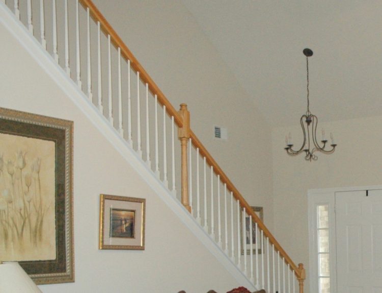
open stairwell before
When you enter the front door, all the decorating action was on the left side of the room – the fireplace, the seating, the window treatments, while the right side was bare and devoid of anything but a ginormous blank wall.
Many are frozen in terror when it comes to hanging family photos or art in a stairwell, because the only way to make it work is to do a progressive grouping of art following the angle of the stairs. But when done right, the pay-off is awesome!
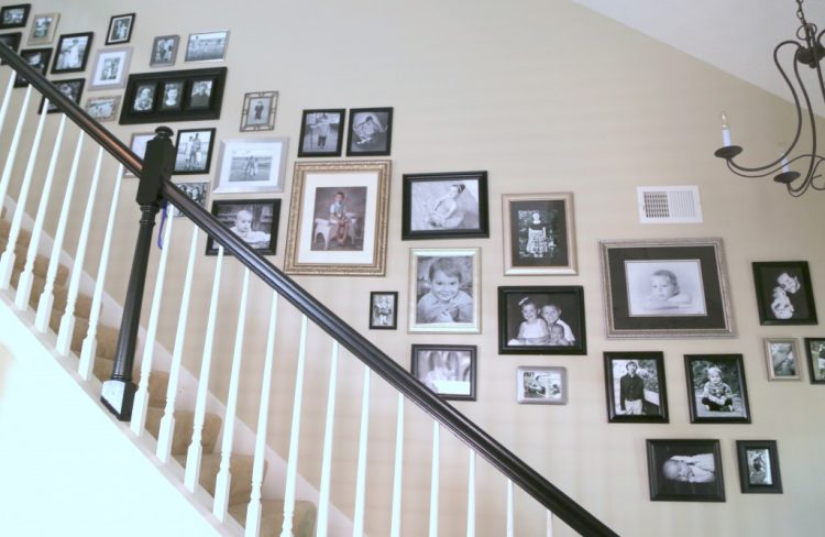
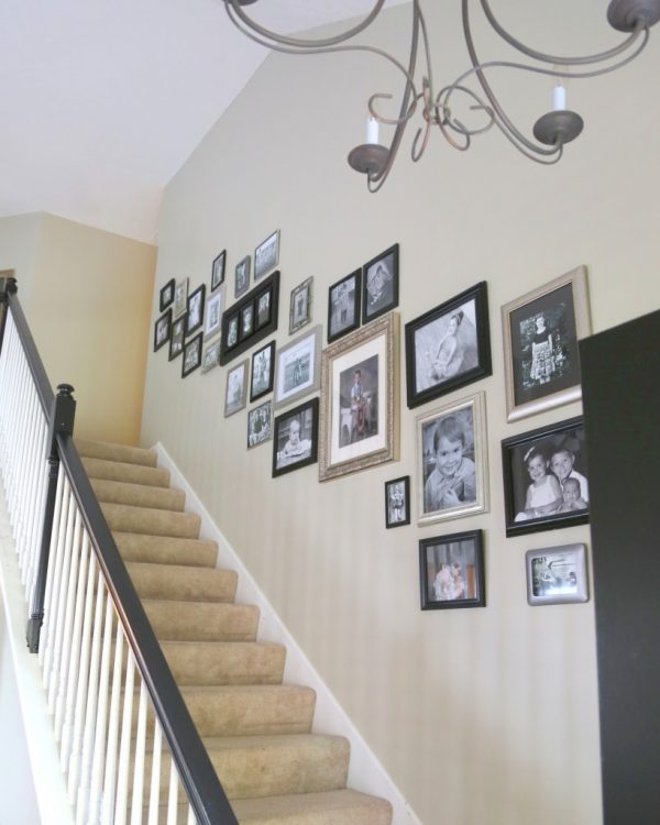
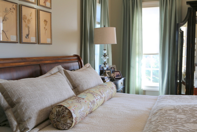
after
Here are my tips for hanging family photos in a stairwell:
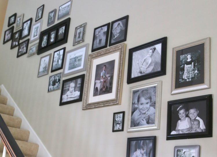
- Choose two frame finishes – black and silver or gold and wood, for example. The frame styles can be different, but keep the overall look cohesive by sticking to two finishes for frames.
- Go black and white. Choose black and white photos when hanging a large grouping of family photos in a more formal space, like a living room or dining room. Save the groups of color photographs for family rooms and other informal spaces.
- Start in the middle of the stairwell with one of the larger photos. Work your way out in both directions so that the grouping stays balanced.
- Keep interior spacing (between photos) consistent to make the grouping feel cohesive, not chaotic.
- Check your work from a distance. Whenever I hang a new piece, I walk over to the opposite side of the room to see what my grouping looks like from a distance. This helps me to know where I may need to hang the next piece.

We recently had this space painted a warmer color than the previous builder-basic. Do you notice any other changes?
I had my client paint out the handrail and newel posts in a soft black to update the faded oak finish. We also had the interior of the front door painted the same soft black to pull the look together.
One more tip – work with a partner when hanging art on a stairwell wall. It’s really easy to get off-balance and you don’t want to take a tumble down the stairs. My client had 36 photos she hoped that we could include, and we managed to use every one in this grouping! My work here is done – what do you think of the results?
I have only 2 spots remaining in the last Expert Psychological Stager™ course of 2015! If you want to join us, this is the week to do so before the course is SOLD OUT. Click below:
![]()


As usual, you knocked it outta the park! This wall is amazing! and I noticed the handrail immediately- what a difference:) I know your client is thrilled with this wall! Beautiful work my friend!
Thank you, Elizabeth! Hanging art is pretty challenging, but it’s one of the most rewarding things for me to do, emotionally speaking. I’m not sure why, but it just makes all the difference 🙂
Hi! What a great display with great rules to follow, Kristie! I thought of you last week as I hung a 25 lb. mirror in a client’s home, solo. Ugh! I was so nervous but I thought of you over and over! HAHA! I really did! It turned out great, though, as I measured and remeasured, keeping my fingers crossed. Your can-do approach to everything really inspires me.
Thanks, Gina! I’m sure you did a great job with the mirror!!! 🙂
Beautiful as usual. My railing is stained dark like walnut. Is that “out” also? It’s probably hard for you to know without seeing a picture. I love your blog!
Pam – NO! Dark walnut stain is beautiful on a handrail – it’s a classic. It’s the lighter blond to orange wood tones that tend to look dated there. My own stair rail is stained dark walnut 🙂
I love your end result! What a great look.
Which soft black did you use on the railing?
Thanks for all your inspiration.
Hi Connie!
The black I chose was Benjamin Moore Black 2132-10 in a semi-gloss finish (satin finish is good, too).
I just painted my stair rail and doulbe size entry door Ben Moore Black. Just wanted to say that even thought this BM color is called black, it is actually a dark grey. I went back to the paint shop thinking they had mixed the color wrong. She told me that BM base emulsion ( don’t know the tech term for that) that is mixed into all paint, is a cloudy color, so if you want a real black, like a shiny piano black, one must use a color called Universal Black, as it is made with a clear base and will not lighten black pigment. Not even my professional paint crew knew this about black. Wish I had known this before I had the painters use the BM Black. I has them redo everything and it cost a pretty penny.
That’s important info to consider! This black is Ben Moore Int/Ext Black or Black 2132-10. It is a soft black – not the blackest of blacks, like you mention.
Moral of the story? Always check you paint color in the light of the area you are going to paint it. Put it directly on the object, not just the color swatch. No matter what the “name” of the color is. Even a color called plain ol black, is not always as expected.
Very true!!!
I’ve recently started following your blog. I like it because your styling uses real people’s stuff and accommodates their daily living. Question: if you were helping this client stage her house for sale, would you recommend she remove all of these photos to depersonalize the space? That might leave the same empty, unbalanced space you were trying to fix.
Great question – what I’ve done in similar situations is to have them replace the photos with black and white landscape photography and people where you can’t make out faces – like walking down the beach, etc. That way the space doesn’t go bare and hokey for staging!
Holey, not hokey.
Great job and great tips! You have found a way to incorporate those large photos I have struggled with by using only black and white and two colours in the frames. Brilliant, Kristie! Your clients must be thrilled with these results!
Thank you, Susan! I think they are very pleased 🙂
WOW!!! Amazing job!!! Looks absolutely beautiful!!! But…not surprising from YOU! 😉 You are so very talented and I am always so excited when I see you in my email inbox. 🙂
You are so sweet, Libby! Thank you for those kind words 🙂