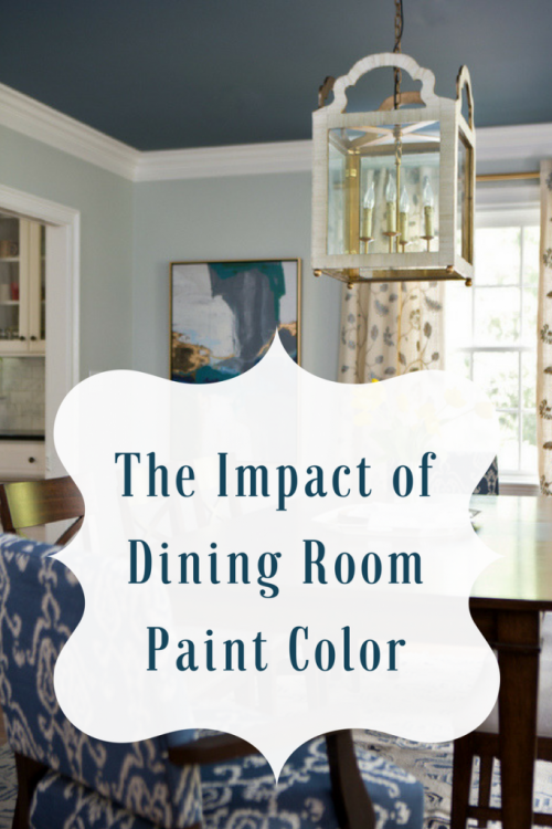
Color changes everything. And it can do a world of good for your dining room. Today’s befores and afters (oh, how I love befores and afters!) are to prove to you the incredible impact of dining room paint color.
Let’s start at the very beginning – that’s a very fine place to start! A lovely couple moved into a fabulous new home, bringing their dining room furniture along with them from their previous home. The furniture is very nice, and I particularly like the rug and upholstery on the end chairs.
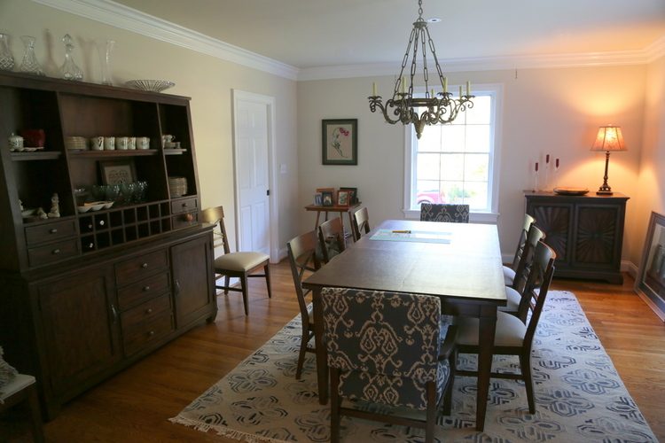 dining room before
But as you can see, it’s still a pretty bland room. This dining room paint color does NOTHING for this room for this space. The homeowner wanted the room to have a more “finished” feel to it. She was ready for new paint colors, and she wasn’t in love with the light fixture, either.
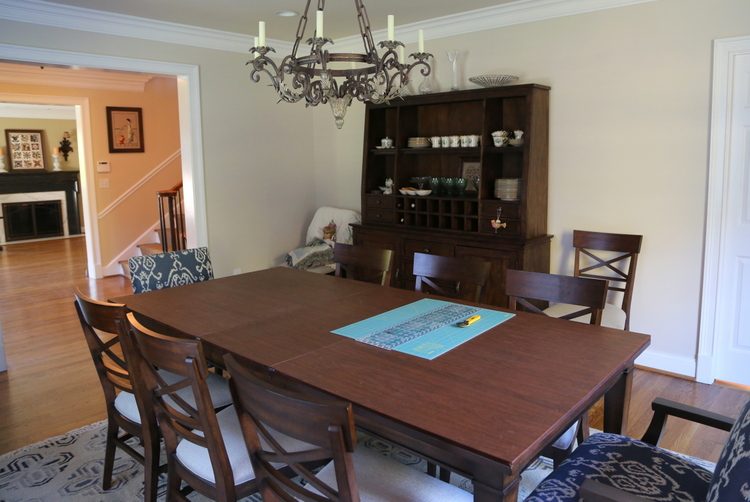 dining room before
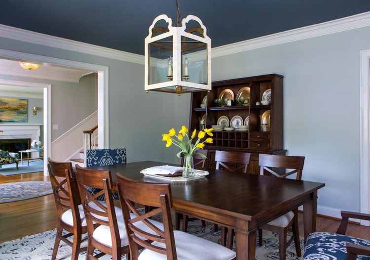
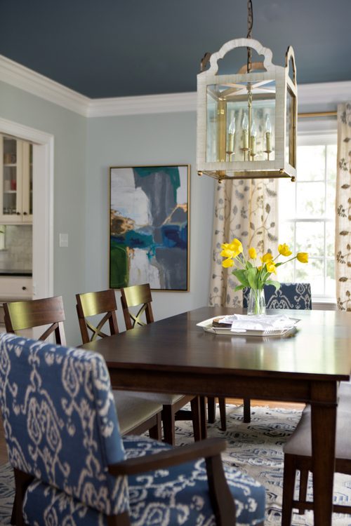
Using her rug and upholstery as inspiration, we chose a color scheme that would make her dark wood furniture come alive. We also chose a fabulous statement light fixture, window treatments, and art to finish out the room.
I love the way this dining room came out! I mean, I REALLY love it.
So without further ado, here it is now:
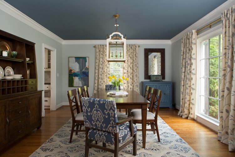 The Decorologist, photo by Sqft Photography
You tell me that a dark ceiling will make your room look smaller, and I’ll show you the before and after of this room!
 The Decorologist, photo by SqFt Photography
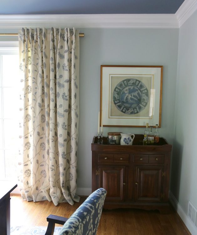
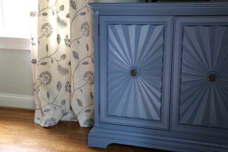
The finishing touch to this room was the decision to paint out the dark wood cabinet in this gorgeous and rich blue. The detailing of the wood just pops now as the light reflects off the semi-gloss finish. I love it. So much.
 The Decorologist, photos by SqFt Photography
So what is YOUR dining room paint color? And would you dare paint the ceiling dark?
Want to learn more about paint color? Interested in becoming a color consultant? Consider becoming a Psychological Color Expert™ with my new online training program. . . find out more HERE!


Beautiful job!!!!!
Thank you very much, Amy!
I love the new light fixture!!! What an amazing transformation!!
Thank you, Karina – it is a pretty fabulous fixture, isn’t it? It was a bit of a splurge, but I think it was worth it 🙂
What a beautiful and stunning transformation! There’s something so dramatic about a painted ceiling especially in the color you selected. It really brings life to that room. Is this a standard 8 ft. height room or is the ceiling a bit higher?
Amy,
This room has 9 foot ceilings, but because it has good natural lighting I would do the same if it were 8 foot ceilings!
That room is downright yummy now!! Awesome job.
Please tell us the colors you used!
Thanks Kristie for sharing a post that relates to the many dining rooms that are forgotten, because they aren’t used often- kills me that dining rooms aren’t frequented as much as the tv room- maybe this face lift will remedy that! Are you able to share the palette of this room? And is it always necessary to have a great difference between the ceiling and wall color. Which also leads me to ask are there under-tones in the respective colors that have to match to make sure we don’t end up with a malange of colors?
Cynthia,
Thank you! I really do think it is a more updated look to go 3+ shade difference in between walls and ceiling. As for undertones – that isn’t necessarily an issue here with these blues. The wall color’s masstone is blue, although it definitely has green in it. The dark ceiling? It has very little green in it – just a nice dark, true blue. Since my client paid me for the color palette, I cannot publicly share the color names, BUT since you have my Psychological Staging Paint Color Toolkit, I can tell you that the wall color is in the kit (one of my favorite bedroom colors) and the ceiling color is in my book (which you also have)! If you still can’t figure them out, send me a private email and I’ll help you out!
Beautiful! Never thought the darker ceiling would enhance that room so much! Love all the new touches as well!
Thank you, Mary! I am so happy with how it turned out.
Gorgeous! Blue is my favorite color so of course I love all the different shades you used! And you’re right; that cabinet really pops!
Thank you so much, Lynn! The blue really makes that cabinet look extra-special 🙂
I painted the ceiling of a small bedroom with 8 foot ceiling blue- very similar to the photo. Walls ivory. Love it. Ceiling just seems so much higher. Grandkids noticed right away and love it.
Linda,
The trick to making this successful is doing a light color on the walls. I’m glad yours turned out so nicely!!!
LOVE the dramatic ceiling. My DR is Anew Gray by Sherwin. It was what I refer to as “Puke Fuscia” when we moved in. I named it that because in the late afternoon light, it reminded me of that weird pinkish, orange-y sawdust chemical that my elementary school custodian used when kids puked. Charming, right! I love it now! Nice and airy.
Oh dear, Puke Fuscia is the worst!!! 😉
I love it ! Persuading my husband it the most difficult thing. What would you do with my dining room where it the ceiling slopes from just 7ft above the windows to 9ft in the centre of the room. I’m afraid a darker ceiling will make the windows look low??
Sharon,
Unfortunately, a dark color on your sloping ceilings will probably not be good option. I’m assuming their is no crown molding there? If not, a better option would be to wrap the wall color (a light one) onto the slopes and ceiling. This eliminates the choppy look that a white ceiling that slopes downward creates. Doing all one color (if it’s a light one) will actually make the room appear larger/taller. I hope that helps!
That’s very helpful – thank you! Having read your other posts about fresher more up-to-date colours I think I’ll try a light colour allover the walls and ceiling with a green tint to it (rather than the current yellow/beige!). The table legs are a grey/green and there is green in the leaves on the wallpaper at the other end of the room. Please excuse the painted samples on the wall on the right – I know that’s a no no. I wish we could get the paint boards here in the UK.
Sharon,
That’s sounds lovely! A gray-green like BM Sweet Spring or Paris Rain would be great here!
I love it! I am just wondering about the lovely blue cabinet. Did that replace the wood-stained dry sink? It looks like a completely different piece of furniture. The doors are not the same and the wood trim on the top edge is a different profile. How did you achieve that 3-D pattern? Is it just a faux effect? I don’t understand what is going on in this before and after picture. Anyway, it looks stunning! You are so extremely talents. I always and enjoy your posts.
Jean,
I believe you are looking at the wrong piece of furniture – there are two wood cabinets in the room. The one we had repainted is in the far right corner of the room upon entry – it’s in the same place in the both the before and after photo. Maybe you thought we painted the cabinet on the other side of the room? We left that one the same!
That is gorgeous! Amazing what just a few changes…the right changes…will do for a room.
My dining room has only one window and it’s on the north, so a dark ceiling probably wouldn’t work. A little color on the ceiling and a different light fixture might do wonders though. Thanks for the inspiration, Kristie!
That dining room turned out stunning! I love how you painted the one piece of furniture blue. Really added balance with the blues in the room. Beautiful! No one mentions the curtains and I think they are a perfect finish to the rooms.. The light fixture is fab…please info regarding it, link or name of company. Love it!
Deborah,
I don’t remember the maker of the light fixture, but we purchased it from Graham’s Lighting in Franklin, TN. And I’m glad you like those curtains! I think they really soften and warm the space 🙂
From a blah room to an interesting, well designed room – just by changing the paint color. The power of color and the expertise of how to put it together. Love it!!
Well, thank you so much, Birgit! 🙂
It looks beautiful! My dining room is a creamy beige. It has 11′ ceilings and a tall window, and is open to the entry and living room. Crown molding and a beam define the different spaces, but the floor is completely open. Would a dark ceiling look good in a room like that? I have thought about it because I always love how it looks when you do it! I think it works better in well-defined rooms, though.
Oh, Jenny, I think color on the ceiling would look GREAT in a room like that! You just need the crown molding to separate, and with an 11 foot ceiling – it would be gorgeous! This dining room has a large framed opening into the entry of the house – it works because the entry walls are the same color as the dining room walls, so it flows nicely while the dining room’s ceiling gives that space it’s own special personality.
I was worrying about the transition to the peachy color we see in the entry hall, then in the ‘after’ photo it looks like you carried the blue throughout. Would you share some before/after photos of the adjoining rooms? — love the blue!
Good eye! Yes, Sandy – I will share the entry/hallway and the living room soon!
I’m head over heels, deeply, madly in love with this room and the ceiling! I live in an old house (100+) that has 10′ ceilings, pocket doors leading from the dining room into the family room and the living room, all three rooms have with coffered ceilings (the beams are sturdy/sizeable and original) and baseboards and the woodwork is all a deep mahogany. My dining room table is dark wood like this one — there’s a big bay window at the end of the dining room. Would a dark color work with a coffered ceiling?
It absolutely would work on a coffered ceiling, Mickie! That would be beautiful – and I’ve done it before with clients with coffered ceilings.
What a HUGE improvement! For those of us with open plan homes… how would you address a “bland” unfinished dining room if it were NOT a separate/divided room as featured in the post, but open to the living room and foyer with NO separation between the rooms (no wall, no moulding, no beams, no change in floor/flooring)?
Kristie, it’s just gorgeous and I love the dark ceiling. I have a combo living room/ dinning room so can’t have this look, but I would if I could. The last two rooms in this 1955 home is the living/dinning room combo and I just am at wits ends as what to do.
Looks great! What type finish do you specify for the ceiling? Flat, satin, eggshell, etc.?
Thanks, Tracie! I typically specify flat paint on ceilings unless the painters are great – then I sometimes specify eggshell on the ceiling of dining rooms. The chandelier light reflecting off the eggshell finish is lovely at night, but you need to be sure the painters are really good and don’t leave roller marks!
What beautiful updates! So many homeowners are afraid of using color on their walls….they’re missing out on such a fun way to totally transform a room (even the old furniture can look different with a new color on the walls)! One topic I haven’t seen you address is the importance of the painters, floor-refinishers, etc., who are a vital part of the makeover. Beautiful paint color looks crummy if it isn’t put on the walls the right way. Same for flooring installation, finish carpentry, etc. Do you have any tips for forming those very important relationships?
Thank you, Sarah! It can be very difficult to find and retain quality painters and other craftsmen. When you find a good one, you do your best to develop a good relationship with him, and hold on to him! It’s so often trial and error, but personal referrals are the best indicators of great work/quality.
What a beautiful transformation! You’ve inspired me to paint a thrift store cabinet in my dining room. It’s a nice piece but will look fantastic in a beautiful blue. Btw, a fun rug can always update and change the look of a room. Where do you usually get yours? Thanks Kristie!
Thank you, Cathy! I typically purchase rugs from local stores, so that my client can see and feel them in person. Online photos can be deceptive. However, I occasionally use RugUSA.com for inexpensive rugs, but only if they provide a photo of the rug in an actual room.
I love painted ceilings, but our vents are in our ceilings. How do you deal with that? Paint the vent covers or leave them white? Of course, there are never any lovely photos of painted ceilings with those kinds of distractions!
Shannon,
Great question! Definitely paint the vents!! I do it all the time, makes ’em disappear (sorta)!
Can you share the source on your drapery hardware?? I love the brushed brass with the modern finals…
Pamela,
The drapery rods are from West Elm – love them!
Fantastic decoration design and the paint color that makes the home more attractive & stylish. Thanks for sharing this amazing blog with us.
Love the transformation – brilliant. Do you think its a bad idea to do a dark ceiling (even flat finish) on a stippled ceiling?
Hello Kristie, Beautiful, every room!! Thank you so much for sharing that information. It gave me some great ideas as I’m looking to re-do my dinning room.
What are the ceiling and wall colors?