|
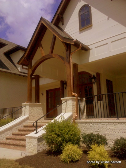
Last week, a new client told me about the YMCA ShowHouse in her Brentwood neighborhood. I always want to learn more about what the leading designers are doing in terms of color and trend. I spent several hours there later in the week identifying colors with my color analyzing tools (they didn’t share the paint colors with the public). It was $30 to tour, but it definitely gave me lots of design inspiration. |
 |
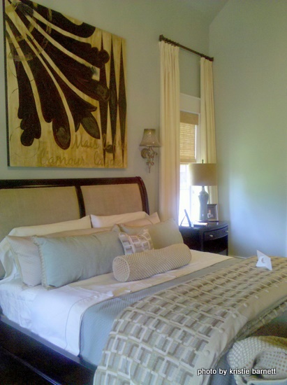 |
Some designer showhouses use a different designer for each room or area of the house, which results in a hodge-podge of styles and colors. I appreciated the fact that they used one design firm throughout so that the look was cohesive and the color palette had great flow. Very tastefully done. I was reassured that my favorites, gray/blues and gray/greens are current and work as “superneutrals” throughout this home. Gonna blog about superneutrals soon. Anyway, the color in the master bedroom was an exact match to one of my favorite color recommendations! |
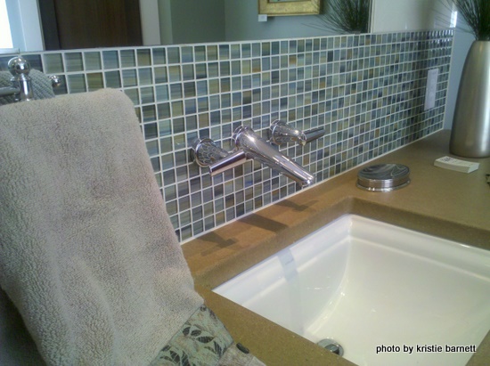
See the blues, greens, and grays in this mosaic tile? I think it’s interesting that all the fixtures throughout the house are chrome, not a brushed nickel or oil-rubbed bronze. Shiny is making a comeback!
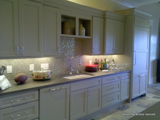
More mosaic tile in the kitchen backsplash. It’s hard to tell in this picture, but the cabinetry is a pewter gray color. Notice the countertops in the kitchen and master bathroom are NOT granite.
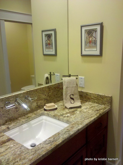
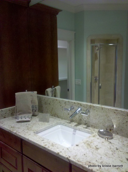
But there IS granite in two other bathrooms. Look at how the fixtures project out from the wall and through the granite slab.
| The art throughout the house was modern and usually abstract. No huge frames, just stretched canvases. You can find similar pieces at Home Goods, or you could try making your own. | 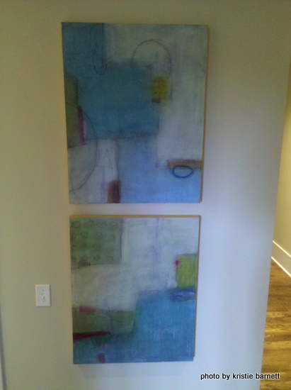 |
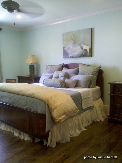 |
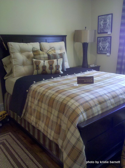
I really appreciate a well-staged bed! |
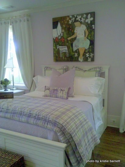 |
Accent walls can be tricky, and sometimes people choose the wrong wall to accent! This lavender wall in a mint green girl’s room was a good choice. Here, the wall accented was the bed wall which had symmetrical windows on either side. |
| Here are the green walls in another shot of the same room. | 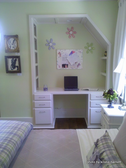 |
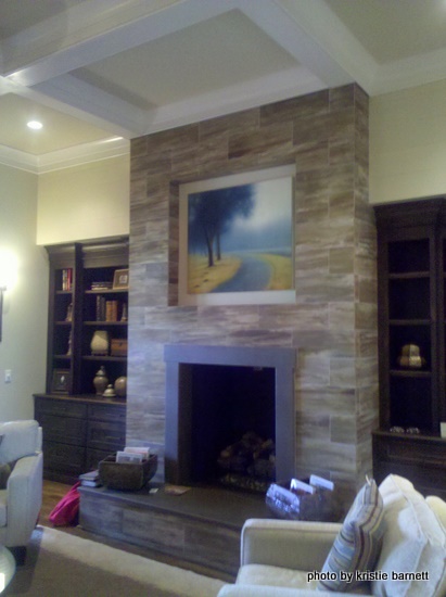 |
Lots of nice colors and finishes, but nothing too edgy or trendy. I think I’d call this Neo-Traditional. What did you think of the YMCA showhouse?
|










Thank you for sharing this, I always enjoy going to showhomes, great place to get ideas!
Vicky
I don’t get the YMCA part. Can you explain? Thanks
Love all the artwork – and I need that guitar pillow!
Love it and would like to see it in person! Leaves me wondering whether I really need to change out the shiny chrome fixtures in my bathrooms like I was considering???
I really like a lot of the colors used in this house. I especially like the cool “built in” desk/shelves in the girl’s room, and the bathroom fixture placement (sticking out of the wall)…very unique. Also, I want that print above the bed in what I assume might be the master bedroom…would be great for my daughter’s room!
What neighborhood is this in? Is the YMCA Show House something they do regularly? I’m not familiar with it….thanks for sharing!
phyllis, the proceeds of this showhouse goes to YMCA programs. all the vendors that worked on the house hope to get new customers by displaying their work there and offering marketing material when the house is on tour. it is located on holly road near lipscomb elementary in williamson county. it cost $30 to tour, but i believe the tour is over now (it was all last week).
amy – if you have chrome fixtures, you might want to spend your money elsewhere to spruce things up! you may be on the cutting edge! brass is still dated, but brushed gold is hot, hot, hot.
That bedskirt on the well-staged bed is LOVELY. Wish they would have put a pretty chandelier rather than a ceiling fan. Ugh.
I’m determined there will be no granite when I re-vamp my kitchen — what is the kitchen counter material in the show house? I couldn’t tell…
The fixtures coming out of the wall is such a vintage nod!
Thanks for sharing the pics, KB!
The art is really interesting, more canvases and less frames. Loved the beds and pillows (we must be related)! So love the grays, blues, & greens – very crisp and calm. Thanks for sharing!
Love this! Thank you for sharing the pictures. I love the desk nook — I always wanted one of those as a kid! It is just so much more interesting than a desk up against the wall. And I love the kitchen counters. What material were they? I am not a fan of granite b/c of all the black…
I loved the picture of the girl and dog over one bed and the girl and cat in another room –
some of the counter material appeared to be quartz or soapstone. andrea – i think soapstone works well in a period house. as for the ceiling fans, i thought the same thing! but one of the vendors was a high-end ceiling fan distributor, so there you go. the art in the house was all for sale. but it was PRICEY.
Great post, Kristie. I loved seeing the pics and reading your comments about them. You pointed out things I would never notice. It is great to know that these colors are still “in” – they are so peaceful and uplifting to me! And very interesting info on the countertops and shiny fixtures! I’m taking mental notes for when we get to move to our forever house! Again – great post!!
LOVE these colors….and the artwork…I’m experimenting on that myself.
Even light soapstone, KB? Or does it have to be dark for a period house???? Sorry I’m getting you off-post…
andrea, i think light soapstone works, too. anything’s better than granite in a period home, if you ask me!
Oh, marble….I’m sooooo tempted by good ole classic marble…
did you know this house burned down last week? the people go to my church
Dianne,
Oh my goodness – I have not heard!!! That is awful! What happened, was it an electrical defect? Wasn’t the owner the architect of the house?
With havin so much content and articles do you ever
run into any issues of plagorism or copyright violation? My blog has a lot of
exclusive content I’ve either created myself or outsourced but it seems a lot of it is popping it up all over the internet without my agreement. Do you know any methods to help reduce content from being stolen? I’d certainly appreciate it.