We’re not even to the halfway mark of 2017, but they are already predicting the 2018 color trends!

I apologize in advance if you think I’m being arrogant in this post, but this is just too uncanny for me not to mention! The 2018 color trends I’ve seen thus far look strikingly familiar. Here’s an image that Sherwin-Williams put out to promote their latest paint color predictions:
Sherwin-Williams
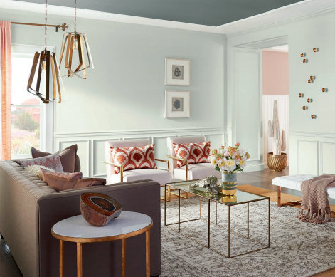
Not only do the colors look like this color combo I chose for the 2017 House for Hope, but the placement is the same, too!
Color Design – The Decorologist, Room Design – Peddler Interiors
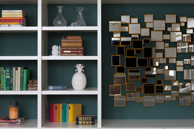
Then there’s this image in the 2018 Color Forecast:
Sherwin-Williams
And here’s the pink I chose for the guest room of the 2017 House for Hope:
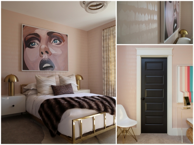
Color Design by The Decorologist, Room Design by Gina Julian
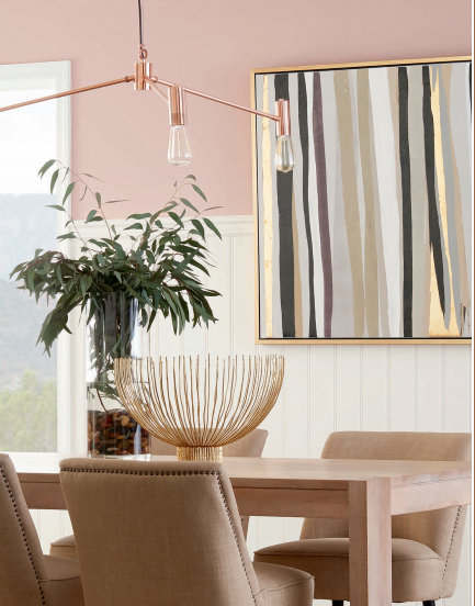
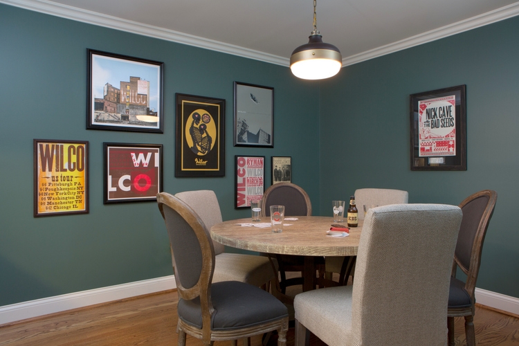
The Sherwin-Williams 2018 Color Forecast also includes this hue:

Which I specified for the House for Hope study:
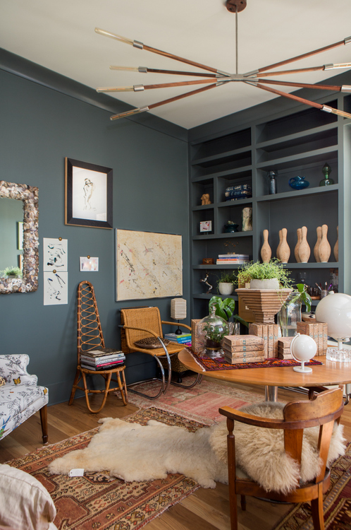
Color Design – The Decorologist, Room Design – Trot Home
See what I mean? And it’s not just Sherwin-Williams. PPG got a leg up on the other paint companies by releasing the first “2018 Color of the Year” pick.
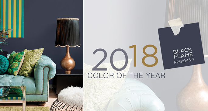
PPG
And here’s my version:
Color Design by The Decorologist, Room Design by Amanda Carlson
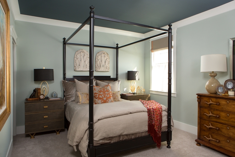
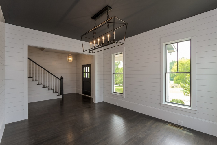
This is a room I specified over a year ago. The color I chose for the ceiling is similar to PPG’s hot color, but it reads lighter because the chandelier is shining on it in the photo:
Color Design by The Decorologist for Kole Custom Home Builders
PPG also owns Glidden and Olympic, and their 2018 Colors of the Year are off-blacks:
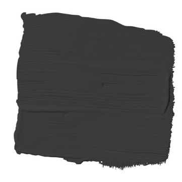
Glidden Deep Onyx
Which looks similar to this color design I did in 2016:
The Decorologist for Kole Custom Home Builders
Here it is in a gloss version, which reads lighter because of the light reflection of higher sheen:
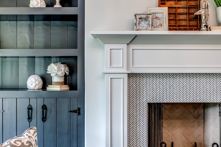
The Decorologist for Kole Custom Home Builders
And finally, Olympic tagged its Black Magic as 2018 Color of the Year:
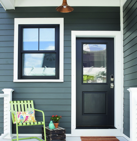
Olympic Black Magic on door and window
The siding color looks like these colors I specified recently:
Color and Room Design by The Decorologist
The Decorologist
And of course I’ve been specifying black for doors and windows for a couple of years, and it’s always a winner!
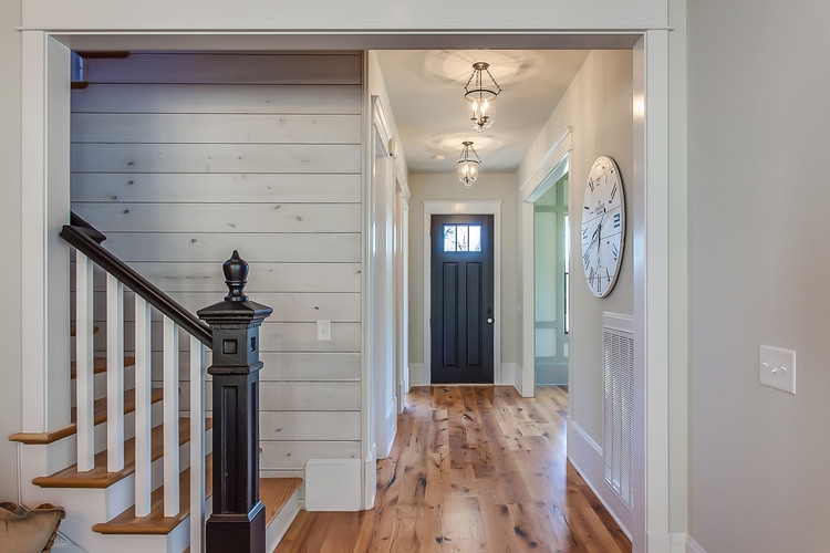
The Decorologist
The Decorologist
Next time someone asks if a paint color I choose for them is going to still be on-trend next year, I can set their mind at ease and tell them I’m actually setting next year’s color trends! Maybe it’s all in my head, but I feel as though somebody is looking over my shoulder . . .

Pin me!!


I love this, Kristie. In some of the photos, where your room colors and the predicted colors are similar but not exactly the same, I actually prefer your choices. Kudos!
Well, thank you for saying so, Joanne!
Hi – I’m looking to paint my house this year and love the look of the dark siding with black windows and doors and then the white trim. Can you confirm the 3 colors for me please???
No, Kristie, I do not think you are being arrogant at all. If anything, It looks to me that the paint companies are the one’s with egg on their faces. They ought to at least in some way acknowledge- -TO YOU– that they are plagerizing your material.
After all the internet is the only way they could possibly get a ” feel” for what is going on in the interior( and exterior) color world.
But, alas, I know you are both humble and gracious enough to take this all as a high compliment, which you deserve!!!
Touché Kristie!
?Paula.
You are too kind, Paula! Although I have met Sherwin-Williams previous Color Marketing Director, they have a new one as of this year. Not sure where they get their ideas for new color trends – it would be interesting to know their process. Two years ago, I met with PPG’s Color Marketing Director, Misty Yeoman, who gave me a private presentation of PPG’s Voice of Color trends forecast when I was working with LP SmartSide creating new colors for their exterior residential products. She is a sharp lady and I see PPG as Sherwin-Williams prime competitor at this point!
I totally agree ! It’s time everyone in this industry gave the Decorologist credit ❤️ Love you Kristie !
Oh, you are so precious, Mary!!! We will meet someday 🙂
Fascinating similarities! I love the study’s layered look!
Thanks, Anne. Although I chose the paint colors and placement for the study, the room’s design is by Trot Home in Nashville!
I think you are onto something Kristie! I’m convinced. They know a good thing when they see it.
Thank you, Davi, only time will tell! 😉
It’s funny how that works! I’ve had gray walls and upholstery in every home since the 80’s!!! This is why having a natural instinct for color combinations makes being a designer so much fun! The photo with the blush pink walls and abstract art…I have that art piece in my staging inventory!!! Love your instinctive flair.
Thanks, Diane!!
Oh, My I keep hoping the gray will go by the wayside, That’s just me. I find it hard to stage with.
Beverly,
Medium grays (and beiges!) and the most difficult to work with in staging. Light grays/beiges can be great backdrops for more colorful decor, if you want it.
there’s no “maybe” to it my friend! you are always one step ahead of the game!
Maybe not so over-your-shoulder so much Kristie as at your gorgeously professional blog. This feels too on-point to be mere coincidence but whether it is or it isn’t…seems to me this is not just the highest form of flattery but down-right shows the incredible force of talent that you are.
Nancy,
Thank you for your generous complement!!! If nothing else, it is affirmation that I am making design-forward choices in my work 😉
Kristie, When you’re good, you’re good! Enjoy the moment. 🙂 There will be enough of those in your future that will question your choices. I always enjoy reading your thoughts.
Jacquie, there are ALWAYS those who question my choices, haha!! 😉
That’s funny, I thought of you when I saw this in my Inbox yesterday! AD talking about black paint “…it’s actually one of the easiest colors to use to create the low-key, easy-going style that’s trending for 2018,” she says. “Black can be overlooked as a neutral color, but it works well on an accent wall or as an alternative to white paint on doors, trim, and cabinets.”
http://www.architecturaldigest.com/story/ppg-black-paint-color-of-the-year-next-big-paint-trend?
You are on point with all of it!! 🙂
Thanks for sharing that article, Leslie!!!
WHAT??? Well, first of all your rooms are all gorgeous!!! But this is a little too much of a coincidence to be a coincidence. hmmm… And I presume that you’re not on their payroll in any way. hmmm… The other thing is that it looks like PPG’s Black Flame is a crib of Benjamin Moore’s Shadow. And yes, I’ve noticed too, that dark colors often read lighter in photos than they really are.
Thank you, dear Laurel! And NO, I am not on their payroll, haha. If only . . .
That’s why I chose to learn from only the best! Great job, Kristie!
You’re too sweet, love you!!!
?
Kristie, you have a great eye, that’s for sure! Isn’t it funny how trends spread? Boys on our basketball team are obsessed with bottle flipping (which I had never heard of until they started doing it), and then a blogger from a thousand miles away mentioned that her son and friends are also obsessed with it. I guess they could’ve all watched the same YouTube video, but sometimes trends just take on a life of their own. I think that happens a lot in the design world too. Anyway, Kristie, I think you have a great attitude, and yes, these new color trends are just proof that you know exactly what you are doing! 🙂
Thanks, Jenny! You are right, trends travel at the speed of light it seems these days. I do think it’s very unfortunate that the paint companies are only willing to publicly align with or hire television celebrity designers, rather than those who are working in the real-life color trenches every day. It’s the way of the world, I suppose . . .
A little too coincidental!? Great job! They should put you on payroll.
If only!!! Thanks 🙂
Sometimes you’re on trend, and sometimes you set the trend. Looks like it to me! 🙂
Thanks, Joey – either way is ok by me! 😉
Wow! It looks like someone has been following your blog! How much closer could they get?!?
I like the black door and other accents, but would find it very hard to do a ceiling in black unless it was very tall. I wish I had you to assist in choosing new colors for my huge 2 story den/kitchen/breakfast area!!
Linda,
Thank you! Actually, an almost-black makes the ceiling recede. I did one last year where the ceilings were 8 ft, and the room looked larger than before! The trick is doing very light walls 😉 You know I do online paint color consulting all over the U.S.? Via a combo of phone call/email/photos. If you are interested: https://thedecorologist.com/services/interior-paint-color-selection/
You are not bragging; just stating the facts! I do think that THEY have found their ideas from YOU! Let’s face it — you’ve got the knack!
You are not being arrogant at all. It is obvious, and has been for some time, that you are extremely talented and you are THE trendsetter when it comes to choosing colors for a home. It could very well be that the paint companies are ‘scouting you out’ to see what you are suggesting. Well done!
Wow! You know, when I read the recent Zillow study, my first thought was that they’d “really taken a page out of Kristie’s book,” but this clinches it: you are really having an impact on the way people see things! In principle I’m hmmming along with Laurel Bern, of course, but I have to say: you have really taught me, and many others (who will perhaps never be able to travel to TN for a class), so very many key principles over time. And sometimes this gift opens a little door for each of us to help somebody else with what we’ve learned. Like the lady I met while buying a piece of furniture on Craigslist, who told me she had started a non-profit to help people stage and refresh their homes, because she’d learned from the Decorologist what a difference it makes when people can see some color brighten up what God gave them! — It isn’t easy to be the one to make waves, or to be willing to become an expert, or to mentor – or to really impart new knowledge, but you are making. a. difference. There are sacrifices that pioneers like yourself make which no one else can understand, and one does not want one’s work to be swallowed up by big ol’ business, so please know & take to heart that it is how and why you (do and) teach what you do (and teach) that makes the deepest difference.
Wow, Sunny, I don’t hardly know how to respond to that. Except THANK YOU for that encouragement – it is an incredible blessing to me! There are so many times I wonder why I am still blogging after 8 years and 1000+ articles, and whether or not it matters anymore, but your words bring me back to the heart of why I started doing this in the first place. I hope you have a wonderful holiday weekend 🙂
Cry…your photos have vanished when I view on my iPhone . Only website with the problem. Heartbreak ? However it does highlight what a great writer you are.
Debra,
Can you check again? I had some server problems last week, but I thought it was fixed. Please let me know if you still can’t see images!
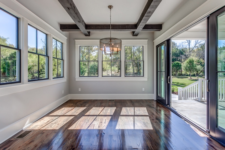
All of these designs are gorgeous!! I have the same windows and doors as shown in that last photo in our house that’s under construction – can you please share the colors in that room??
Thank you!!
This blog is so helpful now a days Grey color is really popular now and look amazing. I like a dark grey bug out with full of sun exposure and seems too harsh for longevity
Kristy, I have always liked crisp white ceilings and black is a fun idea too. But I just bought a house in Texas that has several different planes that turn gradually from the vertical walls to the the horizonal ceilings. As a result of the gradual transition from one plane to another, the actual horizontal ceiling is much smaller than the square footage of the room. Should I paint it all the same color rather than try to change colors between walls and ceiling? Will it look nice?
Yes, Allison, I would recommend that you use the same light wall color on the slants and actual ceiling plane! Maybe instead you could do black on the doors, base boards, or window trim instead to add some pop with black?
Definitely not in your head, looks like they googled you when they were doing their research. They should have at least given you credit, your pictures look just as good if not better than theirs! Do you use special equipment or lights when taking your pictures? Or a professional photographer? I’m a home stager in Massachusetts and want to step up my online presence. Actually I’ve had the pleasure of meeting you at a staging convention last year in Florida. I’m a big fan of your work, and any advice would be extremely appreciated! Thanks for everything you do!!
Hi Elena! Thank you for the complement. I do have a nice camera – it’s a Canon EOS 5D. I NEVER use a flash or take photos with artificial lights on, because that always alters the color of the photos. I use Picasa to edit photos (which is no longer supported – but I still have what I’ve been using for years on my computer) by lightening and sometimes color correcting a bit. That being said, for some of my better work I do hire a pro photographer to take the final photos, because I am definitely NOT a professional photographer can’t always get the quality I want from my own shots. But, you have to be careful about real estate photographers using too-wide lenses that distort the photos. Plus, they always want to turn ALL the lights on in the house and they tend to take shots where the ceiling is dominant in the photos. If you find one that is reasonably priced who is open to taking direction as to the kind of shots you want, hold on to them! Thank you for commenting, Elena – I actually think I’m going to work up a blogpost on this very thing, so thank you for the inspiration!
I can’t wait to read that article when you post it..Thanks for all the info!
Hello! I want to paint my house exterior the same as the house with the black magic color on the door/window. Do you happen to know the color name/make of that pretty green color, and the white? thank you!!
I live in a home with knotty pine walls and ceiling. I would love to lighten it up with new flooring….vinyl laminate…. any color suggestions would be greatly appreciated.