You’ve likely heard about all the “Color of the Year” picks by Pantone and various paint companies. But is there a color combination of the year? I think I’ve identified the combo that’s the clear winner.
Lately when I’m out shopping for client’s homes, I keep seeing THIS color combination:
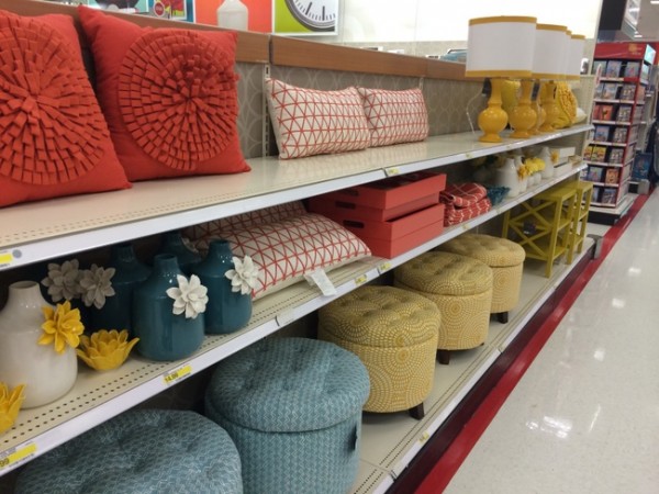
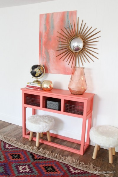
Coral, azure, and sunny yellow. I’m seeing this combo EVERYWHERE. How about you?
These fresh, clean, optimistic colors are popping up wherever I go. Have you noticed, too?
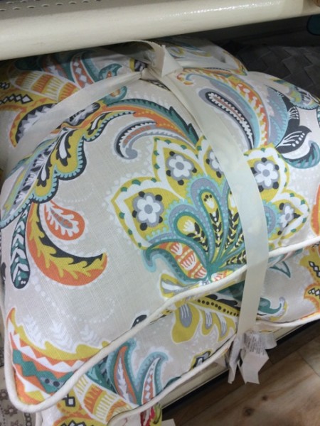
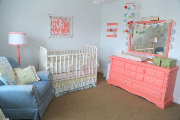
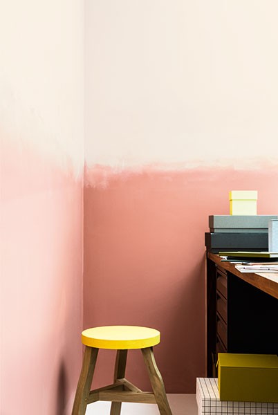
I even saw this color combo in the home that my latest Expert Psychological Stagers™ (EPS) students staged on the final day of training. This nursery is so sweet and happy. This mom has definitely been spending a lot of time on Pinterest! Look at all the decor trends gathered in one place:
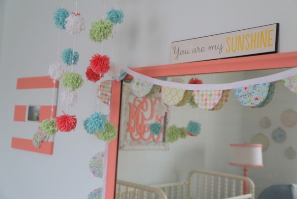
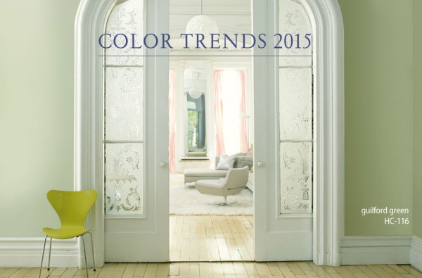
You’ll notice there is also some green in this baby room color scheme. This baby room incorporates all of the major paint companies’ 2015 Colors of the Year.
Sherwin-Williams Coral Reef SW6606
Benjamin Moore Guilford Green HC-116
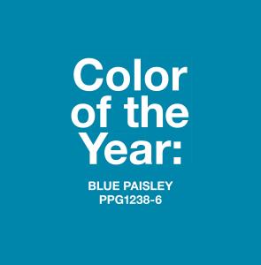
PPG (Pittsburg and Porter Paints) Blue Paisley PPG238-6
And I’m thinking there was one paint company that chose a vivid yellow this year, but I can’t remember which one. Are you surprised you’re not seeing Pantone’s Color of the Year, Marsala? I think you may already know how I feel about that one. If you want to know more about my latest color forecast, you can find it on the newsstands very soon:

Yep, that “2015’s Spring Paint Trends” article was written by yours truly, so pick up the new issue of Everyday Home when it comes out in March.
If you want to try the coral, azure blue, sunny yellow color combination in your own home, using lighter and darker variations of each of these colors will make the overall look more sophisticated than if you simply choose a matchy-matchy three-color combo. What do YOU say about this color combination?


These are all very pretty Krisitie and would love to see these in the home. I’m hoping to see more green in 2016 and 2017. We’ll see!
Donna, I’m loving wintergreen, mint, spruce, and emerald green and can’t seem to get enough of those. Just painted our renovated bathroom in Benjamin Moore’s Steamed Spinach. Paired with white/black/gray tile. LOVE.
Me too! Oh and by the way, I linked this post to mine today – come take a look. http://wp.me/pK9I2-1wY
You are such a rock star! How do you do all this!!???? 🙂
Thanks, Amy. I suppose I’m a bit of a workaholic 😉
I have that bird pillow in blue! In my living room. No coral anywhere though.
I definately agree as I have seen many quilts with these same colors. I painted the walls in a north facing guest room Benjamin Moore’s Palladium Blue but I think it looks a little too young and more like a nursery than an adult room. Any ideas for wall color as I want to use these colors? I wanted the walls to be a blue gray. We have honey oak woodwork which we won’t be painting.
Dena, getting the right shade in a north facing room is tricky. I just painted my north facing living room a grey/blue and it’s exactly what I was looking for; good thing cause it took me forever to decide. The colour I chose is by ICI/Dulux paints named Fine Silver.
I love these colours and they have me dreaming of spring.
Palladian Blue is beautiful, but it sounds like it’s too “clean” of a color for you. You might try Arctic Gray – it’s a really nice gray blue, like a clear sky, not like a baby boy blue.
Love those fresh clean colours. Great article! I too remember seeing a yellow as Colour of the Year.
Well that is the most serendipitous news I’ve gotten lately! I’m about to venture out (98 miles)
to my nearest HomeGoods and /or mall area and look for just those colors. It just so happens that the main artwork above my fireplace is a sunset scene with just those colors and I need all new couch pillows to coordinate!!! Yay! God is good! And I appreciate you too Kristie! Thanks for this blog & all the work you put into it…
Ooh, I hope you find all those yummy colors at your HomeGoods!!!
I agree that in order for this combo not to look juvenile, use various tones
Natural materials such as sisal keeps it grounded
Yes, good tip, Jula. Medium and light tone woods and natural fibers need to be included to make it “grown up.” Too much white with these would look like a kid’s room.
Hi Kristie,
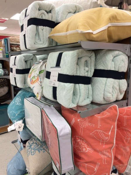
I love these color combos! The third picture really caught my eye! I love the coral bird pillow. Do you remember what store this is?
Yes, Cathy – that bird pillow was on an endcap at the TJ Maxx on Cool Springs Blvd in Franklin, TN (to be exact)!
Kristie, I love these colors soooo much! Marsala – not so much. I doubt it is going to catch on, after all I didn’t see Radiant Orchid anywhere last year. Anyway, I saw those pillows at Target and a little boy was looking along with his mom and he pointed to the yellow one and said, “Look, it’s the sun!” I have to agree!
As soon as I read the post title, I thought, “coral and gold.” I was close! 🙂 I am not a fan of coral. It’s an OK color, and it looks great sometimes, but it’s a color that really looks awful on me out as far as clothing goes, so I tend to avoid it all together. I’m seeing a ton of it in digital scrapbooking supplies lately (which is my main hobby of choice), and I don’t like it there either. In scrapbooking, I’ve seen it most often with black, white, and metallic gold. It looks very modern, but it’s just not “me.”
Jenny,
That’s exactly how I feel about red. It’s just not my thing, no matter what you combine it with. I really think most people prefer ONE of these: reds/burgundy, orange/coral, or pink/raspberry. And they kind of stick with that preference for most if not all of their life. I’m a pink/raspberry girl myself, and I always have been.
I love to wear orange/coral (makes your skin look fresh) but I would never put it in my home. I also wear a lot of red and use it in my home. I love Raspberry, too. Kristie, do you think Guilford Green would look nice with raspberry?
Absolutely, Joanne – Guilford Green and raspberry would be so fresh and fabulous!
A very bright, happy color palette! I am a pink/raspberry girl too! Congratulations on your magazine article.
I just saw those pillows at TJMaxx and loved them too:)
Does anyone know the name or manufacturer of the pillow fabric? I would love to use it or something similar in an upholstering project!
Wow! I can’t believe I actually have colors in my house that are “in.” LOL! I love all of these colors! I purchased a beautiful comforter set (Better Homes & Gardens brand) at Walmart a little over a year ago that has these colors. There is a 1 inch gross grain ribbon trim around the sides and end that is a darker coral/orange/rust color and I painted my walls that color. It looks great! I’m trying to find a coordinating yellow fabric to make Roman shades.
Sounds very pretty, Cheri!
Colors make your life complete. It will be too early to say, which color will rule the year 2015 at this point. But, these combinations are soothing and elegant. It clearly shows that not only your walls, but also the decor needs to be colorful.