It’s been about four years since Restoration Hardware underwent a major shift in its design direction.

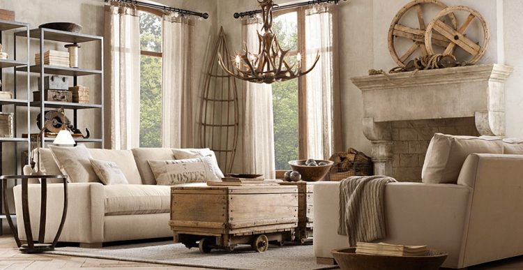
Everything they produced became dark and colossal. Creams and shades of gray. Masculine and rustic.
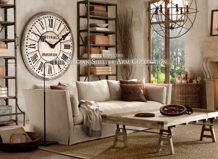
And, inexplicably, gears. Lots of gears.
Well, Restoration Hardware is rebooting once again. Restoration Hardware Modern. You know how RH likes to be so deep and all:
sure, yeah, if you say so . . .
I’m not sure what the heck that means, but I like to cut to the chase. Here’s my take on the changes:
1. The cream is now white.
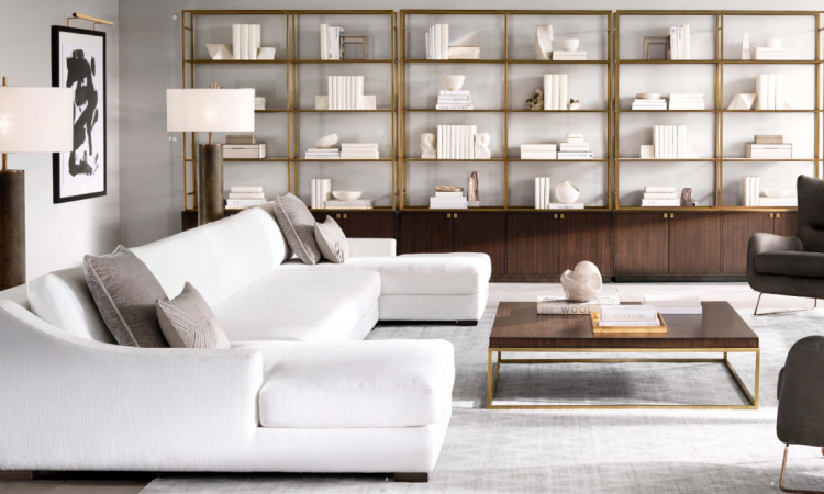
2. Grays are now darker.
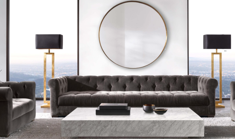
3. Less iron, more gold.
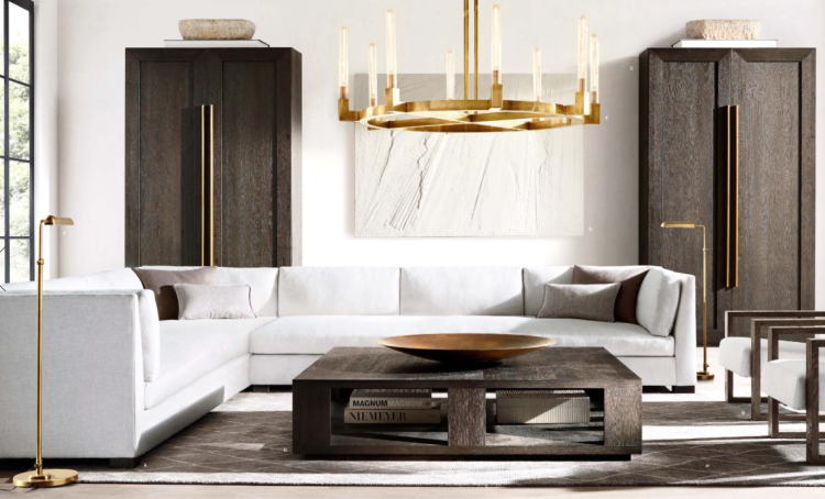
4. Less Belgium, more Mid-Century.
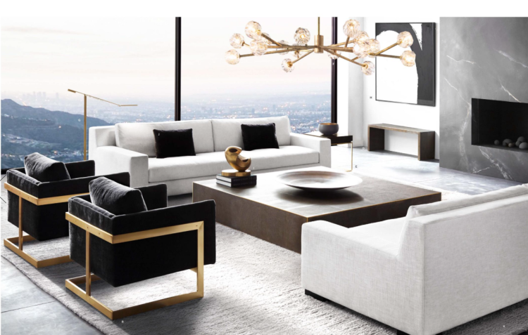
And still NO PATTERN anywhere to be seen.
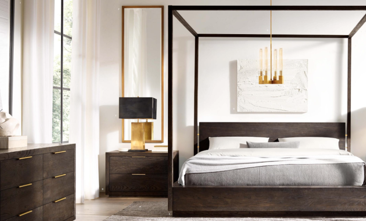
But here’s the best part: NO MORE GEARS!
That’s about it. Honestly, it’s Mitchell Gold + Bob Williams without the COLOR. I know tons of people will love it and buy it. I think the new RH Teen line will yield more livable options, in my humble opinion.
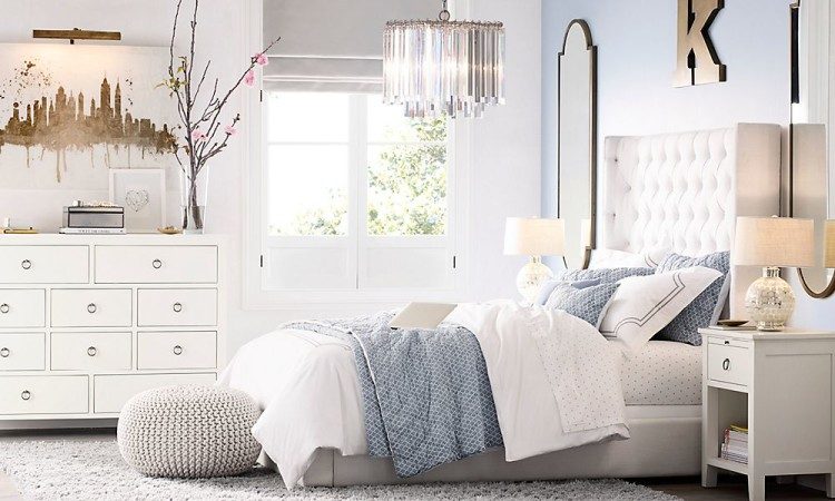
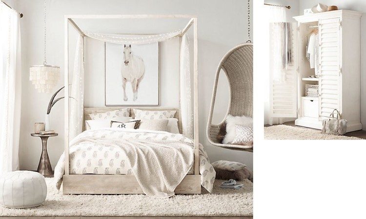
RH Teen
But maybe NOT that horse art. That was so last year . . .
I’m just kidding – I’m feeling very sarcastic today, apparently! What do you think about Restoration Hardware’s new design direction?


Yawn. I mean there are some really great pieces featured, in terms of texture and structure, but I find the overall images in their catalogs boring. Inside their stores, things are not quite so dull and lifeless. I love neutrals, but not everything neutral. It’s just not my aesthetic. Most of their catalogs read like a bad mood comin on. I prefer color and variety in a room, something that reflects personalities and even a bit of whimsy.
I certainly appreciate your sarcasm.
I like that first teen room, but not necessarily for a teen. I find their pictures interesting, but not something that most of my clients would name as their inspiration. I was in our new Z Gallerie & Arhaus yesterday…. Lots of bling with gold, silver & crystals, & with the exception of turquoise & orange, almost all neutrals.
Yep – it’s interesting the staying power turquoise has had – still as strong as ever.
I’ll be glad to see all the weathered wood go, those huge tufted sofas (ugh) and all that iron. I’ve liked their beds and chairs but always wished they would stain them. Looks like they may be going in the right direction. It would certainly appeal to a larger audience.
Aha – they finally got over Steampunk! I’m curious about your reference “less Belgium” though – could you elaborate?
Sandy,
Seems like half of what they put out a few years ago was Belgium-something-or-another (Belgium Roll-Armed Chair, Belgium Dining Table, etc.). It’s like the more tailored, grayer shabby chic look. Lots of gray linen.
I go for a more collected look than the “I bought everything on the page out of the catalog” look. Not crazy about the mid-century look either. The items in my house are not necessarily from a certain time period, but its things I like. I have lots of color (greens, blues, and accent reds). I tend to like rustic, but not necessarily shabby chic. Not sure what you would call my look other than its “ME”.
“Me” is DEFINITELY the best thing to be in my book, Stephanie!
Living in a home of “me” is the perfect place to be, Stephanie 🙂
For me, personally, it says, “You and your three boys not welcome here”. LOL!
Nor children in general!
I believe it is their last ditch effort to stay in business. They have already closed most of their stores in this area.
Not a mid century modern fan and like some color and pattern. I think the prices at RH became outrageous at the same time as their design changes. Will take a look at their teen line though.
Here we go again – it seems when there is lack of imagination or comfort in choosing colors and patterns that go well with each other, everyone resorts to Plain Jane white. Sorry, too basic for me and I agree with the comment above, snore. This also goes perfect with the post I just wrote on my website – this look is NOT for families or entertaining. It’s a show home for the retired, childless, petless and … lifeless.