A few months ago, the editor of Blah-blah-blah magazine contacted me about doing a story and photo shoot in one of my client’s homes. Ah, the call that makes every decorator’s heart go pitter-pat!
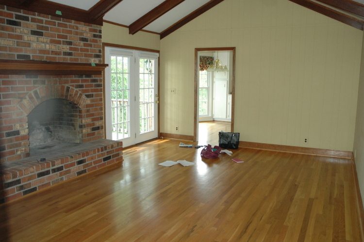
Below is the living room of my client’s home when first purchased. I snapped this photo when I came over to help develop the interior color palette:
 before
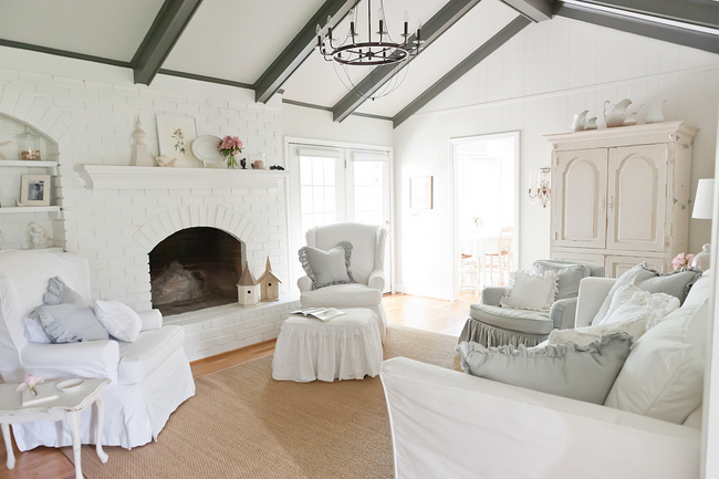
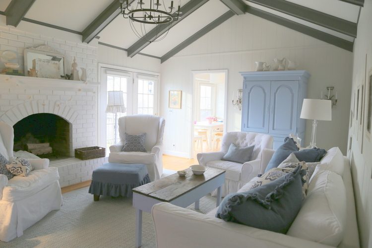
Some of you may remember this makeover. The house was built in the 1970s, and the wood trim, painted paneling, and red brick fireplace certainly attested to that fact. My friend and client, Christiana Liddle, is a seamstress who creates beautiful linen decor at Ruffled Linens, and her style leans heavily towards a shabby chic look. When coming up with a paint color palette, I (gently) nudged her towards the idea of more of a “Belgian chic” effect, and this was the outcome:
Although the slipcovers on the furniture can be bleached and washed whenever needed, having four young children and a LARGE dog can wreak a fair amount of havoc on a home like this! Fast-forward three years. When I called my client about the possibility of a magazine photoshoot, she had to consider what it would take to get her home photo-ready again.
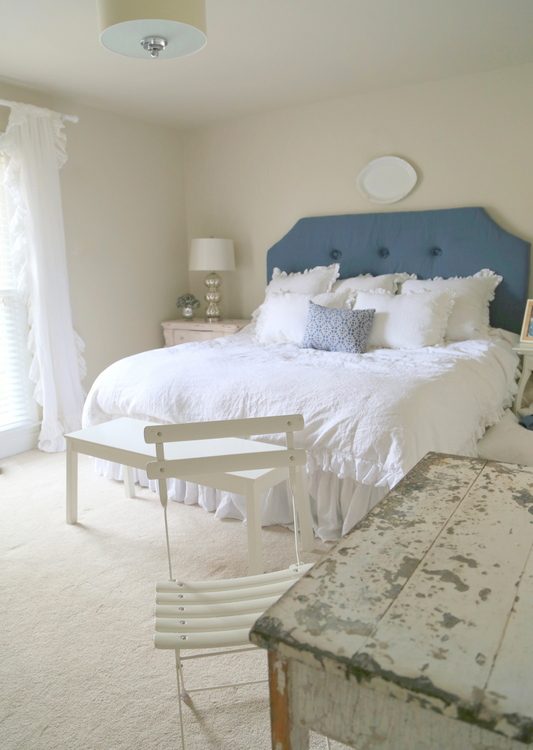
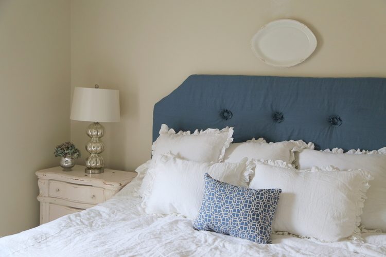
Christiana was going to need to make a few new slipcovers. Ok, a LOT of new slipcovers. And although the master bedroom had been painted three years ago, not much decorating had really occurred in that room – yet. Here’s the room when they bought the house a few years ago:
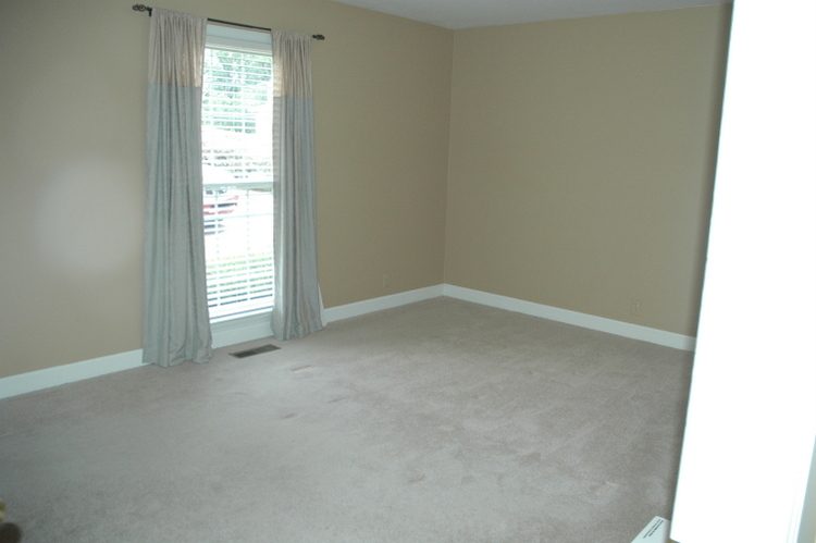
before
They had a bed and some furniture, of course, but the room needed some work. So we got together and made a plan for what needed to be done before this photo shoot. Christiana whipped up bedding for her OWN bedroom (you know, the cobbler’s son has no shoes and all that) and an upholstered headboard.
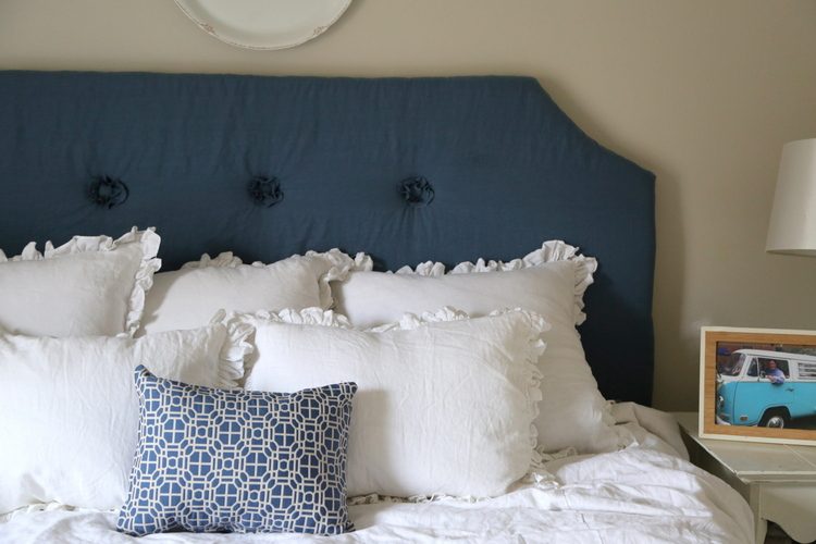
after
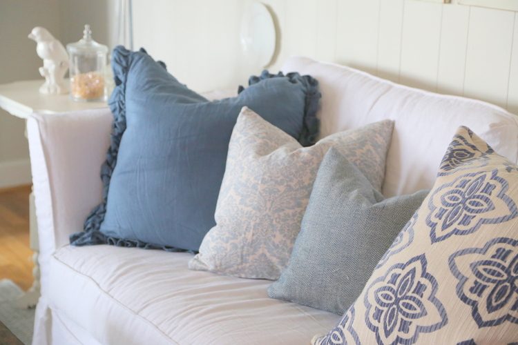
I felt that bringing in a darker blue, and blues in general, would make the white scheme a bit more current and provide a little contrast. Christiana also made the new curtains:
after
Honestly, Christiana is a bit color-averse. I encouraged her to incorporate some gray-blues and darker blues into the existing scheme. White is her signature color, and the new blues are actually acting as a neutral to keep things from looking too flat or too dingy (which is bound to happen with white over time).
whites and gray-blues
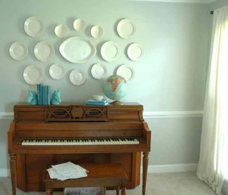
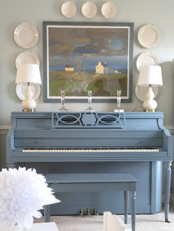
Christiana worked HARD for two months getting the house magazine-ready. After a little, ok, a LOT of prodding from me, she painted her piano blue (she wanted to paint it white – no surprise). Here is the before of the piano from a few years ago:
unpainted piano
Here’s a paint color expert tip: when painting furniture, always choose a color darker than you think you should. This color is Benjamin Moore’s Charlotte Slate, which reads darker on entire walls.
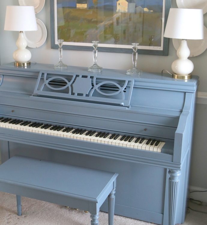 painted piano after
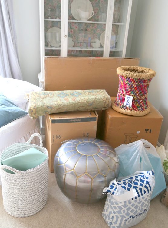
The photo stylist came to the Liddle’s house the night before the photo shoot and brought a load of props.
Decorating a room is one thing, but photo styling is a whole different animal. The stylist told Christiana that they had already determine what shots they would be taking the next day and that they had very specific plans for each shot. When I arrived to bring some lunch for the crew last Tuesday, this is what I saw in the front yard: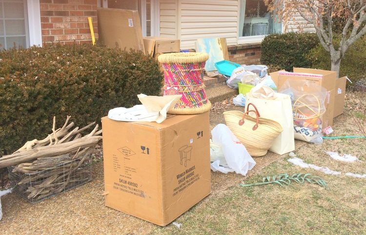
Not as glamorous as one might expect, right? Two photographers and two photo stylists spent sunrise to sunset at her home, shooting three rooms, which did not include the master bedroom that Christiana spent so much time getting ready! Of course, the good news is: she finally has a finished master bedroom to enjoy for herself.
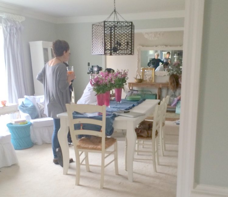
Here are the crew for Blah-blah-blah magazine, setting up a shot in the entry of the house.
They brought in that dark iron chandelier and suspended it with wires to the ceiling of the dining room. They also brought lots of colorful props and flowers to get the look they were going for. Below is the dining room the day before the photo shoot. Christiana’s unique “chandelier” made of paper flowers hanging from a suspended ladder was replaced with the iron chandelier you see in the photo above.
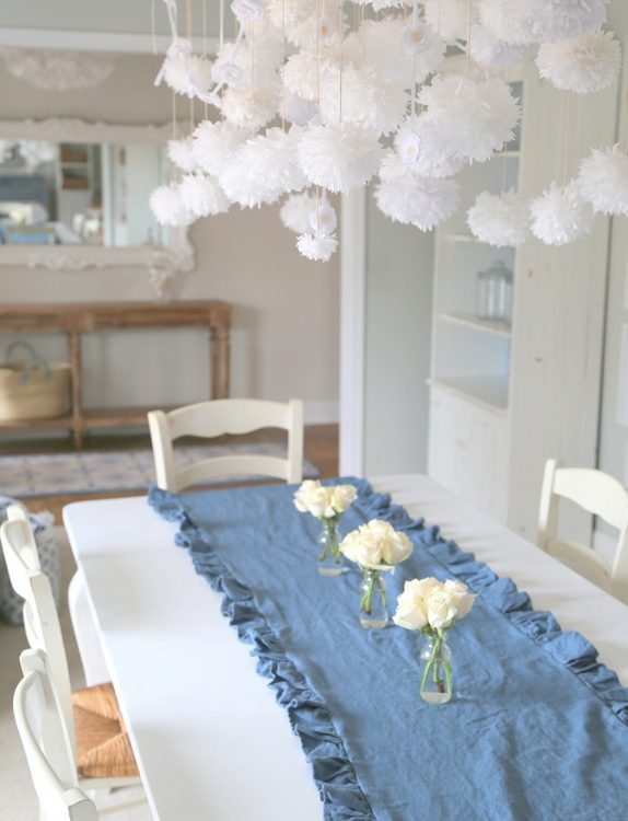
Of course, photo stylists ALWAYS bring in lots of flowers. Look in any shelter magazine and you’ll see fresh flowers and/or greenery in every single interior room photo. Sometimes it makes all the difference in the shot.

This was the entry the day before with the newly-painted Charlotte Slate front door and the new entry table and floor runner I had chosen to spruce up the entry:
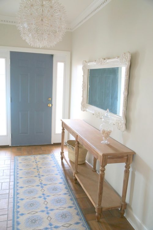
blue entry
And this is a shot I took the day of the photo shoot. Notice the greenery, different floor runner, green accent pieces, and the thing-a-ma-jig they use to get the lighting right.
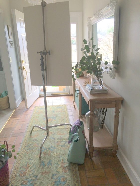 day of photo shoot
It’s definitely going to be interesting to see how the house looks in the magazine! The whole thing is such an interesting process. Another little-known fact about photo shoots? It’s a long time before you’ll see the finished photos in print. It’ll probably be next spring before it comes out in the magazine. And I can’t even tell you which one yet. So, for now, let me show you the other “updates” that changeed things a bit from the initial decorating three years ago. Let’s go back to the first version of the living room:
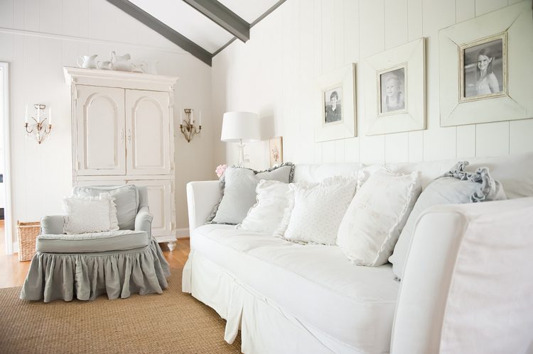
photo from 2011
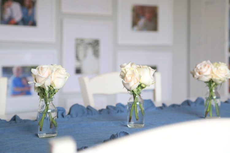
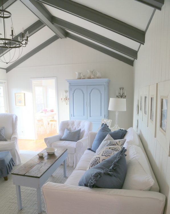
Here’s the “now” version of the same spot:
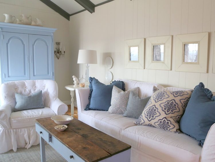
living room February 2015
Christiana made all the pillows:
We’ll let you know, of course, when and where you can see this home on the newsstands. Make sure to check out Christiana’s Ruffled Linens Etsy shop in the meantime. Update: the feature on this home is in Better Homes and Gardens Makeovers edition, March 2016. Check out the results here.
My own home was photographed for a magazine last March, so I’m hoping that will be out by this summer. It seems we’re at the mercy of the magazine industry!
My next Expert Psychological Stager™ certification training is taking place May 7-9, 2015 in Nashville at F&M Mortgage. You can find out about our last course in January here, or you can sign up for the EARLY BIRD pricing special here that is available for a limited time. Let us know if you have any questions – we can wait to help you launch your own staging business or take your current business to the next level! Here’s what a couple of our graduates have said about the course:
“I loved every single minute of this class and have found my complete passion. I always wanted to find a way to combine my design talents & schooling with helping others and now I have! The Decorologist class was A M A Z I N G. I learned so much and she really reinforced my confidence in my other design abilities since they have been tucked away in my mind for so many years now. . . I loved learning the massive differences in design & staging. Totally different goals for each. Now I can do either! I love it!!”
– Amanda Carlson, Tribe and Thicket
“Such a great experience and highly recommend to anyone interested in earning their certification and for those like me that have businesses and want to take their business to another level!! Thanks Kristie Marlin Barnett !!”
Amy Dempsey Wagner, Reflections of You
For more information about the course and how to sign up, click below:


You are right…I am VERY color averse. But you have NEVER steered me wrong and I just love everything you suggested!!! Thank you!!!!!
Thank YOU for being willing to have all those people invade your home – I know it took so much work to get ready for the shoot! Thanks for sending that shot of the dining room – it really does look beautiful 🙂
I went back and found a “before” of that dining rom when you guys first bought the house!
Love the blues! Great job ladies!
I loved that makeover when it was first posted so great to see the changes! Looks beautiful! Love all the details.
This is such an interesting post, Kristie! Thanks for sharing this “behind the scenes” look at a magazine photo shoot! I am amazed that, despite the already beautiful, professionally designed and updated interiors, it took two stylists and two photographers from sunrise to sunset, with a truck full of extra “props,” in order to get the fabulous look they needed!! NO WONDER most people’s homes ever looks quite as fabulous in real life as those we see in the magazines, try as hard as we may!! I feel so much better now, LOL! ( It reminds me a bit of Dove Soap’s laudable “True Beauty” campaign to educate the public, especially young girls, that the models they see in magazines don’t look quite so perfect in real life–their images have almost always been “photo shopped” quite a bit , creating an unattainable standard of human beauty in the minds of many!)
Did they actually paint the armoire blue that same day, too?? I actually prefer the distressed, antique white you gave it, though I guess the blue helps it pop for the magazine. (I do like the blue piano, however!) I love your original makeover of the living room–it seems to fit the homeowner so well as well as look gorgeous. I guess there is a difference between “design for real life”, “design to sell”, and “design to look great in a magazine”!!
Kristie, how did the magazine find out about the home in the first place? Do designers usually send in photos of projects to magazines?
A question about the brick fireplaces (since there are many of us who have them): Would you ever suggest leaving the brick as is? I thought that the brick was very pretty, especially with the arched firebox opening, but I can understand that white brick went better with the homeowner’s style and taste. Would you ever design around the brick, with the terra-cotta tones and try to incorporate it in a design and update for staging and/or someone’s personal home? Just curious about the your thoughts on the design “psychology” on the subject of interior brick!
Thanks!
OOPS- that post above should read “..most people’s homes NEVER look as fabulous…”
Sorry!
Phyllis,
Just to clarify, everything that was painted was painted PRIOR to the photo shoot by Christiana – the magazine didn’t do it or ask her to do it. Christiana was going to have repaint several things anyway just because of wear and tear of three years of four children and a dog. We just decided to add a few spots of color to give a little contrast. But I really do think the rooms will look very different in the magazine than the photographs I took of them the day before the shoot. The props will make the shots look quite different than how they actually look now. But I guess we will see!!!
I would love to know how to responsibly paint a piano. I’m allergic to brown pianos and want to purchase an upright for our family. I’ve always worried about messing up the sound. how did you do it so neatly?
I didn’t do it myself, Melissa – I just chose the color for my client. She used a latex paint, and I assume she lightly sanded it and primed it first (that’s what I told her to do anyway).
You both have done a wonderful job! Kristie if you ever offer a webinar version of staging I am interested! Christiana I will keep you in mind for your lovely sewing!
thank you, jennifer!
This is why I love blues so much! You did a wonderful job Kristie! Updated and fresh!!
Thank you, Kelly! I hope you had a wonderful time in Costa Rica 🙂
Wow, it won’t come out until next spring?! Kristie — you’re so on trend that you know what will be in magazines next year! 😉
That photo thingamajig is a reflector. Camera’s don’t see light the way our eyes and brains do, so photographers have to add light to fill in shadows, and sometimes take away light (called a gobo) to create a bit of shadow and depth in light areas. Rather than using just a flash, the reflector, which can just be a piece of white board, diffuses the light to create a nice even glow without harsh highlights. The gobo is sort of a reverse reflector–it is a piece of black board or cloth that absorbs light and reduces bounced light, useful to help delineate edges and to keep whites from blowing out or to be too hot.
Interesting article and to see what goes on behind the lens. I think they should have left up her creative dining room chandelier though. Must be hard to have your house treated like a stage set.
Kathy,
Thank you for explaining the photography stuff!!! Very informative and helpful 🙂