I’m not much for “matching.” Matched dining sets are safe, and safe is boring. It’s much more interesting to mix and blend your furnishings and fabrics to create a welcoming and unique dining room.

The Decorologist
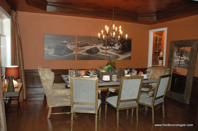
My client had just moved into a new home and wanted to update her tired dining room suite. She was ready to get rid of the whole set, but I thought the farmhouse table was worth hanging onto. It just wasn’t getting any attention in this predictable matched set.

Matched Dining Set Before
We kept the table, but replaced the dated hutch (it had a mirrored back – need I say more?) with one of better scale for the room. The finish of the new hutch was an interesting contrast to the existing table. Then I suggested we mix black x-back chairs and a few woven parsons chairs to add interest and texture. The new wall color makes all the wood look richer than the former neutral color could.

Dining Room by The Decorologist
My client was concerned that the rug and window treatments that I chose didn’t “match.” Yes, if you lay the fabric right on top of the rug, it doesn’t match at all. But when is your window treatment ever going to be laying right on top of your rug? You can see that in the context of this room, the two “mix” beautifully!

New Window Treatments
If you want a dining room where everyone will want to gather, work towards an artful blending and mixing of finishes and fabrics, rather than exact matching. What do you like most about this dining room makeover? I wonder if you’ll notice a little detail that really makes it for me . . .


maybe it’s that you painted the fixture and raised it? Love the result! Do I win at trip to Alaska? 🙂
Leif,
I did have her paint the chandelier to tie in with the new black chairs, good job! But that’s not my favorite part . . . sorry, no trip to Alaska!!!
Beautiful makeover as always.
Is it the light blue ceiling? Nice touch.
You turned the table the other way. Do I win?
The “X’s” added to the glass in the hutch, adding that repeating element to go with the new black chairs? That’s my fave moment anyway. Plus I love the mix if the black chairs and the wicker. And I love the rug!
Ding, ding, ding!!!! Ann, you are correct – that repeated element of the x’s is my “fave moment.” Great eye! Sorry, no trip to Alaska, but good job 🙂
Yes! Always mix and match. Matching sets ARE boring. Great post.
Is it the finials on the curtain rod that blend so well with the fabric? My favorite is the wall color – beautiful! Is that Stratton Blue? I also love the curtains and rug. Great job as always!
NOT Stratton Blue – it’s Atmospheric.
My vote is with Ann! Good eye!
I like the bright orange pumkins!
This is sort of like “Where’s Waldo?”! Yes, it must be the x on the hutch doors. Plus there’s some art on the walls. The color on the walls takes the room from “mousey” to fun!
I love the room and want to know where you got the curtains. As for the little detail as I read your blog religiously, the room is symmetrical and you moved the two end chairs away from the table to make it look spacious. Love it!
The curtains and rug were found in a local (non-chain) store here in Nashville.
I really like that rug. And, I’m local. Will you share which store?
I’m glad you posted this topic today. I’m about to do something with our table and am thinking I’ll stain it darker than it currently is rather than painting it the same black as the china cabinet. Also, planning to mix and match some chairs. I likely will paint the chairs black, unless you have another idea!
Did you raise the chandelier just for the picture? I thought they were supposed to be about 5 ft from the floor. Is that wrong?
Paula,
It wasn’t raised for the photo – but it was taken down and painted. The homeowner may have hung it higher when she put it back up. When fixtures are over tables, I prefer them to be 26″ to 36″ inches from the tabletop.
I love it! It’s interesting how in some rooms, you tone down the colors to something more neutral and it looks fabulous and in other rooms, you replace a neutral with a more bold color and it also looks fabulous!
That must be where good taste comes in!
What a difference! It looks way more welcoming and cozy, like you seriously want to stay for a while! Great call on the farmhouse table as well 🙂
I love EVERYTHING about this new room, Kristie! The fresh color, the X’s, the chair re-placement, rug, drapes & fixture color. I keep trying to find a source for REALLY long drapes for my LR. They need to be
116″ long (top to bottom). Any suggestions–other than custom–(not at that budget right now)??
Thanks, and —beautiful job!
Paula,
You might consider adding a contrasting band to the bottom of some ready-made 104″ length curtains, Paula. Otherwise, you may need to find a reasonable seamstress . . .
Thanks, Kristie. The seamstress sounds good to me….as there are 12 panels needed. Actually, I think I will track down one I used to use for alterations, (who also does panels), you confirmed it!
I love it! Did you stain the table? It looks so much better a bit darker.
No, we didn’t stain the table! But the finish does look richer with the contrast of the black and the background of the blue paint, it all looked so bland-on-bland before.
Love it, Kristie….and I guessed the painted light fitting, too :).
I would have kept the table also- has personality! Plus you saved them money. I love the window treatments- soft and pretty with a touch of color. Very pretty!
I think it looks great–accomplished your purpose and then some. Now for the detail that grabs my attention…those wonderful seagrass chairs. I think they look awesome. I skipped to the bottom to make my comment….gong to go back and see what everyone else says grabbed their attention!
i love these drapes and have looked at them here in town.
they also come in another color.
Wow!love every single thing about this dining room.you have made them a exact match.Everything loks so pretty specially the dining table with back support chairs.
can you identify the source for those lovely drapes?
Joanne,
We got those from Brentwood Interiors, slightly south of Nashville.
It looks lovely! I’m happy to see a non-traditional (at least in the current sense) color in a dining room. I love the mixes of textures.
Very good article. I am experiencing a few of these issues as well..
Love the change and the fact the the original table was kept. Recently inherited a 52″ round table from Great Grandma/Grandpa days in dark walnut. No chairs. I have a standard china cabinet. How strange to do different chairs with a heirloom piece?
Donna,
Not strange at all! In fact, different chairs can bring traditional furnishings to new life. Look on Pinterest or google mismatching dining chairs to get some inspiration (and courage!)