This is a “before” shot of a grandchildren’s guest room in one of my client’s homes. She recently called me in to spruce up a few guest rooms (see the other one I posted about yesterday here).
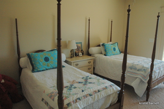
The placement of the beds was already about as good as it gets. Nothing was on the walls, obviously. She attempted to inject color with these blue and green shams, but they weren’t jelling with the country quilts at the end of the beds. And we didn’t have any vertical art to work with for above the beds. What to do, what to do . . .
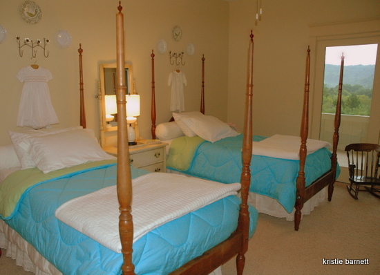
Here’s what I did. We got rid of the shams, but decided to use the duvets that went with them. The quilts were replaced with simple white blankets. The mirror that matches the side table was pulled out of the attic, along with a small antique lamp. My client’s daughters’ baby dresses were on on decorative hooks, and small decorative plates were hung to create a lovely grouping above each bed. My best advice for any room with twin beds: think symmetrical. Twin beds should look like . . . well, twins! This is certainly better than where we started, but I have other ideas for this room. I suggested painting the ceiling in a lighter version of the blue bedding, and reviving the wood poster beds with a granny smith green paint treatment. I’m scheduled to work on another part of the house in about a week, so we’ll see if she went with my suggestions. I’ll be sure to show you the result if she does!
Photo Credit: Kristie Barnett







looks great, I love your ideas to further spruce up the room! those beds are so pretty! I always wanted one when I was a little girl:)
thanks, kelly! i hope she takes my advice . . .
Thumbs up! I say ues to the ceiling!
OH, and a double thumbs up for the granny smith green for the poster beds. So fun