Usually when Pantone’s “Color of the Year” comes out, it’s a big surprise (or shock) to most people. That’s because it usually marks a departure from what we’ve had the year before, and it’s typically in an unexpected direction (if you don’t carefully follow these kinds of trends).
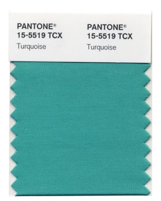
| But this year, the color-powers-that-be kept on trucking down the road in the same direction. Pink Honeysuckle is a bright, festive, happy color, not dissimilar to last year’s Turquoise. | 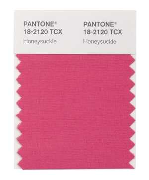 |
 |
And why is that, you say? Probably has a lot to do with the continuing glumness of the American economy and the need people have to surround themselves with color that is upbeat and encouraging. |
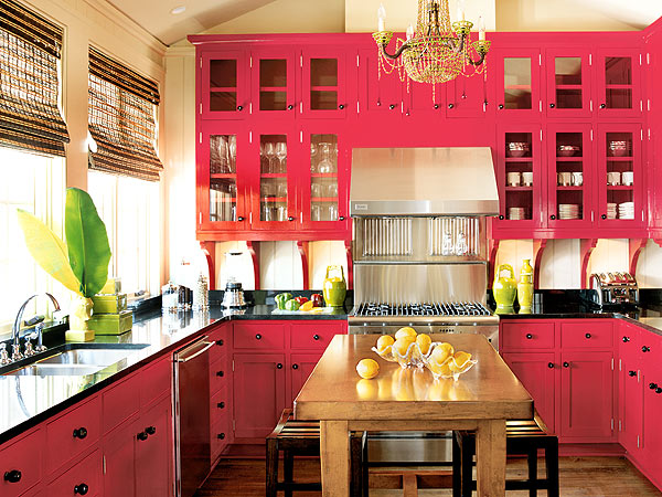
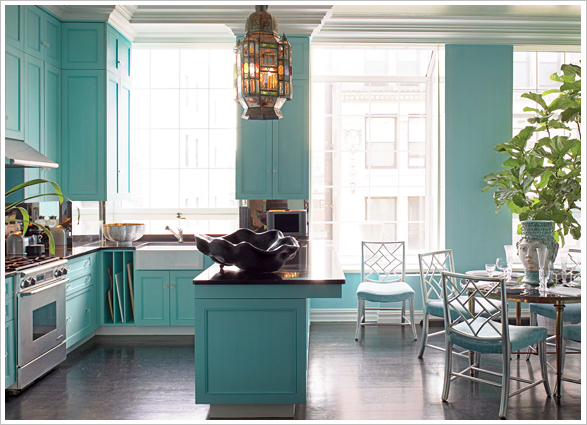
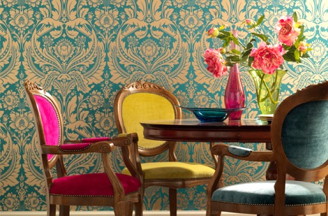
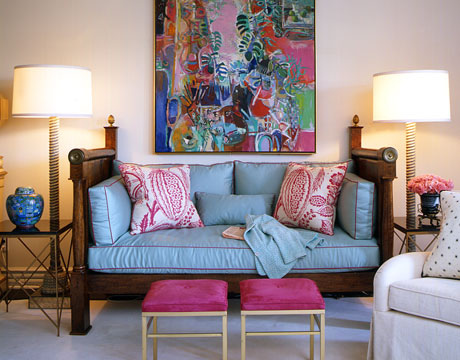
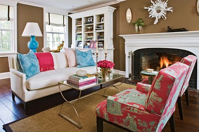
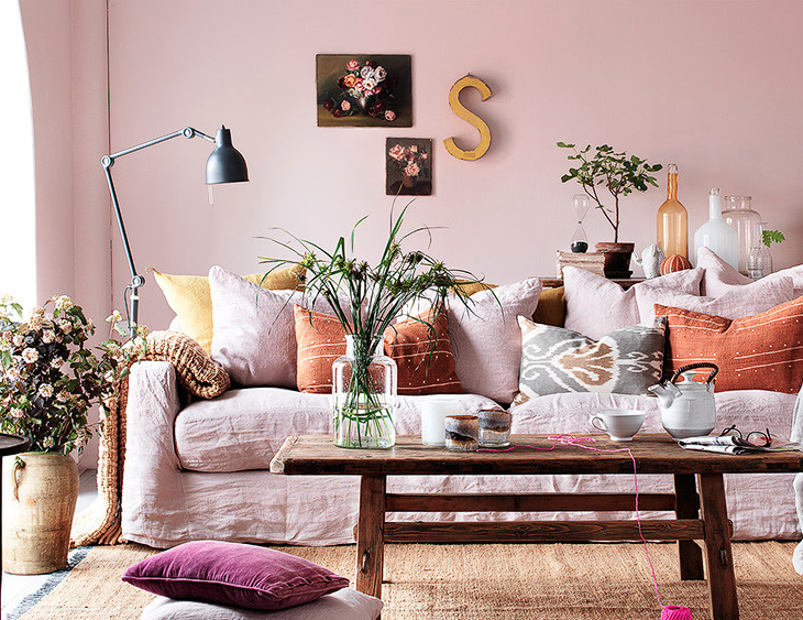
The best thing about 2011’s Honeysuckle Pink – it pairs perfectly with 2010’s Turquoise!
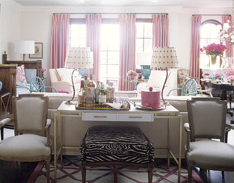
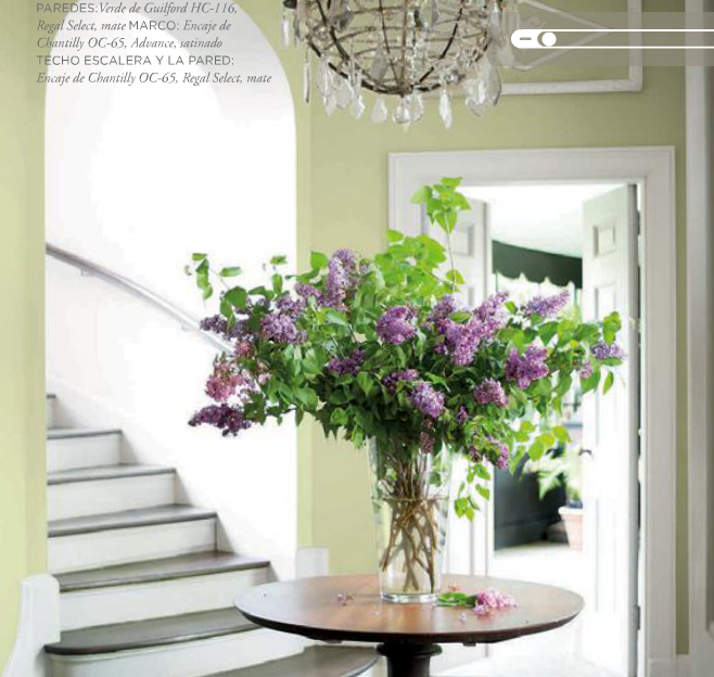
For public areas in your home, think about adding in turquoise and pink as accent colors, rather than the primary backdrop for your rooms. Clean, crisp neutrals like Benjamin Moore’s Monterey White would be a great option for wall color.
Or maybe something a little darker, like Benjamin Moore’s Alexander Beige.
Thank you, Pantone! The future’s not so glum afterall – and that’s something to celebrate! For more on the Pink + Turquoise phenomenon, check out Sensational Color’s blogpost.






Hey Kristie…
I love the pink and turquoise!!! After the New Year comes and goes, I’m going to start my kitchen cabinet project. Thanx for the inspiration!!! XoXo
Lucy’s turquoise room is painted and GLOWING! We didn’t do the pink closet, but I hope we’ll add in some pink accessories. These really are fun, happy colors.
Hurray! I’m glad you like it – snap a few pics when you get a chance. How about Bryan’s room?
I love raspberry! Such a happy color!
Are you sure that color in photo is Alexandria beige? Looks funky, but that could be because it is a photo.
Thanks for sharing.
No, Kelly, the color in the pic is not Alexandria Beige – I was just suggesting it would be a nice backdrop. The other picture is not Monterey White, either – just reminded me of it.
Sorry if that was confusing!
Thanks for steering me to this post! I never get tired of seeing the image of that last room. Love the inspiration, and it IS awesome that Honeysuckle looks so great with turquoise. It’s especially nice to see this bright inspiration in the middle of winter :-).
Yes, I definitely need some bright colors to pick me up this time of year! Really love your blog, thanks for stopping by 🙂
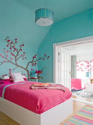
Could someone tell me what brand and color was used on the bedroom that has the tree on the wall?
4th picture down on https://thedecorologist.com/pink-turquoise-its-a-festivus-miracle. Thank you so much.
DId you ever find out what that turquoise color was on the wall with the tree on it?
Ellen,
It looks like Ben Moore’s Mexicali Turquoise 662 or Teal Tone 663 to me.
I know you wrote this back in 2012 but I loved this article. Its kind of interesting when you look back the previous year and see which colors were in. I really like the turquoise girls room with the brown and red tree mural.
wow