Last summer, I worked with Jennifer on developing a color palette for her home. She's a girl who loves color, but felt that her previous paint color selections were not giving her the look or feel she was hoping for. So she called on me for a Color Intervention.
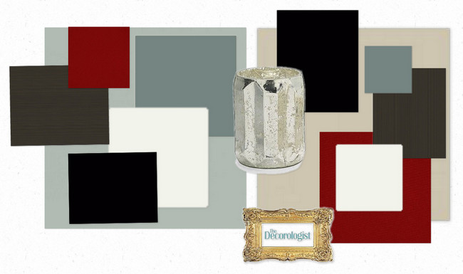
Color Palette by The Decorologist
The challenge was that Jennifer lived half-way across the country! Was I able to help her? Let's see what you think. She started out with a tan beige color in her entry and felt that it was boring. I agreed.
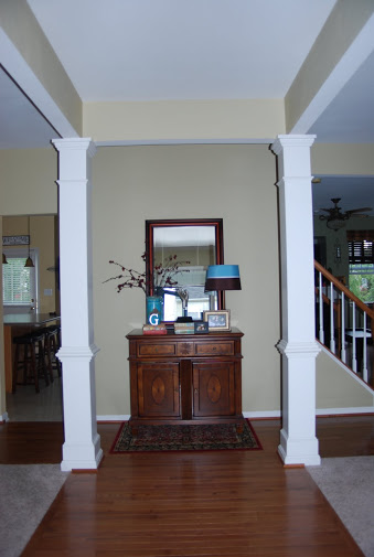
Entry Before
She wanted a more sophisticated, updated look for her home. We came up with a plan that makes the entry something extra special:
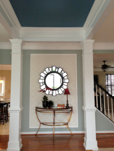
Entry After
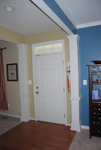
Now let's rotate to the left of the entry. In an effort to inject more color into her home, Jennifer had previously chosen a rich blue color for her dining room. The result was a vivid contrast to the yellow tan color in the entry and adjoining office area.
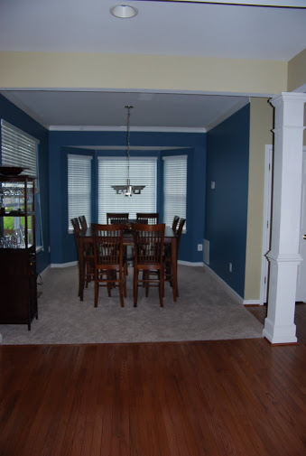
Dining Room Before
What a difference the right paint color can make! This new gray with a blue-green undertone was applied across the dining room, entry, and office. Goodbye, choppy colors – hello, graceful and inviting flow.
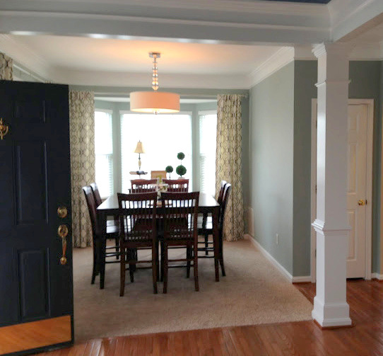
Dining Room After
The other issue we addressed were the columns and trim. Jennifer was open to the idea of adding some crown moulding in critical places, and this made a big difference in the outcome of this space. Can you see below in the photo how the drywall area boxed around the ceiling of the entry is painted out in three colors (white, yellow, and blue)? Is it drywall, is it trim, do we know? This is an issue I tackle a lot, especially in large neighborhood homes built in the last 10 years or so. When the paint was originally placed incorrectly by the builder, it's hard for a homeowner to see past that to a better solution.
Entry Before
Jennifer had the crown moulding added to the interior of the "box" on the ceiling of the entry, then I suggested she paint out the entire drywall beam white like the trim (columns and crown moulding). Now it all reads like architectural trim, and gives a very high-end look.
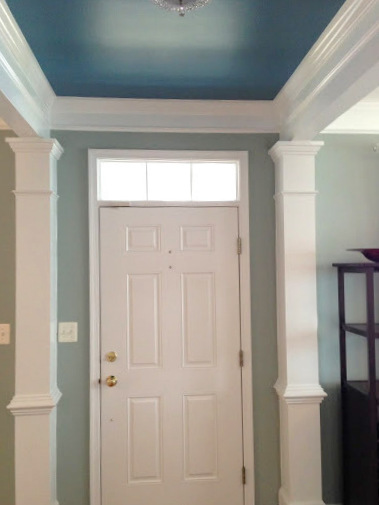
Entry After Paint Color Consultation
Here's the before, facing from the dining room, through the entry, into the office: Stripedy-stripedy.
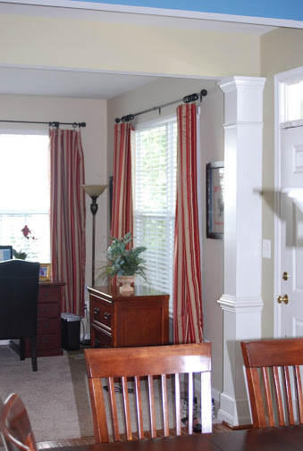
Previous View from Dining Room to Office
The differences between the before and after of this space from this angle are the change in trim and wall color, the lovely new window treatments, and the hanging drum fixture (this is mirrored in the dining room). Gorgeous and fresh:
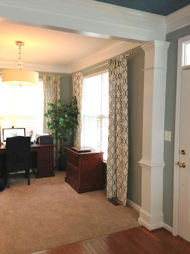
Entry to Office After
Coming full circle now (from the view of Jennifer's camera!), we are back to what you see when you enter the home – office to the right, dining room to the left, family room straight ahead. Before, the family room as a dark sage green with red accents. And keep your eye on the upcoming change to the stairway handrail.
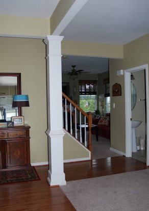 Color Placement Before
The view from the entry is much more pleasing to the eye. There's a great flow of color with accents in the right places. Notice how the entry ceiling and the powder room are the same color? That's the way to create flow without chopping up a space and making it feel smaller and chaotic. And look – the dated oak handrail and newel posts went black and sophisticated.
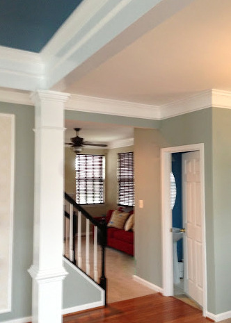
Color Placement After
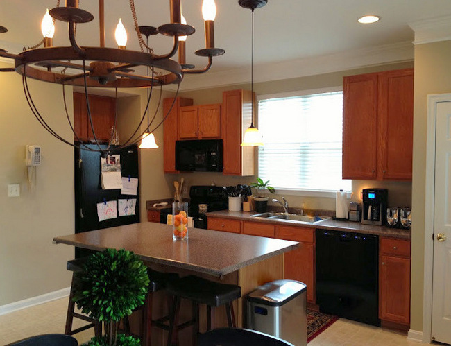
To give Jennifer even more variation, we decided on a more neutral grayed tan for the back of the house, which includes the living room and kitchen. Red will still be an accent color, and what she'll find is that she can move her furnishings, art, and accessories all around this level of the home and everything will still work together. I think that flexibility is important to consider when planning your paint color palette. This was the way the kitchen appeared before our consultation:
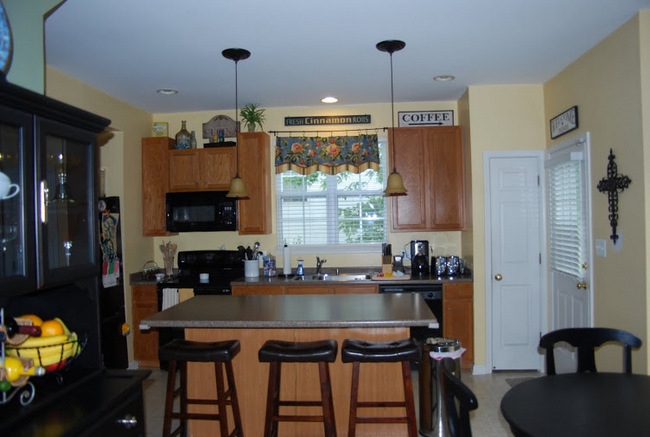
Kitchen Before
Below is the kitchen after the new neutral was painted on the walls and the light fixture I chose for Jennifer was in place. After she completed all the "homework" I gave her to do last summer, Jennifer contacted me again to consult on the second phase of her remodel – guess what that entails?
Kitchen After New Paint Color
She's up for remodeling the kitchen now! I was excited to see her progress and give her specific paint colors and design direction for the next phase, which includes painting her cabinetry, new countertops, kitchen flooring, and completion of the living room area. This is the lovely email she sent me after our second online consultation earlier this week:
"Kristie,
Thank you for talking with me this morning. I had so many areas that I felt stuck and couldn’t move forward. While we chatted I was taking notes-and if you include the first 2 pages that were filled with questions that I jotted down before the call—I now have 6 (front/back) pages of notes that allow me parameters to work within.
I am such a huge fan of your blog and follow you on Pinterest and Facebook so I can get all the juicy details from your experience! Thanks for bringing some style to my home. I can’t wait to share some pictures as I go!
Jennifer"
That pretty much made my week! I have really fantastic clients who listen to what I try to teach them and trust my recommendations enough to follow through, even though I may never meet them face-to-face! I'll let you know how Jennifer's kitchen and living room turn out. If you want to learn more about how to choose just the right colors for your own space, stay tuned for the upcoming launch of my Color Workshop Video (within the week, I hope!) Sign up for my emails and my exclusive newsletter today. You can also follow me on Pinterest, Facebook, or Twitter to stay on top of the latest design and color inspiration.


Great color choices Kristie! Amazing what a little paint can do, as always. Excited about your color workshop video!!! 🙂
Gorgeous! Could you share the name of the blue/gray paint color you used for the flow through the house? It is all just so pretty.
Sorry, Denise. With respect to my client who paid for the color palette to be crafted specifically for her home, I can’t give you specific color names for this project. Hope you understand 🙂
of course! I wasn't thinking.
No problem, Denise. I often share paint color names, but usually not when I share my specific clients’ projects.
Is there a color that would be similar to the gray blue-green color that you could share with us?
What a transformation! I too have an open floorplan and it drives me nuts! I kept the main body all one color just to save on time and brain work, lol, but I love to see how these colors flow and how much more inviting her home has become since you shared your expertise!
Kristie – I'd say that's one of the best transformations I've seen. I LOVE the smart use of mouldings and visual tricks with paint that you applied to smooth out the choppiness of her space. BEAUTIFUL work! The paint color is VERY pretty, too :> Hope I don't miss the post with after the kitchen redo.
Thanks, Sherry! Sign up for my emails and you won’t miss a thing 🙂
I agree, this is one of my favorite transformations too!!
wow! what an impressive transformation for a long distance relationship. lovely!
Kristie, what is the name of the gray painting that you use for the hallway? I am interested in repainting my home and i am in love with different shades of gray. I have follow instructions and will paint my room Chelsea gray and will paint my bathroom revere pewter gray. You are amazing!
Beautiful Kristie! When a home has too many CHAOTIC colors aka the “quilted” look, it certainly needs to be simplifed. Love the colors 🙂
Gorgeous, as usual! I noticed the addition of the crown moulding right away. What a huge difference that made. It makes it look so high-end! When you do a consult like this, do you give advice and a source for things like curtains? Whoever chose the curtains for this project–you or the homeowner–they're beautiful!
Yes, Eileen – I typically give advice/sources for lighting, window treatments, and furnishings when needed. The curtains made a HUGE difference, didn’t they?
Kristie, I just have to commend you once again for a masterful outcome! Funny you should post this just now….I was thinking yesterday about all of the "at odds" elements in my home—- and colors—-things brought from former houses that I've tried to make work here, but they don't really relate. Budget constrictions are a bummer, but they do force more creative thinking. What wonderful results with paint alone! I'm looking at my own boring beige entry and praying I can call the painter soon!
Once again, beautiful work, Christie. I often telll my clients their house is like a good piece of artwork. There must be visual balance.
That paint consultation really paid off for you! Good work!
Whenever you post a Before and After I know I'm in for a treat. Fabulous transformation,
as always.
I'm impressed with all the changes, but that entryway had me at "hello". I love the wall with the "frame" made of moulding and that entry ceiling is gorgeous.
Please tell me where you got your magic wand from, I'd like to get one next time I'm out shopping.
Great transformation. Wonderful work.
Gorgeous work! What a pro you are.
I've said it before but I'll say it again, your befores and afters are AWESOME! You turn "real" homes into really beautiful spaces…and you share your tips, tricks, talent and time with all of us. I don't comment much but trust me when I tell you this is one of my favorite blogs and I read it religiously. Thank you Kristie.
Thank you so much, Cathy! I really appreciate your kind words 🙂 There’s nothing better than to give someone more than they expect they can have, for less money than they thought it would cost 🙂
That entry is spot on perfection! Once again you've blown me away with your color skills. Great collaboration on this project!
Thank you, dear Holly!
Your client must be thrilled with the results. I especially love the entry foyer paint selections. The muted blue-green walls, ceiling color + the glossy white are masterful. Just beautiful. Best, Ellen
I love it all but especially the powder room color and ceiling. Just beautiful! Great as always Kristie!
This post really speaks to me because I have a very open floor plan with ceiling beams separating interconnected rooms (as in the 5th picture "Entry"–where one side of the ceiling beam is painted blue). Unlike the picture, I don't have the columns perpendicular to the beams, which seam to allow for a paint transition by creating a clear line between the rooms. If she didn't have the columns below the beams, how would she transition to a new paint color (for example if she wanted to keep the right side of the entry blue, and have the other room be a different color)? Sorry if that description is confusing. But, I'm starting to think I have no option but to live with one color only throughout my open living space because there are no clear lines of transition! Thanks!
If I understand correctly Emily, I would treat the beams as trim – painting the whole thing white and glossy like trim from the crown moulding on the innermost area to the crown moulding on the outside (dining room and office sides) of the beams. I hope that makes sense!
If this house was a person, you just made them look twenty years younger. Looks soooo much fresher and lighter!
Love your analogy, Kelley! Thanks 🙂
Beautiful transformation! LOVE the painted ceiling in the entry hall! I know you just did the paint chages, but isn't the area rug in the dining area too large? It looks awkward to me. I think it would look better if it did not touch the walls and just be big enough to accomodate the chairs. Please tell me if I am wrong as I am just learning and have a similar area and searhing for a rug. Thanks and BRAVO!
What is the name and co of the main wall color. I am currently looking for a light grey blue green and am only finding dark hues.
I was reading and realized I’d throw in that this color looks very similar to BM quiet moments in case anyone else is wondering
Do you have emails I can subscribe to?
Yes, Deborah – you should be able to subscribe at the bottom of the post!