My article on 2014 Paint Color Trends just hit the newsstand in Everyday Home magazine, woohoo! When the editor asked me to write the article back in the fall, I decided to share not only my predictions, but also those of some other color experts whose work I admire.
While a couple of those experts made the editorial cut in the magazine, I wanted to share with my blog readers the insight they had to offer! My daughter snapped this photo of me in Barnes & Noble:
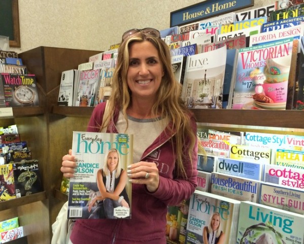
hanging out with Candice Olson at Barnes & Noble bookstore
I hope you will pick up a copy so you can read the entire article, but today I’ll give you excerpts of it, plus the information from my interviews with color experts that didn’t make the editorial cut. And I’ll tell you how you can get your FREE copy of the magazine at the end of this post.
Sherwin-Williams Agreeable Gray SW7029, Benjamin Moore Knoxville Gray HC-160, Kristie Barnett, The Decorologist
It’s easy to look back at certain decades and identify the trending paint colors of that time period, right? If your walls are currently taupe, pinky-beige, or gold, you probably painted last in the late 1990s or early 2000s. Most of us just can’t repaint every two or three years, so we need to choose colors that will seem fresh and appealing for 7-10 years. As a Residential Color Consultant, my goal is to help my clients choose what is on-trend (7-10 year lifespan) vs. trendy (2-3 year lifespan). Trendy is fine in a children’s room or even a guest room or powder room, but not in the main living space where your family spends much of their time.
The Decorologist
2014 paint color trends reflect slight shifts rather than seismic changes. What you’ll notice is a move away from neutrals and a move towards more real color and interesting color combinations within and across color families. West coast Color Expert, Kelly Berg, says, “Grays have been so popular for about five years now. I don’t think they are going anywhere quite yet, and we’ll probably continue to see them as a main “neutral” in many homes. However, I think we may start to see more buttery yellows sneaking in, as a break-away to a color that many people simply find too gloomy. I like to think that these yellows will stream in like the sun after a long, cold storm. Not that I dislike grays – I just think it’s time to find a little more balance and optimism.“
gray-green by Kristie Barnett, The Decorologist, Melanie G Photography
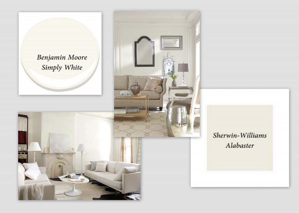
As I have seen in my own paint color consultant business over the last two years, people are craving a bit more from their neutrals. They don’t want the wall paint in their open-concept, vaulted-ceiling homes to “scream” a given color – but they want more color than many so-called neutrals give them. That’s where super-neutrals come in. Super-neutrals are colors that act as a neutral, even if they read more of a color than traditional neutrals.
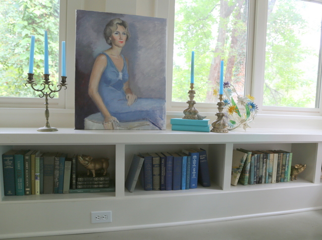
gray-blue by Kristie Barnett, The Decorologist, Melanie G Photography
In 2014, the trending super-neutrals have green, yellow, blue, or purple undertones. Gray-blues with a few drops of green are more complex and immensely liveable – much more so than the one-note powder blues of former decades. Gray-greens are more current than yesteryear’s browner greens, and are a great backdrop for darker greens and all shades of blue in a space. These grayed-down hues can be paired with pops of color across the spectrum. Barely-purple grays like Sherwin-Williams Destiny SW6274 pair beautifully with light and dark blues, even turquoise.
Even though gray remains the neutral of the decade, indications are that people want to surround themselves with more hopeful and uplifting colors. Benjamin Moore announced in the fall what they consider the “new” neutral palette which marks a shift to pastels. Benjamin Moore’s Creative Director, Ellen O’Neill, states “We’ve begun to see a shift away from gray to tints of blues, greens, lavenders, and pinks. . . shifts to pastels without looking too ‘candy’ or ‘Easter egg’.” With a bit of gray, chalky pastels are more liveable than you might think.
Benjamin Moore Prescott Green HC-140 by Kristie Barnett, The Decorologist
Lavenders are on-trend choices for bedrooms and family rooms, and are gaining popularity in more public spaces, like living and dining rooms. Lavenders on the both the red side and the blue side look soothing and modern when used with light to medium blues. Abby Manchesky of Abby M Interiors says “Shades of plum, lilac and burgundy have made a huge appearance for 2014. They are both rich and fresh – a winning combination. I see them coming alive not only in paint and fabrics, but also in rugs.”
Benjamin Moore Violet Mist 1437 by Kristie Barnett, The Decorologist
There is also indication that even more saturated, pumped-up pastels are emerging as the brave new trend in 2014. These colors harken back to the hues popular in 1950’s Palm Springs and Dorothy Draper’s interiors. These colors are happy and hopeful, and also pair well with the trending jewel tones we are seeing. Kelly Berg says, “I think, in general, we’ll be seeing more saturated hues as well as deeper hues. Some of my clients have recently been asking me “Can we go brighter? Can we go darker?” It’s been catching me off guard, but I’m thrilled! After the past few years of playing it safe, there seems to be a movement towards bigger color. Color that really says something.“
Benjamin Moore CSP-1190 by Kelly Berg of Story and Space
Speaking of jewel tones: sapphire, amethyst, and emerald are huge for 2014. Emerald is one of my current favorites, as shown in Kelly Berg’s home office:
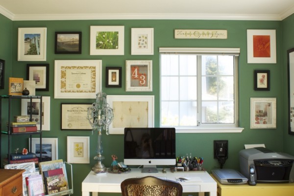
Pratt & Lambert New Glarus by Kelly Berg of Story and Space
When I asked HGTV‘s David Bromstad, original Design Star and star of Color Splash, about his take on the continuing popularity of blues, he noted that there hasn’t been a slowdown of soft blues since the 1990s, and the color has become a classic in his book. “Blue is a gender-neutral color that relates to both men and women. And it can go from soothing to sexy in two shakes of a lamb’s bum,” he quipped. And yes, that’s a direct quote.
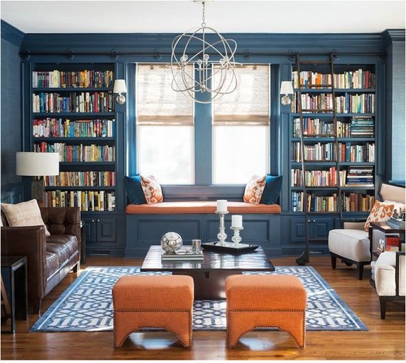
In my own color design work, I’m seeing navy as an alternative to black and charcoal gray. Dark blues can be great options for upholstery color, and are more lively than the typical go-to neutrals.
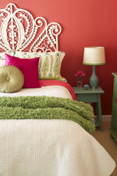
 Benjamin Moore Atmospheric AF-500 by Kristie Barnett, The Decorologist
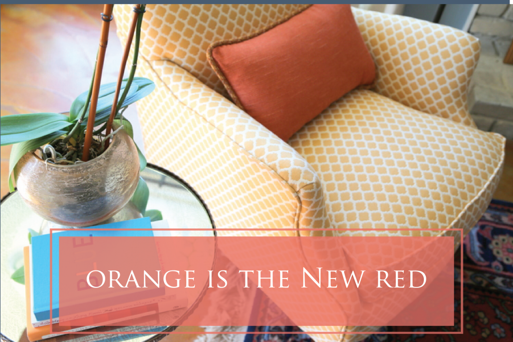
Trending accent colors that pair with neutrals or super-neutrals include bright yellows, oranges, and pinks. Adding pops of these colors makes a room painted in gray come alive. Farrow and Ball recently introduced Yellowcake, a classic bright yellow named to reflect the revival of the “homemade” and a color similar to one popularly used in 1960s kitchens. Bromstad asserts, “Don’t count out the fabulous acid green, either. People love it in small doses and I’m seeing it everywhere. And it looks amazing with metallic gold.”
One of the most important trends in 2014 is actually in paint color placement. Real colors (rather than white) painted on the ceilings or in the backs of bookcases have replaced the over-done “accent wall.” Contrasting colors above and below the chair rail in dining rooms are replaced with trim color extending to the entire area below the chair rail. Both kitchen and bathroom cabinetry painted out in colors that range from black to jewel tones (sapphire, emerald, teals) to grayed heather blues and tempered greens are replacing wood and even faux-painted glazing as the latest in on-trend looks. Bolder homeowners may even choose bright colors for the interiors of their cabinets or vivid countertops rather than the been-there-done-that neutrals.
Kristie Barnett, The Decorologist, Melanie G Photography
Trim painted out colors other than white is also trending. Green on the trim and ceiling takes on a completely different look than the same color on the walls. Painting out walls, bookcases, and trim all the same color is gaining popularity – but in different finishes/sheens. This is a great look for dens and libraries. Eggshell on walls and high gloss on cabinets and trim make the color appear slightly different on the different surfaces, rather than simply blending into each other – which is what it would look like if it were all painted out in the same finish.
David Bromstad says that wallpaper is becoming the hot, new accent wall. New technology means that more intricate designs are possible and that wallpaper and murals are now removeable and moveable, which dispels the phobia that has haunted anyone who has attempted to remove decades-old wallpaper. Bromstad’s own artwork is now available through muralsyourway.com as moveable wall murals in any size.
Heidi Nyline of Warline Painting Ltd. says, “When painting cabinets dark we are moving towards more charcoals, blacks and grays and away from chocolate browns. The challenge with browns is that it looks like you tried to make it look like wood with paint. There is just not getting around that so most often its better to to not even try.”
Benjamin Moore Black Jack 2133-20, Gray Owl OC-52 by Warline Painting, Ltd.
Gold and silver are both trending metallics in 2014, especially when mixed. Both look beautiful against the backdrop of cooler neutrals. Mercury glass and polished nickel looks more on-trend than brushed nickel or chrome. Rich, brassy golds look amazing with the trending cooler color palettes and are completely pushing out oil-rubbed bronze as the finish of choice for fashion-forward homeowners. There are great metallic spray paints on the market in big-box stores that can transform any dated metallic to one of these on-trend finishes. Just be sure to use a metal primer first to insure the paint adheres well.
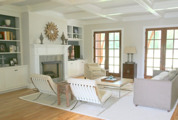
Walls are Salt Glaze by Martha Stewart. Coffee table is custom mix of Benjamin Moore Calypso Blue and Bermuda Turquoise by Abby Manchesky of Abby M Interiors
And don’t forget – paint isn’t just for the walls and trim. Painted furniture continues to be the rage and can add a bit of interest amid a sea of brown wood furnishings. I always advise my clients to choose a color a bit darker than they think they should when painting furniture or accessories like picture frames and bookends. It always reads a shade lighter once it goes on.
 Chair in ASCP Florence, by Kristie Barnett, The Decorologist
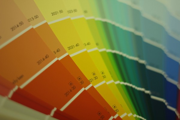
Interior color trends for 2014 really hinge on one main idea – casting off fear of color and the embracing new versions of old colors. That may mean adding in more chalky pastels and whites, punching things up with more vivid jewel tones, using navy rather than black, mixing in gold with your existing metals, or reconsidering your color placement in each room. Just make sure to always test your color the right way: paint two good coats of your color choice on a repositionable Small Wall paint sample board and move it to different places in your room at different times of day, so that you know you are making the right choice for your existing finishes (flooring, trim, countertops).
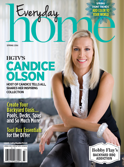
cover girl Candice Olson on Everyday Home
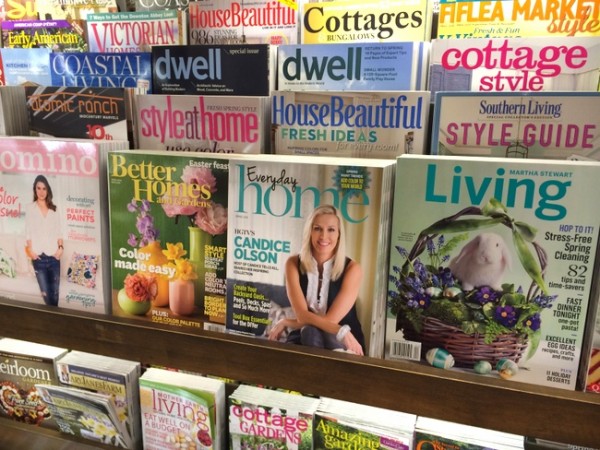
I am giving away several copies of Everyday Home this week. If you’d like me to send you one so you can get the rest of the scoop on my 2014 Paint Color Trends, just leave a comment and share this post on social media or “pin” one of the photos on Pinterest!


Love the way your mind thinks, Kristie. Congrats on your article-may there be many more.
Thank you, Marilyn!
Great post, Kristie! How exciting about your article! I pinned the blue built-ins picture – I LOVE built-ins, especially painted bold colors.
Love these colors!
Cannot wait to read the entire magazine article! (Is it available here on the West Coast..?)
I love the move to more color. I am one of those people who find gray a little dreary…BUT I love the gray cashmere you picked for my bathroom! Congrats on the article.
Nice article! I’m obsessed with this kind of info! (Pinned a photo!)
Great ideas for colors and I LOVE the gold and brass accents paired with them! Thank you!
Congratulations of your article. I would like to see more articles that address a minimalism design scheme.
Very well done article…enjoy your blog and work
Great article, Kristie – congratulations! I love how you always distill everything to be so clear and applicable.
Excellent article! I took notes on your color choices. Your design work also looks great. Mariann
Wonderful article, Kristie! I appreciate the information you share in each of your blog posts, and this article on color is especially exciting!
I’m so glad I get your e-mails. And this one I received on the paint trends IS JUST GRAND! I have just moved into a newly built home. The paint choices from the builder I did not like. So I am starting from scratch but, I love it this way so I can pick what I want. This article on the trends for 2014 is wonderful help for what I should pick.
Thank-You so very much for all of your ideas and for sharing.
Kristie, Your blogs are fantastic. I enjoyed meeting you at the Real Estate Staging Convention in Las Vegas in January. I have painted two of the sample paint boards you gave away at the Convention and they are an easy way to see how the paint color will look on the wall.
So proud to have Celebrity Kristie as my friend! You go, girl! I’d love a copy of the magazine with your article in it.
yes would love a copy kristie, happy painting.
Great ideas! Thank you!
You are my go-to-gal for painting advice and this is just another example of why. Congratulations on your article!
A full blown copy of the mag would be greatly appreciated.
Wonderful article! Great to follow your success. Your training as a psychologist shows in your new field of work. Keep going!
I really like your blog. Get excited when Decorollogisti is in my inbox. Was in the same Barnes and Nobles yesterday looking at the magazine. One day I am going to paint an old, old dresser I inherited.
I love your blog and have found your online color and furniture workshops extremely helpful as I update my 1960’s home. Living in the Seattle area gray is just too dreary to have inside too. You have been a huge help to me and I’m constantly letting others know about your blog.
With the stroke of a paintbrush exciting things can happen – I love painted ceilings and value the information that you share so graciously. Looking forward to reading the entire article.
Thanks for inspiration on this Monday morning. Great article, not a fluff piece. The facts aren’t just facts but concepts to apply for an amateur designer. Thank you for all the untold you give to us readers or stalkers! LOL
Diana
Great post. I love the idea that certain colors become classic over time, in this case blue.
Great, informative post and I would love to get a copy!
Love your color choices and inspirations!! Want to re-do my whole home!! Thanks for a great article and blog! You’re awesome!
Kristie, very helpful article! I love how you make color and style “do-able”!
Kristie, I love getting your updates, and insight. Congratulations on your article. I have been redoing a rental we have had for over 22 years, and have used your ideas throughout. We are actually downsizing as all three kids are in private colleges down south, and it’s fun to add pops of color. It has been a fun process. Thanks!
Always love reading what you have to say….
Was just given the task of choosing all new paint colors for my parents’ circa 1970’s ranch – with new carpet and curtains to follow (never know what length of curtains to put on the tiny, high windows since there is radiant heat under all of them). Working on a tight budget – It will be mostly neutral per Mom’s request. Using a “super neutral” in their bedroom – perhaps sea salt or gray wisp (Used gray wisp in my husband’s office and we both love it). Looking for a warm cream that is not too yellow, gray, or pink – one that will go with brown or tan carpet in the guest bedrooms – any advice?
Thanks for all you do!
PS:
pinning away!
Mary
Mary,
When I think “cream,” I think yellow undertone. Take a look at Ben Moore Monterey White (lighter) and Carrington Beige (darker, more yellow in it).
Thanks Kristie – I will check both out.
Can’t wait to read the article.
Thanks for all of your insights.
Congrats on an excellent article! I would love to have a copy of this for my office, just getting into the color consulting business and really enjoy all your expertise!
blessings!
kelly
Shared on my FB page The Hayloft and on Pinterest
I’m tired of the gray trend and I’m excited about all the new nuetrals. I pinned the dark teal room on Pininterest. I would love a copy of the magazine.
Congrats on the article! I would love a full copy. Your expertise is greatly appreciated! Are feature walls totally out? :/ I love that you give a distinction between on trend and trendy. It’s sometimes hard to tell the difference, which leads to color paralysis.
not TOTALLY – it’s all about the “why.” why do you want to accent a certain wall? is it because it is the focal point (like behind a bed) or is it because you’re afraid to paint the whole room the color you really want?
Great article. I shared this on my Facebook page. I enjoy all of your posts and have learned a lot.
Love the colors. Your articles help me see and think outside the box. Congrats on article.
What a fabulous post Kristie! Love “super neutrals” and try as I may to dislike gold, it pairs so beautifully with the cooler super neutrals. Your examples are inspiring. You truly deserve to be among the Colour Experts in this magazine article~ congratulations, very happy for you!
Thank you, Ginny! xoxo
This such a great reference! Thank you for sharing! 🙂 I would love to win a copy!
exciting article and news, so forward thinking as always, can’t wait to read the rest as need to re-do rooms.
I pinned it: http://www.pinterest.com/pin/287034176225286476/ 🙂
A very informative article, would love to win a copy. I have pinned Benjamin Moore Atmospheric AF-500 picture. I learn something new from every post.
Thanks.
So interesting to see what’s new. I was especially interested in the grays. I totally missed it, because I haven’t painted any rooms in the last 5 years; and now I’m painting them all!!!
(I did go with a grey-green on my library walls 10 years ago, so I’m just repainting that one the same color). But I was worried that gray would date itself sometime soon… This gives me some new options to think about.
Congrats on getting published!
Kristie – congratulations on your article. I’m sure it’s great!!! Looking forward to reading it in its entirety. Thanks so much for interviewing me. I hope that I was able to provide some good color insight for your readers. 🙂
Kelly
You definitely were, Kelly! Your photos are featured in the article, as well. I think you’ll be pleased with it – I’ll send you a copy soon – thanks for the interview, my friend!
Anytime! FYI – digital copy is available to read here: http://www.everydayhomemag.com/#!digital-/cvjm
Nicely done.
Been slowly reprinting my house. Would love to read the article
Great article! You combined the various designers’ ideas in a way that makes total sense to me, a complete amateur. This is already helping me think more clearly about the colors in my home. Thank you! May I please have a copy of the magazine to help me even more?
P.S. And I love! those blue built-in bookshelves. My husband and I spent Saturday afternoon trying to draw something like them for a carpenter and now, here they are! If I had Interest, I would totally pin that photo. 🙂
Well, that’s a new one from autocorrect–Pinterest, not Interest–lol!
Fantastic article! Congratulations and how exciting for you! thanks for the opportunity to win a copy of Everyday Home.
I shared your post on facebook.
Great article! I love looking at different colors!
If I don’t win do you know where the magazine can be purchased?
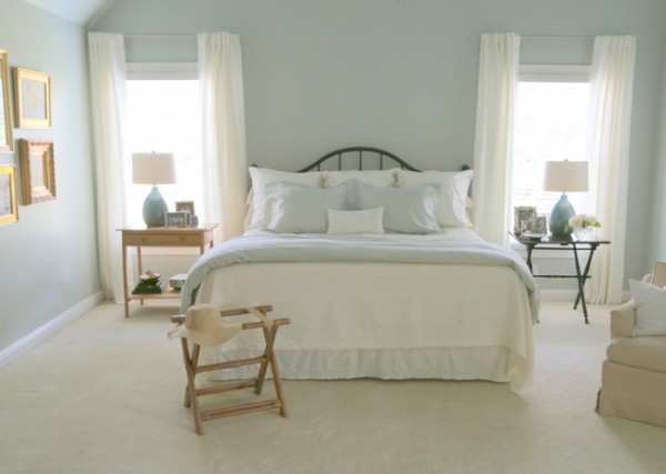
Kristie, What is the pretty blue/gray paint color in the bedroom photo? Love!!!
Great Article, Kristie! Congratulations! I am not a huge fan of grays so was happy to hear that buttery yellows are on trend. I just painted my kitchen a yellowish cream. I am glad I found your blog, because you have so many wonderful ideas. I am pinning it. Thanks.
Great insights, Kristie! Thanks for all of the insights. My favorite take-away designer tip – one that I share with clients often – is to use ceilings as walls. Love it!
-Alison
Thank you for the colour update. I appreciate the advise to make on trend colour choices rather than trendy. This way of explaining colour selection will be helpful. Keep it coming. I am addicted to discussion of colour for the home both interior and exterior.
Great tips Kristie and I love hearing that there is a happier movement a foot than all that gray!
Kristie, Love all of the featured colors! Kathy
Always enjoy your posts Kristie and excited to see this article from you too – how exciting. And of course I’d love to receive a copy but if not then I’ll be on the look out next time I’m at B&N – design magazine mecca that I love to browse when I have some free time. I feel like I have seen a use of dark, rich colors recently. I’m working with the darkest color I’ve ever used (SW Rainstorm) on a project and I must say that I love it. It’s rich and gives dimension to the space.
I’m getting ready to re-do my bedroom & so can’t decide on what color. There are so many pretty colors out there! I’m leaning towards some lighter blues or maybe coral….eek!
frogribbit44
This article is very helpful – we’re trying to paint our new house and it’s overwhelming! These pictures and color predictions help me feel better about choosing expensive paint that I don’t want to do again – ha!
Congrats on the magazine! Great article! I look forward to reading and seeing the whole article. Love your work.
Thank you so much, Vicky!
This was so helpful!
Thanks for the idea and updates. We’re picking paint colors for our new to us home and it gives me food for thought. Several of the rooms have wood plank paneling from the chair rail to the floor. Currently they are white with a icky orangy beige above to the crown molding. Always looking for ideas.
Being married to a beige-aholic, I am always looking for ammunition to show him how great some color can look. These pictures really make my case for me! Thanks!
Win him over, Barb! 🙂
Great article full of great info, as usual!
I would love a copy of the magazine to read the entire article. I enjoyed what I read so far. My daughter is buying a new home and would love help deciding paint colors. I would too!
I’m still working on all the ideas you gave me for my house last fall. Beige has been banished from the 1st floor, one more room to go on the 2nd! I’d love to have a copy of of this magazine, as I’m a bit of a magazine fiend.
Thanks, Kristie. Loved the ideas you incorporated here, and I’m always a fan of David B!!
When is your staging book coming out??
It’s still in editing mode, Jeanette, but hopefully within a month!
Reading your posts have truly inspired me. I have been so unhappy with my lack of decorating skills that I had lost interest in my home. Yet after trying several of your tips, including how to pick the right color and arrange furniture, I am truly loving my home one room at a time. I can’t wait to read your article. Now my husband is shaking his head because you may have created a decorating monster. 🙂
Congratulations! I would be trilled to win a copy
I always get great ideas from your blog. I Would love to read the rest of your article in Everyday Home. Congratulations.
Congratulations! Great job!
Great article on paint color trends. Your work & blog are very inspiring. Here’s my pin. I love the dark blue library! http://www.pinterest.com/pin/35114072069330751/
Great info. Very timely since I just painted. Painted my sewing room BM majestic mauve because I wanted a color that was fresh.
Just finished re-building a new home after a fire Kristie, your comments regarding choosing colors that will not resonate 2013 as our build date is so true, I will try to send you pic’s of our finished product in the future. Please do remember that like our home, our hair and fashions can also use updating from the professionals at times also. Here is to hoping you seek advice from experts and friends regarding the latter too.
Thank you for your comment, Glenda. I am interested in your thoughts about my “hair and fashions.” It seems as though you may have specific recommendations on my personal appearance? I am open to suggestions and am curious as to your thoughts.
Kristie,
my friend and I are both 59, and are avid readers of your posts, we have observed as we age that hair looks useful and more healthy if at shoulder/or chin length. Strange, but the shorter styles can give the added benefit of a face lift without the pain/expense. Parting hair in or near the center can lengthen the face and nose – and pronounced highlights show regrowth and spell added maintenance. We envy your choice of stylist in Nashville, you will have no difficulty in locating the best the South has to offer!
thanks again for wonderful posts, your knowledge and expertise speaks for itself!
glenda
I’m sure Kristie will keep this sage (yet quite unsolicited) advice in mind many, many years from now, when she’s closer to 59. She’s one of the most beautiful women I know, yet I never hear her dispense unsolicited beauty advice or publicly disparage another woman’s appearance. She chooses to focus on the loveliness of others, and she has my respect for that.
Great article! As a colour consultant in Toronto, I also find a lot of the same requests for greys and safe accent walls! I always get excited with a client who wants to be bold and isn’t afraid of adding rich colours in their homes, instead of playing it safe. Now I’ve got some great new ideas to work with. Thanks so much for sharing!!
I would love to read your article on the 2014 Paint Color Trends!
Thanks for the great article! I don’t think I’m quite ready to go away from my white trim yet. 🙂 I love the jewel tones.
Kristie, I haven’t like the grays and am happy that we are moving to a little more color. I painted my house from the Coastal Cool collection, HGTV Home by Sherwin Williams. Love their Watery, Comfort Gray (which looks green in my basement), and my favorite, Sea Salt. All are neutrals to me!
I love your blog. I mentioned the other day that I was beginning to stage my home to sell. I finished today, and am listing the house tomorrow. I hate to move – but I’m looking at the situation as another chance to decorate!
Thank you for all the inspiration you’ve given me, and us!
I devour your information. I painted my master bedroom room a beautiful butter yellow because it feels so much warmer than the grey/blues I’ve seen in master bedrooms.
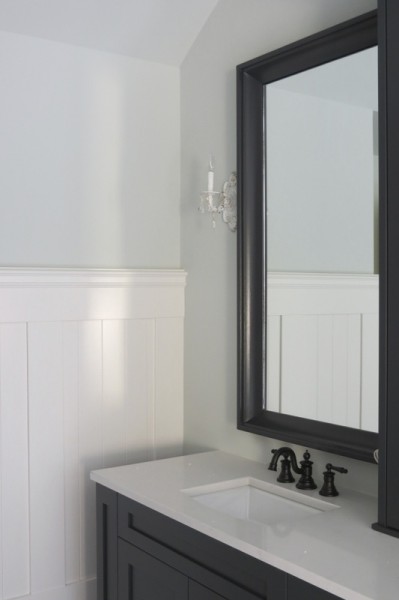
I pinned the bathroom photo (my next project is a bath remodel) and am wondering in particular about the faucet, which looks black — am I right?
OH, and I love it that the last 2 rooms I painted (gray-blue and gray-green, spare bedrooms) are similar to some of the colors you show here!
I confess I am both a gray and Candace addict-which just helped me find you! I am SO inspired by your talent and love your website! Congratulations on your article! AND I can’t wait to see your staging book! Can you offer some assitance on what happens when white walls look blue? The hallway in our second level is dark, and I am a fan of light filled rooms so we decided to paint the walls white hoping that would bounce some light around. However,now that the white is up-it looks blue! We do have gray on the walls in the stairway. How do you pick a color that won’t look blue or work with a color that is going to have a blue tint?
This information is very helpful. I expect to move in the next few months–how would these trends play out in a mid-century home? Hopefully, the magazine article will help me figure it out!
So happy to have found you through Rhoda on Instagram while sharing about the HGTV home in Nashville. Color has always been the hardest decorating dilemma I face. I put off projects constantly because I obsess over finding the best colors. I never jumped on the gray train because it always seemed too cold to me. I’m happy about more color……now I can be “in” again. Can’t wait to read your article in “Everyday Home”.
Great and helpful article, Kristi! I’ve got to get rid of this 2000 gold in my LR! I pinned that beautiful Pratt and Lambert Green wall on Pinterest.
I loved the article. I have soft yellows in my family room and kitchen (2000), that I still love! Glad more color is coming back! I’m about to paint my bedroom in SW silvermist. I assume this would be considered a gray-blue color?
I absolutely love all the colors. I learned so much from these examples. Can’t wait to start painting. Really enjoy your blog. Take care.
This is so informative. I just painted my interiors a soft warm grey and love it but you’ve alerted me to what colors to watch for in the future to keep my decor up-to-date. Love your posts!
Joy
Loved the overview of the various directions color is taking. How exciting! Pinned pics as well.
So thorough, we are currently painting a chair rail in same color of the walls and the ceiling in a half tint (light yellow, b moore). Love the tip about painting it out in a dofferent sheen! Totally going to go back and high gloss the chair rail. One of those little nuggets i always find in your posts. Thanks for all you share.
Ali
What do you think of Huntington Beige by BM, is it still trending?
Great overview! Thanks, as always, for the insight!
Thank you for this article! I just moved into a house where every wall is painted white. It’s screams for color and this article has given me much needed ideas.
Hi Kristie, What a great article! I’m glad you mentioned trim painted the same as the wall color. Do you watch Downton Abbey? I noticed the strong colors on the walls are often carried over onto the trim & doors – all the same color. It looks fantastic, but I’d be nervous to try it!
Warmly, Michelle
Do I watch Downton Abbey??? Are you kidding me – I am obsessed 🙂
WOW !!!!!!!!!! Just found your website from SOUTHERN HOSPITIALTY so wonderful & so much knowledge really like all the pictures also pinned Story of Space ,,,,that bedroom is so peaceful looking with calmness ….TY
Thanks for visiting, Martha! Please come back and hang out with us 🙂
Great post! Been reading a lot about choosing colors for my home. Thanks for the info here!
Great info. I’m about to paint my house, its over 10yrs now as has that pinky beige. I call it builders beige. Going to grey with purple through out. Can’t wait to read the article. Your blogs have been very helpful to me. Thanks. Looking forward to more.
This was really helpful to me – I’ve been stuck on what to do with 90’s era kitchen cabinets, I had painted them white and they just didn’t read ‘modern’ for selling the house. After reading this, I tried two shades of grey, darker for the island base and lighter for wall hung, and they look very current! Thanks for the confidence and inspiration. Sincerely, Susan.