Do you love color, but are afraid to use too much of it in your home? Are you scared that it’ll be too chaotic, or make you feel out of control?
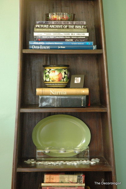
The makeover I am sharing today involved an adjoining living room and dining room. The dining room was already painted a fresh green which my client loved during the day, but hated at night – poor lighting had much to do with that. The adjoining living room’s yellowy-tan walls fell flat in comparison to the vivid color in the other room.
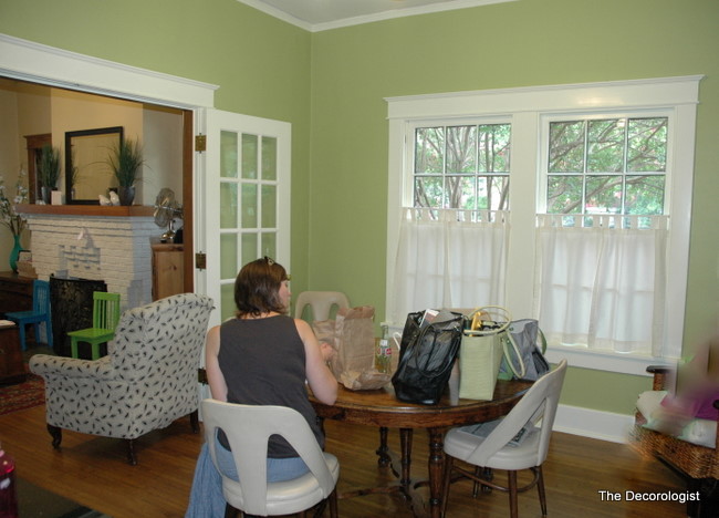
Dining Room Before
This family had lived in their Nashville vintage bungalow for over a decade. They love color, but had only taken things half-way. As you can see in the photo below, my client had lots of colorful accessories in the living room but was afraid to veer off of neutral on the walls because she already had such a colorful dining room. That’s why she needed an interior decorator who specializes in color, like The Decorologist!
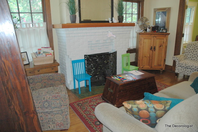
Living Room Before
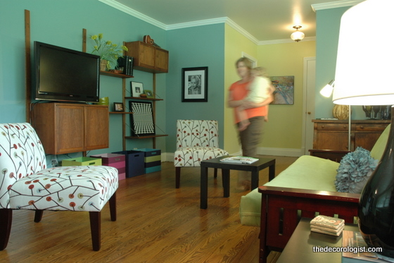
We needed to establish some balance in these spaces – I suggested a blue wall color of similar intensity as the green in the dining room. I must tell you: my client had a very difficult time committing to a new wall color. After much contemplation, color sampling, and adjustment, she finally took the plunge! As you can see, furniture arrangement was critical to making this small living room work and feel “right”.
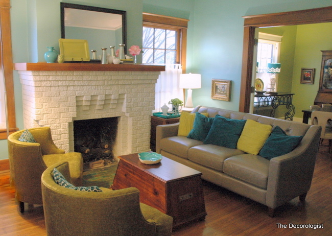
Living Room After
The coffee table/trunk will soon be replaced by a round upholstered ottoman, and my client is on the hunt for just the right piece of artwork for above the charming fireplace. Even though it was always the focal point of this room, the white fireplace really commands attention now – as it should!
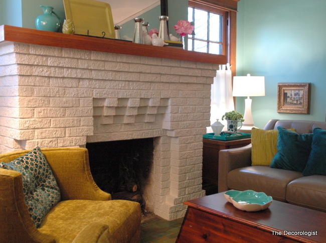
Can You Say Cozy?
The vivid wall color contrasts with the woodwork, making the wood richer and more attractive. The living room is painted in Benjamin Moore’s Covington Blue. I love how the artwork is really showcased on these beautiful wall colors.
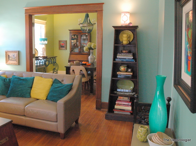
Benjamin Moore’s Covington Blue
The dining room wall color is Benjamin Moore’s Dill Pickle. It’s a yellow-green that works great with the living room’s green-blue. One big issue was the poor lighting in these rooms (the very reason my client didn’t like the dining room at night!) We resolved the issue with a new hanging light fixture and lamps. Isn’t this new beaded light fixture a fabulous choice for this space?
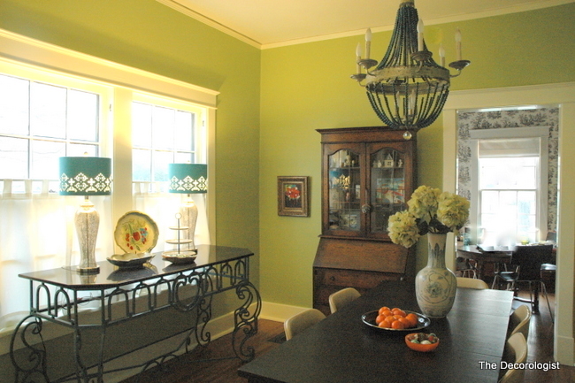
Remember the fabulous blue and green flamestitch shelf liner that I used to line the back of my own dining room hutch in this post? I have another roll of it, and it’s going in the back of this antique hutch pictured above. Ok, here’s the “before” shot of this dining room again:

Dining Room Before
Here’s the “after”. This iron and glass buffet used to be red, but now sports a coat of rich, deep sapphire blue. It was previously on the other side of the room, somewhat impeding the traffic flow. My client had never even considered putting any furniture in front of these windows, but this airy piece works perfectly here.
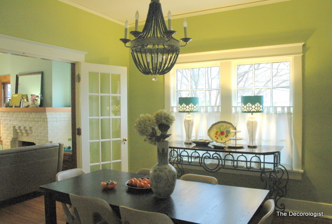
Dining Room After
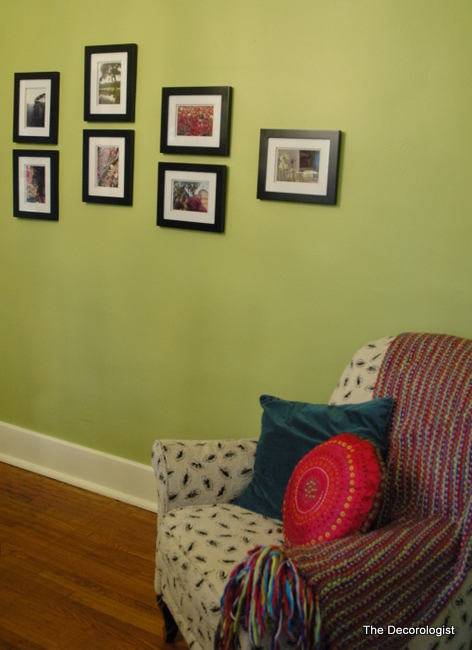
This corner of the room offers a cozy spot to read and to admire my client’s nature photography.
If you love color, why go half-way? Fear and perfectionism can paralyze you and keep you from taking chances that will truly make your house a home. 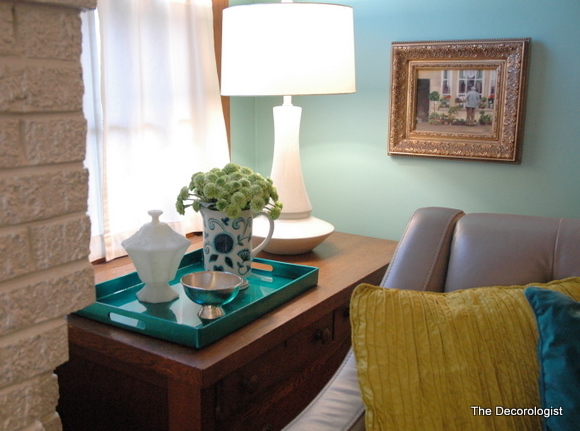
So tell me, are you living IN COLOR?








With almost everyone using neutrals of tans and greys, I like to see other colors being used. It’s definitely the decorating though that makes it work. If there are other rooms on this floor, or if there was a foyer between these two rooms, what color would you choose or would you do a neutral?
Love you color choice….both rooms look amazing now!! Great job Kristie!!
Jenn
Love it. Trying to convince a client right now to go with blue in the living room which adjoins her green dining room. I will forward her your post..perfect timing!
one of my all-time favorite color combos – blue and green! looks great, Kristie.
I love this! I’ve been considering using the same palette as a base in my living/dining areas that are really one large room, but the fact that the only windows are north facing has stopped me. Would it work with north light and not just feel cold?
Hooray for the Decorologist! That living room transformation is beautiful! I was wondering what was going to happen with the fireplace, but that new color on the walls really does bring that fireplace to life and reconnects it to the room. Job well done Kristie! And I do LOVE color so much – so much that sometimes I think about if I’ll ever have a neutral design scheme in my home.
Beautiful, and a good choice to complement the natural wood trim instead of painting the trim.
I recently found that painting one wall–in my own home–was not ‘enough.’ I thought it would be, and ended up doing the whole room! Happy about that!
Barbara,
I tell my clients, “If you like it on one wall, you’ll love it all four!”
Yes! I was hoping you would do this!
Great work, Kristie! Yes, as decorators we are always striving for balance. You pulled it off beautifully here!
those beautiful lamps…
Beautiful choices that make the rooms come together. Especially love the sideboard moved to the window!
where did the blue lamps come from? LOVE the blue/green combo
Shades from Home Goods. Bases from Target.
Love the colors Kristie! I am one of those girls that you can never have too much color. I really like the blue… XoXo
I am definitely not one to shy away from color! Green bedrooms, yellow living/library, Laura Ashley deep reddish/pink in kitchen/dining. The kitchen/dining have yellow prints and the living/dining deep rose fabrics. Hubby stopped me at the ceilings. I wanted a cream/tan but they are white. I have beautiful wood floors throughout our little cottage and wonderful creamy woodwork. Color makes me smile. I love the two rooms you shared. Thanks. I cannot wait to see more. Donna
Kristie, Another fantastic transformation! Love the blue lamps shades and mix of styles. Personally, I like the coffee table…unique design and the unpainted trim in the living room looks great.
Great example of what we can do in our homes with the furniture we have enhanced with a few colorful pieces.
Wow! Kristie–beautiful job! I’ll bet she’s ecstatic!!! With relatively little spent, right? Did she have the furniture in other rooms, that you used?
Just a note about her existing DR chairs…I took some tightly upholstered chairs, similar to these to an auto upholstery place–brought my own fabric (looked & felt like leather) and had each chair beautifully redone for $25 each!!!! Lots cheaper than new chairs—unless of course, you’re a consignment store junkie as I am!!
Blue & green also my favorite….thanks for posting this!
Pretty good dill, Pickle. Looks like you’re doing real well, Kristie!
All the best to you and yours..
Came over from Ginger Snap Crafts — and just spent 45 minutes wandering around here. I am moving my home from “nuetral” to colorful and found so many great ideas. I would love it if you would consider linking up with Busy Monday (open Monday through Thursdays) at A Pinch of Joy, a linky party for ideas that make life better, easier and more fun!
Dill Pickle is a rich earthy beautiful color. What is the ceiling color?
Wow. What an amazing difference. Great style
I love color and yet I’m afraid to commit to it. I have creamy white cabinets in my kitchen with Golden Leaf granite and a travertine tumbled stone backsplash. I took the plunge by painting my kitchen BM Georgian Green, but now I can’t decide what color to paint the great room and dining room. It’s an open concept floor plan so you can see all rooms at once. Any suggestions?
Hello, I check your new stuff daily. Your story-telling style is awesome, keep up
the good work!
Lovely! What a surprising transformation! Just wondering where the kitchen chandelier, white lamp, and very cool blue lamp shades came from. Again, you’ve done an amazing job creating a living space that’s functional and BEAUTIFUL!! I appreciate your talent!
Dining room chandelier — shadesoflight.com
white lamp — Home Goods
blue lamp shades — Home Goods (bases from Target)
What colors are in the rest of her home? I just painted my living room dill pickle and my kitchen covington blue, because I was inspired by this blog post. I LOVE IT . I have a second living room that I need to paint now, to tie it in with these bright colors. Any suggestions???
I know this thread is old, but based on these pictures I would love to use Dill Pickle in my new home. But the Benjamin Moore swatch looks drab and not at all bright and cheerful. Has the formula for Dill Pickle changed? Or is the swatch just that far off?
It’s actually quite bright, Kathleen! It’s very difficult to judge from a fan deck, because you may be comparing that color to other much brighter colors in the deck. Color is relative – and the color you see in a fan deck will be lighter and brighter than it appears in that deck! Be sure and test the color – I use SmallWall 12×12 testing boards so that I can move a color around a room or house and get a better idea how it will actually read in a given home!
I know this thread is old, but I just picked up a “swatch” of Dill Pickle and it looks nothing like the beautiful, somewhat vibrant color I’m seeing online. Is Dill Pickle brighter like what I see in pictures, or subdued like the “swatch”