Guess what? Last weekend I was on the same page of the newspaper as Jessica Simpson and Kim Kardashian!
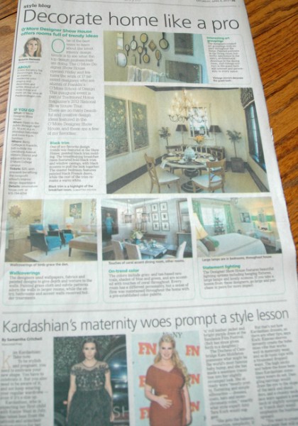
If you didn’t catch my article on The Traditional Home O’More Show House, let me get you up to speed on the latest designer trends I spotted there. The O’More Designer Show House opened last Friday and features the work of 17 talented designers who are alumni of Franklin’s O’More School of Design. This inaugural event is part of Traditional Home magazine’s 2013 National Show House Tour. There are so many beautiful and creative design ideas featured in the O’More Designer Show House, and these are a few of my favorites:
Wallcoverings
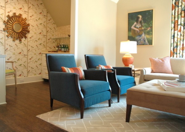
Designed by Kim Zimmer
The designers used wallpapers, fabrics, and painted designs to give depth and texture to the walls. Painted grasscloth and subtle patterns adorn the walls in larger rooms, while the entry, bathrooms, and accent walls received bolder treatments. When I asked designer Kim Zimmer what inspired her space, she told me that the family room was based on the idea of a “modern aviary.”
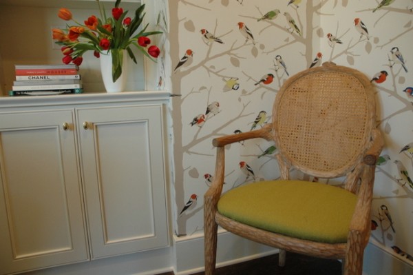
Schumacher Bird Wallpaper
Kim told me that you should start with something that inspires you – something you love – then build your scheme from that point. Then you will end up with a design you love!
On-Trend Color
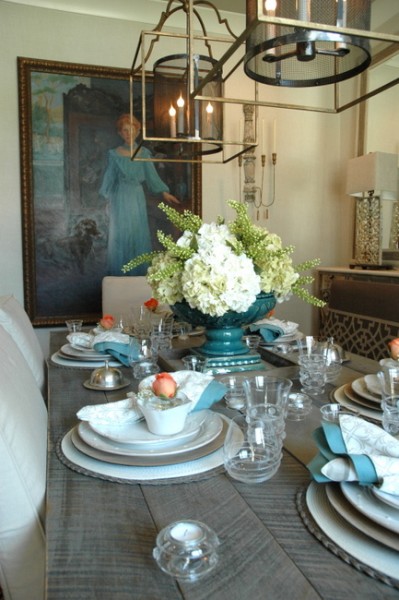
Dana Goodman Interiors – Crysta Parish, Lead Designer
The colors include gray- and tan-based neutrals, shades of blue and green, and are accented with touches of coral throughout. Every room has a different personality, but a sense of flow was maintained throughout the home with a pre-established color palette. Crysta Parish of Dana Goodman Interiors chose to keep a neutral color palette as the dining room is one of the main transition spaces into the rest of the house. She added blues and coral as accents.
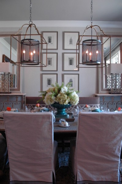
When I asked her how visitors could incorporate a bit of this room design into their own homes, Crysta suggested using a neutral color palette with organic tones and textures. She also suggested painting the ceiling an accent color, using 2-3 smaller chandeliers rather than one, and dressing up a plain slipcovered parsons chair with an applied decorative banding to the bottom of the skirt.
Statement Lighting
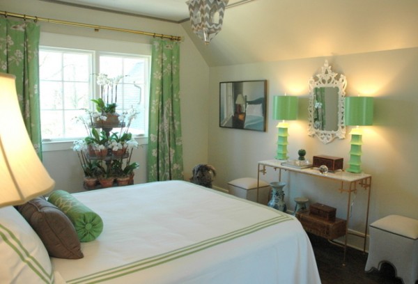
Design by J. Haynes Interiors
The Designer Show House features beautiful lighting options including hanging fixtures, large lamps, and lovely sconces. If you take a lesson from these designers, go large and purchase in pairs for more impact.
Interesting Art Groupings
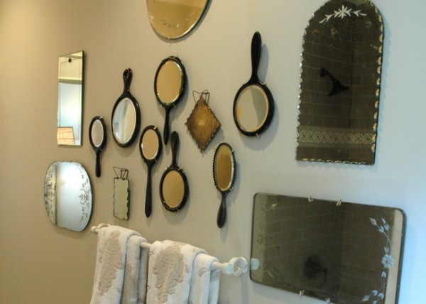
The designers created art groupings with impact throughout the home. Painted portraits in the living room, butterfly specimens in the entry, architectural drawings in the dining room, and vintage mirrors in the guest bath add interest and personality to every space.
Black Trim
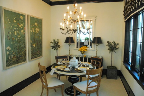
Breakfast Room design by Jonathan Savage
One of my favorite design trends was featured in the Show House – painted black trim molding. The breathtaking breakfast room designed by Jonathan Savage featured bold black trim and window casings, with black accents to pull the look together.
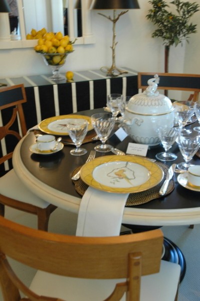
Jonathan told me that he thinks the approach of “less is more” is important in design. He feels that restraint is a great thing to take away from the breakfast room he designed. Too often, rooms feel overdone when too much fabrics or too much furniture is used.
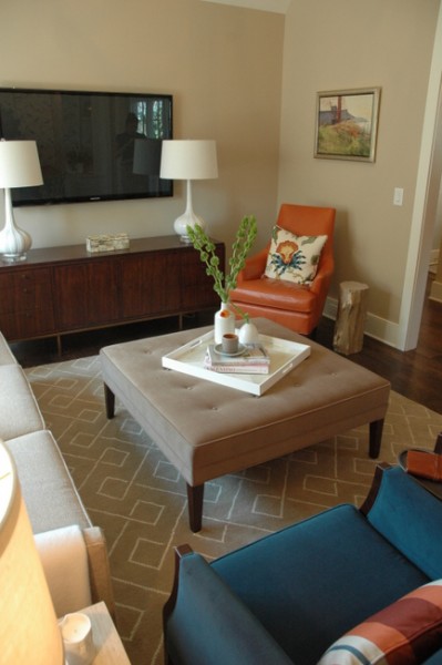
Kim Zimmer
I hope I’ve whet your appetite and you want to see more of this fabulous Show House! The Traditional Home O’More Show House is open to the public now through April 21, 10 – 4 Mondays through Saturdays and 12 to 4 on Sundays. Tickets are $20, and proceeds benefit the non-profit school’s interior design department. For more information, go to omoreshowhouse.com or call 615-794-4254.





Love the dining room- beautiful. No big surprises with the colors, we are seeeing them everywhere. I do like the breakfast room and the black- but not sure if the art work is working. Thanks for sharing Kristie!
The dining table was decorated by one of my favorite stores in Nashville: Color. That blue pedestal vase is gorgeous! Color has tons of beautiful merchandise and a fantastic staff who will come up with endless ideas of how to style their pieces with what you already own.
PS: Kristie, I am looking forward to meeting you next week!
Thanks for telling me that Color did the table! It is beautiful, and Color is a fabulous store. Yes, look forward to meeting you!
I toured yesterday! Beautiful day and a great house. I loved the mix of traditional and more modern styles. I’m not sure what think about the black entryway. That was surprising. I LOVED the laundry/sewing room.
Cindy,
The dark entry was definitely interesting, but I think I would have liked seeing that drama in a powder room instead. That laundry room was pretty amazing – I couldn’t get any good photos of it for my blogposts because they were still finishing up painting in there. Super-cool, though!
I’d also have to agree that sometimes “less is more”. It’s always better to err on the conservative side when it comes to a remodel or redesign. You don’t want to do too much at once and then end up not liking how it all looks together.