Global color authority, Pantone, just announced that Radiant Orchid is their 2014 Color of the Year. Wonder how they made the choice?
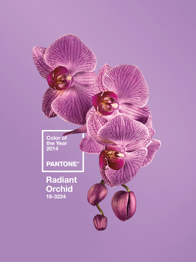
“While the 2013 color of the year, PANTONE 17-5641 Emerald, served as a symbol of growth, renewal and prosperity, Radiant Orchid reaches across the color wheel to intrigue the eye and spark the imagination,” said Leatrice Eiseman, executive director of the Pantone Color Institute.
Pantone describes its pick for 2014 as “a captivating, magical, enigmatic purple.” This color works well with mint greens like you see below:
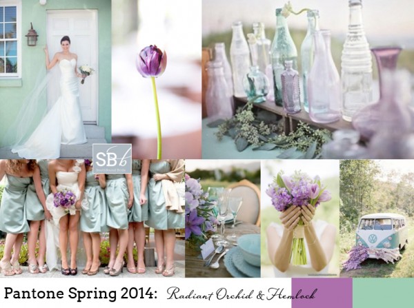
Or with both light and dark blues:
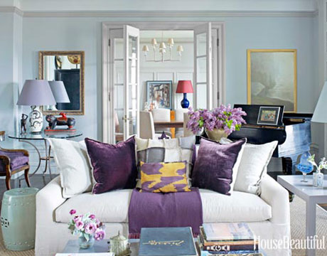
designer Alexandria Doherty, photo by Francesco Lagnese via House Beautiful
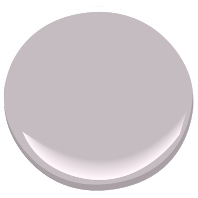
For a wall color, you would want to gray down this color to make it livable for most spaces. Some of my favorite gray-lavenders include Benjamin Moore’s Iced Mauve 2115-50:
and Sherwin Williams Beguiling Mauve SW6269:
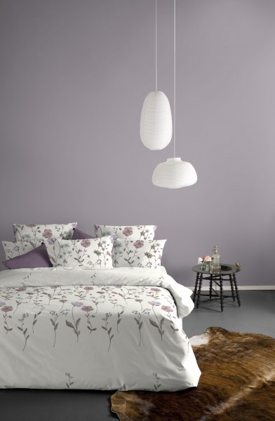
source
If you use a grayed-down version of purple on your walls, you can use more vivid versions of purple (or other accent colors) in your fabrics and accessories. What do you think of Pantone‘s choice for 2014 Color of the Year? Stay tuned as I will soon be sharing with you my own forecast for the best on-trend paint colors for 2014 – which will be featured in a decorating magazine in the spring!


I an happy for the upbeat feeling of this colour, and can’t wait to see how it gets implemented. For myself I lean to the grayed down side of things!! Congratulations in your upcoming article!
Thank you so much, Sheila 🙂
I love orchid. It’s a great color that makes a lot of rooms look softer and more elegant. Great post!
This is probably one of my favorite colors to wear…if I can ever find it! Maybe now…
Sometimes I don’t consider MY favorite colors to use in the house—I guess maybe I’ve become
over-focused on what the house wants to be.
Just wondering if the paint companies ever think to ask the color experts out there, such as YOU,
Kristie, what colors are people wanting…. Looking forward to your article!
Oh, I wish they would Paula!!! Hear that, Sherwin-Williams?? 😉
I totally agree that it needs to be greyed down for walls. I recently used deep purple pillows on a navy blue sofa, and it was stunning.
I love the color, but I agree with you, it should be used as an accent color. Love the grayed down versions for the walls.