| Have you heard? Sherwin-Williams has introduced their color forecast in what they are dubbing ColorMix 2011. The 39 colors selected by Sherwin-Williams color experts for Colormix 2011 are grouped into four palettes: Purely Refined, Bold Invention, Restless Nomad and Gentle Medley. Jackie Jordan, director of color marketing for Sherwin-Williams, says “Status is no longer about consumption, it is about personal identity and ColorMix 2011 evokes that sense of uniqueness.” With this new color collection, Sherwin-Williams wants to “celebrate individualism – a trend toward not being trendy at all.” Let’s see what you think of their new palettes: |  |
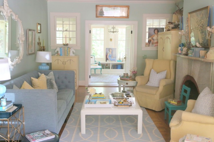
Gentle Medley

“fresh, airy, innocent
Hard times call for soft colors: the hint of green in a spring leaf bud; the chalky blush of a seashell; the time-etched beauty of a vintage fabric or photograph. Fashion has turned a romantic, nostalgic corner, bringing pastels and parchment-pale neutrals back into the palette. The hues are innocent without being sweet — flirty, yet not feminine. They reflect not just a yearning for youthful innocence and gentler times, but also a refreshing honesty and lack of pretension that are thoroughly modern.”
Below are the colors from the Gentle Medley palette that I think have some real potential:
Sand Dune SW6086

Breaktime SW6463

Chartreuse SW0073

Bold Invention

“experimental, artsy, expressive
The city never sleeps. Neither do its colors. These high-energy hues vibrate with spontaneity and rebellion. Neon bright, graffiti bold and digitally enhanced to 3-D luminosity, they’re the colors of technology, of avant-garde art and of the entrepreneurial spirit that celebrates shaking off dull routine to do what you love. The eclectic global influences range from the Cynical Realism art movement of urban China to the carnaval spirit of Rio de Janeiro, host of the 2016 Summer Olympics. Anything goes, and self-expression is the new metropolitan mantra.”
These are the colors from the Bold Invention palette that I really like:
Habanero Chile SW7589

Tempo Teal SW6947

Parakeet SW6711

Garden Grove SW6445

Restless Nomad

“sultry, exotic, primal
Thanks to the Internet, everyone now has a passport to wander the world, soaking up its flavors, images and colors, and stirring them into an eclectic global design stew. Morocco and Turkey are making their presence felt, but there’s no need to stop there. Today’s adventurers feel free to sample from anywhere and everywhere, pairing Persian paisleys with exotic animal skins and Indonesian batiks. Colors, too, wander all over the palette: from dusky darks, to hot vibrant pinks and reds, to earthy food-influenced hues that evoke eggplants and cabbages.”
Below are the colors from the Restless Nomad palette that speak to me:
Indigo Batik SW7602

Alchemy SW6395

Hopsack SW6109

Armagnac SW6354

Purely Refined

“elegant, tailored, understated
True luxury doesn’t shout its presence with glitz, glamour and bling. It whispers, revealing its pedigree through clean, classic lines, exquisite tailoring and handcrafted heirloom quality. Pared down is the new upscale, and its color palette demonstrates similar restraint, filled with understated neutrals, yet with nuances and undertones that interact in intriguing ways. Layering organic textures and subtle detailing add to the natural elegance of the timeless look.”
Below are the colors from the Purely Refined palette that are my favs:
Svelte Sage SW6164

Rice Paddy SW6414

Light French Gray SW0055

Dutch Cocoa SW6032

Classic Light Buff SW0050

I’ve got to say, my favorite is the Bold Invention palette. But I also really like the peacefulness I see in the Purely Refined palette. If you want to see all the colors in the palettes (and not just my favorites), check out the website here. I’m curious: what do you think of Sherwin-Williams new color palettes? Do you have a favorite palette?
Photo Credits and Palette Descriptions: Sherwin-Williams.






I like Gentle Medley an Restless Nomad…I guess when I’m tired of being a nomad/bohemian I’ll rest in Gentle Medley
looks like a lot of soft muted pastels with just hints of punchy color. love it. finally!! my kind of palette!
Dianne, I kind of see you as the Bold Invention type!
I love Bold Invention and the puink in Restless Nomad.
Or pink if I could type!
I just like that you spell palette correctly! 🙂
jennifer, how else would it be spelled? or how is it often spelled miscorrectly?
People spell it palate (which is the roof of one’s mouth, hence “delighting the palate”) or pallet (which is a fabric bed roll type thing). Nerdily yours, J
haha, of course!!! jennifer, i am a spelling fanatic. when i misspell, i am mortified! please send me a message if you find a misspelling in my posts. i have a daughter who’s a genius, but is a terrible speller – drives me b o n k e r s. 🙂
Hi, Kristie,
Well, I painted a wall in the dining room Aganthus green and the arch in the living room the Wythe Blue and my husband told me he feels like he’s in a nurse’s office or a psych ward. A little medicinal feeling for him… I’m not sure I’m feeling the love either. But I do like the Wythe blue in the bathroom with the black and white tiles. What about this new Rice Paddy color or Breaktime for the dining room and maybe a grayer blue for the living room. (I know I’ll never please my husband with these pastel feminine colors, but I need to lighten it up.) Words of wisdom, oh wise one?
Thanks!
Lisa
Oh, Lisa! Sounds like you need a color consultation, stat. Email me if you want me to come by and evaluate . . .
I am a big fan of the blue in the purely refined collection. I noticed you didn’t include it in your list. Is blue a bad choice or is that just a personal preference? If I had the time and money I’d redo my whole house in various blues.
Lee,
Blue is NOT a bad choice! I love blues! It’s just that I have a bunch of other blues that I prefer that have better, more on-trend undertones. The darker blue is not bad, but the lighter one is one of those colors that comes out looking childish, like a baby nursery. Doesn’t have enough gray in it. I’d LOVE to have a client who wanted their whole house done in blues. There are so many blues I love, that would be fabulous fun!!!
I needed to thank you for this very good read!! I definitely
enjoyed every bit of it. I have you book marked
to look at new things you post…