I have a client who wanted to update her bedroom. The layout of her bedroom was such that the furniture pretty much had to stay where it was. She did not want to paint her walls or purchase new furniture.
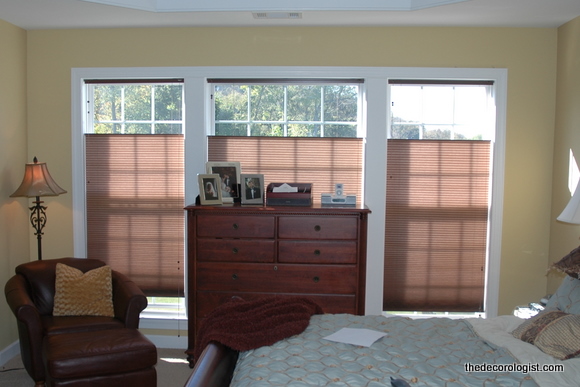
Her windows were outfitted with nice blinds that work really well with this type of window, but they still just felt unfinished. She had the idea of a valance in her mind, but I quickly talked her out of that. In most situations, valances look dated. Others may disagree, but that’s how I see it. I had another idea, which I’ll explain momentarily.
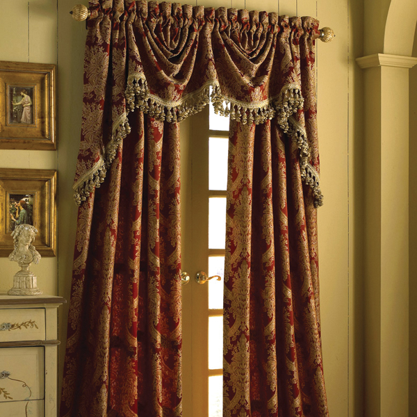
When the “neo-Victorian look” was popular 15-20 years ago, designers dressed windows like they were going to a grand ball. All the swags, valances, and festoons made it to where the window treatments demanded your attention when you walked in the room. All that fabric and fancy finishing made window treatments extremely expensive, and it had the effect of blocking all light into rooms – all that fabric could have been hung on a windowless wall for all you knew, it covered so much of the window! There are still a lot of those neo-Victorian styles in many stores and many, many homes.

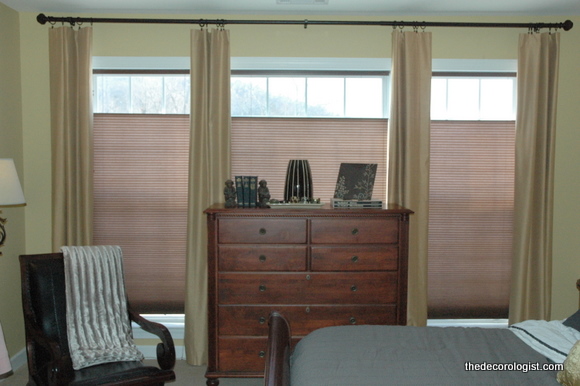
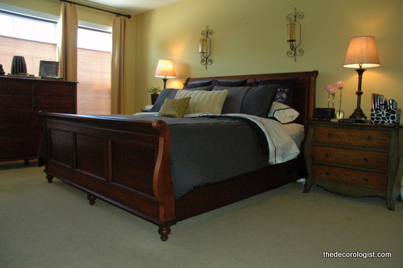
Rather than putting the emphasis on the overabundance of fabric around them, I prefer to put the focus on the windows themselves and the view beyond. Since we were going for a sophisticated and peaceful effect in my client’s bedroom, I suggested she hang 4 panels in a similar color as the wall color. Using panels that are the wall color or a slightly lighter or darker version of it puts the emphasis on the window, not the color of the window treatment.
Also notice how the panels were hung – as high above the windows as possible and several inches out either side. That way they let in more light when they are open – if you mount them on the edge of the window frame, even when they are open they block a significant portion of the window itself. Mounting them high above the window actually makes the window look larger, more grand, more significant. It’s an elegant look, without being showy.
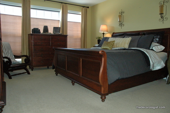
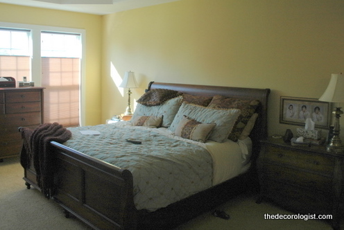
Let’s take a look at the before and after. Here’s the before:
You’ll see there are a couple of other changes in the “after” – like darker, more sophisticated bedding and more current lamps. There will be a lovely piece of art above the bed once it is stretched on a frame. It really does feel like a luxury hotel suite, don’t you think?
Again, the windows before:
And after:
If you think about the ballgowns that were popular in the 80’s and 90’s, they were all poufy sleeves and padded shoulders. Now the look is more streamlined and flowing, bringing out the beauty of the woman wearing it. So the focus is on the woman’s body, not the dress she’s wearing. In the same way, I try to put the focus on the architecture (the windows) rather than on the window treatments. Do you agree or no?




the only thing I don’t like is that the dresser blocks a good part of the windows….
you’re right, of course – but there is simply no other place for the tall dresser to go – there’s a huge armoire (with tv) on the wall opposite the bed, and the dresser is too tall to use in place of one of the bedside tables. sometimes, you do the best you can with what you have 🙂
Hi Kristie, Great post! I couldn’t agree with you more. I still have some outdated swags on my website that just have to go. The opulence look is finally out of style. There also seems to be an abundance of just plain white panels with color banding or trim. Very fresh!
Kristie…..I have yet to see anything you have done that I didn’t like. You truly have a gift and know how to use it.
you are very kind to say that, karen! thank you so much 🙂
Beautiful!!! Where do you get lamps like that? And what should a person expect to pay? I love the pieces above the bed and the beautiful bedding too! Way to go!
thanks allison – Home Goods is the best place I’ve found for lamps (do you have one in Alabama?) TJ Maxx, Marshalls, and Target are also good places to look. $40-$50 each, typically.
I am always amazed at how you can take a room that already looks pretty good and transform it so dramatically.
Speaking of bedrooms – how can we make our beds feel as luxurious as the swanky hotels? Their mattresses and pillows not only look good but feel good.
here’s a secret: in really nice hotels, they put an extra sheet on TOP of the blanket, below the duvet. i have no idea why this is so, but it feels so posh! and good down blend pillows will help, too 🙂
The first thing that came to mind was the dresser like Dianne said. But then I see where you answered that. (it won’t fit against that wall where that leather chair is?) I still like the look of a clean straight line valance, but I totally agree with you on the ball gown look! What a great description! Glad to see that trend go away.
stephanie, about the dresser – since there is a huge armoire across from the bed, it is right next to that chair you see in the photo. not only is there not enough room for the dresser there in the corner, but i really hate the look of two wood pieces side by side in a bedroom. we had toyed with the idea of the bed in front of the windows – i actually really like the way that looks most of the time – but the room isn’t wide enough to get the armoire and dresser on opposite walls in that configuration – and the tv wouldn’t be very visible from the bed. thanks for your comment! 🙂
I’m an interior decorator and also use this method frequently to frame windows and views . Yay to more light and simpler window dressing! Thank goodness the puffy, overdone look is out…at least for now 🙂
I agree that less is more when it comes to curtains. I never liked the poofy, draped, heavily tassled look for curtains in the 90’s. I’m glad that these days, people are choosing light fabrics and simple lines. You really added some style to that room!
thanks, kelley! your drawings are really amazing, by the way – what a gift to have that kind of talent 🙂
Lovely transformation! As for your request for comments on the drapes… My concern is that the trend will be reversing to more full drapes very soon… I’d like to see a slightly more fuller panel so they will look current longer. I’m not a trained decorator… just very passionate about home decor and helping friends and family with my ideas. 🙂
Sheryl,
I’d like to see fuller panels, as well, just not too overwhelming. In fact, I usually advise clients to do 2 panels on either side to get more volume – it just looks more high-end to me when they are nice and full. Thanks for your input to the discussion 🙂
I’ve seen your recommendations for lamps at Home Goods (that is where I got mine!), but was wondering if you have a similar go-to store for quality window treatments? Any thoughts on a thinner more sheer drape versus thicker lined drapes? Thanks!!
Susan,
Choices are really limited for off-the-rack quality window treatments. Ballard Designs, Pottery Barn, West Elm, and Urban Outfitters are good options, but the variety is limited!
I have Trey ceilings in my bedroom and don’t know how high to hang my curtains. Should they be hung near the ceiling?
Yes – in most cases, it’s best to hang the curtain rod about 2 inches from the ceiling.
I love your advice on hanging curtains, it is hard to find advice on hanging curtains in rooms with different dimensions. I have a dilemma in my dining room that has 12 foot ceilings. The top of the window is at 8 ft. This leave about 4ft from the top of the window to the bottom of the crown moulding. The windows have blinds so the there will only be decorative panels on the sides. It seems too high to put the curtains at the ceiling, right above the window seems too low. Is there an in between?
Mindy,
I wouldn’t take curtains all the way up in your situation – maybe just a foot or so above the windows. More important is to mount the rods as far into the corners as possible, so that the curtains (when open) won’t block your light from these windows. And it looks like you need 3 panels – one for the middle and one for each furthest side of the windows.
Thank you so much. I am excited to hang the curtains with confidence now, not questioning myself. Looking forward to reading more of your posts.