 |
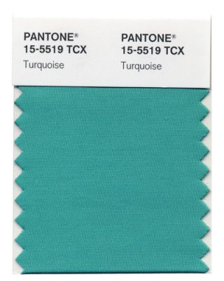
This lovely turquoise color is Pantone’s color pick of the year for 2010. What is Pantone, you ask? Pantone is a longtime sage of the color spectrum. The company creates standardized color palettes used in the design, graphics, cosmetics and fashion industries. Every year, the Color Institute forecasts color trends that tint our everyday lives. The hue of the year is a jewel-like blue with a good dose of green. Look how nicely it matches my blog! |
Pantone says this color combines “the serene qualities of blue and the invigorating aspects of green.” Inspired by both water and sky, it emotionally represents a comforting escape. This color appeals to both men and women and is flattering to just about everyone. This turquoise has both warm and cool undertones, so it pairs nicely with browns and neutrals, is a good compliment to reds/pinks, and livens up other greens. Pantone believes it will be “especially trend-setting with yellow-greens.” This color wasn’t chosen on a whim. The Color Institute team travels around the world analyzing colors in different kinds of contexts, studying consumer psychology, and hitting trade shows. They honed in on several blue and green shades. The winning turquoise represents the best of these broader trends.
| Style List says that blue as long been considered America’s favorite color. And this shade is one of the brightest, cheeriest shades in the blue family. “The current popularity of zingy colors breaks with the old belief that economically rough times call for soft, neutral hues.” | 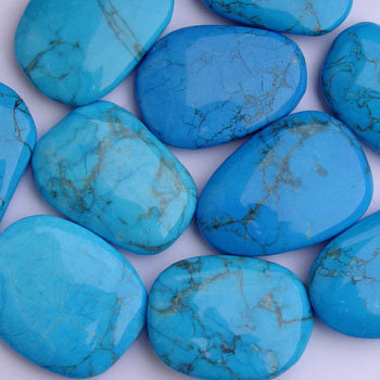 |
The largest advertisement agency in the country, JWT backs this development, too. Ann Mack is the director of trendspotting for JWT, the largest advertisement agency in the country. She predicts: “Saturated carnival colors — blues, oranges, greens and yellows — will replace 2009’s paler palette; think Cirque du Soleil and Alice in Wonderland.” Hmmm, harkens back to my Fall Color Forecast . . .
 |
I love this color but, frankly, I was a little surprised at their choice. I mean, this color has been on-trend for quite some time. It reminds you of the Tiffany Box blue, doesn’t it? Remember my post earlier in the fall: Color Therapy – Peacock Blue? Very similar, just a little more green in Pantone’s pick. |
I guess that’s a good thing – no huge seismic shift in a popular color means that design/fashion’s love of blue is not wearing thin. I use so much blue in the color palettes I create for clients, so it’s an affirmation of recent choices – although I think I’ll mainly stick to gray-blues, robin’s egg, and peacock.
What do you think about Pantone’s 2010’s Color of the Year?
.

I guess I am a trend-setter too since I painted my kitchen and bedroom Pantone!! love it
Do you even need to ask how I feel about this color? But, I thought the same thing — it’s been everywhere for so long….I keep anticipating it’s fading away. I’m a little surprised! Somehow I am always amazed at the brown/aqua combos that keep showing up in prepackaged comforter sets, rugs — you know, in big box retailers. Major burnout on the brown/turquoise.
Love it! Crate and Barrel had it everywhere in their spring catalog. I prefer peacock blue because it looks more sophisticated, but its still a gorgeous color that lends itself to many design schemes: preppy, contemporary, global, etc.
I agree with Andrea. Although this is one of my personal fav. colors and love to wear it. ( trend or no trend).
I am tired of the way it is used as a trend instead of just working it into good design. I also thought the pastel trend would last longer. oh well. we shall see?
I’m with you, Heather. It’s just a good color, not a trend anymore! And I really like taking a pastel base of colors and adding in a few of the punchier “circus” colors to liven things up. I’m not giving up on my pastels!
My husband has almost put a no-more-turquoise edict over our house. Whatever will I do then??!!
Andrea, there’s only one thing you can do. Ignore him 🙂
I love this color!!!