Lately I can’t seem to get enough of inky, dreamy emerald green. It’s sophisticated and glamorous with white trim and fabulous art.
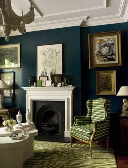
Jewel tones like emerald and jade can’t help but read dramatic in a glossy or lacquered finish.
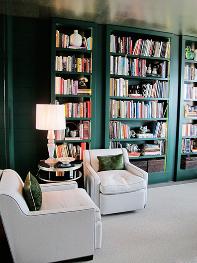
Recent Kipps Bay Showhouse – library by Jamie Drake
Maybe I’m loving it because it feels a bit Dorothy Draper – a nod to the late 40’s, maybe even the early 60’s. Gee, maybe it feels a bit like my other favorite Drapers: Don and Betty!
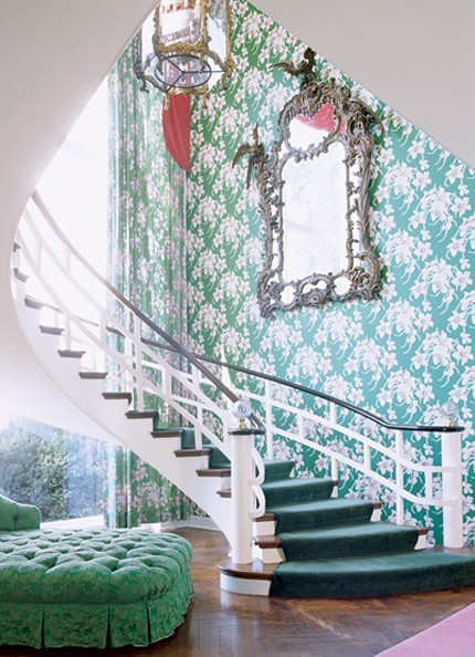
Hotel Lobby decorated by Dorothy Draper
I like teally-green and jewel tones paired with lighter greens, light blues, even reds or yellows.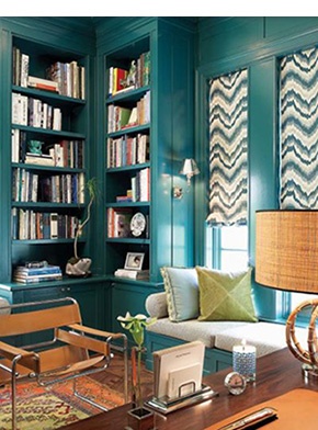
Emerald, jade, or kelly green are strong enough colors to act as a neutral – much the way we’ve seen navy doing lately.
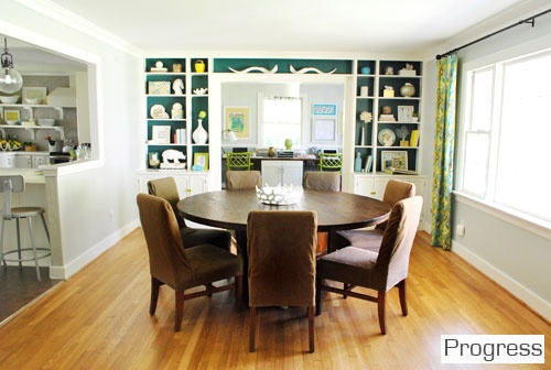
As a Nashville Color Consultant, I’ve been using lots of inky blues in the backs of bookcases – but I’m totally crushing on the emerald green backs of the bookcases featured on Young House Love.
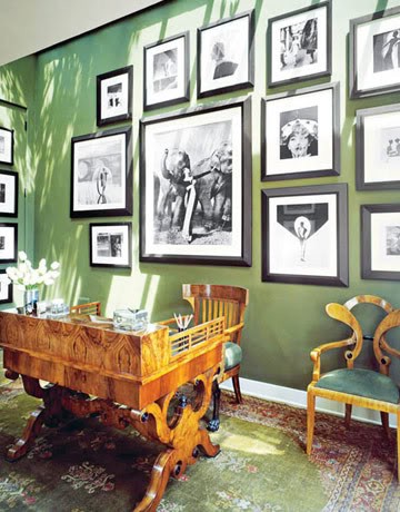
I helped a client choose a fabulous dark green for their family room last week, not dissimilar to the color on the walls below. What a striking backdrop for black and white photography or art.
If you haven’t yet, follow me on Pinterest to see what other colors are turning my head these days!







Hi Kristie,
I’ve hardly ever met a color I didn’t like! Being a person who loathes painting, I stick to lighter, neutral paint tones and accessorize with color. I also heard a designer say a few years ago, that colors that aren’t found in nature are the trendy ones we’ll tire of faster. What do you think?
Barbara,
That may be true about colors not found in nature. I certainly wouldn’t paint an open floor plan space in that dark of a green! But I love the idea of it in a dining room or library – or even a sunroom with tons of natural light.
I have been crushing on those bookcases from Young House Love for so long — I just can’t look at that photo enough times! 🙂
Beautiful color! I especially love that first picture. Gorgeous! The greens are getting stronger, don’t you agree?
Kelly,
Yes, they are definitely getting stronger – darker, and also in the edging away from the so-popular blues.
I have been reading your blog all night and love everything! I am looking for a paint color for my office at work, we have to use Sherwin Williams and I am wanting a rich dark green. I love the top 2 colors and would even be ok with something a little less blue/teal and a little more olive. Do you have any suggestions?
Hi there
What colour and company is this green please?
Many thanks
Jo