In my last post, I wrote about a recent Elle Decor article where high-end designers were deeming certain decor trends to be “so out.” I obviously disagreed with them and (judging from the unprecedented amount of responses from you guys) so did you! Several of you wanted to know what’s on the The Decorologist’s list of trends that should be thrown out the window.
In working with real clients in real homes, I don’t get bogged down in what design trend is hot or not. However, I am going to tell my clients if they have something going on in their home that makes it look “dated” and is holding them back from having a beautiful space. So here’s my top 5:
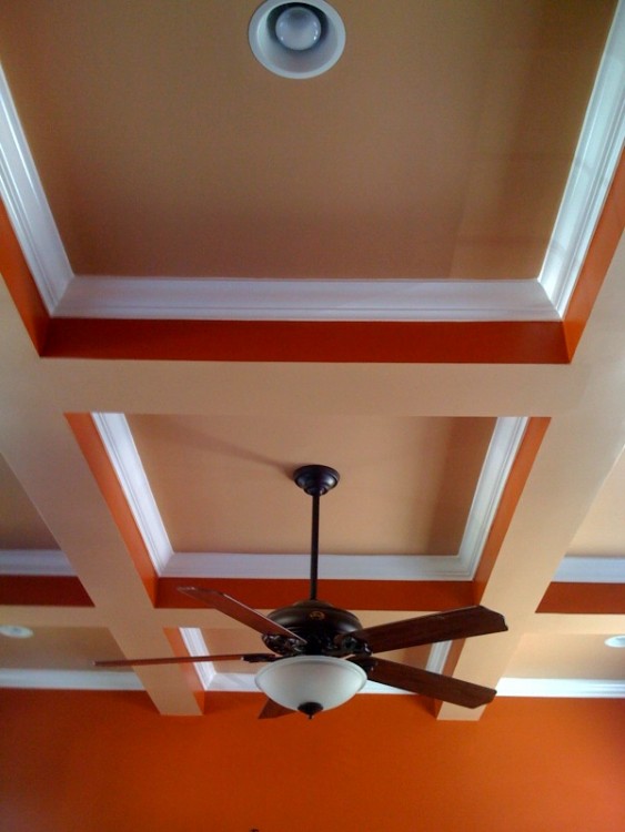
1. Tray and coffered ceilings with the banding painted in an accent color. When tray ceilings first became popular for dining rooms and bedrooms, multiple colors and contrasting banding were used to make people take notice of the trayed effect. That looks so dated now. It’s like, “Look at me! I’m a tray ceiling!!!” No duh.
source
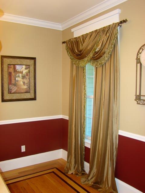
2. Accent or contrasting color under the chair rail. There are other options below the chair rail that I will expand on in a future post, but just know that if the wall above it is yellow you shouldn’t paint the wall below it red.
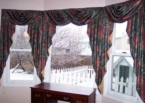
3. And that last picture reminds me: Windows wearing ballgowns. Festoons, jabots, valances, and all other fancy/puffy window treatments do nothing but block your light and make a scene. Elegant, simple panels highlight the view and your architecture, as window treatments should do.
I Really Hate Even Putting This on My Blog
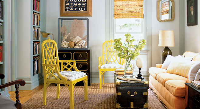
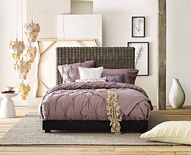
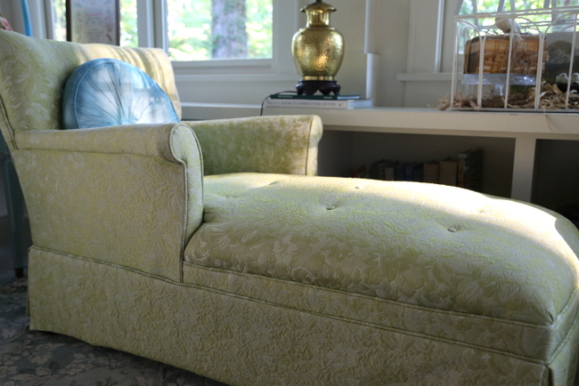
4. Matching sets of furniture. That goes for the living room combo: sofa/loveseat/chair with matching side tables + coffee table, all in the same style and wood finish. And that goes for the complete dining room or bedroom set. It’s just a lazy and uninspired look.
source
5. Unused or under-utilized spaces. No one needs three living areas or a dining room that is never used. Transform your unused space into a library or office – anything but leaving it utterly wasteful.
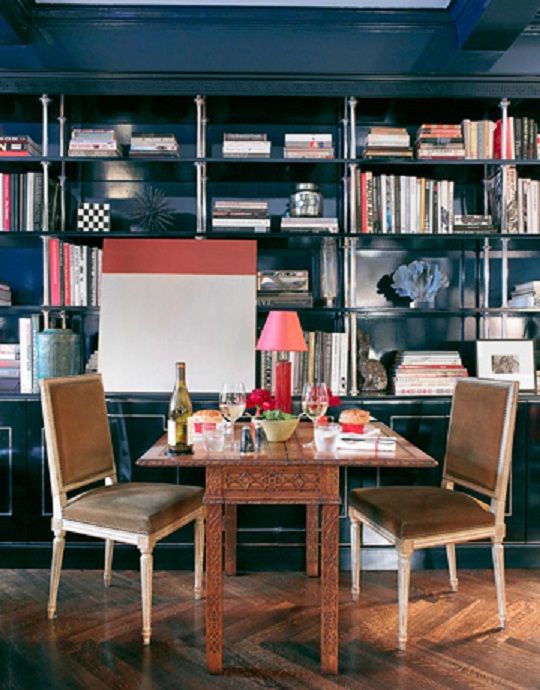
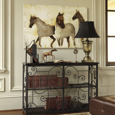
You didn’t hear me mention the owl trend, the horse trend, the antler trend, the words-as-decor trend. Because I will not be the one to walk into your home and say, “Oh, you must get rid of that horse art – it’s sooo Spring 2011”!
Those fun little trends aren’t what date your house and drag it down. Year-by-year, you don’t have to be on the cutting edge of design. But there are some important things you can do to stay in the current decade.
Now, do you agree or disagree with MY list?








Agree, agree, agree!!! Wonderful article, Kristie.
Great tips….but I know for a fact that you love OWLS! ha
i do love owls, and i’m not quite ready to give them up yet!
Well said!! Our real life clients need to be rescued from the 80’s but for goodness sake, let them hang on to last year’s purchases a bit longer:)
Carol,
Yes, there are definitely bigger fish to fry than last year’s antler trend!
I totally agree about the windows wearing ballgowns! I have never seen “tray” ceilings before, though, so I didn’t even know that was a trend!
what? you’ve never seen tray ceilings??? where do you live? the photo was actually of a coffered ceiling, but surely you’ve seen tray ceilings. google it!
I live in the SF Bay Area. Maybe it’s an East Coast thing?
have you seen tray things before in the east cost?then
It’s definitely a southern thing
I have a tray ceiling in my bedroom. What do you recommend doing with it. Obviously I can't get rid of it. Does this mean that it just needs painted the color of the molding that trims it? White like the ceiling?
I have an inverted tray ceiling at my friend Chuck’s home. The ceiling is ivory white, with 2’x2′ blocks hanging down separated by 6″ wide canals. No color variation. It’s the lighting that provides the variation, specially in daytime, by a bay window on the south side of the room. I tell you, it’s more appealing than normal tray ceilings. Rest of the room is decorated in the same way.
@Rhonda
I’d suggest you invest in the right kind of lighting. With the shadows in the right place, your simple-looking tray ceiling can bring out wonderful shades. As I said above, this works better if the whole thing is painted in the same white-ish color.
Everything rotates around your taste, though.
I never saw tray or coffered ceilings either until I moved to the South from the West Coast! We just had flat or vaulted ceilings, most without crown molding even. I personally like high ceilings that are not frayed or coffered still.
Well I was LMAO when you said you hated even showing those swags and jabots on your blog!! I make custom draperies, and I will tell you I made a ton of those back in the day. I just about only make panels or roman shades now. That is it! I had one client who insisted on the fussiest most complex window treatments and I delivered! Whatever makes your client happy, but that was after I told her “no one is really doing that anymore”….
well, i sure wish you were local, amy! i could definitely send you business, but only if you SWORE you wouldn’t do swags and festoons!
I totally agree. Our tray ceilings, or turtle back ceilings as my family calls them, were a dark dusty mauve when we moved in. They matched the paint below the chair rail too! I couldn’t paint it all white fast enough. Our house is only 12 years old. We moved in 5 years ago. Every wall, ceiling, and closet in our house was various shades of mauve….even the garage!
I’m still using my plain white swag valances in my olive green kitchen though. At least until I can find the right print for some long panels or install shutters.
Kristie, do you think the way pillows are creased in the middle by decorators makes a room look dated? I know it’s supposed to look inviting to sit down to a fluffed (pointy eared) karate chopped pillow, but come on, it’s so overdone! It doesn’t look very inviting to me to see a sofa full of pillows all lined up and pointed at the corners. 🙂
Rose,
Interesting you should bring up karate-chopped pillows! I have issues with those, too: https://thedecorologist.com/the-art-of-towel-folding-the-karate-chopped-pillow
I missed that post. Thanks for sharing!
You have said it so well about matching sets in any room! I always was turned off by that idea.
It makes me think of Motel 6 or something of that nature. “Lazy” is exactly right. Even bachelors
without artistic sense can collect things that they like and attempt to put them together in some fashion.
A little off the subject, but a former teacher remarked that it’s too bad that Art classes have been phased out of most public schools–they helped children learn to think outside the box and discover that there are other choices than the ones they can “click” on!
Glad to find your blog–just wanted you to know that it was via Maria Killam/Color Me happy !!!
Thanks for your comment, Paula! Glad to have you here 🙂
I do not mind matched sets of furniture as long as they are not overly ornate or people pull out one piece and add something eclectic to the mix. They can also do that though by using different and unexpected fabrics and colors. Adding ones personal collections and artwork can make matched suites of furniture not even that noticeable. And I don’t know of any public school that has phased out ALL art classes.
I completely agree with your list. The first two are what I deal with often, as a decorative painter. Usually, I’ll suggest that a client paint the vertical band around the tray to match the adjoining ceiling, and then I’ll do something cool inside the tray itself, depending on the house (I’ve done plastered “crocodile” textures, aged fresco murals, patina’d copper finishes…). And whenever possible I suggest they get rid of the chair rail altogether!
Old, dark, fussy Oriental rugs are also on my “that has to go” list. I love Oriental rugs, but I like them light and faded. Grandma’s navy-and-mauve rug… No!
Great post! 🙂
We don’t see a lot of coffered ceilings or chair rails in Australia, but totally agree with the overdone window treatments and matching furniture! The other trend that is (hopefully) dying here is the completed unrelated feature wall – the one where the homeowner really wants say blue but is afraid to paint all 4 walls so only paints 1. Colour blocking may be new to fashion but it’s always in with interiors!
Ah yes, the ever-popular accent wall! I previously posted about that very thing: https://thedecorologist.com/please-do-it-right-or-dont-do-it-at-all-the-accent-wall
Friends gave my kids a real honest to goodness moose antler they found on their property in N. Maine what should we do with it? Can you talk to my dh about the above/below paint situation? I am anxiously awaiting the followup blog on that one.
I like a lot of them on your list, and I kinda get the bit about the matchy-matchy furniture sets, but I have to admit that we are totally into the whole arts & crafts/mission/craftsman/bungalow thing, and so I have a lot of matchy-matchy, but I think that’s matchy-matchy with a plan! 😉
However, that said, it’s really too bad I live in a typical SoCal sort of spanish influence stucco tract house … but who cares, I’m surrounding myself with the things I love. It’s an eclectic vibe ;^)
And P.S. all of this explains why I am not a decorator at all and am probably in dire need of one.
Oh yes, your list is wonderful! When I was taking my classes recently, I can’t tell you how much red and golden yellow I saw – oh my gosh I think I might have been the only person not to think it looked good. Ok, maybe not the only one but one of few. You would think that the other students hadn’t picked up a shelter magazine in 5 years. And the matching sets, ahhhhh. And now that I’ve officially been caught by the design bug, it’s really challenging going into a home and not mentally planning out a new design in my head. And good tip on the tray ceiling too – I like that one.
LOL! Great post. I agree 100% with the windows, the yellow and red, matchy-match furniture. And the painted ceiling- ewww! Look at those window treatments! haha
Kristie, just wanted to compliment you on your fabulous blog and great common sense,I really enjoy reading your posts, I always can learn something new from them-last year, before I learned about you and Maria Killum, I totally updated my house, got rid of all my”collections” David Winter English Tudor houses, 100 different elephants,etc repainted, new furniture, everything was sleek,new beautiful, why is it only 9 months later and I am slowly updating my update? adding a tochske here and there-I think I have a TJMaxx,Marshall Home Goods store,Pier One addiction,i am putting myself in recovery, i just bundled all of my credit cards and hid them away, alas i am only going to read decorating blogs and magazines from now on,my life as a fake decorater is over-I have to stop the madness! I guess that is where overstyled homes gets its bad rap-I kinda miss my old crap!
oh kathi, thank you for sharing that with us – lots of people have that same struggle, not knowing what to keep and what to get rid of. getting rid of things is usually good, but not if you just fill your house back up with “stuff” again – especially stuff that doesn’t have meaning to you and doesn’t “stick.” thank you for reading and for your comment!
By the way, I am going to be painting a room with a chair rail soon, so I am going to waiting for that future post with bated breath!
I agree with you. The swags in your picture look sculpted and if people insist on having swags, my opinion is that they really should look as if there was so much material left over that the extra had to be looped round the curtain pole. Few people can afford this look which originated in grand English country houses, so you end up with mean, sculpted looking swags and tails that are pleated, and you can tell that fabric was skimped to save money. Simple is always best.
Question: would it be too trendy or is it already outdated to paint my front door black? If still ok, should it be glossy or semi-glossy? House is painted brick–light beige,gray with charcoal accents, old English style outside.
Having a slow day at work and reading through your entire blog. Love it!
Paula,
I think painting your front door black is a great idea – I’d do semi-gloss. Actually, I just had a client do all her interior doors black, and they look fabulous – so sophisticated!
Uh oh. I have matching bedroom pieces. One triple dresseron which lives a big screen TV and two high boy bureaus. I couldn’t help it. My beloved bought it the year before I moved in. It’s not going any where, ever, according to him. He’s adamant. What’s a girl to do?
Can you split up the set? I, too, hate to get rid of perfectly good furniture. Could one bureau go into a guest room? Could the dresser become a side board in your dining room? Is he willing to paint one?
My beloved’s style is completely different than mine – it is important to remember “people before things” and I try really hard to consider his opinion. Good luck to you!
have you done your promised post on chair rails yet? I don’t see it and would love to hear what you have to say. our bedroom is currently ivory, from the baseboards, walls, chair rail and ceilings. I have a lot of painting to do and it is pretty overwhelming!
Just found your gorgeous blog, and I am still laughing out loud about your not wanting to put the puffy window treatment photo on your blog. Ha, ha. I agree too, I prefer simple window treatments too!
I just want to add in here, though I know this is an old post, tray and coffered ceilings are NOT out, or a trend. I don’t think that is what she meant, I think she was pointing out the very dated way they are painted. Also, I completely agree with the window treatments, I want to gouge my eyeballs out with a fork every time I see a house with those awful window treatments!
Hi to all,
I just have to giggle about everyone’s “this is out and this is in posts”! Fact is we all love something different in varied combinations. You laugh at the Bishop Sleeve draperies, but soon if not already, plenty of people are hoping those drapery panels with the grommets would fall off the ends of the earth! The sleek ones and bold colors of the 60’s are coming back.
The truth is we all like different styles. Some of us like to follow trends and change our decor accordingly, some of us like to keep to the classics, some us love our interiors and do not ever want to change no matter what the “trends” are. It would be just wonderful if we all just follow our hearts, and not say “this is out and this is in” because we judge those who just love their “dated” decor. Who are we to critique what makes others feel good!
Excellent points, Rene!
Thank you for this very helpful post. I never realized how obnoxious those crazy ornate tray ceilings were and never gave it much thought until this post last year. It was memorable too btw “look I’m a tray ceiling!” I took a mental note for our own dining room and even showed my husband your post as backup. We just did Ben Moore’s pashmina, a moody, elegant greige in our DR on all walls, tray and ceiling. It looks fabulous, clean and simple, for now but we’ll add one layer of white semi-gloss crown on one of the tray levels in the future, but that will be it!
The only reason those designers say something is out is whatever is in they are either getting a great deal on, producing themselves or probably most likely they’re sick of it.
This is really good stuff. I have saved decades of design books from mainly Sunset Magazine. I love to pull out a kitchen or bath book from the 1970’s or 80’s to show a client what was hot then. 4×4 beige kitchen tile with brown grout.Ugh. Classic design is what I look for.
Completely agree, especially the dated window treatments!!!
Kristie,
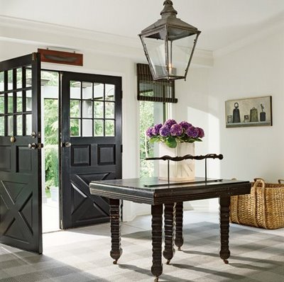
I’m almost 2 years late in seeing your blog, but got a huge kick out of the article! Karate-chop pillows hehe…I am desperately trying to find doors like those in your article at top (double doors with x pattern at bottom). Do you happen to have a source??
Want to know what drives me nuts about decorating a home? People who think their artwork needs to match the color of the decor. Artwork should be something you love, not bought to match the couch!
Holly
Amazing post! thanks for this blog…
It has been a couple of years now, and I agree with everything you said. but actually now is the time to buy a nice Ming horse or a wonderful original horse oil painting since people will get rid of the cheap ones and the expensive ones for about the same price. The best way to deal with those trends is to vowel not to follow ones that don’t fit into your personal ascetic. That is difficult for some people because they don’t understand their own taste so they think they hate things that are merely dated and love things that are merely trendy. I was that way for years but now I know my own taste now (that narrows the field) and I know my house that narrows the field even more. It is important to watch trends and edit the ones that won’t work immediately. Like when the west indies look was so hot I knew I couldn’t add it in so I kept elephants and monkeys out of my decorating. I never added owls either. And I didn’t do the words as decor either. I did add one majorella blue Ming horse, and I love it.
If horse pictures are out, why do all the home decor stores have tons of them? My husband wants to do Southwest. How can we leave out the horse? Are chair rails out with accent colors top and bottom? Should we paint the chair rail and do the wall all one color?