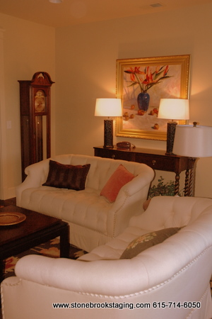
No, that previous picture was not a black and white photo! But it looks black and white when compared to the “after” picture. Cozy up your rooms by adding some warm colors like the chocolate brown and coral in this living space. Now there is just the right amount of contrast against the light walls and cream loveseats. What a difference this patterned rug made over the plain cream one that was here previously.
| Here’s the “before” of the room from another angle. The homeowners were having difficulty making their room come together – the furniture felt hodge-podge and the arrangement fell flat. |  |
What they needed was a fresh perspective and a new furniture arrangement to make the furnishings more cohesive and the room seem more welcoming. By floating two loveseats in the middle of the room, they can easily pass on either side to the kitchen or master bedroom. Seating is no longer lined up against the walls with a large path down the middle of the room and far from the entertainment center. The new arrangement makes this room feel more than a pass-through into other rooms – it’s now a cozy and welcoming destination.
Do you have an important room in your home that’s been treated like the least important? Maybe you should go shopping around the rest of your house like I did in this home. This was accomplished in a few hours and not one thing was purchased. If you need help warming up your house for the fall and you are in the Nashville area, schedule an appointment with StoneBrook Staging and Interior Styling before the holidays creep up on you!
.












Wow! big change for the better. That rug makes a huge difference. I love how you pulled out the corals.
That rug does it all — perfect against the dark floors. Not such a contrast as the light rug. What makes that work? Is the darker rug warming up the space by soaking in the light? Is the light rug not working because it is too reflective of the light and breaks up the space? Whatever the reason, what a difference!
Andrea, I think the previous rug did break up the space too much. The background color of the second rug kind of soaks into the dark wood floor, but the pattern really contrasts – so I think it’s that pattern that really works here. Plus, before the beige sofa sat on the beige carpet and against the beige wall. Now the 2 creamy sofas pop out from the dark beneath and are separated from the light walls by the dark sofa table and artwork. Now there’s a good mix of light and dark + color and pattern.
BRAVO!!! That was masterful!
Beautiful job, Kristie. You are so talented! Love that framed art!