For many years fashion has been a step ahead of home decor in regards to trends and colors. The big trends you see in fashion one year have often trickled down to the home decor market the following year. Over the last couple of years, the gap has been closing. Decor is now fast on the heels of fashion, sometimes walking side-by-side.
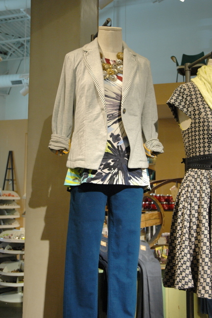 Anthropologie in Green Hills
As a Nashville Interior Decorator who specializes in color, I make it my mission to stay on top of trends so that my clients get the most up-to-date information I can provide about color and decor. I’ve been doing my research and want to share what I’ve found about the hottest trends in color for this fall.
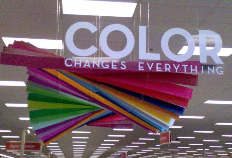
Emerald and Hunter Green will reign supreme this fall, in both fashion and decor. These greens are stately, elegant, and decidely more grown-up than the fresh yellow-greens we’ve grown used to seeing, although chartreuse and citron are still hot colors for fall.
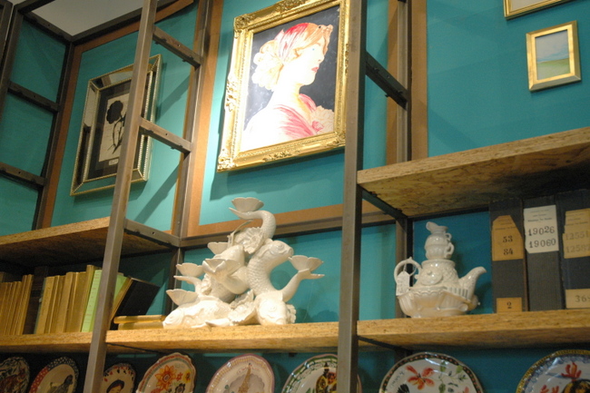
Emerald Green and Antique Gold in Anthropologie, Nashville
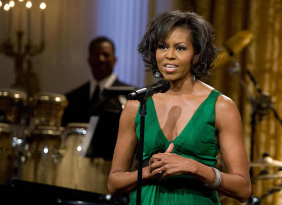
Michelle Obama wearing Emerald to Stevie Wonder concert at the White House
We’ve been so saturated with blues, aquas, and turquoises over the last few years, it’s natural that greens are making a comeback. But don’t count out the blues just yet – they are still a fan favorite and you’ll still see lots of new decor items in those colors, but they may be leaning a bit greener . . .
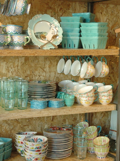
Anthropologie, Nashville
Mint green is the new turquoise. Think old hospital green – it’s fresh and happy, and is a fabulous backdrop to all the rich jewel tones that are gaining momentum this fall. And here’s a secret: all greens looks great together, so mix them like crazy! 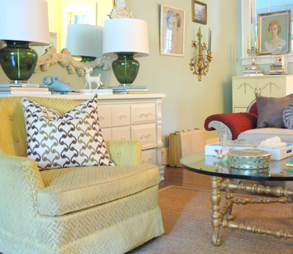
Minty Green Walls in The Decorologist‘s Living Room
I’m seeing lots of dark blues – navy, royal, and sapphire. I can’t tell you how many navy ceilings I’ve been specifying lately! And you’re seeing all the most fashionable ladies wearing it (thank you, Kate Middleton!).
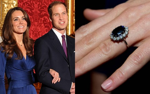
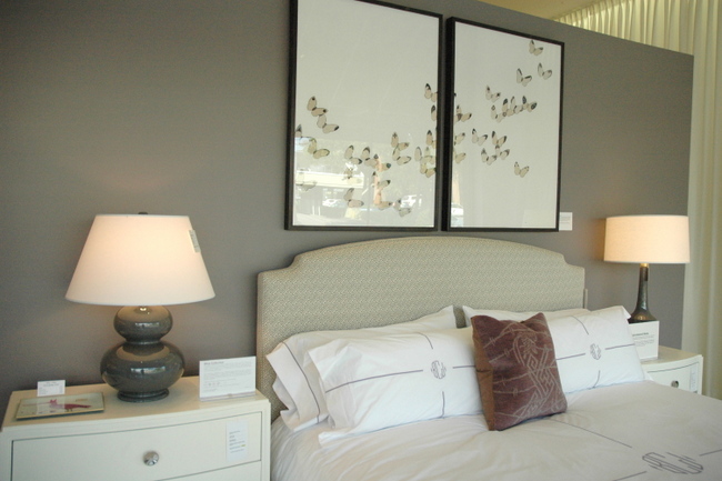
Speaking of royalty: aubergine, wine, and plum look regal and work beautifully with all the varying tones of grays. These are great colors in home decor this fall.
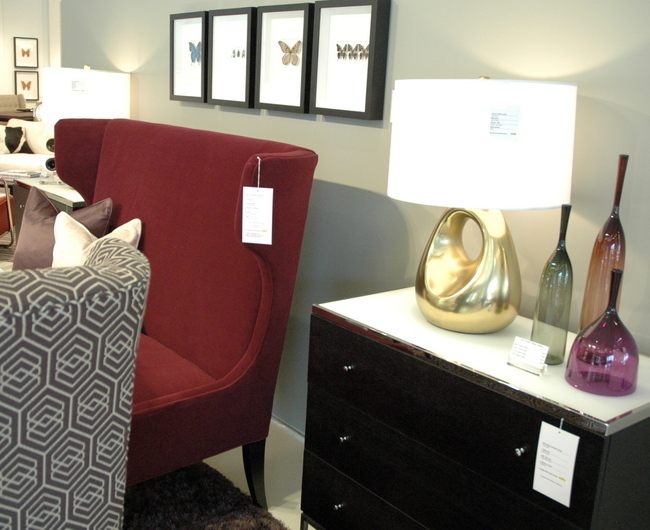
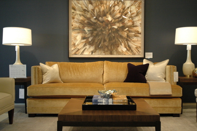
Mitchell Gold + Bob Williams
And speaking of grays – yes, gray is the new brown, but brown has not been banished. Browns and grays layered together are the hottest look in neutrals. Add wine and grayed lavenders for an on-trend color combination.
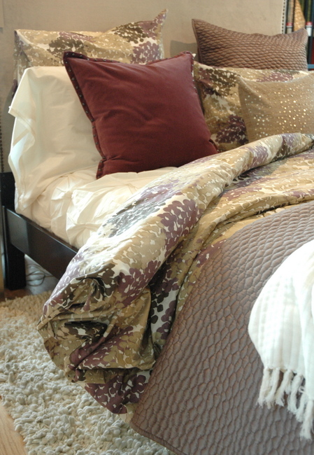
Wondering about metallic finishes? All things golden and gilt add grandeur to any interior, and certainly take center-stage this fall. Brushed, antiqued, and even polished gold are the hottest metal finishes going (thank you, Downton Abbey!).
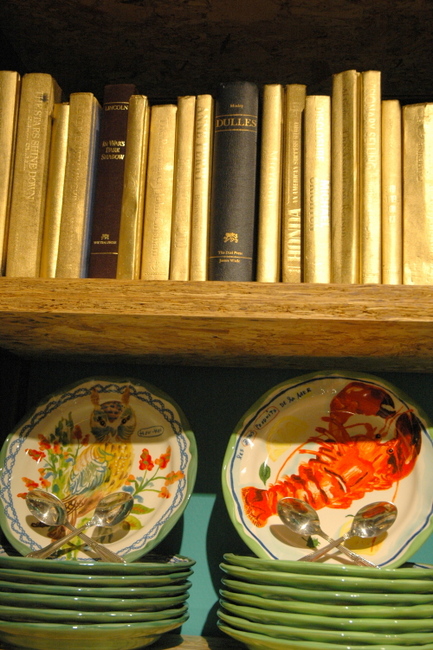
Gilded Books at Anthropologie
Mercury glass and polished nickel or chrome will be popular, particularly with the more contemporary set. Mixed metals in the same room is mainstream now – you’ll be behind the times if you are still insisting on the same metal finishes throughout your space.
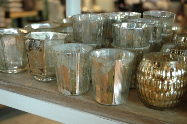
West Elm, Nashville
This fall’s yellows are less citrus and more golden. They pair well with the gray neutrals, as well as the popular navy and royal blues.
Forget the staid black or expresso leather. I’m seeing lots of leather at Mitchell + Gold in dark green, sapphire blue and navy, and dark plum – gorgeous!
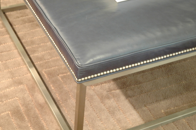
Navy Leather + Brushed Chrome
Camel and caramel is back. I knew they were was back in fashion, but I frankly was surprised to see them in home decor so soon. These lighter stains will become the popular go-to for leather furnishings as we move away from the expresso browns that have dominated the market.
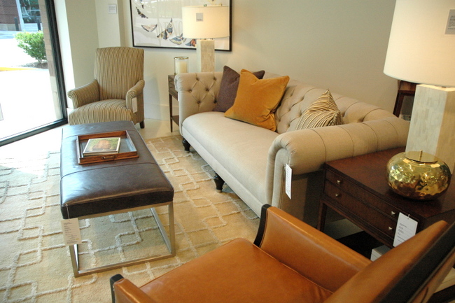
Caramel Leather at Mitchell Gold + Bob Williams
Although Tangerine Tango was named 2012’s Color of the Year by color giant, Pantone, the oranges we will be seeing this fall will be a bit more rusty and earthier.
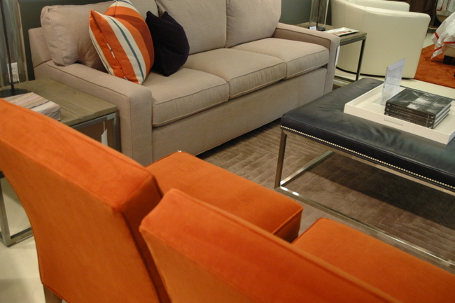
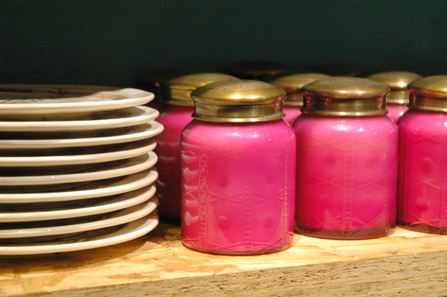
I’m happy to say I’m still seeing fuchsia and dark pinks as accents and in accessories, as well.
The biggest surprise to me was all the lighter grayed blues that are coming out in stores like West Elm. I’ve been specifying grayed blues for several years now and thought that trend would be ending, but not so! Light blues + grays spread over multiple displays throughout the store.
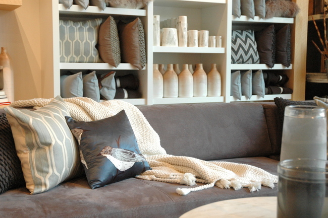
Light Blues + Gray in Nashville’s West Elm
So what do you think? Any surprises, or are these color trends what you expected? And what hues will you be gravitating towards this fall?
*This article was featured in Style Section of The Tennessean last Saturday. Make sure you look for The Decorologist there on Saturdays!



from my email:
“great post!
Love to see colour Trends.
I saw some gorgeous deep rich blue-green leather dining chairs at Pier 1 in Canada.
I told some pics on my cell phone but do not know how to load here.
Here is the link from their USA website with a picture of the colour but the true colour is much more blue-green.
http://www.pier1.com/Mason-Bonded-Leather-Dining-Chair—Teal/2536370,default,pd.html
Thanks for the greats posts, love reading them!
Julie”
What’s old is new again. It’s fun to see updated twists on colors making a comeback.
Yes Barbara, there are certainly lots of updated twists on those colors we’ve seen before – love it!
I love how you are able to summarize everything we see out there. It’s not always easy to wade through the sea of colour and see what is going to come out on top! Thanks for the great post Kristie!
This is a Fall trend I am happy about! I love all greens and the gold seems to warm everything up and gives it a cozier feel. Thanks, Kristie! xx, Julie (lots of “julie” readers today) 😉
Thanks for all the time spent sleuthing this stuff Kristie–it’s really interesting.
A trend I also see in fashion is the mix of super formal and casual….as in tuxedo pants and a soft flannel shirt & loose jacket. Always did like the masculine/feminine balance in both dressing and interior design. Jeans & a frilly shirt, etc. No more head-to-toe all one look —so much more interesting and creative. The super coid contemporary interiors need some softening up too! If money weren’t a restriction, I’d love to see some men’s suiting fabric (upholstered pieces) with lavish taffeta floor to ceiling drapes at my house–or anybody’s house!
I so agree with you about all of the blues! Especially navy- getting stonger because it looks so great with everything. Medium blues are also really stepping it up lately also. Great post!
I am loving the greens, plums and grays… I just thrifted an incredible Murano glass lamp in emerald green, and am now on the hunt for a tall, slender drum shade to DIY in, I’m thinking, a metallic gold of some kind. Yes, it’s definitely that kind of lamp 🙂
Thanks for an informative post. I’ve been loving all the purples out there. I never was a fan the first time around (was it the 80s?), but now I’d like to use it in my home.
Where can I find the print over the gold sofa at Mitchell Gold + Bob Williams? I looked at the website and it’s not there!