 I’ve been sworn to secrecy since early August, but it’s finally been announced: I’ve been chosen to be a part of the Design Bloggers Tour for High Point Market this fall! I’m so excited and honored to be part of this fabulous group: The High...
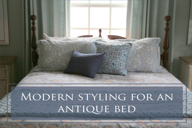 This is the third in a kind of series about decorating with an antique bed. The first was about putting away a bed that I had been sleeping in for 28 years to make way for a new one, the second was about transforming an antique bed with paint, and this one is about...
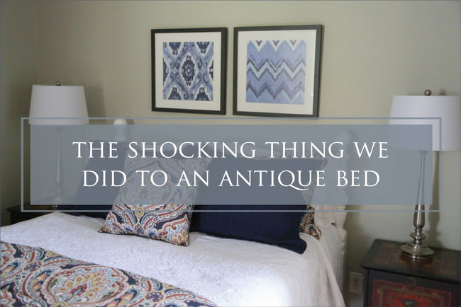 Last week I talked about getting rid of vintage furniture that you don’t love anymore, namely my own antique spindle bed. Some of you may have believed that I shouldn’t have parted with it. So, what can you do if you don’t want to part with your...
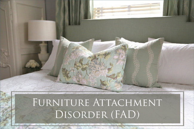 It seems as though every day we hear of new psychiatric and medical diagnoses. Have you heard about this one? It’s called Furniture Attachment Disorder (FAD), and it can really mess you up! I’ve worked with many clients over the years who have this...
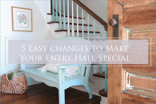 We all know how important first impressions are, but do you know what kind of impression your entry hall is making? When you’ve been living in a home for a while, you kinda go blind to its flaws. Walk through your front door and try to be objective. Is your...
Loading...