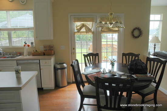
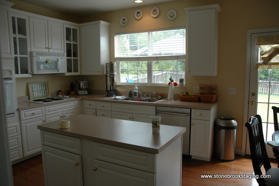
It’s “Before and After” time! This is one of my favorite kitchen updates. It started out nice enough: butter yellow walls, white cabinets and appliances, nice wood breakfast table.
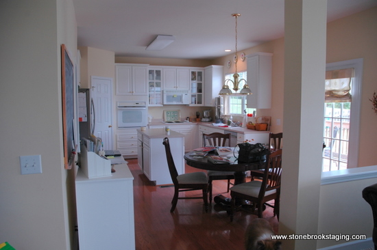
But my client wanted more – something updated, clean-lined, and welcoming. She was over the peely thermafoil cabinets, formica countertops, dated lighting, and lackluster color scheme. Before, it was a little bit country. Now, it’s a little bit rock-n-roll:
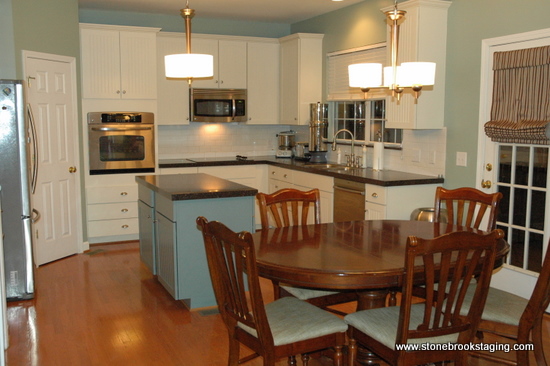
We traded the yellow wall color, the brass light fixtures, and the fussy window treatment . . .
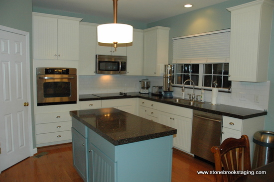
. . . for a soothing gray-green wall color with a deeper greenish-blue color on the island, on-trend brushed nickel light fixtures, and simple yet elegant window treatments.
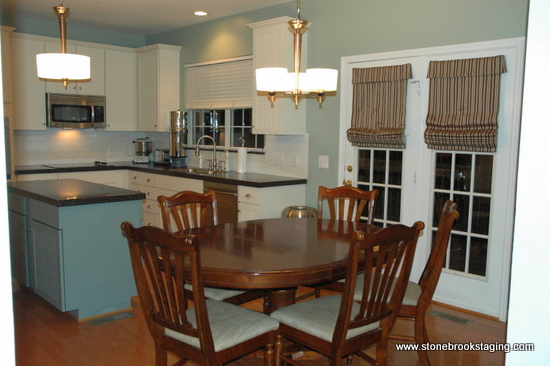
Where we saved money: scoring on-trend lighting, faucet, and stainless steel microwave on clearance from Lowe’s, choosing a black cooktop (rather than stainless steel) to blend right in with the new countertops, and installing inexpensive but timeless subway tile as a backsplash.
We also saved by maintaining the same cabinetry layout and simply refacing them with cottage details, and by keeping the existing breakfast room suite.
Are you ready for your own kitchen transformation? Helping you make cost-effective choices with a high-end result, StoneBrook Interior Styling will actually save you money. Click here to see what I can do for you.
.







love this. the before reminds me of my kitchen. i really like the bead board doors. ive never seen that before. so clever!
Looks great Kristie!
I love that the island has that deeper color…it’s visually heavier, bringing the eye there and grounding the whole space. Nice!
Can you speak about the subway tile? While a classic material, it has been fiercely in for so long. Aaaallll over all the design mags in every bathroom and kitchen, yet I never seem to tire of it. Will it be around for the long haul? I mean, as classic/ageless as marble counter tops???
Andrea, I do think subway tile is ageless and will be around for some time to come. It’s so reasonable in terms of cost, but always delivers a high-end look. I love when it’s run vertically rather than horizontally and when it’s accented with a few interesting glass tiles. I think we’ll soon be seeing more variety in the colors offered. If you think about it, square tiles have been in style for 70 years. It’s about time the rectangle takes center stage!
Beautiful, Kristie! You are GOOD!
This is so beautiful! I am so ready in my heart to change mine, but unfortunately my bank account always seems to hold me back.