Last winter, we undertook a remodel of the upstairs of our 75-year-old home.This involved gutting and reworking an impractical bathroom, removing walls, transforming an office into a bedroom, adding closets, opening up sight lines, and making better use of light and spaces.
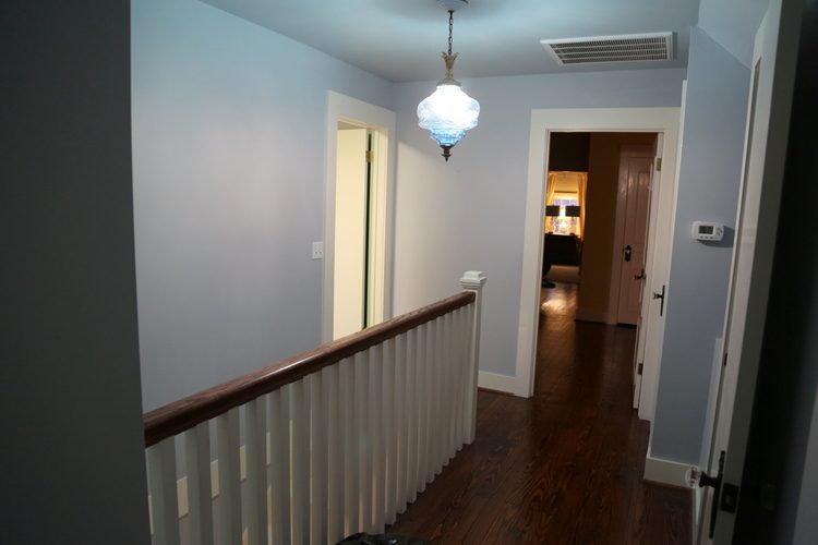
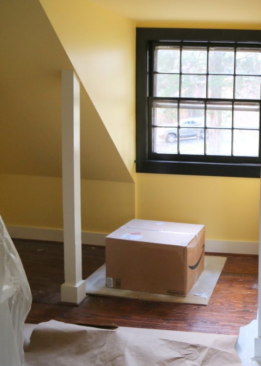
Our goals included brightening up the dark space and taking full advantage of every nook and cranny in the upstairs. This is a before photo taken from the entry of what was Mr. Man’s office, facing back towards my daughters’ rooms and the stairwell.
before
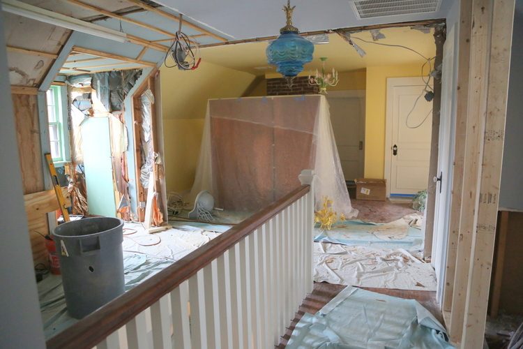
Multiple walls had been added throughout the history of the house, but we were unsure as to the original layout. Removing walls makes it a bit more clear, as the hardwood floor gives away clues.
in process
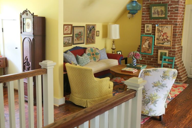
And the cool thing is, we found that the flooring went all the way through this area. This means that originally, this entire area was open and by removing the walls it’s much more like it was when the home was first built. There was an exposed brick chimney in the middle bedroom that I wanted to be visible throughout the space. Here’s the way it looks now:

Here is how the layout read from the top of the stairs before we began tearing out the walls. Our younger daughter’s room was to the right where you see the chandelier, and our older daughter’s room is beyond that. They didn’t seem to mind having the “pass-through” bedroom situation, but it wasn’t ideal. The room you see to the right was a skinny, long storage area. It had two windows, but the light from them didn’t really reach the hall (especially when it was full of junk and I had to keep the door closed).
before
Now what was previously a pass-through bedroom is an open den space for the girls. Removing the walls resulted in light flooding in from areas previously closed in by walls that chopped it into a rabbit warren of small rooms. Did you know that yellow is the only paint color that brightens up a space that doesn’t get a lot of natural lighting? That’s why I consider it for basements and other rooms with few windows.
Benjamin Moore Hawthorne Yellow HC-4
This was the former bedroom after we cleared out the majority of the furnishings, from the front dormer of the room facing towards the back of the house:
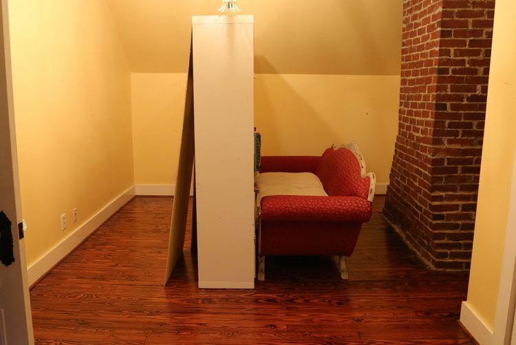
before
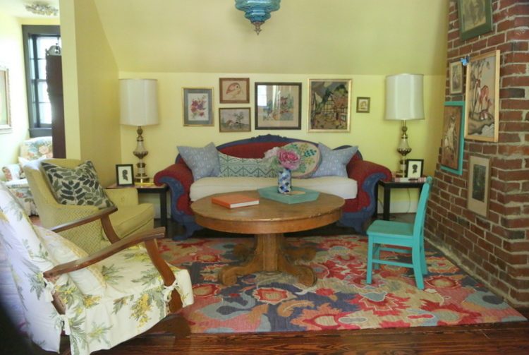
And here it is now. This is a very happy place for the girls to hang out. They both like a bohemian look, so this is a pretty good mix of that and vintage (most of which we already had). One thing I have to mention: it was very difficult for me to take photographs where the yellow walls (Benjamin Moore Hawthorne Yellow) read accurately. I don’t feel like the wall color reads in photos like it does when you are in the space. It’s a bright sunshine yellow, but it is not as lemony as it looks in some of these photos. I like having my grandmother’s sofa nestled in on the wall that’s slanted. Painting the slant and the ceiling white would have made the space look so much smaller, so I chose to wrap the Hawthorne Yellow on the ceiling as well. NOTE: I would NOT use this color in a staging project. This is a very taste-specific color, and a taste-specific space. This is our “forever house,” so I can do anything I want!
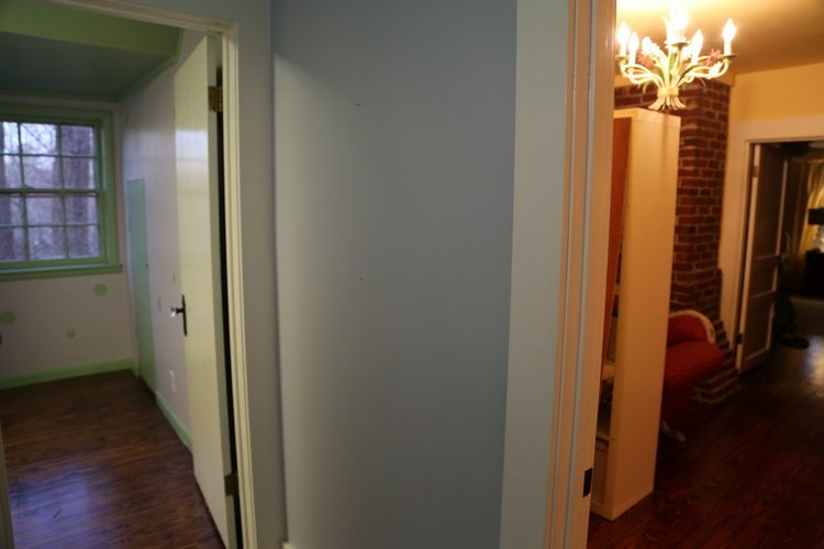
This was the room where you can see the walls that were recently removed:
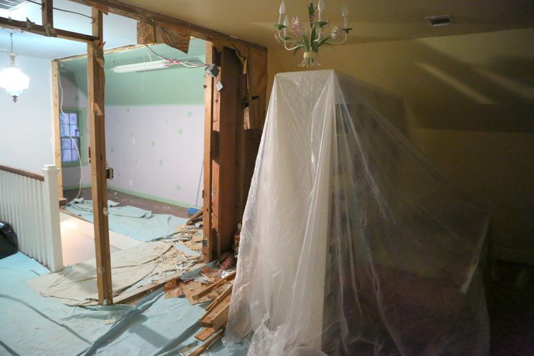
during
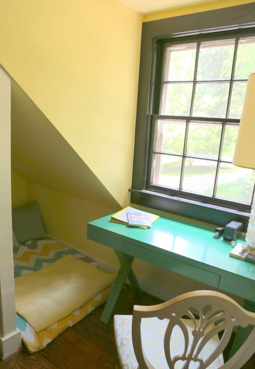
And here you can see how it flows to the bookcases in the area that was previously a closed-off storage area. There’s a desk beyond the bookcase under the window there where one of the girls does her homework.
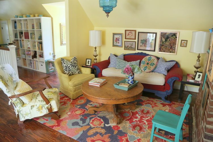
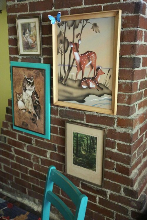
This exposed chimney stayed as it was when we moved in 15 years ago. I only added a grouping of vintage animal art, which the girls love.
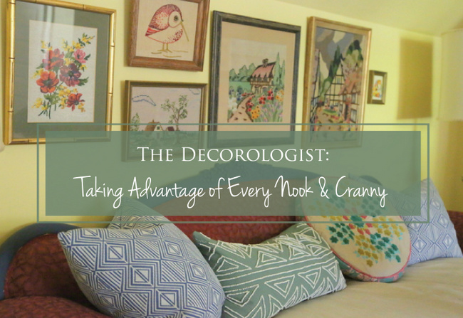
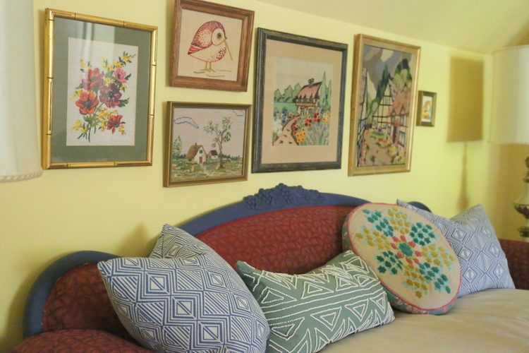
And here’s one of my favorite things about the space – a collection of embroidery and crewel art, most of which I have gathered over the summer at estate and barn sales. The costs for these range from $1 to $30 each. One of the lovely larger pieces was a gift from a friend that knew I love these.
Opposite the sofa is a dormer on the front of the house. I painted all the windows and window trim in this area black, which draws the eye outside.
The front dormer serves as a homework area for my younger girl, as well as a cozy hide-away nook below a slanted wall, fit with it’s own sconce for reading.
If you missed the rest of the upstairs remodel, you can check out the fabulous emerald green bathroom here, the storybook bedroom here, and the library nook here.
Make sure to follow me on Facebook so you can participate in naming the new paint colors I’ve chosen for LP SmartSide‘s exterior building products!
If you are a professional Home Stager or Realtor, check out my NEW product that will take you from listed to sold!!!


This is really sweet. Love colors and textures. I want to curl up and read a book there. That chandelier is special.
Great work and design
Thank you very much, Kathleen. It is happy and cozy – we all love spending time up there!
Your upstairs is a beautiful and well thought out space for your girls, and has your love and heart for them in every nook and cranny:)) It’s even more beautiful in person- and I could tell how proud they are of their space by the smiles on their faces. 🙂
Thank you, Elizabeth! And I love the embroidered art you gave me! The girls really do love the space, and it finally feels like the way it should be for the sake of the house. 🙂
Beautiful. I especially love your gallery wall of embroidery and crewel art, I want that owl! Great job Kristie!
I love everything you do. Have been following you for a long time, and wish you could “do” my home.
I love this space. It’s totally the kind of area I would happily spend hours in. Yellow is my favorite wall color. Love your vintage art display and that you hung pieces on the brick chimney. Awesome!
Thank you, Donna!
LOVE! I’m thinking of going with this yellow for my family room and kitchen. It feels like a departure for me in terms of color choices, but I have an eclectic decorating style and lots of colorful artwork. I live in a foresty neighborhood in the Pacific Northwest and my family room/ kitchen area gets very little light. Another consideration is that I have to pick a color that goes with my beige/ brown granite kitchen counters, beige marble around the fireplace, and ashy brown wood grain laminate flooring. Hawthorne yellow is surprisingly good with all of the beiges and tans. Also, I wouldn’t have to change the trim color around the windows and the fireplace mantel which is sort of a warm ivory. Your blog has inspired me to go with this color! Love your style and creativity
Thank you so much, Ingrid! If you have a lot of tans and beiges, you may want to consider a slightly warmer yellow – take a look at Benjamin Moore Dunmore Cream. It’s also in the historic color collection, like Hawthorne Yellow. Best of luck!!
I painted my living room walls Hawthorn Yellow… most of the time I love it! But sometimes I wonder if I should have chosen something a little more neutral. Especially when I scroll through pinterest and everything is white white white lol
Love the rug. Can you tell me where you got it?