There are several different ways to go about choosing a color palette for your home, but I find many people need help figuring out how to incorporate varying colors and still get “flow.”
Flow just refers to how the colors transition as you walk from room to room, without seeming jarring or surprising (in a bad way). Some people who want their rooms to flow get overwhelmed and just pick a neutral and paint all the rooms the same color.
Tsk, tsk. You can be more creative than that! Here is my formula for creating a color palette that provides both variation and a pleasing flow of color:
- Start with 3 color families that you like plus a neutral white/off-white. Now, decide which of the 3 colors are your favorite – that’s your living room color.
- Determine how light or dark you’d like your colors to be. This will affect the overall feeling of your home – peaceful, happy, dramatic, cozy, whatever you are going for.
- From each of those 3 color families, choose a specific color that is similar in intensity – so you will either have 3 lighter colors, 3 medium colors, or 3 darker colors.
- Now choose a neutral white/off-white that looks good with all 3 colors. Watch out that the undertones work with all 3 colors!
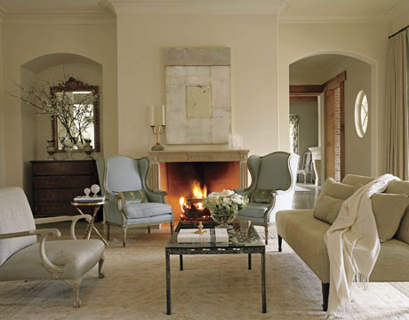
- Use these colors in different combinations and applications throughout the main living areas of your home.
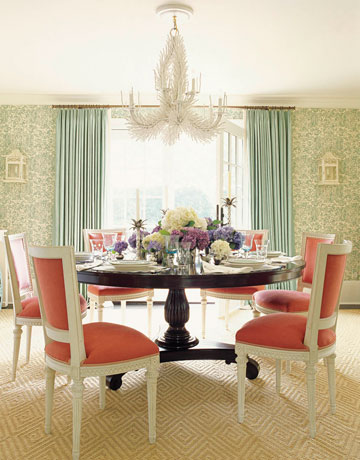
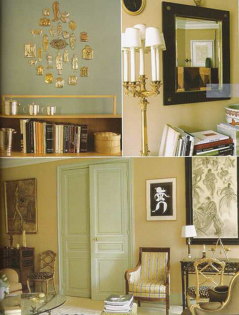
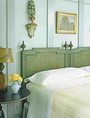
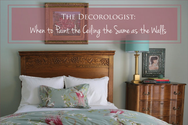
Let’s say we choose light versions of green, yellow, and blue. In one room, you might do walls in the first color (green) and white trim. In the next, you do walls in the second color (yellow) with green trim or ceiling.
You add in the third color (blue) in yet another room, but use accents of the first two colors (green and yellow).
Some rooms may be just one of the colors (yellow) and white. 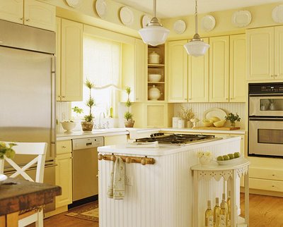
And one might be primarily white with accents of two of the other colors (blue and green).
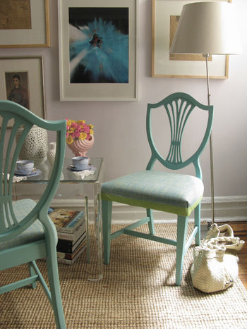
In this way, you can achieve an overall sense of flow throughout your home without becoming bored with look-alike rooms. If you need professional help establishing your own color palette, contact a trained Color Expert like The Decorologist to help you create flow in your home. Admitting you need help is the first step in transforming your homelife!
Photo Credits: House Beautiful, Flickr (xJavierx photostream)2,3,4,6, Shop Online 2011.






I’m so happy that I found your blog now before I move. It is exactly what I’ve been looking for and believe me, I’ve looked at A LOT. Especially when it comes to blogs, LOL!
Relatable Style
good job.I love this.it makes me calm & relax.
Great post.. So many people need help with color flow and this explains it perfectly.
Kristie has been a godsend for me in figuring out my color palette and creating flow in my house… all paint colors have been selected and painting is starting! i am so excited to see the final product! i was lost without her.
Awww, Alison, what a nice thing to say! I think it’s going to be fabulous – can’t wait to see how your colors turn out! (FYI – Alison is an on-line, long-distance color client.)
It’s always nice to have a few “rules” to help. Choosing colors is especially challenging when you have an open floor plan, this is a great way to get a person started.
If I were a Teenage Mutant Ninja Turtle, now I’d say “Koauwbgna, dude!”
Great tutorial as always Kristie! Question for you: my challenge coming up is a client wanting to replace the ’80s flourescent lighting in the drop box over their island… do you know ‘the look’ 😉 ? It’s the only lighting in her kitchen and she doesn’t want to sacrifice the ‘illumination’ as she put it. She’s not into sparkly chandeliers, but seems open to almost anything else. I’m going to see her space on Tuesday, but my question for you is do you have a personal favorite for this type of lighting replacement? Just curious on what your take would be to modernize without selecting something that is going to date itself too quickly… and, she’s quite conservative!
what about an iron-type option? ballard designs and even lowe’s have some good options outisde of chandeliers and boob lights. if it’s over an island, you don’t have to be as concerned about ceiling height, so you can get out of the flush and semi-flush mount range of lighting.
Love how you explain everything so well!
Another great post! Thanks for sharing this with my readers at Fab Friday!
Warmly, Michelle
Good advice. It’s so hard for me to narrow down what I like!! But this makes me feel like I can use more color and still get a nice flow. Thanks. You have all sorts of great tips and advice throughout your blog. Looking forward to reading more…
Hi Kristie, Thanks so much for linking up another great post to Fab Friday. You write such great stuff – I could feature you every time! Love that yellow kitchen, BTW.
Warmly, Michelle
thank you, michelle – you are precious 🙂
Wow….I LOVE your style of decorating, soothing colors and rooms that make you say “Ahhhh..I want to be there’! I first was introduced to you in the gatherings magazine and definitely will be a continued follower, looking forward with expectation of sure delights and inspiration. I love your rooms and colors used in the gathering magazine and especially fell in love with the rug you have under the dining room table. Is there any way that you can direct me to where I may purchase the same one? Thank you for bringing a ray of sunshine into my day!
Thank you so much, Bridget! If you mean the floral wool rug in my own dining room, I found that at an estate sale in a grand old home about 14 years ago. It was originally a 12×15 size that was wall-to-wall in the home’s dining room. I cut it into 2 so I could use one in the dining room and one in my enclosed sleeping porch. I dearly love it and have never seen another one like it.
Hi. Thank you for the incredible helpful tips as to how to go about approaching the daunting task of choosing colors. I have been living with swatches on the walls for far too long. Do you by any chance know the name of the color used in the yellow and white kitchen? If not, do you off hand know of one that is incredibly similar? Thank you. One more question. If one is to purchase a gift card for an e-mail/online customer, what is the wait time before booking their appointment? Looking forward to answers to both of my questions. Thanks….
Great post! I’ve never seen it so well put. Question: Can you use lighter hues of your color palette in the rest of the house if your great room in a darker hue? In our case, we had all this gorgeous pine ceiling paneling and trim. So we went with a mustard yellow, deep red, and medium-dark blue. Those are great colors, but I really, really like a lighter blue or lighter yellow with white trim. Does changing hues mess up the flow? Is there a way to lessen any jarring that might occur switching between hues?
Thanks! ~Erin
Great post! Been reading a lot about choosing colors for my home. Thanks for the info here!
I have all dark furniture and love dramtic walls but it seems so dark in a townhome that is shaded lots by trees. I don’t care for white walls but have lots of white trim, crown molding, kitchen cabinets, and stairway as well. I like neutral colors as well, no blues, yellows, puples or gray and especially no reds. I see homes I like with taupe and khaki tones and love them but not sure it’s too much for my furniture, and open concept areas with high ceilings. I do like the flow of 3 colors combined. I do use that method..any advice would be appreciated. I go for more of the elegant sophisticated look, mainly traditional. In that I mean I accessorize with some pottery, vases, that tend to be more comtemporary perhaps. I do have my office painted a deep teal that almost has a warm undertone… Thanks