| Last weekend, I went with the family to see Tim Burton’s Alice in Wonderland. It was a visual feast! The colors, the scenery, the clothes, and ideas – I was completely enchanted by it. I have no doubt this film is already influencing tastemakers and trendsetters everywhere. | 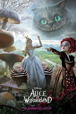 |
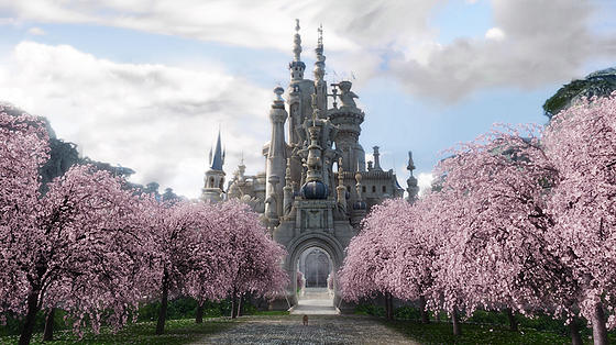
The colors were fabulous – if you love the vintage Alice, be assured this rendition stayed true to the blue. Alice’s blue dress, that is. That gorgeous peacock blue permeated this film. And I saw lots of lavenders with the blues, which I’ve talked about here.
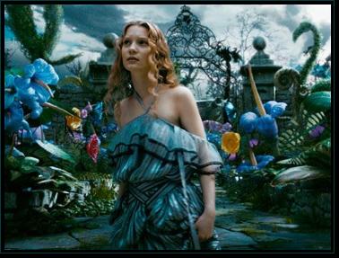
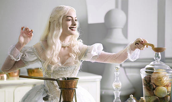
Metallics and grays kept the gay colors from being too childish. The creamy, off-white of the White Queen was set against those dark eyes, brows, lips, and nails. Dramatic, unexpected and fabulous!
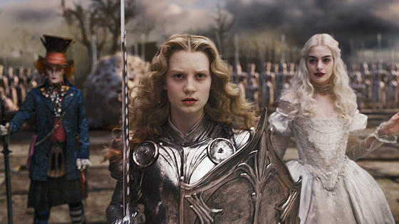
Could we call this Biker Glam? Hints of that white-hot decor trend weve talked about, Rustic Glamour . . .
Lots of toadstools – I predict the continued revival of that 70’s mushroom craze, but in regal colors rather than the drab of that previous era.
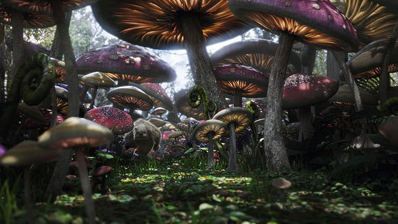
I think these toadstools may inspire some dreamy lamps!
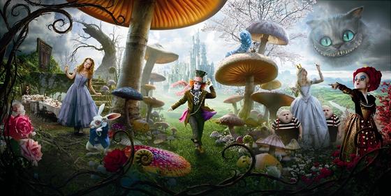
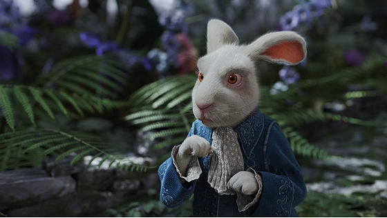
I love all the gray with the pinks of the rabbit’s ears! Pink/gray is the new pink/brown!
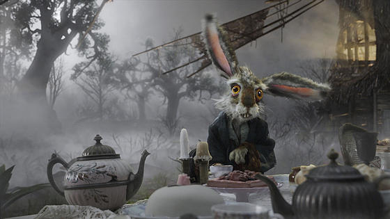
Enchanted gardens, enchanted forests – can’t get enough of it.
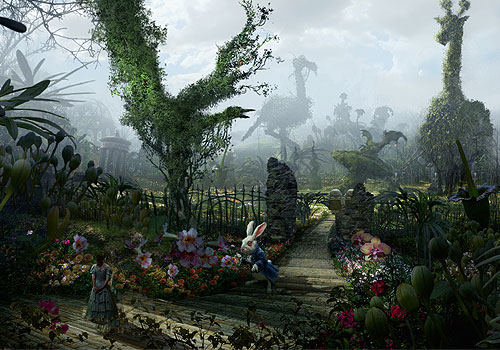
Another frame with that brilliant blue set against grayed whites, greens, and lavender.
So, there’s already talk of interior designers using the inspiration from this film to play around with scale in interiors – using big, oversized objects in small rooms, teeny-tiny furnishings in large rooms. Designer Abigail Ahern says that “magic happens when you start playing with scale . . . furnishings look way more impressive than they really are.” Is this an example of what we might see in the near future?
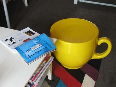
I don’t think I’ll be standing in line to buy the oversized teacup chair, but I’m definitely on the bandwagon for more theatrical, enchanted interiors full of adventure and wonder!
Photo Credits: Wild About Movies, Movie Set, Oskaya, Zap 2 It, My Deco.



Pink and gray was very popular a few decades ago..I love it..I LOVE all the colors in your phots too
Dianne, it’s like they say: what’s old is new again. Design and fashion are cyclical, aren’t they?
Tim Burton has a unique style when making his movie. I love Nightmare Before Christmas and Edward Scissorhands.*`,
Tim Burton is an eccentric director in my opinion but he has his own unique style:,`
I appeared to be extremely pleased to discover this web-site.I desired to thanks for your time with this wonderful study!! I ACTUALLY definitely enjoying every little bit of it and I had you saved to check out new things you writing.
You need to engage in a contest for one of the most effective sites on the web. I’m going to highly recommend it all site!