This is one of my favorite room makeovers to date – just finished this one on Monday. The client and her daughter follow my blog and contacted me a while back about doing a revamp on their living room here in Nashville. The reason why I love this project is because it was all about enhancing the beauty and function of the space while using what was special and meaningful to this family.
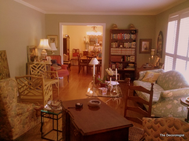
Ok, let’s get started! This is the view of the living room from the entry of the house when I first arrived. To be fair, my client had pulled a couple of extra pieces of furniture into the room for me to consider, like that wood dresser in the front. Anyway, she was looking to freshen up the paint colors (currently sage green in the living room and light yellow in the dining room. She also really wanted to add an electric fireplace, but feared that it might look too fakey in the room.
living room before
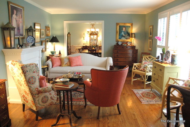
I typically start my designs out with a good plan for furniture placement that invites conversation and highlights architecture. The plan was to install the fireplace directly across from and centered on the bank of windows. The new conversation area would cluster around the fireplace, leaving an easy path to walk through to the dining room (and on to the kitchen beyond).
After Design Intervention by The Decorologist
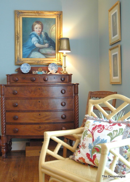
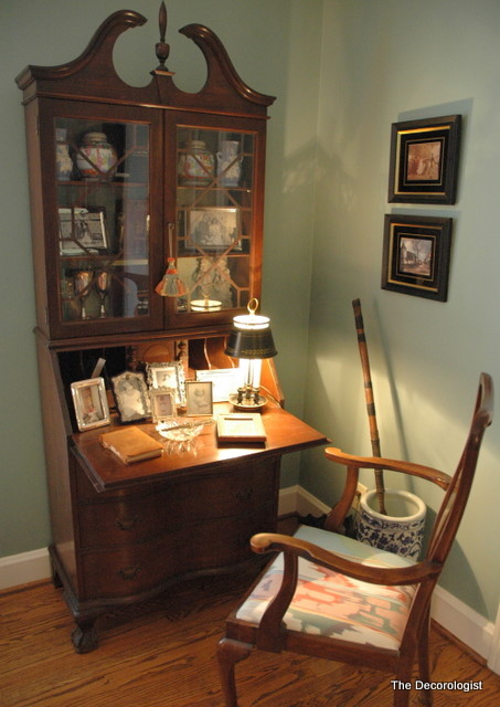
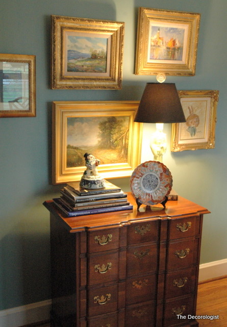
We traded the sage green walls for a more vibrant greeny-blue. This color really makes the dark wood look richer.
antique desk
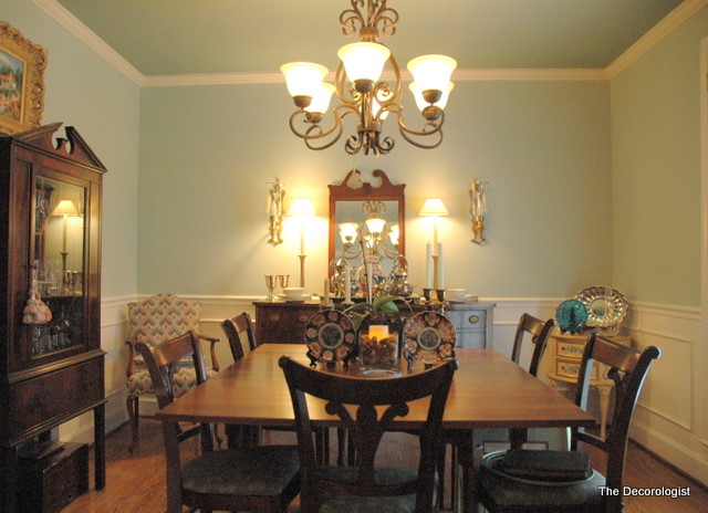
The dining room walls went from a butter yellow to a light blue from Benjamin Moore’s Historic Collection, while the ceiling of the dining room was painted the same darker color as the living room to create flow. I didn’t like the paint treatment below the chair rail – I suggested it be painted all out in trim color to create the look of real painted wood wainscotting. Here’s the before of the small dining room:
dining room before
Doesn’t the wainscotting look so much better? There’s still some work to do on the back wall of this room, but I wanted to go ahead and show you the difference the paint made. I definitely think some vertical plate groupings would be great in here, bringing in a darker blue and the coral color.
Dining Room After – Benjamin Moore’s Palladian Blue
Here’s a before shot of the side of the room where the fireplace ultimately went in. Notice the fabric on the wingback – this was reupholstered to update it and tie into our new color scheme.
before
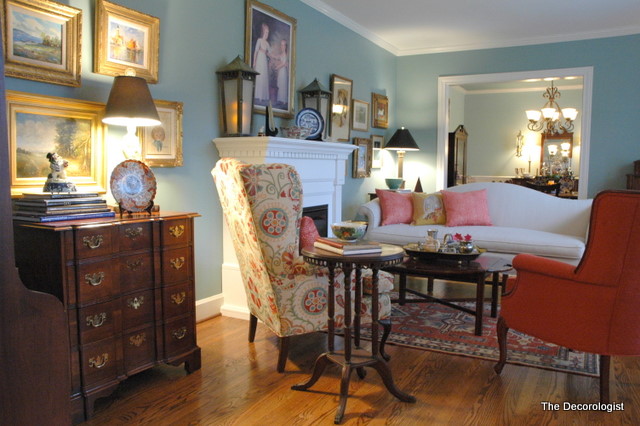
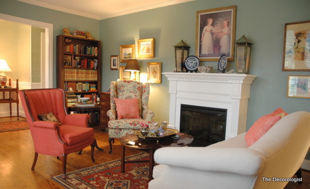
I hung about 20 pieces of art on these plaster walls in a couple of hours right before I took this photograph. Doesn’t it look as though the fireplace has always been a part of the room? Love the way this turned out!
Cozy Living Room After
Another “before” from the opposite angle:
Before
The “after” is a warm, inviting room to curl up in front of a fire and read a great book (historical fiction, anyone?).
Living Room by The Decorologist
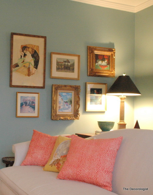
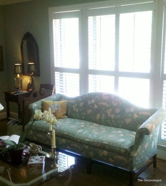
Did you notice the new linen-look upholstery on the sofa? Here’s a secret – it’s actually painter’s dropcloth! An inexpensive, yet elegant way to recover tired furnishings.
Dropcloth Sofa Upholstery and Eclectic Art Grouping
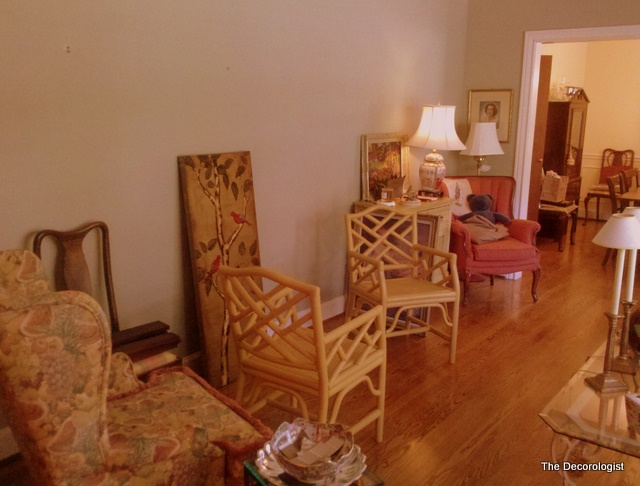
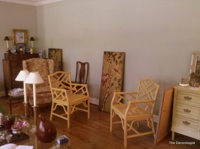
Here is where the sofa with it’s dated upholstery was formerly positioned:
Before
Now, a cute pair of yellow bamboo chairs flank a small dresser in front of the beautiful windows. 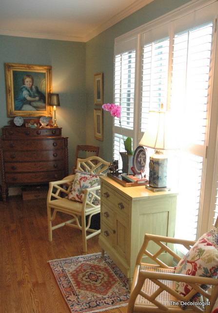
Fresh, New Space
There are so many interesting things to see in this room – my client wanted to make sure she could still be “surrounded by my pretties.” I think that we achieved that goal!
Art Grouping
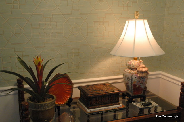
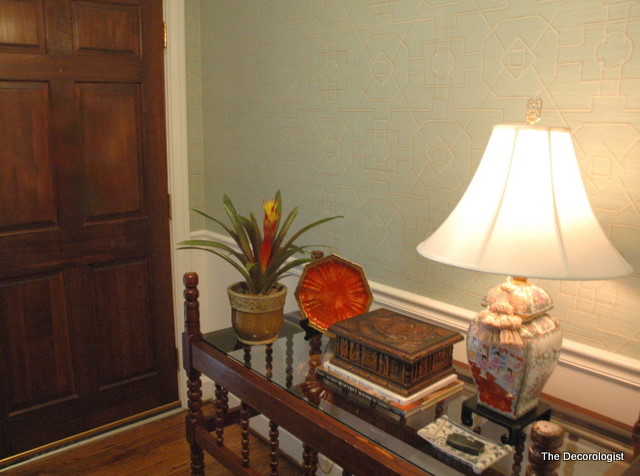
Last but not least, let me show you the fabulous wallpaper we found for her entry. It’s grasscloth with a light blue trellis pattern.
Blue Trellis Wallpaper
A rectangular mirror with a fat gold frame will be hung directly above the entry table. The table is actually a family heirloom – a baby crib flipped over and topped with glass! I have to give all the credit for that stroke of genius to my client – what a fabulous idea that turned out to be.
Upcycled Antique Entry Table
This was the view of the entry before. The walls were peach, as you can see. You can also see where I taped off the area to install the fireplace with painter’s tape on the first day I was there!
Entry Before
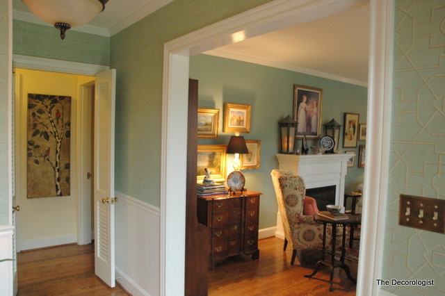
Now, this is what you see when you enter the front door. What a difference!
Entry After
This client and her lovely daughter were so amazing to work with – they were completely open to every recommendation I made for their space, and it really paid off in the end.
If you’d like the gift of a room makeover for Christmas, now is the time to purchase a Decorologist Gift Certificate. My rates will be increasing at the first of the year, but gift certificates are available through December at my current rates.










Wow! Stunning and beautiful makeover!
You did an amazing job! It is so much brighter and looks larger, but yet cozy at the same time!
Wow – Great job, Kristie!! Looks awesome.
I love this room! Thank you for the decorator tips. I’m taking interior design courses right now so it’s helpful to see what great design looks like. I’m sure your client is really happy to be surrounded by her beautiful things.
Thank you, Lisa! As I’m sure you know, reading design blogs is a great way to learn more about the practical side of decorating in the real world that you may not get in classroom courses. Good luck in your studies and thanks for following 🙂
I love the wall colors. Looks great!
Love the gold framed artwork! Lots of interesting groupings!
My client sent me this email after reading the post on her room today:
“After I dried up my tears and picked up my jaw, I just could not believe we pulled this off. I cannot thank you enough for all the time spent and suggestions you made. It really is a happy space for all of us. All the things that matter to us from both sides of our family have been well done in the décor. ”
This kind of client makes my work so fulfilling!!!
Great wall colors and furniture arrangement.
I love the greeny blue color in the living room. What color is it. My hardwoods have a bit of an orange cast to them and it might be good with them.
Ben Moore Stratton Blue – good color for floors with orangey undertones.
I loved reading this post!! Such a great remake of a tired and dated space, but one that was loaded with potential. Your choice of colors and the way you created groupings was so fun to watch! You are now on my sidebar so I can keep watching you work your magic!
Stunning! Did you have the couch professionally reupholstered in the painters dropcloth or did you do it yourself? If so, did you use a glue gun or tacks?
Karyn, it was professionally reupholstered. Dropcloth also makes awesome custom slipcovers.
My mom made fitted slipcovers for my sofa out of painters’ dropcloth, and then I upholstered a chair to match, and I love it! My house is very casual cottage, and it’s great to see how beautiful the dropcloth adapts itself to a more traditional room, as well!
And . . . these rooms are absolutely GORGEOUS! You did an absolutely fabulous job, as always!
Grins!
Pamm
Beautiful wall colors and great furniture arrangement. LOVE the grasscloth. Would you mind sharing the source? Have you ever done grasscloth on a ceiling? We took the popcorn off our ceilings and the sheetrock wasn’t damaged but it looks awful. I thought about papering with grasslcoth because dealing with the sheetrock while living here would be a huge wet and dustly mess. Yikes! Thanks.
We ordered it locally, think the brand was Thibaut. Grasscloth is not the easiest thing to apply – unless you are an experienced paperhanger, I wouldn’t even attempt it on the ceiling! If I were you, I’d take the plunge and get that ceiling fixed right so you can enjoy it while you are living there. If you ever decide to move, you will HAVE to fix it and putting grasscloth on it would be a red flag to buyers that maybe there was water damage at some point!
Kristie, I especially love the upholstery on the chair…remember it! I think that might be great when I do my living room. Love that color combination.
Yes, I think that would be great for your living room! I’ll remember 🙂
so charmingly cozy!
come visit anytime.
warmly,
michele
I adore Palladian Blue, even more so than the Wyeth. It’s lighter, and clearer and so pretty. I would use it in a minute. You did a great job of refreshing and updating your clients home. The coral accents with blue on the wall is fabulous, your client has got to be totally happy, because that is exactly how it looks.
Well, it’s easy to see why this is your favorite! Now it’s a happy, beautiful room, filled with charm! Well done!
It’s amazing how you brought that room up-to-date! The colors are wonderful! I found your blog through a FB link and will definitely be following from now on.
Thank you, Carol – happy to have a new reader!
What an amazing job! I love your color choices and I love the way you arranged the furniture. Great job!
Very Nice job in all the rooms!
Palladium Blue is one of my personal favorite colors. It has a nice balance of blue & green additinally the balance between muted and bright is just right for many applications. I like it so much that I chose it for my own bedroom (with a pale blue costom mixed ceiling) as well as quite a few clients.
It appears as though the ceiling is also painted with Palladium Blue…love it!
Wishing you a brightly colored day,
Mary Nolte
Thanks, Mary. Palladian Blue is on the walls of the dining room, but Stratton Blue is on the ceiling of the dining room and the walls of the living room.
one more thought – do you spec wall coverings often – at my new job they want me to promote it. The trellis design is really gorgeous.
Kristie, it is absolutely beautiful! You and your clients must be so thrilled with the outcome. This post makes me want to get a business started even more and assist those people that just want a boost in their home. I love how you still stayed true to their style but just kicked it up 10 notches. And yes, the fireplace looks comfy and cozy as though it has always been there – that is amazing! It’s really stunning and certainly your hard work paid off.
Thank you so much, Holly! For me, it’s so much more rewarding when I am able to work with things that have history and meaning to the homeowner, rather than starting from scratch. It’s important to me that the client feels like it is their room instead of mine, you know?
This room is beautiful! My sister follows your blog and forwarded this to me because she said it reminded her of my style! She’s right–I love it! Could you please, please share the details of the fabric on the throw pillows on the bamboo chairs? It looks like exactly what I have been searching for! Thanks!
I really love how these rooms turned out….love the colours and all the art work!
I hate to swear,,,,but …I swear YOU are a decorating genius !!!!
Just now looking at this so hope you still read from this post. I love the baby bed idea and have two of them. It looks really narrow. Did they make it smaller and hen added the glass? We want to do this to mine as it is just gathering dust in a closet. The entire makeover is fabulous. Thank you.
The FIREPLACE MAKES that room! How beautiful!!! We are about to get an electric insert for our mantle. Could you tell me the brand you have and how realistic it looks when the flames are on? It looks like it has always been in that room, as you said! BRAVO FOR ALL YOU DID!!!!! WONDERFUL TRANSFORMATION!!! XOXO
Betty,
I did this room a few years ago, and I can’t remember the brand. It was purchased in Nashville at the Hearth and Grill Shop. The flames aren’t totally realistic, but not bad for an electric flame!
Hi, I am in England and ordered a tester pot of Stratton Blue, inspired by this post.
Benjamin Moore is not a well known brand over here and I was surprised to find it had quite a sheen, rather than the chalky matte look of most period paints. Did I order the wrong type of paint? It doesn’t look so glossy on your photographs. Thanks, C
Clarey,
All paint colors can come in a variety of sheens. The sheen should be on the label. For wall colors, I typically choose an eggshell finish (very slight sheen), but for a chalky finish you’d want a flat or matte finish. Trim and wood furniture typically gets semi-gloss or high gloss finish. Maybe you got a semi-gloss sheen on accident? Also, the level of sheen changes the color a bit. The higher the sheen or shine, the lighter the color becomes.
Just happened onto your blog while looking for make-over ideas for my living room. Just googled “blue and coral living rooms” and found this gorgeous room. I can’t wait to try some of these wall colors – just what I need given my rug and fabric colors that I don’t want to change! Thank you so much! I will now be a regular reader!! Can see why your clients love you!
Great, Lori! Thanks for the comment and I’m glad the blogpost helped you 🙂