Creating furniture arrangements that make people feel welcomed and invited into a space is an art. Rooms that have all the seating facing the television makes guests feel, well, unimportant. Or at least not as important as that dang television.
Fabulous Conversation Area
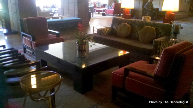
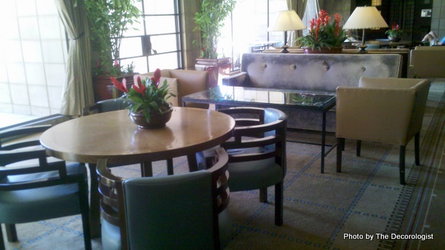
A conversation area should foster conversation, right? And a place for a drink, a book, and your outstretched legs. This fab seating area is in the lobby of the Arizona Biltmore in Phoenix, where I spent last week with Mr. Man. I think my new favorite color palette is russet, aqua, and gold!
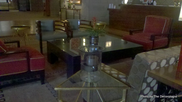
Arizona Biltmore Lobby
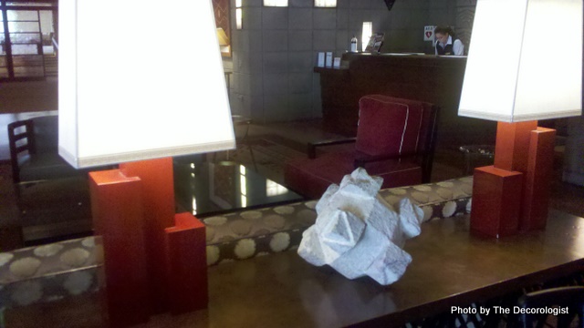
Proper lighting is paramount – lamps are essential in a conversation area. An overhead light does not create atmosphere or ambiance. It usually just creates a headache. Lamps on side tables are good, as are a cool pair like these on a sofa table behind the sofa.
Uber-Cool Lamps
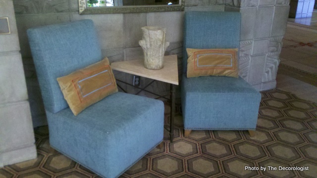
Not only do I love these slipper chairs, but the triangular table between them makes good sense. Because the position of the chairs follow the lines of the table, you’re inclined to be a bit more conversational with the person next to you.
I know this is a hotel lobby, but they really did a great job of creating lots of interesting conversation areas. I swear, I wanted to go sit in every one of them and have a cup of Starbucks! Love how the shape of those chairs just feel right with the round table.
Arizona Biltmore Lobby
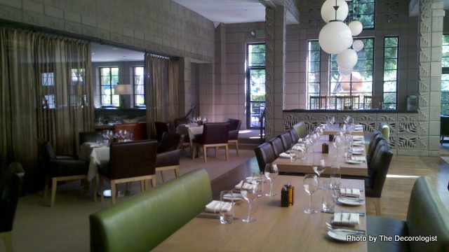
Even the seating in the hotel’s restaurants was comfortable and inviting – no uncomfortable wooden chairs here!
Wright’s Restaurant, Phoenix
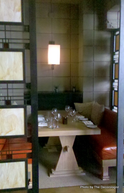
There’s nothing like carving out a cozy and special nook for dining or conversation. So many of us fight our architecture – we should be following the cues our architecture provides! I also love all the trestle tables they used in their restaurant. I often recommend those to clients because they allow more leg room and movement.
Intimate Dining Nook
Frank Lloyd Wright and his students didn’t just design buildings – they also designed the furniture to occupy those buildings. The focus was on optimal function, but what occurs when you make the link between furnishings and architecture can be amazingly beautiful as well. How much do you consider your architecture when you are decorating your home?





I just learn sooo much from reading your posts! thanks for educating me.
Hey, that’s what I’m here for! 🙂
Hi Kristie,
I have searched the internet over for the answer to my question, but no luck, so I’m hoping you can help me. We are moving from a large house in FL, to a small house in DC. I want to use my two red leather chairs (they have red, orange, gold paisley arms, down to the bottom on the side), and I just found a beautiful solid gold linen loveseat that would bring out the gold in the chairs beautifully….. but, what do you think about mixing a 47″ (wide) love seat with two 35″ (wide) chairs? I only have about a 10″x 10″ space to work with. Could I somehow balance it with a side table? Our should I figure out how to work with its matching sofa instead? Thanks so much for taking my question. I’ve enjoyed reading your blog today.