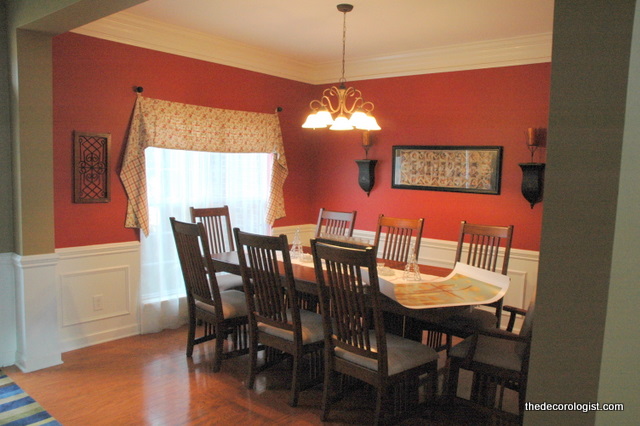
I was recently working on a color palette for a home, and the homeowner made the comment: “Well, I know I can’t do blue in a dining room. That’s what my mother always told me.” Have you ever heard you can’t do blue in a dining room? Red has been a popular color for dining rooms over the last 15 years or so – red is supposed to stimulate the appetite.
Red Dining Room Before
Do we really need our appetites to be stimulated more? Maybe that’s why our country is so overweight . . .
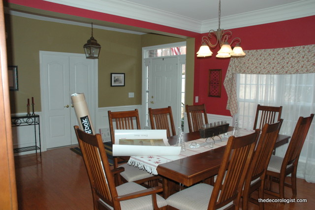
Dining Room Before
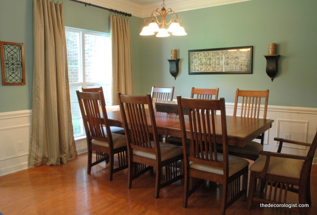
This dining room I am featuring today belongs to another client of mine, who had no qualms about doing blue in her dining room. She simply followed my recommendations for 2 new paint colors and window treatments, and what a difference!
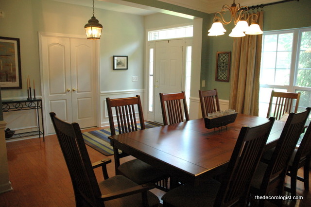
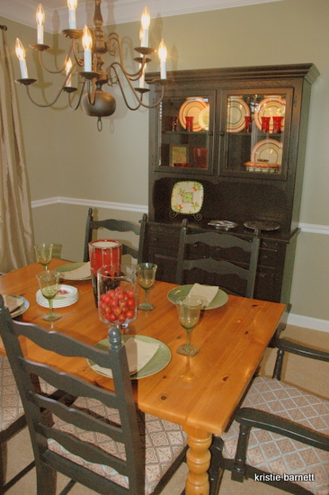
Dining Room After
I find that blues and greens tend to update orange-toned wood (like these floors). I usually steer away from yellows, corals, and reds in rooms with wood in orange or red undertones.
Blue Dining Room After
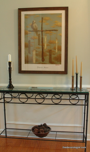
I encouraged my client to frame this beautiful poster art by local artist, David Arms (remember his home tour?) for the entry area adjacent to the dining area. It looks really great against the newly-painted walls. This color is Benjamin Moore’s Gray Cashmere 2138-60.
Artist David Arms’ Print
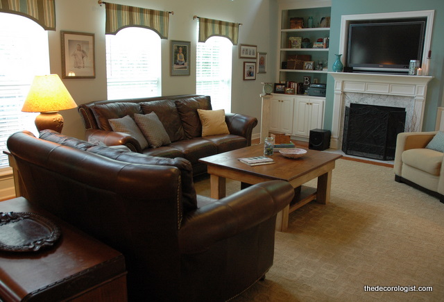
The color update extended into the living room, which was previously yellow.
Living Room by The Decorologist
Do you think there are certain rooms that shouldn’t be painted certain colors? Is it time to break out of those old “rules,” or are those rules there for a reason?




Red makes me feel crazy–I love the blue! 🙂
I love blue & white in any room and think in the dinning room would be very soft
Janice
I completely agree about updating orange toned woods by using blue on the walls. I also love blue in dining rooms, provided the room gets good light and isn’t north facing.
When we moved into our own house 7 years ago, the dining room was already painted a color that is REALLY a no-no for a room in which you eat – avocado green. And not just any avocado green, but one that looked like a day old, half rotted avocado would look. Gross! Needless to say, that was repainted immediately.
it’s nice. Yes, the yellow/red undertone with the dining set looks so good with the new paint, refreshing, crisp and calm. For the new window panel, I wonder if that’s how a standard width (50in wide ones) window panel look like?
like the living room as well, wondering what it looks like before…
the dining room panels are off-the-rack, but hung outside the window at a higher level to give them a more sophisticated look. the before of the window treatment is in the first 2 photos. the living room window treatments are the same as they were before.
I LOVE color! I’ve always heard the “hunger stimulant” thing when it comes to eating areas, but I’ve always just figured that it didn’t really matter… LOL
LOVE the blues you chose!
I find red to be depressing in most cases. It often ends up feeling cold, which is the opposite of what you think should happen.
Yes of course “you” –or anyone! can do “blue” and the color you used is lovely. I recently used a deeper blue–actually in two dining rooms–and they both turned out quiet well and achieved the desired response, I don’t have pictures posted on my site yet, but the colors I used are Blue Grotto and Atlantis, both from http://www.EcoHues.com
So, do you think it’s a ‘reaction’ of some kind to so much red-dining-room (Boring red dining rooms?)
There many reasons for selecting one color over another, in any space, but really it all comes back to the client–who they are, and the feeling they want to have in their own spaces.
Kristie, I dont’ know if it’s a time of life or a trend toward a traditional ‘classic’ interior, but blues are very much on my list of much loved color for interiors. I think was makes the dining room work so well is the warmth of the blue, things might be different if it were a cool blue. But it is truly lovely.
Ahhhh, color!
Beautiful Kristie. So fresh and happy! What is the color of the dining room walls?
Kristie
I agree that red seems to be the default color for dining rooms. I also agree that it looks terrible with many types of woods. To me blues and greens are more organic, and compliment the wood tones instead of highlighting it’s faults like red often does. The after photos are so much more softer and easier on the eyes for sure!
A word from the client- Kristie is amazing. I couldn’t believe how quickly she figured out my style and helped me narrow down a color palette from which to work. I was not expecting us to rearrange furniture, wall decor, photos, etc. that day, but I’m so glad we did! I had not been able to figure out how to arrange my furniture in that open living room to get the cozy feel I wanted. Kristie also advised me on the type and color of tile I should use for a kitchen backsplash I was planning. I’m SO GLAD she did, because the tile I thought I preferred would have been way too busy for my countertops! I have a very hard time making decisions about decorating, among other things, and if Kristie hadn’t helped me, I would probably still just be talking about painting and not doing anything about it. Dining room color is 704- Delmar blue. It is also the color around the fireplace/built-in shelves.
Awww, thanks Karla! You were awesome to work with 🙂 I’m glad you are happy with how things turned out – it really does look great!
I think any colour can be made to look amazing in a room..it just depends what you put with it and how you dress up the room.
hmmm, the problem with what you are saying is: there are existing elements that cannot (or will not for $$$ reasons) change. if you don’t work with the colors in those existing elements in the right way, the resulting mixture can be a disaster! another thing: never make the assumption that just because a color is in a paint fandeck, it can work as a wall color – most of the colors in fandecks should NEVER go up on entire walls (and were never intended to)!
Great post Kristie! Love the blue!!
xo
Maria
thanks, Maria! hope your recent training went well (i’m sure it was great!)
BTW The headline was great!
Dining Room looks beautiful in blue!
Hey Kristie, I love this dining room! Can you tell me what color blue you painted in the room? It is so hard to pick out a nice shade of blue. Thank you so much.
Kristie, what a great post! I’ve done several blue dining rooms recently (they just seemed to be the right solution for those clients!) and everyone has been thrilled w/ them. Rules schmules! (And your befores/afters are fabulous – you’re the makeover queen!)
So glad to hear your advise for orange-toned wood! I live and work out of a 1917 American Foursquare with southern yellow pine woodwork. It’s still in its original orange-toned finish – is that shellac? Anyway, we want to preserve the woodwork but often feel limited in our color choice for the walls. Blues aren’t my favorite, but greens are!
Being a graphic designer, from the visual aspect, blue is often considered an appetite suppressant and generally is not used to promote food., i.e. for labels, menus, etc. I can’t get past that idea with blue interiors for restaurants and dining rooms. I know, it’s just a mental thing.
I loved the transformation in the dining room. I was especially excited when I saw the David Arms painting. He is amazing and unbelievably talented. I have been watching his artwork evolve since I entered the family thirty one years ago.
The colors you chose are so much prettier and pleasing to the eye.
Thank you, Margaretta! I have at least 6 clients that have David Arms’ art in their homes. I know all his pieces by name now!
Also, you might be interested in a post I did last year on David Arm’s home interior – it’s so creative and fabulous!
https://thedecorologist.com/inspiring-design-the-nashville-home-of-artist-david-arms
We just painted our dining room a deep French blue and what I love the best is how beautiful it makes everyone’s eyes look. Makes our dinner guests (even if it’s just us and the kids) look great, which adds to the dining experience.
I love how serene and comfortable that blue made the room! Years ago I fought with finding just the right sagey green color. I have cherry wood and espresso dark tables. I found the most beautiful green, Restful by Behr. It is so soothing and tranquil! I am buying my first home soon and 5 years later I still have the name memorized. I used it in my dining room with Garnet trim to go with my cherry wood and Asian inspired theme. I then used it on three walls in my bedroom with the fourth being a muted lavender from the same color coordinated swatch. It was peaceful and serene.
I have owned a few cafes over the years and I went with the soft blues, lavenders and restful green. I learned a lot about the psychology of color when planning my colors. Orange, red and yellow irritates people and makes them want to eat and run. That is why McDonalds, Burger King, Jack in the Box use those colors so much.
So if you want your guests to savor their meal, relax and be calm red is a no no. I just found your blog and it is my new addiction! Thank you for sharing your wonderful know how with us!
I am looking for a new color to update my dining room. I went with a blue color called spring rain in the living room and I have a small entry way separating my dining room from my living room. I noticed you used a color called gray cashmere in the entry way of the above project, but what was the blue used in the dining room? I really don’t know what color to use. This is not my strong suit and I am lost.
Would you have any advice for a person like me? We did recently redo the hardwood floors to a jacobean color for a farmhouse type of look.
We used Ben Moore’s Del Mar Blue in this dining room – it looks great with the Gray Cashmere!
Thank you, I think it looks great, too.
Hi Kristie,
This post is amazing. It looks just like my dining room and living room. I’m so excited to have found your blog! My friend recommended me to you after you helped her with her house in the “touch of turquoise” post. My question is, can these blues work next to an off white trim? I noticed the trim was white in these pictures. I do not want to paint the trim because we just got new custom windows in off white. 🙁 Thank you so much for your inspiration!
I also have a soft blue dining room-b Moore night mist-love it. Your transformation was amazing! Red is so dated and in your face- love it in powder rooms though;)!
Hi Kristie,
I love this site!
I have a very open plan every room connects to the other and I would like different colors. Grey walls with orange accent wall in living room and serene green in dining. How do I make sure they flow? And can I go crazy with orange? I picked grey not to break the rules but if I followed my heart am wild, I'd love a vibrant orange everywhere.
What do you suggest?
I have Gray Cashmere in my master bath. It’s a beautiful color.
I love blue. So I will get the orange toned wood 😀
I love this article !
Hello, I painted my walls this same BM color and really really love it. I was struggling over which neutral panels to buy when I saw this post. I really love those window panels! Can you tell me where you found them? Thank you!
Blue is NOT a good color for a dinning room, unless you are on a diet. Blue is an appetite suppressant. Be prepared for partially empty plates & a lot of leftovers.
Rest and digest. The color red is a slower wavelength than blue toned colours. Red can help activate the parasympathetic nervous system (rest and digest) and can assist with the digestion of food and unltimately the absorption of nutrients
I absolutely love the colors. I have been struggling for ideas and this is perfect!
Thank you for sharing!
Thank you for commenting, Nancy! Good luck on your project 🙂
Sorry, but the blue looks green and very drab to me
Joe, that’s why there are thousands of paint colors to choose from – and why I tailor paint color consultations to every client I advise. One color doesn’t fit all!
The color update extended into the living room, which was previously yellow.