Spring is nearly, finally here! I actually have some spring bulbs popping up in my yard, which makes me hopeful for warmer weather.

Spring!
Spring always inspires a few projects around my house, so here’s a few I finished up this week. Let’s start with the mid-century dresser I found at an estate sale in the late fall. I had been looking for just the right piece to use in my dining room as a sideboard with lots of storage.
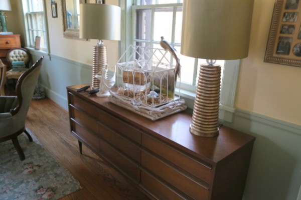
mid-century dresser before
I painted one coat of Annie Sloan’s Florence Chalk Paint and decided it was too vivid and shocking a color for my more muted dining room colors. I had thought I’d put a dark wax over it to dull it, but I didn’t want a rustic finish on this. It just didn’t seem right for a mid-century piece.
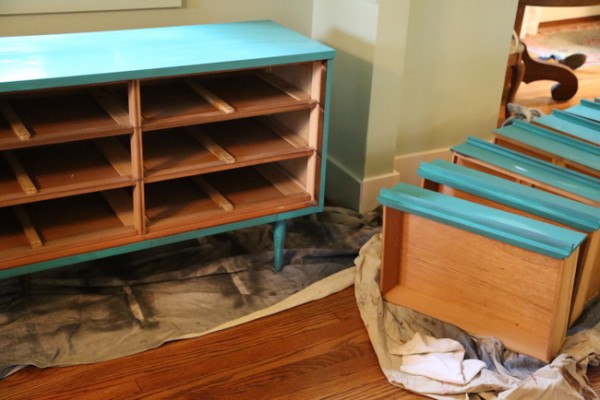
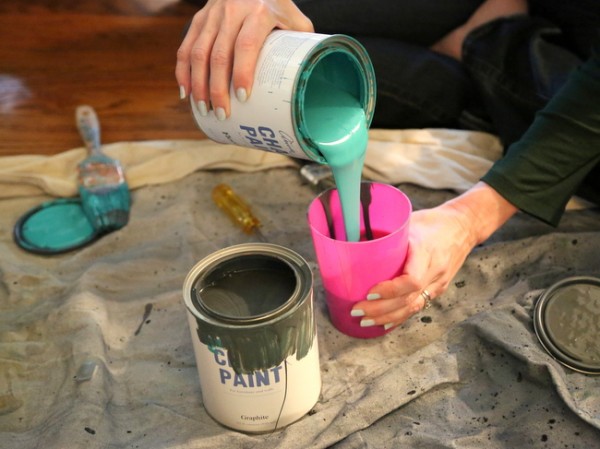
So, instead I took some Annie Sloan Graphite (a really nice charcoal gray) and made my own custom color for the second coat of paint.
Florence + Graphite = Mucho Mejor! (translation – much better)
Here’s how the dresser/sideboard turned out after the second coat and a application of clear wax:
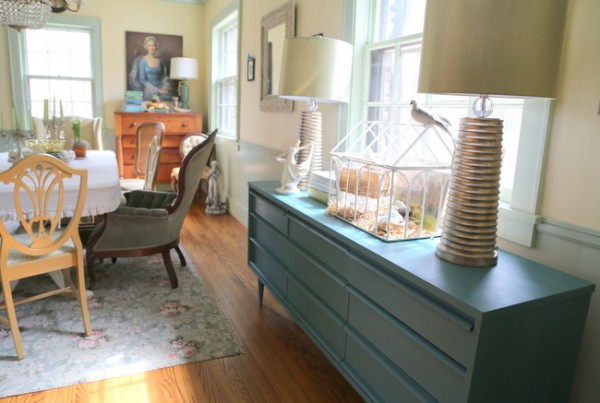
after
I also painted this non-functioning cuckoo clock I bought for $15. The face of it was plastic, and it was made in China, so I didn’t feel bad about doing something fun with it.
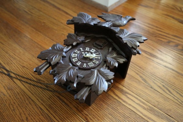
cuckoo clock before
I wanted to hang this in the dining room as well, so I wanted it to relate to the dresser without being an exact match. I decided on straight-up Florence with a bit of dark wax on top.
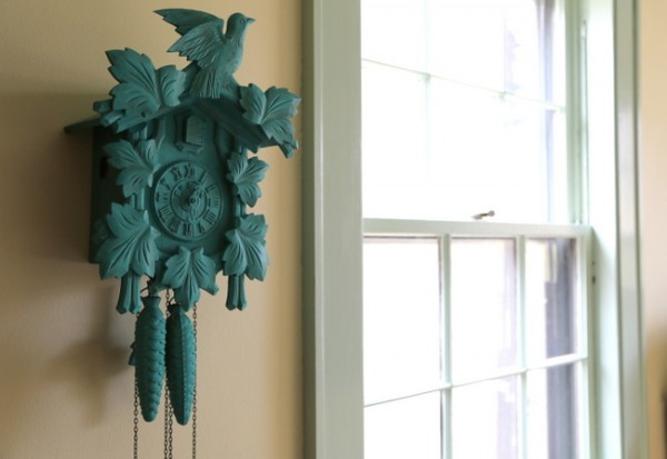
It’s a fun pop of color over here next to my corner china cabinet, don’t you think?
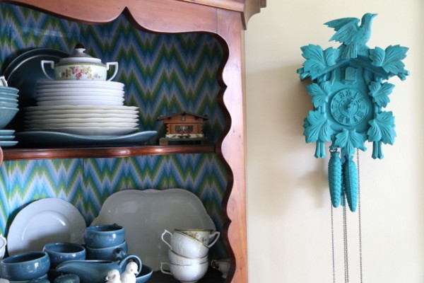
I feel pretty sure this cutey will be quite the conversation piece over dinners with friends. Here’s a photo with a little more context:
for details on that blue Victorian chair, check this out
And finally, I found this cool man portrait at a yard sale last week for a whopping $3. It’s an actual original painting, too!
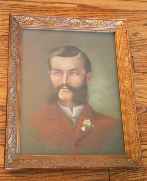
The frame looked a bit too staid for me, so again I pulled out the Annie Sloan Florence. Also added the dark wax.
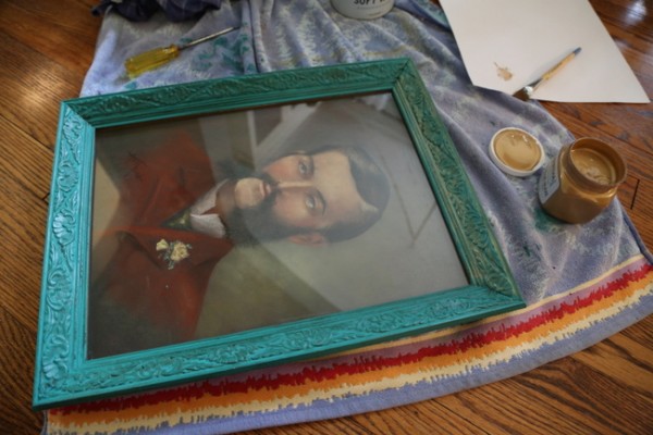
painted frame in process
I hung it in the odd little place I had wanted to hang it. But it didn’t tie in enough with the piece stacked above it. So I painted on a couple of coats of Martha Stewart gold glaze I found at Home Depot. It’s water-based, but is kinda gooey and takes several days to dry. Now it totally ties in with the gold frame above it!
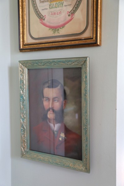
not so serious now, huh, mister?
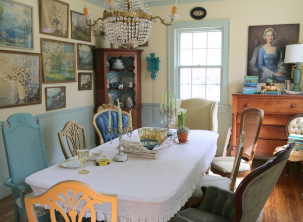
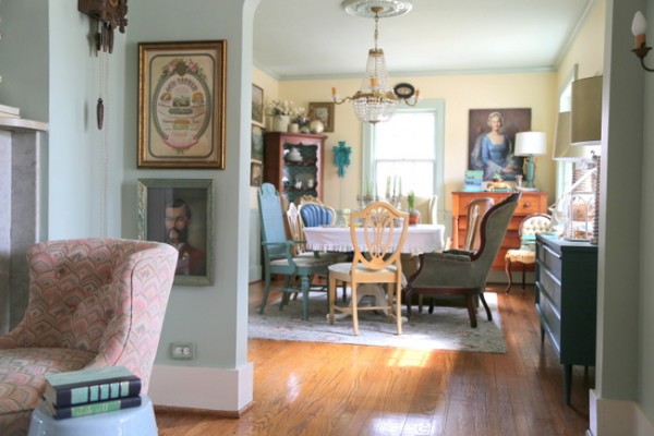
When looking from the entry/living room, you can see all three pieces that I painted. They relate, but aren’t exact matches. Yes, it’s quirky. And I like it a lot.
Who’s working on their own home decorating projects this weekend?


I love the sideboard Kristie, I never would have thought to tone Florence with Graphite but now I’m doing it ! Thanks for the inspiration, your dining room is delish!
Gorgeous! I love the cuckoo clock.
Fun!! Might I make a suggestion? You can totally ignore it, and I will not be offended. 😉 I would add some light colored paint to the numbers and hands on the cuckoo clock to make them stand out just a bit.
I ditto what Brenda S. said. I have Florence and Graphite and have been playing with them but the thought to mix them just never occured. Florence can wake you up for sure, but I did a heavy oak round coffee table for my granddaughter’s play area and it is wonderful there. I recently did a 50/50 mix of Florence and Provence trying to get a color for an antique stereo cabinet turned big pot cabinet for my kitchen. The color was still too much. I’m trying Graphite and Florence next. I’m so excited!! Thank you!
It looks terrific! I especially love the clock and portrait.
Everything looks so fab! I especially love what you did with the clock. I have the exact same cuckoo clock but mine is working (at least the last I checked it was). My clock was given to me on my 10th Birthday by my Dad after a business trip to Switzerland. It is not my style at all and sits unused in a closet. Do you think it would be sacrilegious to paint it a pop of color? After all, I painted my grandmother’s antique dining chairs chartreuse green and her parents brought them over from Sweden. I’s sure she’s spinning in her grave but I adore them now and use them every day.
I have an old clock that doesn’t work too, and you may think I’m crazy, but it’s actually a Black forest Cuckoo clock my sister brought me from Germany 40 years ago. It’s going to cost me a fortune to get it fixes, it’s missing some parts, so I’ve decided to paint it too! I hadn’t thought about the turquoise, I was thinking of silver, but the turquoise would look great in my house as well! I have some mind making up to do! Kristie, our house is almost done from the do over after the fire, and it’s looking FAB! you have been my inspiration in so many ways! I’ll send you some pics later and show you how!
Carol
I’m glad your renovations are going well, Carol! I’d love to see what you’ve done. I have another cuckoo clock (that does work and is better quality) that my husband bought for our anniversary one year. I wouldn’t paint that one, but I had no problem painting the other one! Here’s my thought about your clock: if painting it will make it to where you will actually use it in your decor, go for it! Too many people will choose not to use something at all and keep it in storage rather than to paint it and actually enjoy it in their homes. Let me know how it comes out!
It’s amazing what a coat of paint can do! All those things you painted became so much prettier! Loved all of them. Good idea with the golden glaze on top of the teal.
I painted my bedroom this weekend, in F&B’s Sudbury Yellow. Love waking up to something warm and sunny – I live close to the arctic circle so I totally need all the warmth I can get…
*swoon* You know I LOVE all three of these!!
Love the toned down Florence color. Everything ties in together in a lovely way. Good for you.
It’s been spring cleaning time around my house. No time for projects yet, but I’m getting cleaned out so maybe I can! Thanks for the inspiration.
I really like the whole thing. I like “Quirky!”
🙂
I refinished a buffet table this weekend! I’ll post it on your FB page, I used BM wrought iron with RL faux glaze tinted black. I love chalk paint but didn’t want the price or rustic look. I am happy with how it turned out, it was a very fun project!
Sounds great, Kelly – I’d love to see it!
I can’t believe you painted a mid century piece of furniture. They are so hard to find. I would have bought it from you. Next time don’t paint it. Call me.
Love the color you came up with to paint your mid-century modern sideboard/dresser. It can be a very versatile piece. You have great, quirky taste, very fun.
What kind of wax did you use? Does it just go on top of the newly painted surface? Looks beautiful on the sideboard!
It’s Annie Sloan Clear Wax – but you can use any clear paste wax. I’ve even used Turtle Wax car wax before!
Gorgeous work. The blue Victorian chair makes that dining room pop. Glad we found you Kristie.