It’s the time of the year when everyone seems to be talking about the “Color of the Year,” including me. But just because a paint company puts out a new one (no less than 10 different companies do it each and every year now) doesn’t mean that THAT is the color you should repaint your walls or use in your decor if you are trying to sell your home. Color for staging is pretty important, so let’s not make a mistake that should be avoided.

There’s ONE PARTICULAR COLOR I want to warn you about, no matter whether it’s a color of the year (it’s Benjamin Moore’s pick, actually), or uber-trendy (it’s not – yet), or even if it’s your favorite color (and for some of you, it is). But I’ll get to that most dangerous color in a moment.
First, effective home staging is all about visual perception and psychology – something I happen to know a little about. Colors carry connotations that can have psychological implications and impact our emotions.
Recent studies show that both men and women rank blues and greens in their top three favorite colors. Blues are associated with freedom (open spaces), expansiveness (sky), tranquility (a babbling brook). Greens are associated growth and fertility (vegetation), wealth (money), safety (green traffic light).
So besides neutrals, using a blue or green color for staging your home are pretty safe bets and aren’t going to be major turn-offs to many buyers. Mind you, I’m not suggesting ANY blue or green is widely-appealing – muted, grayed versions are best for selling homes.
But whatever you do, stay away from the most dangerous color for staging homes to sell.
I know, I know. This is already making some of you very angry!
Do you know how I know that?
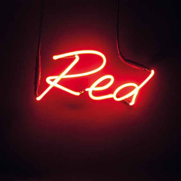
Because red is associated with anger, among other things. Actually red is a VERY polarizing color. Besides being associated with anger (the matador’s red cape enflames the bull), it makes us think of danger (stop signs), life and death (blood), and intense heat (fire). On the flipside, it’s also associated with – you guessed it – love and passion (heart).
For good or for bad, red walls can make your blood pressure rise – it’s been proven in scientific studies!
Now, beyond all that psychological stuff and whether you love it or not, there’s another big reason not to use a red color in staging a home. A reason that few people are aware of, except maybe for professional photographers.

I am not a professional photographer, but this is my pretty sweet camera!
Red is particularly difficult to capture with digital cameras. I am no professional photographer, but I’ve done a lot of research on this phenomenon so I will try to explain it in layman’s terms as best as I can understand. Bear with me.
Cameras typically capture three different images with three separate color channels – red, green, and blue – at the same time, which are then combined into a full-color image. In order to produce a nicely textured image, it is important not to either overexpose or underexpose these three colors. Bright red colors may simultaneously be overexposed in the red color channel, and be underexposed in the blue and green color channels. It confuses the camera. Detecting little green or blue in the photograph, the camera’s meter will think the space is darker than it really is and adjust it by overexposing it.
That’s how you end up with blown-out reds. When red objects are blown out in photography, they lose all detail. To have good texture, you need detail in more than one color channel. When the red channel is overexposed, the reds are simply blown out and all detail is “clipped.” So that richly woven red blanket that it so pretty in person might photograph more like a cheap blob of red paper on the end of the bed.
Red is at the top of the scale of wavelengths of visible light, and is a difficult color for cameras to decipher. Just a very small change in light will change the color temperature. That’s why when you take a photo of something red, it often turns out differently than how you see it in real life. It may be more vivid, duller, orangey, pinkish, or even purpley. Have you ever tried to take a picture of a beautiful sunset? And been terribly disappointed with how your photo turned out? The camera is often unable to capture the subtle tonal variations of red, resulting in an image that is not at as impressive as you remember the view.
There are ways that professional photographers can deal with the red issue, like setting the white balance correctly, reducing the saturation, underexposing the photo, or processing the raw file, but this stuff is for the masters (certainly above my skill level). One guy was explaining it in a photography forum and showed the difference in a typical shot of a red flower (on the left) and whatever he did to make it look true-to-life (on the right):
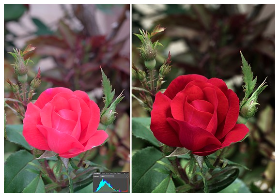 sorry, but I lost the reference here and don’t know who took these photos!
Good luck fixing this yourself. Believe me, I’ve tried. Let me share a personal example of a high-rise condo I staged many years ago. It already had several walls painted red recently, and the owner was not open to painting. I saw the condo and thought it looked pretty cool, just needed to tweaking before it went on the market. And then I took photos. The red bedroom that looked warm and enveloping when I was in the space looked more like a fluorescent bordello in the photos.
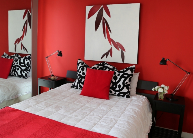 I seriously could not sleep if the room actually looked like this photograph, could you?
Besides the photographic issues I’ve discussed, red is considered the most visually heavy color of them all. It advances more than any other, which draws a lot of attention to itself. That may be great for marketing and advertising of products or services, but it can be overly “Hey, look at me . . . I said, LOOK AT ME!” in MLS photography.
For good (love, passion) or for bad (anger, hate), red makes emotional statements that are, well, kinda aggressive. And red is aggressive in photography. In this otherwise neutral space, the so-called “pops of color” pop a little too much. So much so that your eye kinda fixates on the red items and not the rest of the space.
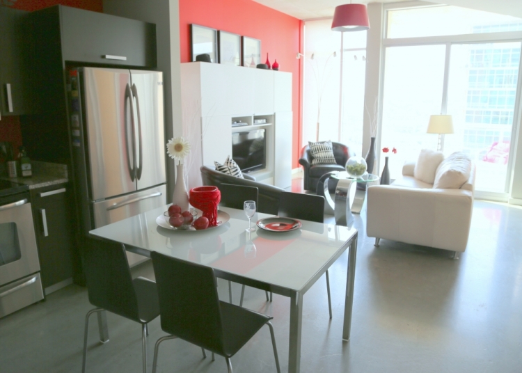
The camera didn’t know what to do with these reds. Notice how the red in the backsplash area reads more pink-red, while the wall on the right with more natural light reads orangey. It’s just too much.
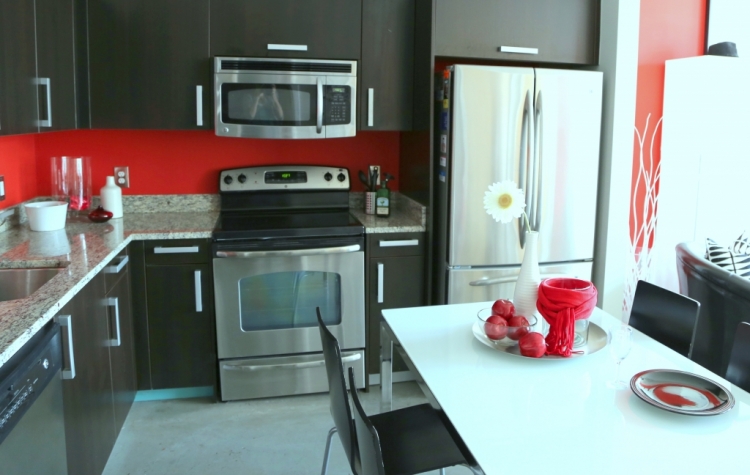
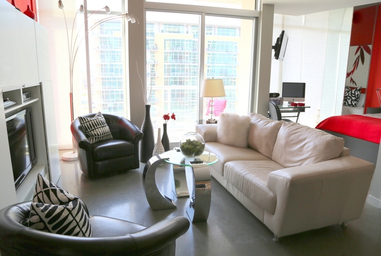
And this final image could have been nice, but it was ruined by those pesky pops of red that lead your eyes on a wild goose chase from the upper left-hand corner (looks orange) to the flowers in the vase, to the pillow on the porch (looks pink), to the little boxes on the desk, to the bordello bedroom space. After this condo staging, I never used red again for decor props.
I’d show you more when I used to try to put red in my stagings in the beginning of my career, but I can’t. Because the photos were awful and I destroyed them long ago.
Please understand me when I tell you that red can be beautiful in a home that you live in, if it’s a color you are drawn to, so don’t be afraid to use it if you love it! However, understand that it is dangerous color for staging to sell a home. I typically recommend removing as much of it possible to make the MLS photos draw in as many buyers as possible. So if you hire an Expert Psychological Stager™ (and I recommend you do), they will be doing the same and bringing in the right color staging props to make your MLS photography pull in buyers like a magnet. Because they understand the “why,” and now so do you!
Want to learn more about color, design, and staging? Subscribe to the blog for free and access our special report about how you don’t have to sacrifice beautiful design just because you have children and pets! Scroll down and sign up below.
My Expert Psychological Staging® certification training is now available completely ONLINE! Find out how you can become a successful home stager in my RESA®-accredited course!


This is true. I am extremely put off by houses with any red fixed elements, not because I dislike red but because they overwhelm and dominate the space. I can’t see anything else. Bright orange has the same effect.
Yes – although there are some who really LOVE red, if it puts off a significant portion of buyers (for whatever the reason), it’s better to avoid it. Staging is about appealing to the widest audience possible. Thank you for sharing your thoughts on this, Kay!
I love reds and oranges as accent colors, but understand the issues others often have with them. I had a lovely red wall in my entryway at my previous house, but when we decided to sell we immediately painted using neutral (boring – ha!) colors. House sold in three days. If you like vivid colors, you should paint your home however you want – just know when you are ready to sell, you’ll likely need to repaint and it all works out!
Great advice, Stephanie – thanks for sharing that!
EXCELLENT information!! so, so, so good!!
Thank you, dear!
What a fascinating blog post, Kristie! Well done!
The only really red thing I have in my home is a large Oriental rug with a red ground. It has a border of cream and lots and lots of flowers in lovely soft colors. The rug is not jarring, but instead reflects color onto the walls, ceiling, and soft colored furniture in the room. Not noticeably so, but enough to give the room a nice glow. I think it is about as much red as I can handle, and maybe I like it because it is not the focus of the room. Thanks for your interesting insight and photos today. I always learn something new from you!
Your rug sounds lovely, Laura! I promise I’m not trying to bash the color red, just trying to sell houses! 😉 Have a great week!
Oh, I totally get that, Kristie, and you are right…red can be very jarring!! Before we purchased our FL home we rented a townhouse in order to have time to learn the area and make a wise decision about where to settle down. The great room walls were a deep red. We liked it for renting purposes, such a change from anything we used in New England, but I’m with you, I wouldn’t want to live with it long term. We moved from the townhouse when the owner decided to sell, and her buyer planned to gut the fairly new house, red walls and all!
I couldn’t agree more. I can not believe that red is coming back. We are still trying to help people update their red dining rooms from 1990 🙁
So true! But honestly, I don’t think we are going to see red walls go on-trend anytime soon. Accessories and decor, yeah probably. But not red painted walls – it’s simply too soon.
I think people see red walls in pictures and know that they have to paint before they can even move in. Red = work!!! We have a red wall, but I still can’t look at it in homes for sale. Makes me cringe. I know we will have to paint over ours.
Since red appears to “advance,” it also would likely make a room look smaller, too, correct? That red bedroom wall, in the photo above, seems to be menacingly closing in on the bed!
Yesssss! “Menacingly” is the correct choice of words, Phyllis. 😉
Thank you….can’t handle red in staging….ever!
Awesome article, Kristie! Chock full of great info.
You’re welcome, Steph! Thanks for the comments 🙂
Hi Kristie, I enjoyed this blog post. I’m a fellow home stager in Atlanta and couldn’t agree more about red in staging! I do have red in my home, but you’re right that it doesn’t photograph well. Thanks again for all of your great content!
I’m glad you liked it, Jeanne – I hope that explaining the “why” will help people understand that the recommendation is not an insult against their love for red or against their personal decorating taste. There are actual REASONS why using red in homes to sell is a bad idea. Thank you for sharing your thoughts!
As a professional photographer as well as a stager. I also hate the color yellow, It does the same thing in images as the red.
Emma,
It’s interesting that you mention yellow. I also have a difficult time making photographed yellows look how they really look when you’re in the room.
What about red front doors?
Ah, GREAT QUESTION. Red exterior doors are good! Nothing is more classic and positive-signaling than a red front door, as long as it isn’t too pink a red. I should have mentioned this in the blogpost, so thanks so much for bringing it up, Nora. The red issue is an interior one.
Red is one of my biggest pet peeves with real estate listings- besides drapes from the 1980’s. It always looks outdated. I don’t understand why people like it as a wall color, but I especially don’t understand why people don’t paint over it for selling a home; it seems like a no-brainer but I’m continuously shocked by the MLS and what people think is acceptable. Thanks for the detailed explanation Kristie!
So true…great explanation of the “why” you should avoid red! I have always avoided it in my stagings because I do feel that it’s too bold and you want the buyer to feel more at home and serene – and red is the color of maybe too much energy! I use soft greens and teals and I think they work great. Just enough color for bringing the eye where you want the eye to go…without raising the buyers’ blood pressure!