One of the things I love best about what I do is getting to work with interesting collections and art.
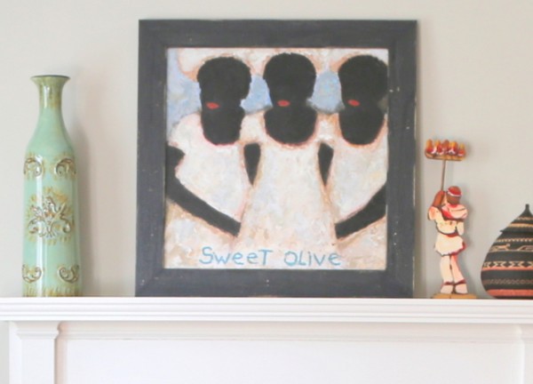
Studying the things people collect give me great insight into what makes them who they are and helps me learn what they want for their home. This couple had collected Louisiana folk art and primitives over a period of time.
before
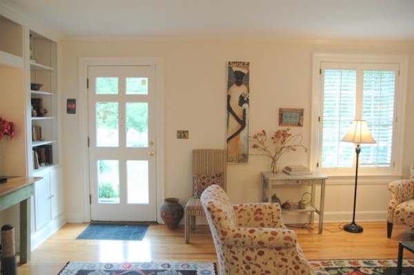
Because their art and furnishings were already so colorful, they had relied on white walls to showcase their collections. Unfortunately, they found that gallery white did not give them the warmth or finished feeling they wanted for their home.
before
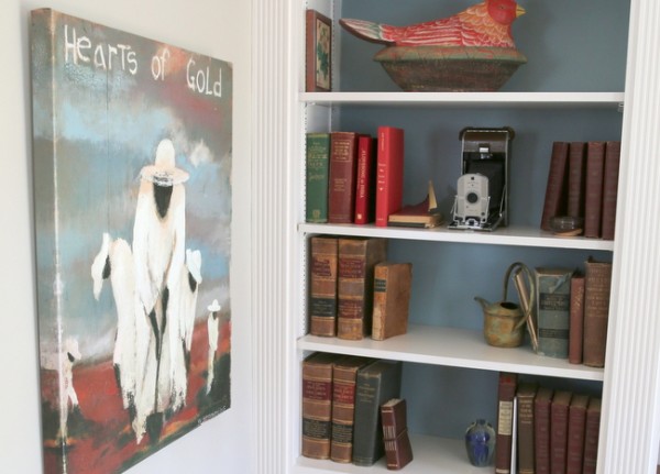
The entry/living room also included bookcases where antique books and primitive art could be displayed, but little seemed to be noticed like it deserved.
before
As a color and design consultant, I see my role as helping clients make choices that enhance and bring more life to the things they love and want to live with in their homes. Paint color and paint color placement can be very important in creating just the right backdrop for the things in your home that are meaningful. My clients had tested many paint colors, resulting in patchworks like this in several rooms of their home:
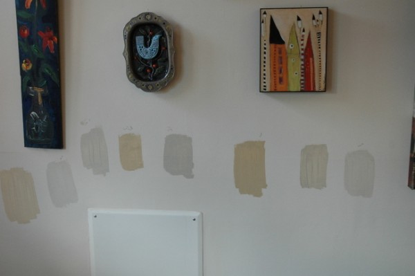
they should have used Small Wall paint sample boards
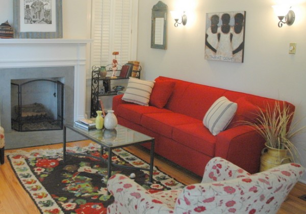
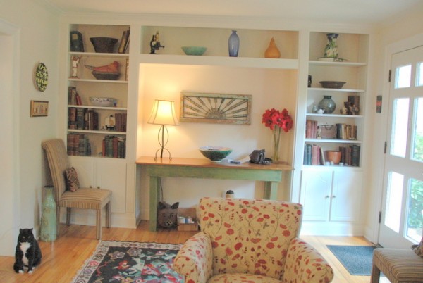
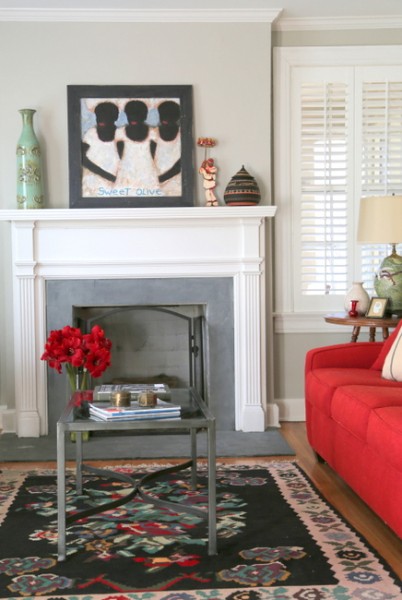
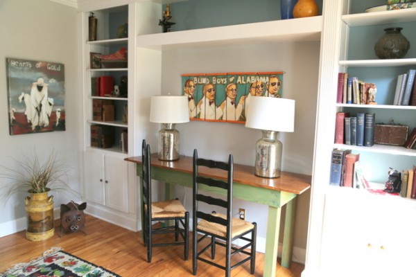
They finally gave up and googled for help. I’m glad they found me! The funny thing is, once we began working together the wife discovered that her mother follows my blog. It really is a small world, isn’t it? We worked together to find just the right paint colors to complement and enhance the collections that were so important to them, then rearranged furnishings and collections to create a living room that looks like a work of art. Here are some of the “after” photos I took last week after doing some final tweaking of the space:
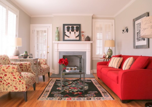
the right gray is the perfect backdrop for punches of color and vivid art
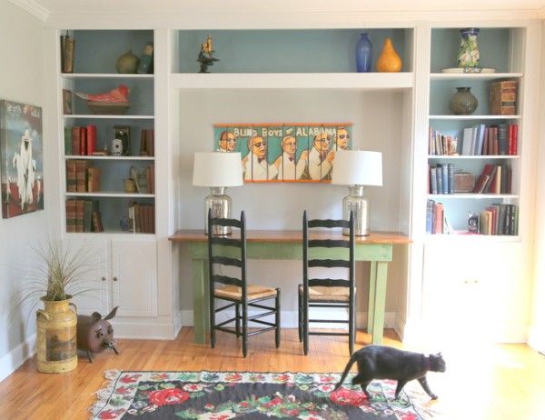
the addition of color in the back of the bookcase gives new life to this side of the room
So, what do you think? I have another room in their home I want to share later this week. To make sure you don’t miss out on any of my before-and-afters, sign up here to subscribe to my exclusive emails 2-3 times per week!


I learn SO MUCH from your before/after pics! Keep ’em coming!
It’s amazing how such a subtle change makes the space look finished and the architecture pop!
Beautiful rearrangement of furniture and soft gray paint to complement to the art!
I love it! The colors are perfect, and the new furniture arrangement works so much better.
Luv it! But those sample patches on the wall – YIKES!
Yikes is right! Of course, I used Small Wall paint sample boards when choosing the paint colors for this house.
The gray looks nice. I also like to use bolder, darker colors for art walls to really made the art pop. Nice job Kristie!
Oh boy the paint really made a difference. I’m in love with their style! The unique art they’ve collected and all the colors in the room are amazing. Can’t wait to see more. I wonder if they would share info about some of the art? That could be a cool blog post in itself.
I like light walls to showcase art and collectibles but that does not mean it has t be white. You still kept them light but chose just the right color, once again! My favorite change has to be the back of the bookcases!
Thank you, Luci!
I love the soft gray. So warm and inviting and really makes the art pop. The back of the bookcase are awesome. The color really ties everything together. Love it all as usual!
Absolutely gorgeous. They had beautiful pieces and bones and you made it come together perfectly. So happy to have met you at the conference. Your work and educational approach in the blog are inspiring. Thanks Kristie!
They must be delighted. It looks SO much better!
Lovely! Do you have the name of the gray paint? Beautiful job!
Thanks, Mary! If you’d like more information about the paint colors used in this client’s design, contact my assistant at [email protected]