Just announced: the 2017 Pantone Color of the Year is GREENERY:
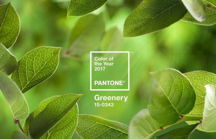
Yes, the photo is lovely, but cue into the little box in the middle of the picture. THAT’S the color of the year. It’s an acidic, nearly neon, yellow-green. Pantone says the color pick is “a symbol of new beginnings” that is “zesty” and “life-affirming.”
Let’s get down to brass tacks here. How does this color trickle down into our fashion and decor? Hmm.

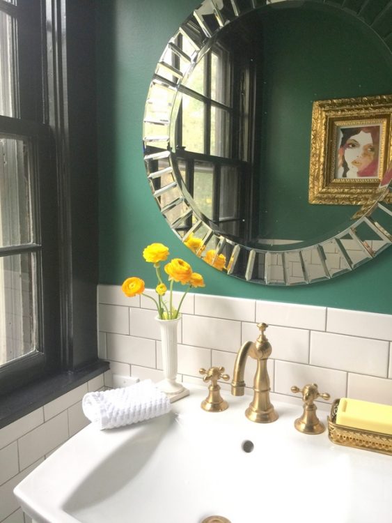
Blue-greens have been increasingly popular the last couple of years, and I have definitely been on that bandwagon. Dark greens like emerald and spinach are dramatic and sophisticated.
design by The Decorologist
It appears that Pantone wants to influence our greens towards yellow instead. I can take it in small doses in decor, mixed with other variations of green and turquoise or dark blue. But putting this color in the spotlight? Kinda makes me feel like The Grinch. How about you?


Remember the green from (a couple of years back? Maybe more…) a while ago? Different than this but I guess it’s ‘easy’ to do a color-of-the-year that is some kind of red, green, blue, gray, etc.
Well anyway I’ve been using this color as a little accent Pop at home for a while now. I guess for fashion it will look great with some skin tones (not me, but that’s ok certainly). Thanks for your post, Kristie.
Barbara,
Do you mean avocado green??? It certainly feels a bit like that. I don’t mind it in small doses, for accents pops as you said, it can be fun. But this particular shade is sooo acidic . . . I think you’d have to have a dark tan or skin tone to wear this color, too!
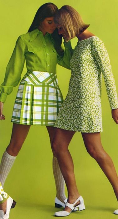
Wow reminds me of the 1970’s and Peter Maxx posters. What’s next? Flower power stickers and microbuses? I love green, but this one is a bit much…maybe in small doses as accessories.
I’ll be blunt, can’t stand the color!
Great post Kristine! Just wrapping up my RESA presentation where I do see jewel tone greens/blues as a trend, so not surprised to see a “form” of green chosen. I was surprised at the “brightness” of the color, so do agree with you on how it could be used. Feel like this is a better choice than the pink/blue and marsala of years past though…Looking forward to seeing you at RESACon!
I agree with you, Kristie! Emerald green is one of my favorites. I could look at your emerald green bathroom all day, love it!
I feel like the Grinch as well.
Like you, I’ve found my clients love many shades of blue greens right now (and have for a while), but this yellow green is a hard pill to swallow.
Yes, Laura, a bitter pill . . .
I love it! It’s similar to the green apple color I have on the focal wall in my bonus room. My ivory entertainment center pops against it. It’s bright and cheery in that room that doesn’t get much light and the rest of the walls are Italian Ivory so it’s just the pop of color the room needs. I guess I’m in the minority on this one, but I think it’s so fresh and cheery.
I do like a nice apple green, Cheryl. This particular shade reads more neon to me. I’m sure we’ll see softer and more pleasant derivatives of Greenery like the one you are describing!
I actually love it 🙂
It reminds me of the color “lemongrass” in Fiesta dishes. I have Fiesta ware in a rainbow of colors and I adore the lemongrass as an accent color. I agree this would not be a primary color for me either. It does add a fun pop of color though.
I’m sorry…but I hate it too! It reminds me so much of the 1970’s (chartreuse greens, bright pinks, yellows and orange) As a young bride in 1971, my kitchen was bright orange and yellow…it almost glowed in the dark! What was I thinking?? They say, what goes around, comes around again…but I say, leave this color buried in the past! I don’t think the average homeowner will embrace this color.
haha! Great job Kristie and here we go again. I give up.
I almost named this post: “Pantone : You’re Dead to Me!”
Ditto on the “small doses”!
I thought acid green was in a couple of years ago, but here is a variation as color of the year. I like it in moderation, and even in excess in certain applications. I would not use it on walls for staging, probably, unless the neighborhood/target market supported it. Certainly as accent pieces it gives nice vibrancy. If a client wanted it on their walls for their own home, I would ask if they would be happy repainting in a couple of years, if the charm (or trend) wore off. I do this for a lot of colors, though- I kind of like my walls to be the receding support to the color scheme of the room, rather than the scheme itself; especially if the furnishings and decor will have a lot of style and life in themselves.
So, like in many things, it all depends. But it is a happy color of nature, that’s for sure.
Can’t stand it. It’s not a color most people could live with in any but very small doses. I remember the kitchen in my family’s house in 1964–chartreuse cabs, wallpaper with big stylized flowers in chartreuse, orange and yellow, and orange curtains with ball fringe in the three colors. It was a huge kitchen with white counters and floor, and the walls were white, so it didn’t overwhelm as much as one would think, but still . . . do we have to repeat the past?
I’ll let my plants do their green thing and leave the rest of the décor neutral where I find comfort.
Yes, the only “Greenery” imagery Pantone is putting out that I actually like is that of leaves and plants. Not the clothing or the decor.
Love the “you’re dead to me”… and with the comments on the 70’s in mind (though I would have said 1968 “day-glo” colors) can harvest gold be far behind?
Sandy, yes – it’s a bit day-glo, for sure! Neon. Fluorescent. But wow, the leaves sure are pretty . . .
Borderline grinch here. It’s not completely awful but it’s not an easy color to use either. I don’t care what they named it (Greenery? Really?) I’m calling it Electric Neon Avocado.
I had a feeling a shade of green would be color of the year but not this bright/bold. Maybe in small doses as a accent color. Great article Kristie.
I think of it like Fashion week which showcases clothing lines many would consider bizarre. Most of us do end up incorporating the essence of the new trend into our wardrobe to be on trend. I guess with color it’s the same thing- though like short skirts this may require some editing.
No doubt, Cynthia. Great insight! This acidic hue will tone down and be a palatable option pretty quickly, I’m guessing!
I painted a door and a wall in my black and white kitchen Ben Moore Blooming Grove in 2012. After 4 years of looking at it every day I still love it. I’m looking at this color on my phone, but it sure looks similar. Obviously not everyone likes it but in my afternoon light kitchen it is bright and cheery and makes me happy. And that’s all that counts. Especially on gray winter days….?
The MOST important thing is surrounding yourself with colors you love, and you’ve obviously picked a great one for your kitchen! That’s the same way I feel about my home’s colors, even though most of them have been there for 15+ years!
I wore those clothes 4o+ years ago! Let’s leave the clothes and that color in the 70’s. That has to be the worst decade for fashion (?) and home décor ever.
Haha! Maybe they should pair Greenery with last year’s Marsala. That’ll turn heads.
Now THAT would be a fashion statement, Jessica!!!!
I loved this color throughout the 90’s and 2000’s–now I am sick of it.
Alas, our last kitchen was this color (previous owner’s paint job), and, amazingly, our current kitchen is also this color (previous owner’s paint job). It feels dated (early 2000’s) to me. I can’t wait to paint our kitchen!
I like greens, absolutely. This particular color though, I see as an accent color. Maybe I’d feel differently if this “greenery” color were a flattering one for me.
I’ve had a raincoat that color for 10 years. I LOOOVE to wear it in the rain, because it’s so cheery. Even though I love most greens, I couldn’t live with this green in large doses. I live wth a lot of green n my house, but they’re a little calmer.