As promised, I’m sharing the REST of the color trends from the most recent High Point Furniture Market. No, the entire market was not blush pink – and I know many of you are relieved. What I saw there points to the 2018 color trends will be seeing soon.
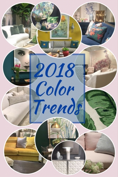
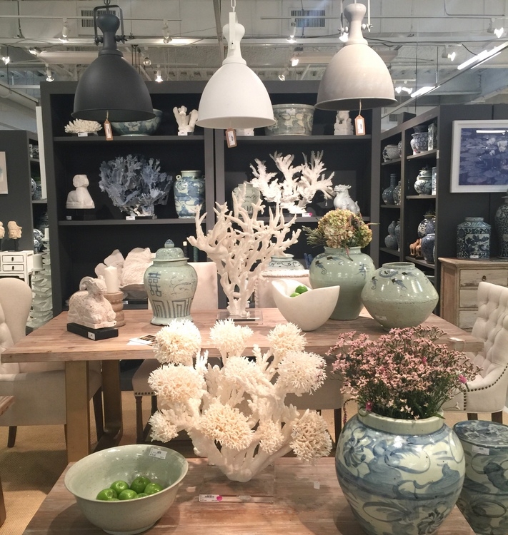
So, what other colors will be trending in upholstery, furniture, and decor accessories? Let’s start with my personal favorite – the gorgeous greens.

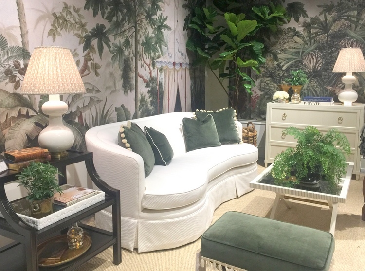
The backdrop of this vignette in the ModShop showroom is very similar to Benjamin Moore Steamed Spinach, which I have used in a couple of projects – and in my own home.
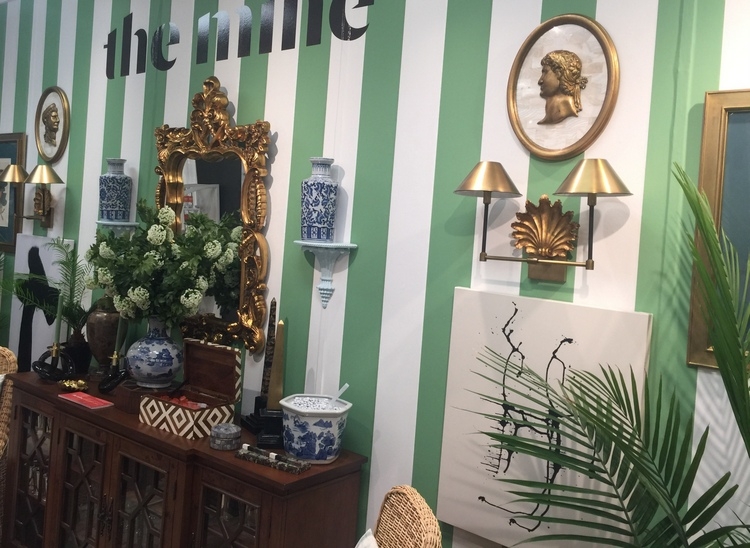
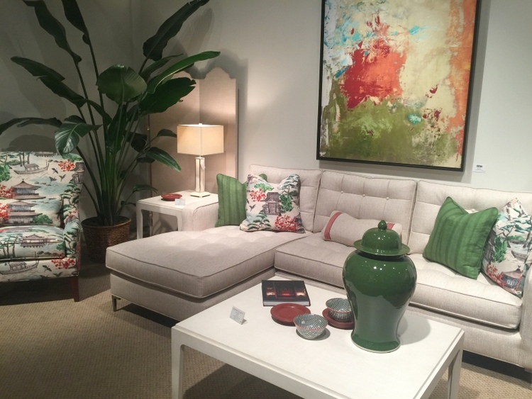
Green and white cabana stripes are both preppy and refined. Love them with all the gold metallic and the blue-and-white ginger jars.
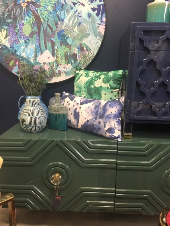
Blues and greens of all shades blend beautifully together, and continue to be a part of the 2018 color trends.
This lush paradise full of green and white was in the Highland House showroom:
 Crypton fabric at Highland House
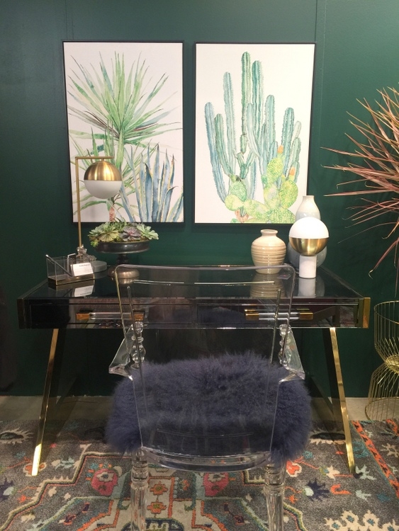
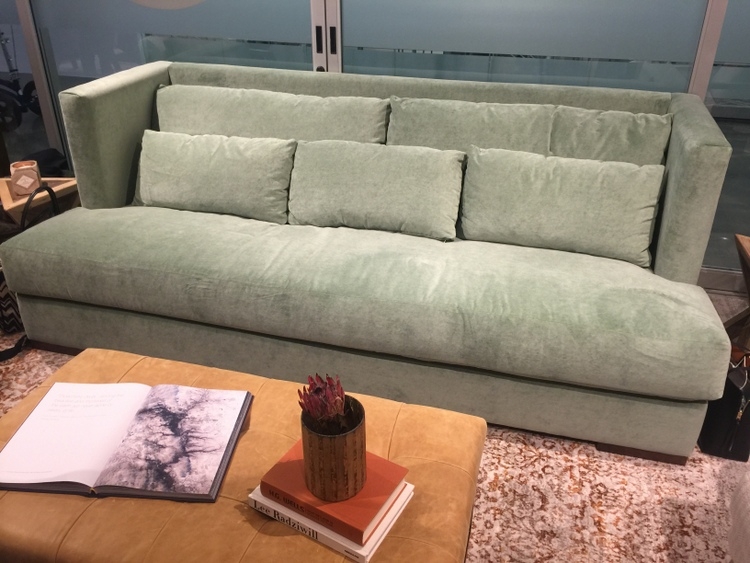
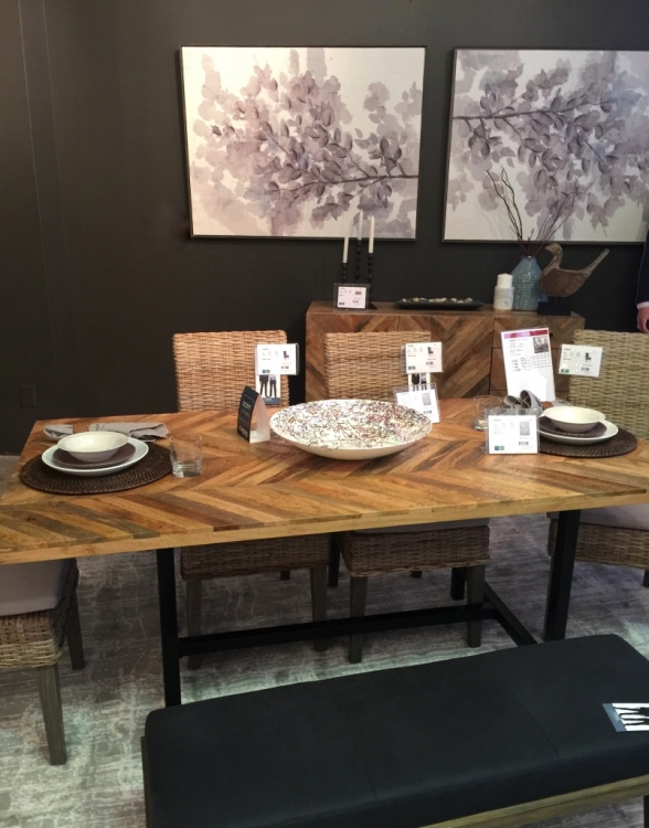
The most popular greens at market were the dark emeralds, jades, and forest colors.
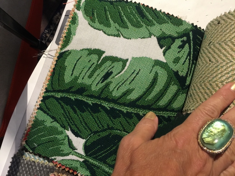
This gorgeous banana leaf fabric from Sunbrella can be used indoor or outdoor, and look how perfectly it matches my ring!
There were also splatters of jadite green throughout High Point Market, like this fabulous sofa from Younger Furniture:
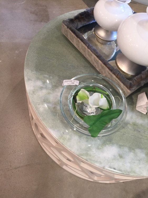
And in both upholstery and stone tabletops in Green Apple Home Style:

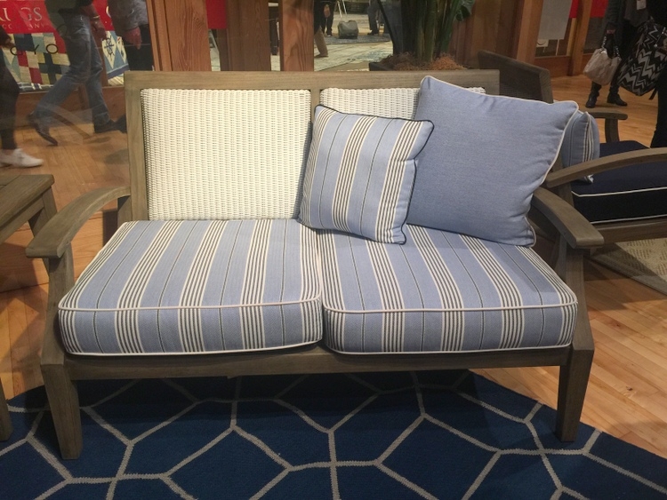
If you think it may be over for blues, you are mistaken. From light blue to aqua to navy, blues are practically neutrals since they work with most colors. They continue to be popular in paint, furnishings, and decor, making them central to the 2018 color trends.
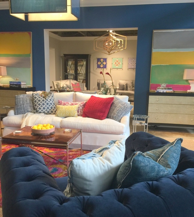
Navy, royal, and teal were seen throughout High Point Market. The Sunbrella showroom featured saturated and varied blues, and I absolutely LOVED the striated pattern on this fabulous sofa that fellow High Point Blogger, Jana Phipps, and I snapped a photo on.
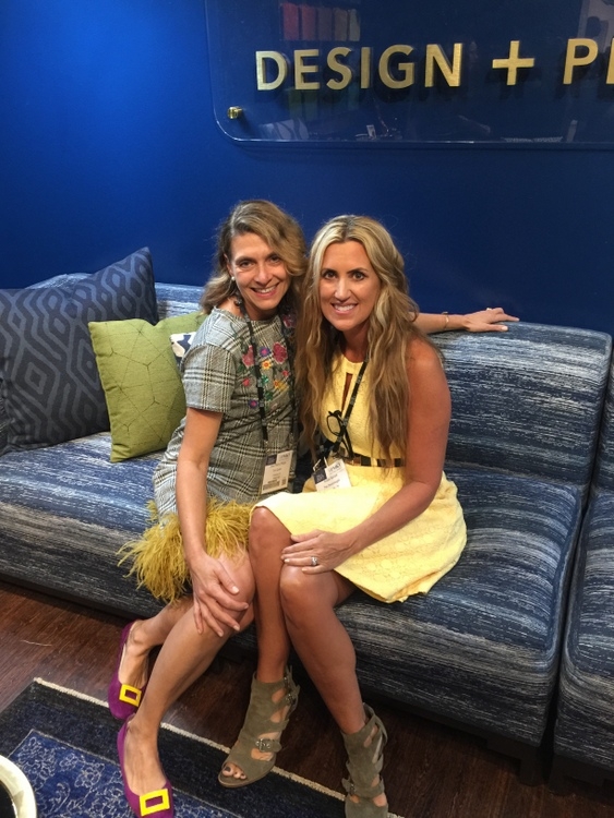 Trim Queen and The Decorologist in Sunbrella fabric showroom
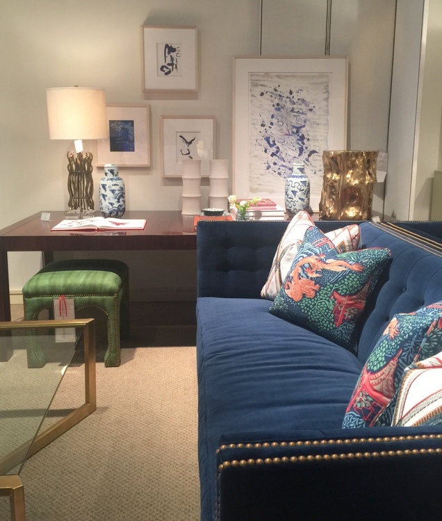
Teal was an important color in Michael Berman’s collection for Theodore Alexander . . .
. . . and for the Bend Goods showroom, which features seating, table, and decor made completely from wire.
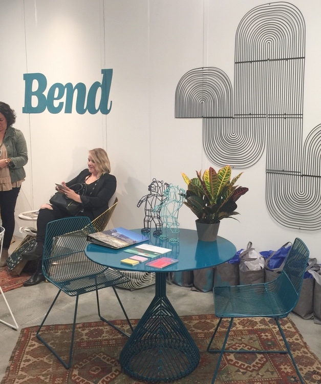 Bend wire furniture
It wasn’t all dark – there were lighter blues throughout market, as well. I loved the marriage of navy and aqua in these shapely chairs!
Because of technological advances in indoor/outdoor fabric, a blue upholstered bench like this one from Lloyd Flanders would be equally lovely on a porch or in an entry or mudroom.
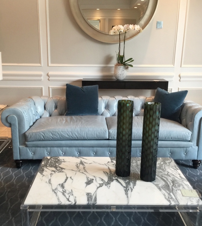
Even leather is going blue, like this lovely tufted sofa in the entry of the Theodore Alexander showroom.
For a lighter look, you can’t go wrong with a lots of whites mixed in with variations of blues:

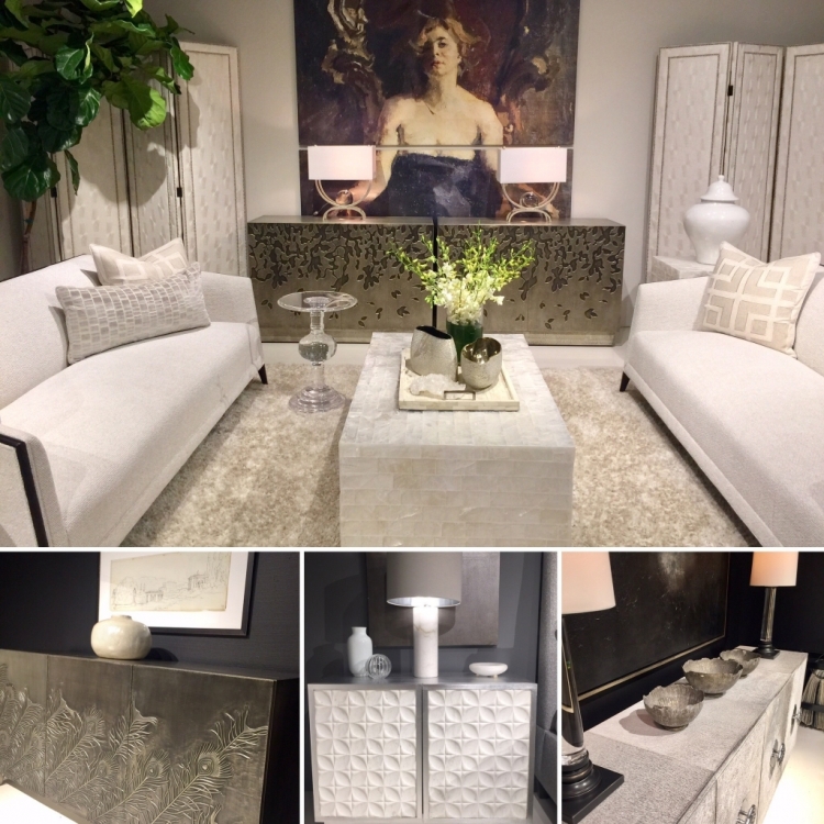
Speaking of white, there was a ton of white and off-white at High Point Furniture Market. I’d say that white/off-white is truly the dominant neutral right now. Yeah, gray is still here, but the contrast of white and black is really hot. Many showrooms featured room vignettes that featured dramatically black backdrops for whites and light grays. Black and white are at the root of 2018 color trends.
 Bernhardt Furniture showroom
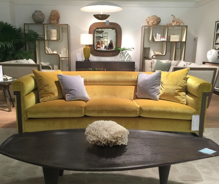
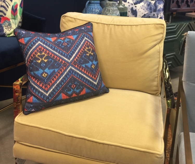
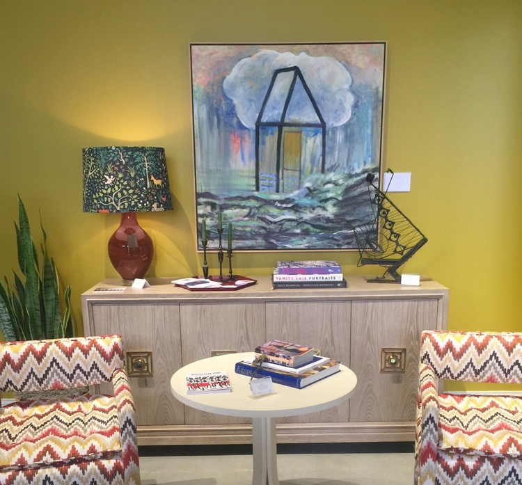
Now, shall we talk about the FUTURE for a moment? I’m going to let you in what I believe will be the next big trend color.
I saw bits of it here and there at High Point, typically in a supporting role. But I believe it will become more dominant over the next couple of years, as it pairs beautifully with many of the recent popular colors and would be easy to incorporate into existing color schemes so many of us have.

 Michael Berman collection for Theodore Alexander
Yep. Watch for yellow gold as it emerges as a dominant trend color. It’s gotta be done right, or else it looks dated – it’s all about updated color combinations and placement.
I told you it wasn’t all blush pink! Now that you’ve seen some of the 2018 color trends 2018, what do you think? Which colors or combinations are your favorites?
This is a sponsored post. The specific topic, content, and opinions are completely my own. All photography by Kristie Barnett.


Yay!! ALL of them! I’m even excited about the yellow that is to come!
Thank you for this terrific view into the wonderful displays and trends at High Point Market! Since I was unable to go, I have to live vicariously through you and others who went and were excited to share their experiences!
Thanks for stopping by, Karen! I’m not sure how many are going to feel about the yellow, but I’m excited about it, too. Done well with a light hand, it’s pretty fabulous.
Love the all the colors!! Do you ever teach classes in NY/NJ Metropolitan area??
Thanks, Diane! I do my Expert Psychological Stager™ course 3 times a year (March, June, and Sept) here in Nashville. Attendees fly in from all over the U.S. – here’s the link for more info: https://thedecorologist.com/product/best-home-staging-training/
Or you may be interested in my video courses (1-2 hours in length). You can find those here: https://thedecorologist.com/shop/
I’m sorry, I just can’t say I like any of it! All I see is 90’s decor!
What colors are you liking for interior decor, Elizabeth?
Love them all Kristie……. with that being said I don’t think I can probably get the blush to fly in central KY….. but we here in the bluegrass are always up for blue and green.! Thank you for such a great preview.
Thanks, Becky! I’m glad some of them will work for you 😉
Always so happy to see these gorgeous sapphire blues….but not loving many of those greens, and unless a client is in LOVE with them, I’m not sure I will incorporate them in bigger pieces.
Great piece, thank you!
Janice Weinstein
The Spirited Design
Thanks for sharing, Janice! I am a fan of both the blues and greens. I am in love with dark greens – I have a dark green home office. I also did a bathroom in dark green, black, and white with gold metallics. Sounds like you are a true blue person!
Cabana stripes? Uh….no. I tried hard to find a “love” among the colors and actually did. The black and white was the best I could do… and this is someone who loves Monet as well as Picasso! This was a tough batch, I felt.
Only black and white? Did you feel the trending colors are too bold for your liking? I wonder if you prefer lighter tints of color. They are definitely easier to live with for most people.
I love the blues and greens and whites! They’re already the dominant colors in my home, with more and more clean white being added. As for the golden yellow, I really don’t like it, it’s not ‘fresh’ enough for me. But, I adore soft, pale yellows, and think they’d compliment any of the other colors shown, better than the golden yellow does.
Kim,
I’m always a fan of blues and greens 🙂
Hi Kristie, First, I want to thank you for posting so many fabulous pictures and sharing your insight and adventures at the show. I appreciate the time you take to do this! My favorites from all the photos you shared are the blush lampshade, that striated sofa is darling and I want it now (I see it is a Sunbrella fabric; is it as soft as it looks?), the gorgeous banana leaf fabric, and the pops of Asian influence in design. I agree that the yellow trend has to be used judiciously, but didn’t Billy Baldwin in the last century say that every room needs a touch of yellow? I have used that principle for many years! Not sure I would paint a whole wall or buy yellow or gold upholstery, but I do like yellow flowers and burnished brass lamps. Did you see any celadon green at the show? It’s such a pretty color that would look beautiful with navy! All in all, looks like the trend is full of fresh colors with a balance of soft and bold.
Thank you so much, Laura – I literally took 2,000 photos, so it took a looonng time to cull through them all and decide what to post. And YES, the Sunbrella fabric felt great. The technology for outdoor fabric has really come a long way, and now it can truly be used anywhere! I love celadon green, and saw touches of it at market, but not a lot. I agree that it looks amazing with navy, and I am actually using it a lot!
Hi Kristie,
Wow! 2000 + photos…that’s a lot to edit! I hope you know how much your blog followers appreciate you! I’d love to see how you are using navy and celadon. I am not a designer by any means, just love to decorate my home and a lot of what I’ve found in reading your blog validates my choices….whew! Thanks for your reply!
You are very sweet, Laura – thank you for the encouragement! When I get some good photos of those projects, I’ll be sure to share 🙂
I have always been a jewel tone gal. My favorite is the jewel greens. I have been craving green for a while and was so excited when Pantone announced Greenery as the color of the year. I thought there would be more green accents out there. I have noticed a recurring theme in pictures of rooms I love and it is that they all have lush large plants. Maybe that is what I need. I am liking the yellow lately, and I’ve never liked yellow. I even recently finished knitting a golden yellow cardigan. It goes well with so many other colors, especially all the blues teals, turquoise that are a mainstay. Blush pink and yellow accessories and pillows recently arrived at my local Target so the yellow must have been out there for a while. I guess I just didn’t take notice. I personally hate that shade of pink that’s all the rage. Some of it looks too fleshy. I like it on handbags, shoes, clothing, but decor? No. My favorite color is pink, too, but more saturated hues.
Thanks for sharing your thoughts on the trending colors, Laura! I’m with you on the pink – I actually prefer the darker berry pinks myself. A little blush pink goes a long way!
Such a GREAT post! Thanks for all of the inspiring photos! I love all of the rich and saturated hues!
Wow, so gorgeous – love every single one! I tend to go with warmer jewel colors this time of year and then go back to lighter colors in the spring/summer. A lot of my walls are Hawthorne Yellow so it tends to work. Thanks for sharing your pics!
Donna,
Yay! I have Hawthorne Yellow in the common area of our second floor, as well as in our finished basement. It’s like sunshine 🙂
I like all of them but the blues and emerald green will always be at the top of my color “love list”.
Love the blues, greens and teal but yellow? Might take me a minute to like that one 🙂 Thanks for sharing!
It might grow on you, Teresa . . . 😉
Love it all! I was hoping to discover the name of the navy chinoiserie pillow fabric in the Century Furniture pictures. The beautiful pillow on the navy sofa. Would you know how to direct me to find a source? Thank you!
Finally, some jewel tones!!! By the way, can you recommend a neutral, pale blush color that is so pale that you can barely see the pink? Like a string of pearls?
Blessings.
Thanks for the color examples. Green is the new black!
this is really nice to read..informative post is very good to read..thanks a lot!