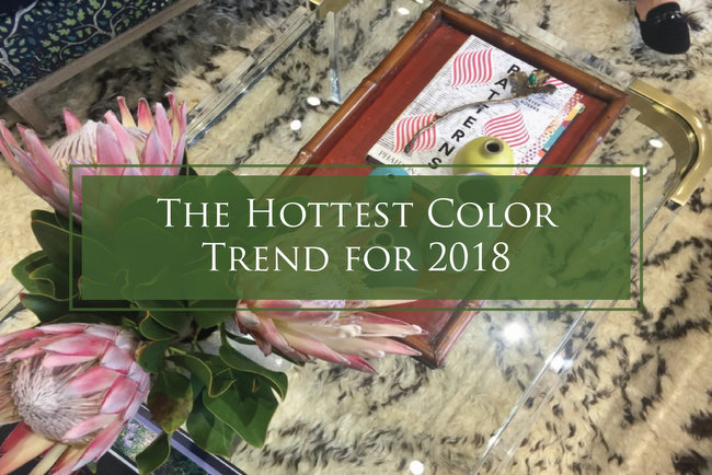
Hi friends! I recently returned from High Point Furniture Market, where I was part of the 2017 High Point Design Bloggers Tour. Being chosen for this tour was kinda like having a backstage pass. I got to scout out the hottest trends in interior design for the upcoming year, which I’m simply dying to share with you! And because COLOR speaks to me more than any other component of design, the 2018 color trends are what I want to share with you first.
I’m going to be talking about the big color trends coming down the pike, as well as the lesser ones that will be having a hot minute this coming year. But guys, I have too much color info and too many photos to fit all of the color forecast into one post.
So, today I’m sharing the hottest color you didn’t think you’d see in 2018.
I’ve heard so many people say something like this about this particular color over the last year:
“THIS COLOR won’t last a hot minute.”
“Don’t buy anything THIS COLOR, because it’ll be dated in a year.”
“THIS COLOR is too trendy. It won’t last long.”
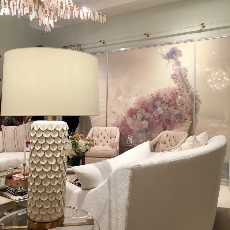
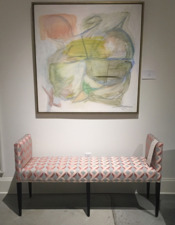
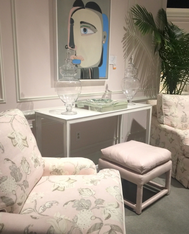
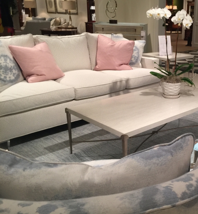
Well, I won’t make you wait any longer. Of all the colors I saw at High Point, one emerged as the belle of the ball. And it was BLUSH PINK. It appears that this color may have a longer shelf life than many predicted when it began trending in 2016. Check out the blush pink with white in the amazing Duralee showroom featuring a-mazing Crypton performance fabric:
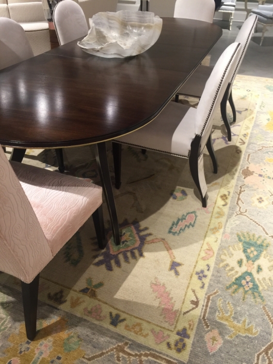
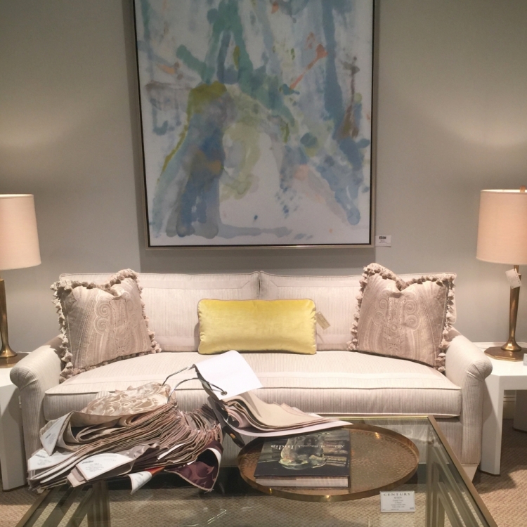
Blush pink was mainly paired with whites and creams, as you see in this Highland House dining room:
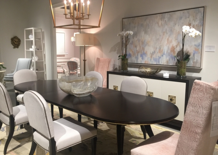
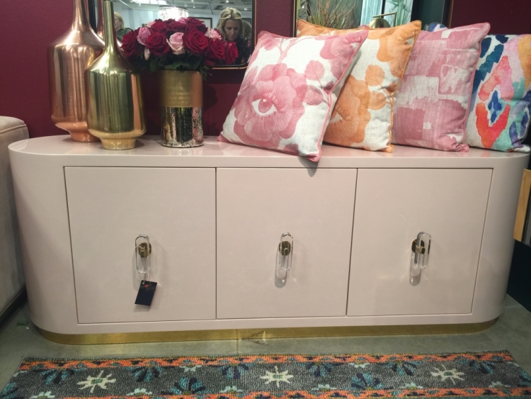
Blush pink can work very nicely with yellows and gold – makes me think of lemonade. I really loved the colors in this beautiful rug:
The blush pink with light blues and yellows are reminiscent of the early 1990s, which I’m beginning to grow nostalgic for!
Just to clarify: this isn’t a color prediction – it’s a fact that we are going to be seeing this blush pink a lot more in furniture, fabrics, and accessories. The things you see at High Point Furniture Market are the new lines of product companies are launching in stores across the country, typically in about six months from now.
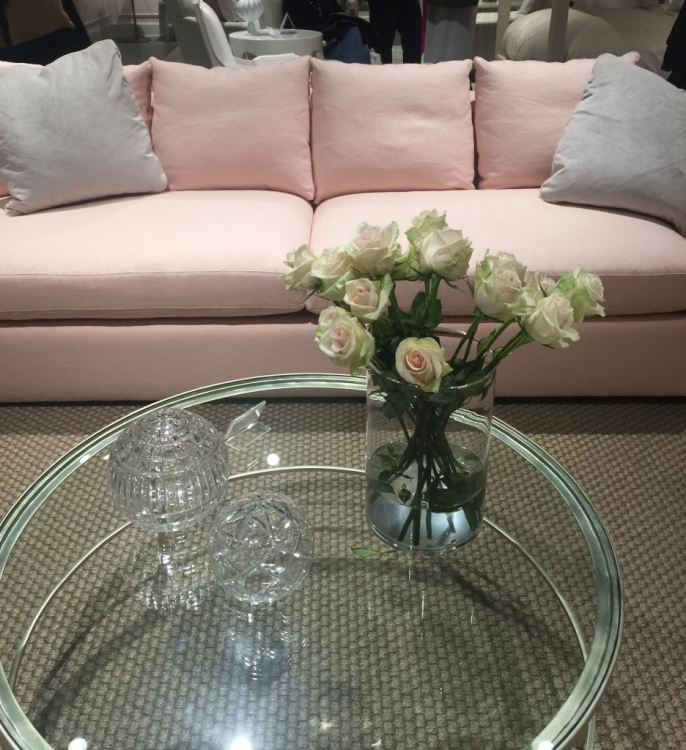
Pink sofas abounded, either with off-white or light blue pillows. This one is in Crypton performance fabric, which is extremely stain resistant:
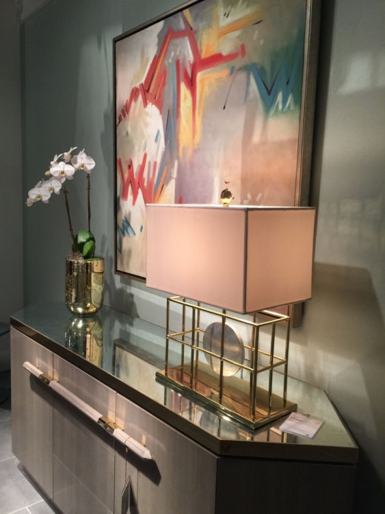
I can’t tell you how many blush pink lampshades I saw! Or maybe they used pink lightbulbs to cast that color within a cream lampshade? I should have checked . . .
I toured several vignettes in Highland House that were pink on pink, but that’s certainly not the only way to use pink.
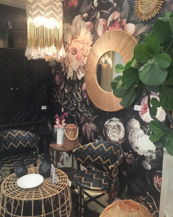
Black can ground blush pink and give it a Parisian feel, keeping it from seeming too sweet.
Blush pink was an unexpected choice for a backdrop in Century’s Furniture for the Garden showroom featuring forest green and navy upholstery and rattan.
Pink is a natural since large florals are trending right now. The black backdrop in this wallpaper lends a sophistication to this jungalow vibe:
You can also just use touches of pink as an accent color for pillows. Much lower commitment than a pink sofa, no?
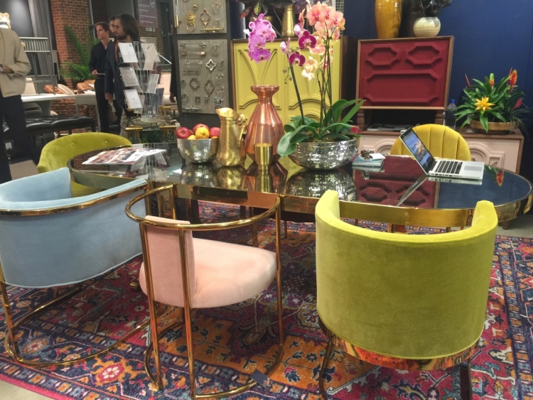
High Point Furniture Market showed attendees that pink can be surprisingly versatile – it was a sweet foil to richer, bolder colors featured in the fun-tastic ModShop showroom:
Pink evokes strong feelings, I know – you either love it or hate it, right? Never fear, friends! If you hate pink or think it’s too delicate or girly, there are lots of other color stories in our 2018 forecast! And I’ll share those with you in an upcoming post.
I’d love to hear your reaction to the ongoing blush pink trend. Yay or nay?
This is a sponsored post. The specific topic, content, and opinions are completely my own. All photography by Kristie Barnett.


Double ‘nay’! 🙂 I will add that none of those interior designs are pleasing to me, they look insipid and totally boring..
Hi Dolores,
I find that most women have a preference for either red, pink, or orange – but just one of those, not all. Is that true for you? Which do you prefer?
orange for me!! I love apricot and little dashes of orange
Maggie,
I saw the most beautiful Younger sofa in apricot at High Point! You can see it here:
https://www.instagram.com/p/BaUaYLrghBp/?taken-by=thedecorologist
How interesting! I definitely prefer red over orange or pink. I can enjoy them all in small doses, though.
You know something that really struck me about a lot of these images is how the form or silhouette of the furniture and/or accessories (and in some cases even the detail and accent parts of the furniture) felt really dated. While I was stoked to see the blush pink trend. However only 2 or 3 pictures I’d ever consider using as a design reference for my own home. With a few minor components of other images hardly sparking any real interest. So I wonder if it’s because not only are the colors reminiscent of a different era but so are the physical pieces as well. And it’s one too many throw backs to past design to feel fresh and current. I know I could be really wrong about this as I don’t think I really fully understand design trends over time. I’m simply an enthusiast in decorating my own space. But I honestly can’t tell if multiple decades are going to call and want their stuff back!
Hi Kira,
Like fashion and architecture, interior design often relies on history for inspiration. “New” designs are often reinterpretations of old ones. Take for example West Elm – considered very modern and current to millennials, most of that furniture is just revamped mid-century modern. I did see a lot of throwbacks at market – everything from Art Deco, Moderne, Mid-century Modern to more recent furnishings and colors reminiscent of the 1970s, 80s, and 90s.
Glad to hear it; I recently purchased a rug with blush in it for my inventory. I love pink!
Lori,
There are definitely lots of geometric, bohemian, and oriental rugs coming out with pink in them. I recently ordered one for a project myself!
The 90’s are still too recent for me!
haha!!!
Pink, green, and rose are my favorite colors! 🙂
I love those, too, Rhonda. I’m really liking blush pink with emerald green and gold at the moment!
Me too!
I’m happy to see the pinks coming back! They are calming and soft. Use as much as you like to inspire the feel of the room.
Pink and orange are my favorites…Red in small doses. Soft pink appeals to the soul in so many ways. I am glad to have softer colors on the walls and accessories. Every color goes “in” and “out” of style. Best advise I give, don’t put in a pink wall to wall carpet. Paint is an easy change.
Sandi,
Yes, paint and accessories are more easily changed out – good advice!
I would not be one to say I am on the pink wagon….however I bought a house that I am doing a little updating in one bath and kitchen. The bath was going to have a white counter top but because the wall tile is not pure white it would not coordinate so well.
I have chosen an entirely different Quartz and hoping once it gets installed that the coral color I picked out for the vanity will work. If not….blush pink will be the answer as I have already purchased a flamingo print for the wall from a local artist. So I am happy to hear it is a color with some staying power:)
I kinda love a good flamingo, Deb!
Blush pink happens to be my skin tone…..but I hate to think that it is being elevated over the lovely warm browns out there.
It actually pairs well with warm browns . . .
I have hated pink since I was a little girl. I love more earthy tones
Pink is definitely polarizing – either positive or negative!
Oh yay! I’m in the process of adding bits of blush to our new home. Glad to know I’m not totally off! 🙂
Nope, you are right on track, Stacy!
I love blush pink! It is so flattering to many skin tones so when light reflects off it everyone looks fabulous! This is such a versatile color. Love your photos and hearing about your design adventures, Kristie! That lamp with the blush shade (or pink bulb) is gorgeous!
Thanks for sharing your thoughts, Laura! I’ve also seen some blush lampshades at HomeGoods lately . . .
Ooooh, thanks for the heads up, Kristie!! 🙂
Love it all…every combination!
First of all…thank you for the very informative post and photos. I always enjoy your take on the new trends.
But, I want to gag. I’m sorry, I hated everything and to me it is like stepping back into the 80’s. When we built our home in 1987 all our wallpaper, paint and furniture had those colors (mauve, light pink, pale aquas, peach, light blues) Beautiful at the time, but became dated in 10 years. Most people cannot afford to redo all of their furnishings every 10 years
Susan,
I hear your dismay – but don’t worry! There were lots of other fun color trends at market – I’ll share those next, I promise! 😉
Nay. So lovely for a girl’s room or feminine office… but not in other rooms. I agree that it looks like the 90’s! Combined with the blues I’m getting flashbacks of the Southwest look!
Stay tuned for some other color trends that may be more to your liking! With color, one size does not fit all 😉
Big nay for me. I’m so glad you ended with a promise of other colors. 🙂
Yes, stay tuned!
For my next bedroom redo, I don’t know if I’ll choose blush with navy or fuchsia (or magenta) with navy. I tend to like bolder colors, however, so most likely will go with the darker color. No neutral rooms for this girl! I do love pink shades–ex-nay on the warm colors. Don’t care for yellow, orange, or red. Just redid my living room in gray, navy, teal, with a dash of fuchsia.
Cyndi,
I definitely see hints that these blush pinks will get warmer and more saturated as time goes on – think strawberry or raspberry for accent colors, which would be really nice with navy!
I like the pink but it reminds me of the mauve phase. I feel like I’ve seen all these colors in these combinations in the 70’s 80’s up till now.
I have to understand I like a brighter colors.
Yes Jeannie, you are definitely someone who is draw to more saturated colors!! 🙂
I actually really like the blush pink. BUT when I see it paired with the pale blues, pale greens, and cream I immediately think “Golden Girls”!!
I can see that, Jackie! ;/
Hmm, at first I was thinking blush sounds very pretty and romantic; not a problem! But in most of those spaces it seems kind of washed out, drained, almost sickly. I can see it looking very pretty with the right yellow or especially grays and browns. Still, I prefer more vibrancy in my pinks like the strawberry or raspberry you mentioned in a previous comment.
Actually for spring, it could be very pretty with soft mint greens, aquas… I have to think about this! lol
I have noticed a pale to mid-tone peachy-blush color in a lot of BBC Victorian era productions, which probably photographs well and can be a nice counterbalance to natural or painted wood trim. Pink was not considered a girly color until around 50 years ago, and it is in many period rooms as sort of a neutral, including in the old BBC Sherlock Holmes series in his study. Didn’t look girly at all. Also have seen it quite a bit in those lovely old travel posters from the 30s-50s, paired with saturated colors, and in the 40s-60s interiors and fabrics paired with maroon, gray, black, brown, cream, lemon yellow, aqua or turquoise and either strong (40s) or pale (early 60s) pastels.
Kathy,
I love to draw on history for color inspiration, and I enjoy your insights – thank you!
Kristie! Does this mean we can finally cave in and agree to paint our little girls’ rooms pink without worrying about whether the house will sell – or am I getting ahead of myself? Think pink (like charcoal, wall-to-wall gray, and navy) will make the shift from “highly personal” to “everywhere present”? I’ve had a nice bucket of paint (that looks just like the inside of a shell) waiting in the wings for some time. PS I do prefer calling it “Rose Quartz.”
Sunny, I believe a pink little girl’s room is just fine – even if you may sell soon. Most buyers don’t make decisions based on wall colors in kids’ rooms. However, painting your living room or master bedroom pink would be a no-no! Pink with navy and gray sounds like a very updated option for a girl’s room to me!
Yikes! Everyone just got done remodeling their houses to get away from these colors and here we go again! I just have never liked pink, something about it just makes me want to gag!
It looks beautiful in some of your photos….BUT, I’m afraid I may not be able to go there because it’s a little close to 80’s mauve! I do think a very pale blush pink is fabulous in a little girl’s room though! 🙂
I’m really diggin’ lol the blush pink and gold combo. I think it’s so pretty. I also love blush pink with copper accents. It’s a totally new take on the pink (which was really mauve) from the 80’s. Can’t wait for your next post!!
I agree, Robin! Maybe in a home office or sitting room 🙂
I’m waiting to take delivery of a blush pink velvet couch I order a few weeks ago. I’m paring it with a black provincial desk for my office. It’s a colour I never really thought I’d ever fall in love with but it’s taken me under its spell! I also think it’s here to stay. Thanks for another great post Kristie!
Wow, I’d love to see that velvet sofa!!! Sounds lovely!
I for one am thrilled! I agree with others that many of the vignettes from market are a bit ho-hum, but I have invested in a bold and even somewhat masculine pink chair (the print is tribal and has other sub-colors), blush throw pillows, and artwork with pinks all in my living room with neutrals, grays and black pieces as well. I’ve also just painted my office pink and white with loud navy and magenta accents. It can be really fun and definitely NOT of the 1980’s!!
I normally gravitate to saturated warm colors, but I’m a big thumbs up for Blush Pink!
I have always loved the old 50’s style bathrooms with all the pink tile, sink, toilet, etc. I’m thinking blush pink walls and black and white for everything else for my master bedroom and bath!
Dee,
I’ve always coveted those vintage pink bathrooms, but I do have a vintage green/black one 🙂
Having seen many of these showrooms and others in my work with WithIt (Women’s Leadership Development Network, based in the home industries) during Market, I can say that almost all of the Blush shown had definite brown undertones, not “pastel” & little girl-y but tending more towards apricot or a hint of coral.
My favorite colors are blush and bashful! Great post. I love the blush pink and black or charcoal together.
I’m a big fan of coral that leans more red. My daughter’s bathroom is painted BM Claret Red and I LOVE it. I am, however, looking for a much lighter version for the ceiling in what will be her big girl bedroom. Thankfully, that project is a year or so down the road as we are currently deep into a kitchen renovation 🙂 I love color, so posts like this are very exciting for me. Thanks for sharing Kristie.
Love the pink! I love pastels and lots of light and white curtains with pale pink or pale blue duvets and I love pale pink in the living room and have always had blue living rooms!
Our last house had lots of granite, it had brown flecks in it, we sold that house partly because the brown in the kitchen made me hate the whole room. I am much happier in a different house minus the granite! Color makes me either happy or sad…
My Christmas things are pale pink and silver and pale blue too. I love pink
And I love the Blush wedding gowns, I would have chosen pink if they had been around when I was married