Matching colors for your home sounds like a simple visual exercise, but it can be harder than you may think. Today I’m sharing how I pulled together a color scheme for a current project, with tips that can help you with your own interior projects.
For my ongoing beach vacation property project in Seagrove Beach, FL, the main wall color was the most important color decision that needed to be made. I chose Benjamin Moore Silken Pine for what I refer to as the “anchor neutral” for the entire home. This color is for the open concept areas (living, dining, and kitchen), the hallways, connecting areas, and the main floor bedroom. This color sets the mood and feel of the entire house, and it must coordinate well with nearly every other color in the house since it can be viewed from rooms painted other colors.
Then, I decided on the main accent color for the home, which is a dark forest green. That will be the color for the kitchen base cabinets. I chose a clean-lined sofa in that color. So far, so good. I then began searching for a living room area rug that would include many of the colors of the interior scheme. This is what I landed on:
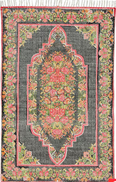
This rug had the bohemian feel I was looking for, but you can’t ever be sure about the exact colors of rugs and fabrics that you purchase online. When the rug arrived, I compared it against my wall color and sofa color. And I was concerned:
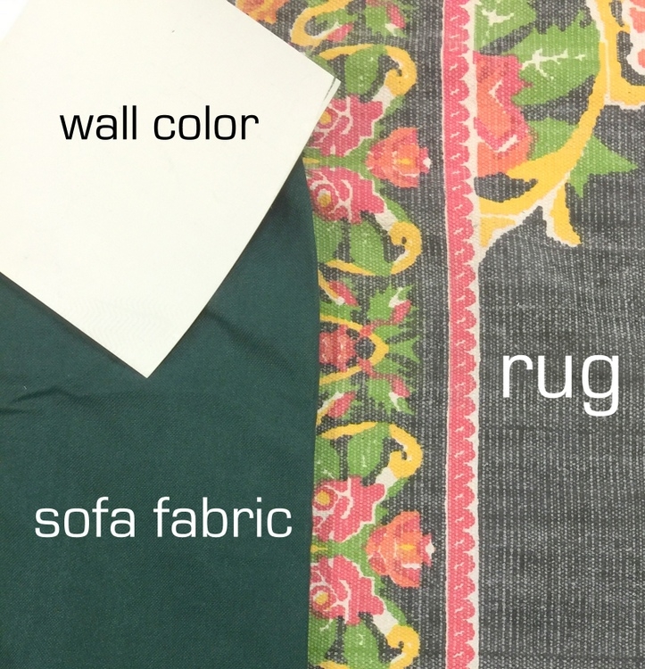
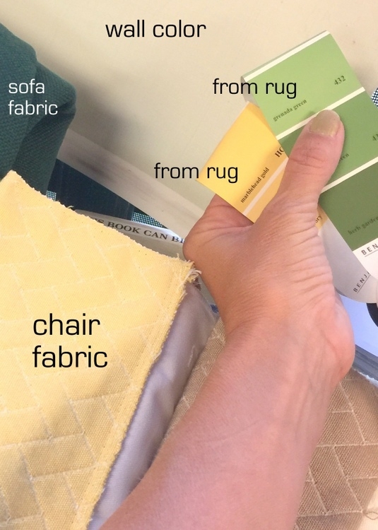
They don’t exactly look like a match made in heaven, now do they? I was also trying to choose an outdoor fabric to recover some club chairs that would also be in the living room. When shopping for fabric, I couldn’t drag the huge rug into the store. Instead, I found the closest colors in my Ben Moore fandeck, and took those with me. Now I’m looking at all these together:
If you think I never question my design decisions, you are sorely mistaken. I’m pretty sure we all do! I stood there in the fabric store, knowing the painting was already in progress, the sofa and rug had already been delivered, and I’m thinking:
Do ANY OF THESE colors even work together at all?
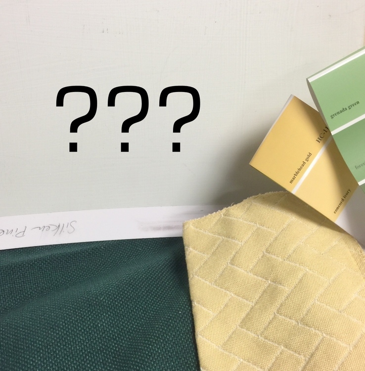
One thing I’ve learned in the last 14 years is that there’s an art to matching colors and patterns. Lots of experience and experimentation is helpful. For me, the experience has taken place in hundreds of homes, while the experimentation has mainly taken place in my own home! I’ve learned that the backdrop can be a more muted color in order to let the more saturated colors in fabrics and decor can really take center stage. So a muted light green can be a neutral that will complement a darker, stronger green and even other saturated accent colors. But man-oh-man, the colors in that rug were scaring me.
So I ordered another rug, just in case. I was prepared to eat the cost on the rug that didn’t work in order to insure a good finished product. Last week, I traveled to the beach property to begin the installation of the furnishings. Along with the sofa, chair, and rug, I brought down other decor that would be a part of the big picture when it all came together. And it ends up, I really preferred my first rug choice afterall!
You may notice that I use large paint sample boards when comparing all this – this is super important! SmallWall is the best product I’ve found to sample paint colors – I carry them around with me when shopping, of course!
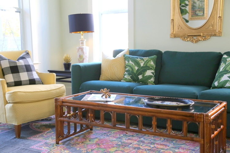
For the most part, the other decor in the room should support the color scheme. It’s really about repeating colors (even lighter and darker versions of the color) across the space, so that they look purposeful. Here’s a corner of the nearly-finished sitting area labeled with the main room colors. It really boils down to variations of 3 colors: green, yellow, and black:
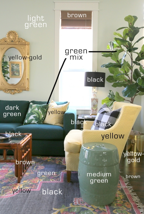
Of course, you see that brown is in there, too. But it’s not just the hardwoods – it’s also in the simple window treatments, the rattan coffee table, and even a bit in the asian lamp bases. The pink in the rug is the wildcard of this color scheme. When the room is complete, you’ll see how I will use it sparingly in a couple of other places.
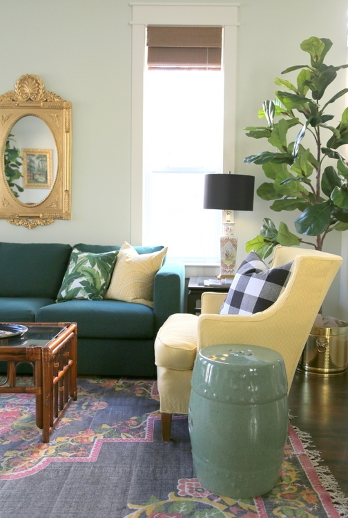
Keep in mind that this is a sneak-peek of the space, and it’s still incomplete. I took these pictures after I set up the living room, but I am still tweaking and bringing down another small load of furnishings next week to finish up the project. I’m not sure I’m satisfied with the mirror here, so that may change. I had planned to paint the rattan, but now I’m thinking I like it natural here.
Notice there’s even a gold lining inside the black lampshades – I love that!
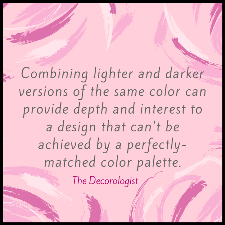
I’m not sure if this was helpful or not, I just wanted to try to explain why matching colors in your space it isn’t always simple – especially when you can find exact color matches in fabrics and decor. Actually, combining lighter and darker versions of the same color can provide depth and interest to a design that can’t be achieved by a perfectly-matched color palette. That’s especially true if you are going for a more “collected over time” look, rather than a “straight out of the showroom” look. Another thing to keep in mind: although colors may not match exactly when you lay them right next to each other, from a distance they don’t look as dissimilar. Like the stronger yellow in the rug? Because there are just small bits of yellow in the pattern, it looks quite similar to the larger expanse of softer yellow in the chair and pillow fabric. The funkier yellow-green of the rug is picked up in the varying greens of the sofa pillows and even the fiddle fig leaf plant in the corner.
I just got word that the contractor is finishing up with all the final details of the remodel by mid-week. Cleaners will be in to get it sparkling for me to return and get the house completely ready to rent by spring break! Stay tuned for the big reveal, befores/afters, details of the high-low projects, and inspiration for your own projects!


LOVE!!!!!!!!!
🙂 Just a sneaky peek!
Hi Kristie
What a beautiful room. That rug is fabulous. I’m also updating a family room/kitchen and I hope you wouldn’t mind sharing the beautiful wall color you went with. I’ve been thinking about using bm soothing aloe vs an off white color. Soothing aloe is so calming and wonderful. Just the calm I need after a long work day. Can’t wait for the final reveal.
Thx again for all you share and teach us.
Thank you so much, Penny! I believe I did share the wall color in the post, but it is Benjamin Moore’s Silken Pine. Soothing Aloe is also a beautiful color – a bit more blue, while this one is a bit more green. I can’t wait to show you more 😉
Very lovely, sophisticated, and so “ fresh” to see someone deviate from the “expected” typical, coastal palette of greys and blues! I love how you labeled everything to help us learn how to pull colors together. I noticed that those gorgeous lamps also have pink/tones on them to tie in with the pink on the rug- I’m sure that must have been intentional, too, right?
I also noticed that the wall color looks much more green than I ever would have guessed from the photo of the chip. Is that just in the photo online, or is that difference apparent in looks in real life, too? Just wondering. Thanks!
Hi Phyllis,
Actually, the color you are seeing in those lamps is brown (which I failed to label). On my computer screen, the wall color looks pretty accurate. Definitely has a green hue, but it is fairly subtle. It’s possible that your device is showing the colors a bit differently, I can’t be sure. Thank you for the vote of confidence for deviating from the norm! That is certainly the intention 🙂
Wonderfully honest post, Kristie! The room is turning out great.
Thank you so much, Amy! Can’t wait to get back down there next week.
Love this post! Sometimes when I’m trying to match colors, I’ll place the items next to each other and stand back and squint… something about seeing them a little blurred helps me. I also frame it out with my hands or a square cut out in paper in order to block out other colors or items around it that might distract from the items I’m trying match.
Yes! Those are great tips – it’s so easy to be distracted by surrounding colors, especially if you are looking at those colors in a different space, like a store! Thanks for sharing those, Loroy!
I agree completely with Phyllis E! I love color and am getting so tired of gray, black, and white. Not to mention that green is my favorite color. The pink in the rug is something I never would have thought of or even tried, but it so fun and fresh here. LOVE the room and can’t wait to see the completed kitchen. We have dark green cabinets in our basement bar, and I almost wish I had them in my kitchen as well.
Thanks, Lisa! The one upper cabinet in the kitchen was installed and painted last week, so it should be complete. I was pretty happy with how it looked when I was last there, but I’m saving posting any photos until it’s really finished. I will, however, probably post “in progress” photos to show how sometimes it looks crazy before it gets better! The “in the middle” part is where some clients kinda freak out, scared that the wrong choices were made. Kinda like I did with those colors and fabrics . . .
You nailed it. “Combining lighter and darker versions of the same color can provide depth and interest to a design that can’t be achieved by a perfectly-matched color palette. ” This is exactly what I’m always trying to explain to my clients. That, and metamerism…but that’s a discussion for a different day!
Thanks, Darla! 🙂
I love that rug! May I ask where you found it? Beautiful sneak peek!
Sure, Amanda! It’s from Rugs USA.:)
It’s just absolutely fantastic! Love it! I’d rent it from you any day!
Thanks so much, Amy! I’ll let you know when it’s available 😉
Love it! Is this on a beach? I’m looking for a place for next month down there…
It’s 200 steps from the beach, but not beachfront. Has a community pool 25 steps away. Great neighborhood and beach! What dates do you need? We should have photos done soon . . .
I’ve used Silken Pine in many of my homes. Currently, I am using it in the primary bedroom of our west coast vacation home. It is so soothing and such a subtle green, even in a north-facing room. I also used it in the open living room / dining room in our main home, south-facing with skylights and a vaulted ceiling. It looks grey or green, depending on the time of day. Love it! I usually pair it with BM Pale Oak in other parts of the home.