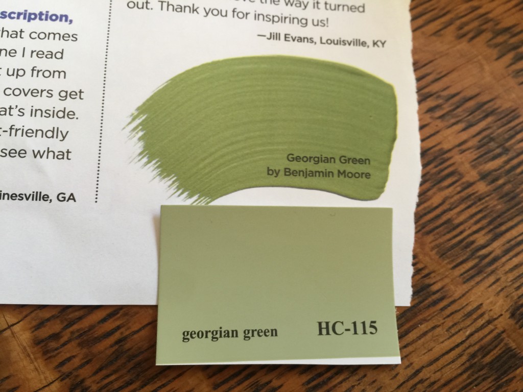
I hope you are ready for a Breath of Fresh Air, because Benjamin Moore just announced it as their 2014 Color of the Year!
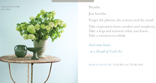
Benjamin Moore 2014 Color of the Year – Breath of Fresh Air 806
Benjamin Moore has some predictions about other trending colors for 2014, which I will be sharing with you in a series of upcoming articles. And they aren’t the only ones with something to say about 2014 color trends . . .
Benjamin Moore
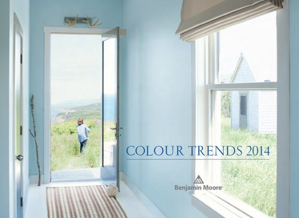
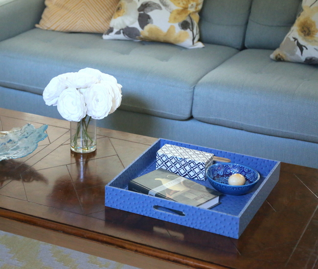
Here’s a room with less natural light painted in a color that looks like Benjamin Moore’s Breath of Fresh Air. Always keep in mind that natural and artificial lighting affects how you perceive a color in a given space.
So what do you think of Benjamin Moore’s 2014 Color of the Year? If you want to keep up with color and decorating trends, make sure you subscribe to my emails here. If you want to learn more about choosing just the right paint colors for your home, check out my Color Workshop Video.


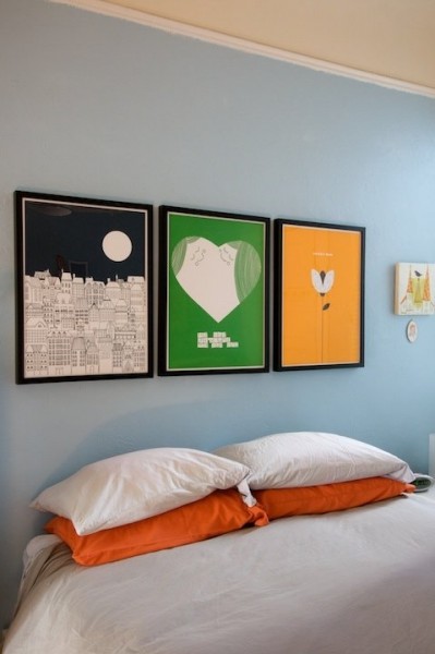
That is a relaxing, fresh color. I painted my office China Blue, and it looks more like BM’s picture of Breath of Fresh Air. My office does not have a lot of natural light. I have a large fluorescent overhead light, two table lamps and one floor lamp. Sometimes, I turn on only the lamps. With or without all the lights on, it reads more light blue than green.
I just looked at the photos of my office. After I painted the room, when the room was empty, the paint looked very Tiffany blue. The room now looks more like Breath of Fresh Air since I’ve added loads of white and dark blue accents (blue area rug, blue console, white curtains, desk painted Simply White, bookcase/china cabinet and chairs chalk painted Pure White).
It’s important that you shared that, Wendy. It’s easy to jump to conclusions about a new wall color BEFORE you add in furnishings, fabrics, and art. All of those things you added totally changes the way you see the paint color vs. seeing it in isolation. Color is definitely relative!
Hm. I can’t say that I am personally a fan of this color. My strong preference (at least for colors on walls in my home) is for softer, more whispery colors so this comes across as a bit too saturated, a little too “baby boy” for me.
I’m not loving this color. Feels a little nursery boy blue?
I would gray it down a bit to use it in anything but a child’s room or small room, but it could be “matured” with the right pairings of more grown-up colors.
It pretty, but just like any other light blue colors out there. Nothing special.
I am still posting mine sister! 🙂
But of course! You must!
Love it!!
Meh! Not too exciting is it?
Not really – and not very “new.” Frankly, Ben Moore’s Color of the Year 2013 fell a bit flat (Lemon Sorbet). Haven’t had ANYBODY asking for light yellow paint this year.
https://thedecorologist.com/nashville-color-expert-announces-benjamin-moores-2013-color-of-the-year-lemon-sorbet
Way too much blue value in this. Not a fan at all.
I think some people did not love the emerald green pantone color of the year and wanted blue instead, so now they have it, I am guessing pantone might choose blue or purple for 2014.
I have to say a do like greens 😉
I really thought it would be Monaco Blue, myself. And in reality, that’s the color that seems to be the “it” color this year! I wouldn’t be surprised if Pantone chooses a lavender or a mint green. We shall see!
Thanks for replying I know you are a busy person but it’s nice to read your opinion. Let’s see if pantone doesn’t surprises us with a red color for 2014 hehe, all this is fun and exciting to me I don’t know why 😉
I think it is so nice. Very calming and, like the name says, fresh! Especially in the photo of the hallway with sparse decoration. I think it is a good-feeling color.
Painted the guest room with this color….I was originally fearing the “baby boy” look…..now with white it’s starting to look like a sea scape or relaxing place….living in FL, guests come from cold places and love the room, it’s “fresh, clean and crisp” color looks like they landed near the ocean…..I’m looking to add “pop” not sure, if it should be teal or darker blue….large ceramic floor tiles are ugh, white, so I was thinking about a rug? Maybe striped? Any ideas? Thanks
I’m ordinarily not a blue person (no pun intended) and have never decorated with any shade of blue, but I was looking at a few different colors for our bedroom, I was ready for something completely different and this blue caught my eye. So we went for it and we love it! If you think you like it in pictures-you will like it even better on the walls or even a piece of furniture.