Benjamin Moore‘s 2013 Color of the Year is Lemon Sorbet 2019-60.
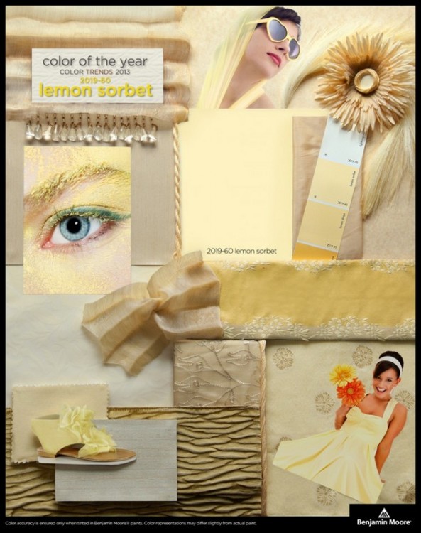
Fresh off the heels of 2012’s top pick, Wythe Blue, Lemon Sorbet is a fresh optimistic color that works well with other popular clean colors. Notice this is not the yellow-gold popular in the late 90’s and early 2000’s – it’s a crisp, clear pastel yellow. Here’s an example of the color in a child’s room:
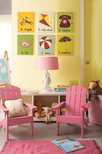
Chicago Tribune
“It’s the perfect partner for the emerging palette of freshened, polished pastels that promise to be favorites in the coming year. Additionally, it’s the ideal transition color as we move from the more vibrant spectrum and mid-to-deep tone hues that we’ve been experiencing in home furnishings and fashions.” explains Sonu Mathew, Color Chats writer and Benjamin Moore’s senior interior designer. Click here to read the entire Color Chats article.
I think it pairs well with watery blues and greens, like the updated surf-and-sand palette I posted the other day on The Decorologist Facebook page:
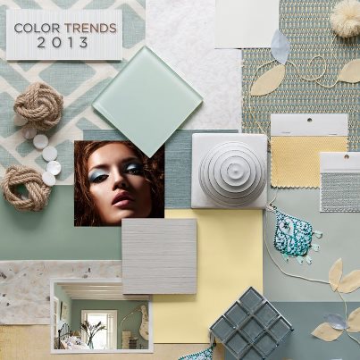
Benjamin Moore 2013 Color Trends
So does this mean you slather this exact yellow color on your walls? The Decorologist would advise against it – this clear color will read lighter and brighter once up all over your walls. It’s a bit too clear, almost fluorescent to use as a wall color in a living or dining room. Instead, check out Windham Cream HC-6, Weston Flax HC-5, or Philadelphia Cream HC-30 as more livable alternatives.
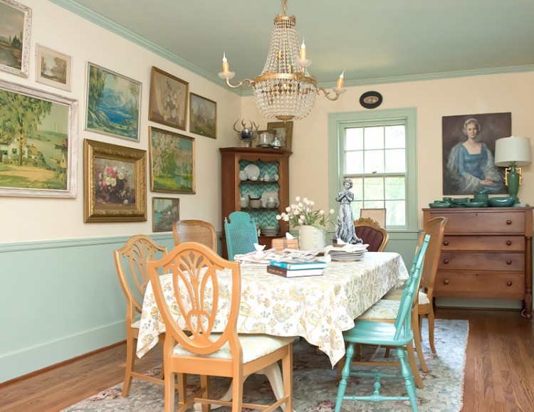
The Decorologist’s Weston Flax Dining Room – Photo by Melanie G Photography
I’m dying to know what YOU think about Benjamin Moore’s 2013 Color of the Year!






I can safely say that I will be passing on this one (love Wythe Blue, though!)
Ellen,
Do you have some alternative yellows you would suggest instead?
I find myself hitting the wallpaper books when I need a yellow. As strictly my personal preference, yellow paint on SheetRock is just not my favorite. But, papers such as Thibaut Terrazzo Damask yellow, David Hicks “The Vase” in the yellow colorway, or a Gracie yellow Chinese scenic, or bring them on!!!
Ellen,
Ooh, I like how you think!
Great advice as always Kristie. I like the movement to clean fresh colours and I love the way a nice creamy yellow plays off the greeny blues that are really popular now. I agree with you though, that this particular yellow might not be the exact one we put on a customer’s walls but more of an inspiration.
With yellows in particular I find they become much brighter and intense when they are used on walls. I like your suggestions for more subtle alternatives.
Heidi,
Thanks for your feedback – yeah, I can’t see you putting this particular color up on an exterior anytime soon!
My thoughts are that it’s too harsh a colour for most people. The story board colouring looks lovely, however the photo above with the pink chair shows a little more of how it will really look. It’s too severe and cool to create a warm and inviting room.
Along with your great suggestions Kristie, I’d suggest:
Pale Straw 2021-70 or Soliel AF-330 which will still be very light and bright.
Good suggestions, Jil! If someone wants a bright yellow, not gold but not lemon – nothing beats Hawthorne Yellow for brightening a poorly-lit space.
My thoughts exactly Kristie. This color works beuatifully with the soft blues but up on the walls? Too bright for me. I am interested in seeing what others think about this color!
I love this sunny colour yellow, I’ve just bought a daisy…used as a prop on my Monday post! When I was buying it I put it in the middle of the grey table we ate at in the shop and it just brightened the grey up perfectly… grey and yellow..this yellow…one of my favourite combinations.
Nice try, Ben. But I’m with the rest of you!
So I am on trend – yeah! Although my yellow is dirtier…but it is paired with the soft blues- love it!
Wasn’t last year’s color orange? The orange didn’t go over too well with anyone I know because I’ve seen no orange anywhere. I’ve seen mega shades of blue or blue/green everywhere. I think sorbet will go over as well as orange did last year. We’re all too busy looking at samples of blue for house to worry about sorbet.
Pam, Benjamin Moore’s Color of the Year 2012 was Wythe Blue. You are thinking of Pantone’s Color of the Year, Tangerine Tango. There actually has been lots of orange this year, but certainly not on walls!
I will step out and be honest, I don’t love it, and was disappointed when it was announced. I do, however, appreciate your post. Very good words of caution.
no likey…..
from my email:
“I wonder what color green that is on the window and ceiling. Like the lemon.
Brenda”
The green on the trim and ceiling is Prescott Green.
I love yellow. When I was a teen in the early 80’s my parents built our house and my mom chose my bedroom color, which was that yellow. It was such a happy color. As an adult I wouldn’t use it on my walls, but would as an accent and in my clothing.
In your post, you say “So does this mean you slather this exact yellow color on your walls? The Decorologist would advise against it – this clear color will read lighter and brighter once up all over your walls. It’s a bit too clear, almost fluorescent to use as a wall color in a living or dining room.” And it seems most people here agree.
On the Color Chats page, they show many rooms with walls painted with the Lemon Sorbet. Do you think those rooms wouldn’t look particularly good in real life? Too much of this yellow shade that would come off as too bright for most tastes?
thanks,,,,,
Patsy,
Thanks for your question – yes, I think it’s a bit intense as a wall color for most people unless it’s for a child’s room or game room. It’s kinda like the way they do things on the set of movies or television – you have to amp up the color for it to look good in photos or on film – you want to catch the attention of the audience. The same is true for magazine shoots and before-and-after room makeovers you see on tv. But in real life, a more muted version would be much more liveable for most people to incorporate into their homes.
Thank-you, Kristie, I love it! Lynne
I totally agree with you that this color is too clear to use on walls in a main living space – or anywhere outside of a child’s room or nursery. Even then, I’m not sure it’s a good choice. However, it could look really pretty to modernize a piece of vintage furniture.
Can you tell me what the color of the tile is in the story board?
Dear Decoralogist, I’ve been having a hard time with yellow. The room gets indirect natural light. Started with Ben Moore Butter, then lightened to Ben Moore Pale Straw. Pale Straw looks great on the can daub but is way to bright and chilly and it turns Toulouse-Lautrec, absinthe-green by late afternoon.
The effect I want is warm and easy on they eyes in a natural, dairy tone with the soft and cosy glow of low wattage incandescence. After checking your blog my plan is to try Windham Cream, Philadelphia Cream, and Weston Flax.
My living and dining room is looking super in Grey Mirage with Dry Sage below the chair rail. Got Gray Mirage from your blog; you used it in a room with art.
Jon