For those who questioned the staying power of blues, paint giant Benjamin Moore recently announced their Color of the Year 2012 – and it’s one of my favorites, Wythe Blue HC- 143.
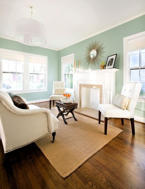
Wythe Blue is in Benjamin Moore’s Historic Color Collection, but don’t let that fool you. This watery greeny-blue is fresh enough for a contemporary space. Last summer, a new client asked for my opinion on the color in her entry and living room. Her grown son told her it was dated, but she still loved it after 10 years. Although I had lots of ideas for updating her home, this was one of the few times I advised a client to keep the same paint color. Guess what color it was? Yep, Wythe Blue.
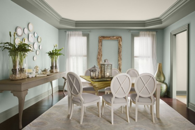
Take it from The Decorologist: there are lots of reasons to love this color. The hint of gray in this color makes it sophisticated enough for a “formal” living or dining room.
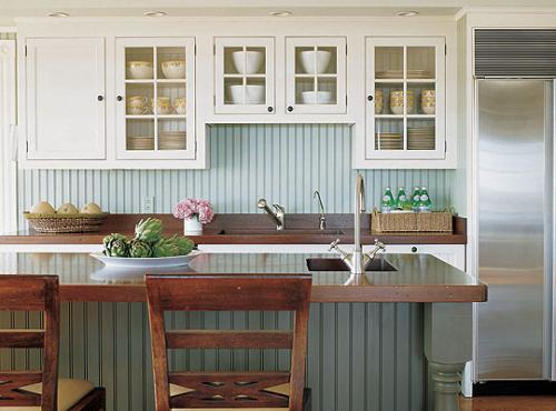
Wythe Blue feels right at home in rooms with a coastal vibe like this Nantucket-style kitchen.
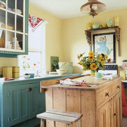
It can also ramp up the vintage charm when painted on cabinetry and paired with nostalgic accessories.
Wythe Blue Cabinets
Make sure you pair this color with other equally clean colors or it will make your muddier colors or fabric look dingy. If you like Woodlawn Blue but want a little more green in your blue, Wythe Blue is a good pick. And this may be the best reason of all to choose Wythe Blue for your space: it’s the color of Mad Men’s Don Draper’s foyer!
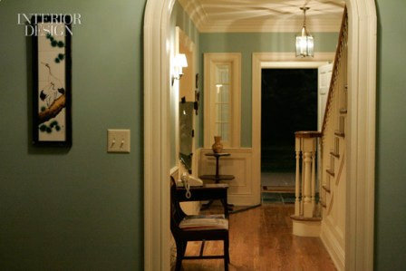
Don Draper’s Foyer is Wythe Blue!
If you need help finding the perfect blue (or any other color) for your home, contact the only Nashville Color Expert on the Benjamin Moore Color Expert Exchange for an in-home or on-line Color Consultation today.

![wythe blue door via homeandharmony_blogspot cottage and vine[2] Image from The Decorologist](https://thedecorologist.com/wp-content/uploads/2011/10/wythe-blue-door-via-homeandharmony_blogspot-cottage-and-vine2.png)






Although I have never heard of Don Draper, I love this post and others like it because it helps me understand how one color can “be” many styles. In each of the photographs you used, Wythe Blue looks completely different. Especially where it is painted on the cabinetry vs. the formal dining room. Keep it up, Kristie! I love learning from you! And I am loving the “blue” you chose for my sun porch (Water’s Edge)! Now if I can just get to the rest of the house….
Amy, I love what you said – color can “read” differently in different contexts. That’s why it’s not always a good idea to choose a paint color based on how it looked in someone else’s home – it may look totally different in the context of different lighting conditions and different furnishings. Send me a pick of your sun porch when you can – I’d love to see how it turned out after the paint went up!
Oh…I love this color! I have been wanting something with blue/green paint and maybe this is it! I have so many projects to do it is ridiculous. I want to paint my daughters bathroom and I want to to repaint my kitchen possibly. I also want to redo my kitchen cabinets in a color ~ maybe Wythe Blue!
Well, now you’ll know you are on the cutting edge, Katie! Go for it – and send pics 😉
Is there a way to paint Don Draper into my house somehow? Ha! Great post – and I agree with the previous commenter about how the color “reads” in different spaces. The color looks completely different from one picture to the next!
Well, if Don Draper can…
I LOVE Wythe Blue, and it’s so pretty when the sun bounces around a space painted in this colour. What I really love about this colour is that it looks cheerful even on a gray, rainy day… and yes it does read differently in different spaces, but I’ve never seen it look dull or lifeless, cold or unwelcoming. Great post Kristie!
yes, this is one of my favorite color too, and it’s the secondary color in my living room — a chair, painting and a few accessories. It’s quite close to the color on the right art frameof this page.
Thanks for sharing the paint color of 2012. I really like this color, mostly because it has green in it. I could see it used on a wooden chair or a frame. Hmmm…I may have to try it out in my room.
I absolutely love it! So tranquil… would love to plug this into our home!
Back in the day, Don Draper’s entryway and hall DEFINITELY would have had wallpaper, not just paint. Every single room would have been wallpapered, especially in a Colonial. Probably a documentary print (stripes with lines of flowers inbetween) probably in the Wythe Blue and ivory.
Wythe Blue is perfect everywhere!
That’s funny, because just last night I was looking at colors which might go okay with my 1986 blue tile floors in the mudroom and said, “Hmmmmm, this Wythe Blue might be nice.” Now I’m off to Google land to see rooms done in Wythe Blue.
A question – I’m interested in your observation that blue wall colors tone down orange hued floors since they’re opposite on the color wheel. I have orange oak 1986 floors. Why do blue walls do that?
Dixie
You are so right about making sure to pair it with the right furnishings. I painted an alcove of my bedroom and placed an ivory and black patterned chair in the alcove. The chair no longer matched the ivory bedding in the larger part of the bedroom, in all different lights. I am actually thinking of painting the alcove back to ivory like the rest of the bedroom. Bland, bland, bland. But I just don’t know what else to do! Thanks for sharing your knowledge…I am learning a lot!!!
Jane
BTW, I just had to have Wythe Blue for that alcove thinking it would accentuate the coziness of that little nook. It has been my favorite color for years and I finally broke down and bought it, painted the alcove, was disappointed with the results, and later learned it was chosen “color of the year”. I wonder if I can salvage it by doing something else with it? I just had that chair reupholstered, so I don’t want to change the chair. I wish I had your eye!!!
Jane
Well, since I did not get any feedback, today I am painting the alcove back to ivory. Will save the beautiful Wythe Blue paint for some other purpose. Sad that it didn’t work out for the alcove. 🙁
Love Rooms colors and great ideas Keep it up. I look forward to your posts Peggy
Hello…I fell in love with wythe blue and just picked it up for my shutter color for our gray cottage style house..it looks like a ginger bread house with the roof line we have. I want my front door an accent color and was wondering if you could suggest a color for me. I was thinking of a pale, soft yellow or a soft green like a beachy color. The gray beach house that I have seen this color on also did the garage doors and the front door but I thought I would try to go with another color for my door. I will appreciate any suggestions you have. I will also send you a photo of my house….thanks!
Oh, maybe I will paint the buffet Wyethe blue instead of Dragonfly. Prime the wood first? Thank you and have a good evening.