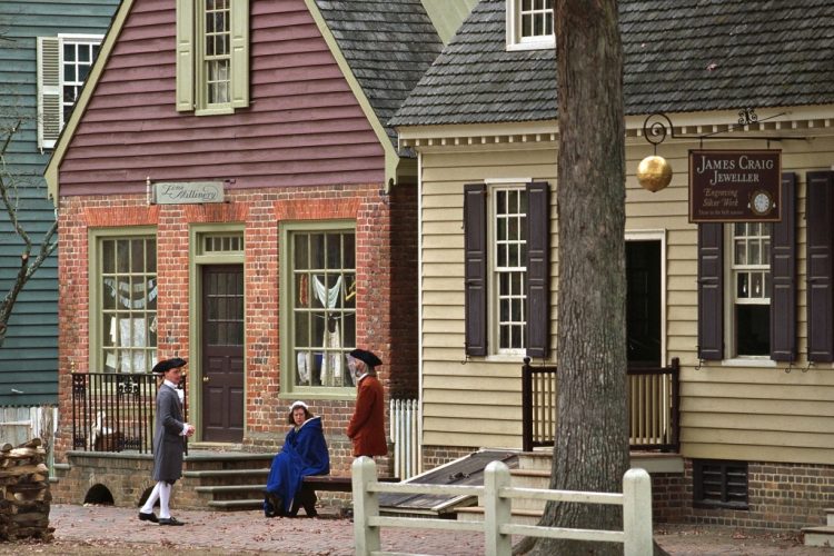
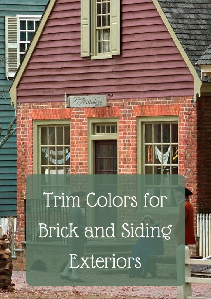
I’m always on the lookout for exterior color combination inspiration, and I love when I find great examples of trim color for brick and siding. Sometimes you need to show someone a photo for them to understand what you are proposing!
One of my favorite shows on television right now is TURN – Washington’s Spies on AMC. It’s a historic drama about The Revolutionary War that is currently in its 4th and final season. If you haven’t seen it, I highly recommend you go back to the beginning and binge watch straight through it! Be sure to turn on the “closed captioning” option, though. I didn’t do that in the first season, and there is a lot that you’ll miss if you don’t – the British accents plus so many colloquialisms of the time can make you miss a lot of the subtle humor and details.
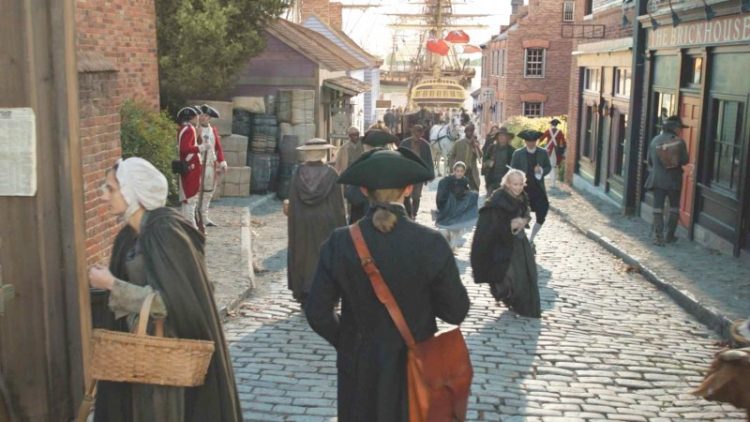
The street scenes and buildings from TURN illustrate a few points about exterior paint colors that I thought might be helpful to some of my readers. Although brick and stone buildings usually sport white trim nowadays, it’s often the wrong choice. I think it’s more of a default for homeowners, but it doesn’t usually yield the best result.
Here’s an inspiration for trim color for brick exteriors – how about black? Notice also how the red door ties in well with the brick color, and the vivid green door provides a great POP like an exclamation point:
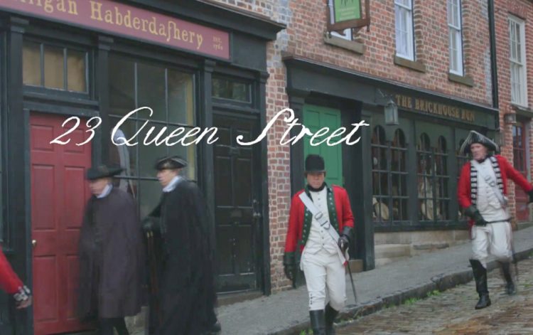
check out Benjamin Moore Essex Green (the blackish trim), Country Redwood, and Yellow Green
Here are examples of red brick buildings with warm-colored trim like yellow and green. These earthy choices look lovely as trim color for brick:
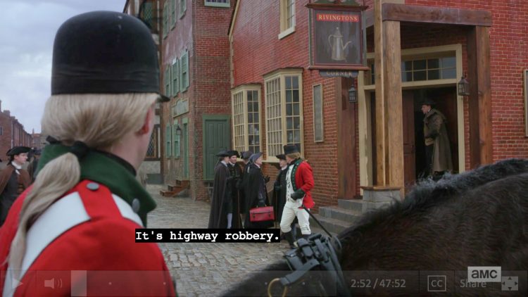
check out Benjamin Moore Lehigh Green and Marblehead Gold
When you have siding, rather than a brick or stone facade, you can be as colorful as you wish. Here are a few historical examples from TURN:
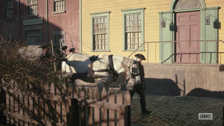
check out Benjamin Moore Chestertown Buff, Southfield Green, and Garrison Red
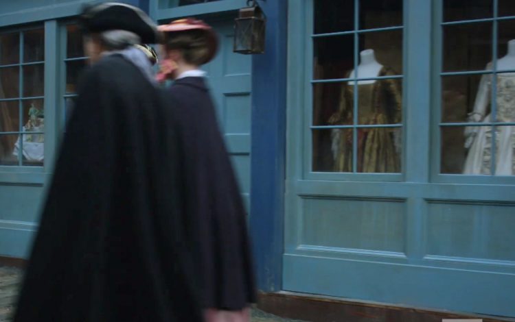
check out Benjamin Moore Whipple Blue and Van Deusen Blue
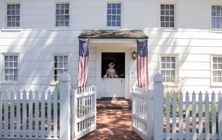
We see a lot of white on white these days on exteriors, which is classic and lovely:
But not often do you see red on red on red – which looks gorgeous here in Colonial Williamsburg, VA:
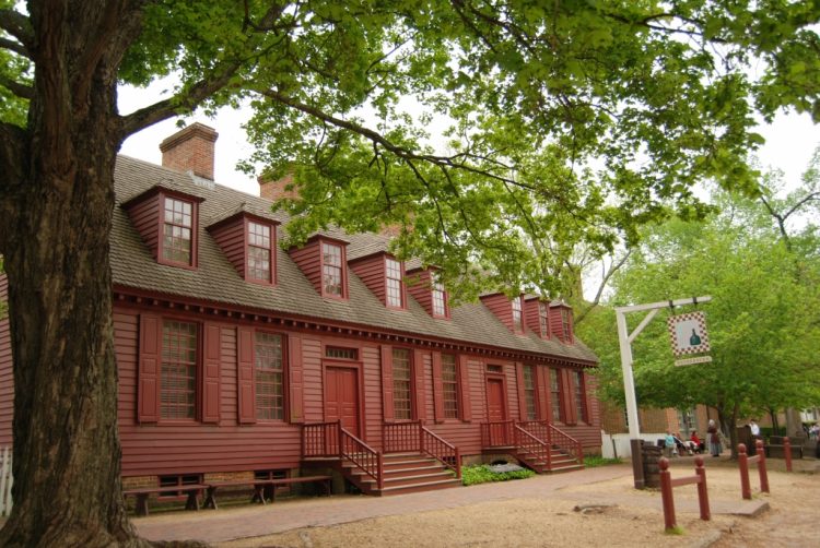
check out Benjamin Moore Country Redwood
Always remember: exterior colors fade over time in the sunlight, so expect them to wash out a bit a couple of years down the road. Also important to note that with so-called “neutrals,” the undertones will emerge in exterior lighting conditions – so make sure you don’t choose an undertone you want to avoid. I see this a lot with exterior neutrals with red-violet undertones that end up looking pink or purple.
pin this image for later reference
Registration is OPEN for the Fall session of my in-person Expert Psychological Staging course! You can find out more about that here. I’m also working on an exterior paint color course that will be online, so stay tuned for that . . .








What delightful colors! The series sounds great as well…. I’ll check it out.
You’ll love it, Beth! So, so good.
There are no “undertones” in opaque architectural paints. Every color except pure ehite, pure black and combinations there of belongs to a hue family.
Also, paint colors must coordinate with fixed elements like brick. The magenta paint doesn’t work with rhe orange brown brick.
Sandy,
I agree with you about the magenta paint with the orangey brick – it’s too pink for it. It’s still a cool screenshot from the show! And yes, every color belongs to a hue family. However, most laypeople speak in terms of “neutrals” vs. “colors,” and think of undertones as the hue family – I know may not be scientifically accurate strickly speaking, but most people don’t get the heady scientific discussions about color. My point was that you need to be mindful that what looks like a neutral gray or beige can often look more like a “color” than a “neutral” on an exterior. Undertones do exist in architectural paint colors – they are certainly subjective in that they aren’t measurable – it’s a color that is present but not clear or obvious (quoting Lori Sawaya here). Now I hope Lori doesn’t read this and hand me my *** if I’m describing this incorrectly . . .
Thanks, Kristie. I just think that those of us who know better should help raise the bar by being accurate and not perpetuating misleading, subjective ways to talk about color. When you think about it, hue family is a simple idea, not heady or scientific. To see neutrals in their respective hue families in displays at many paint stores really makes things clear.
And since colorimeters have changed the game completely, people are going to become more knowledgeable and demand better information.
As an architectural paint color consultant/professional stager/painting contractor, I always find a great nugget or two in your posts and enjoy them very much, even when I don’t always agree with every word.
Let’s have lunch when you come to Hendersonville!
Thanks again.
I love history. And Colonial Williamsburg. And Netflix. I’ll have to see if they have TURN on DVD.
Historic color combinations can be so much fun. Our forebears seemed to understand that decorating rules are sometimes more like guidelines, and managed to bend them with taste and style.
Hi Kristie, I was wondering if you could send out your email again where you explained how to hang pictures without doing all the painstaking measurements but instead used painters tape (I think on the back of the item you want to hang) Unfortunately, I didn’t save your previous email and can’t remember the details of the process but do remember it was a very ingenious idea. Thank you in advance.
Hi Kristie, it just goes to show that inspiration can come from anywhere when your mind is open to it! Visual examples are a god-send as many clients can’t envision what is presented to them. Your blogs are honest, entertaining and educational. This Aussie would certainly appreciate any online course you could come up with!
Thank you, Michelle! I can’t tell you how many people I’ve worked with who look at me like I’m crazy when I present a color scheme to them – until I show them a couple of photos similar to what I am proposing. That’s when the light bulb comes on, and I get the “Ohhhhhh, I get it now!” Thank you so much for reading and commenting!!! 🙂
Thanks for the tip about that show on AMC–definitely sounds like something I’d like. I love history–especially the Revolutionary War and colonial time periods! And by the way, I also think that the Colonial time period is one of the golden eras for architectural and interior design–think how we still emulate the wonderful, classic furniture and architecture of Chippendale, Sheraton, Hepplewhite, Adams, etc. By the way, does the show feature a lot of interiors, too? Maybe you could do a post about that, too! Sometimes, though, those rich colonials evidently chose interior colors to show off their wealth, because certain colors were very “high end” expensive, LOL–at least that is what the guide at George Washington’s Mt. Vernon will tell you to explain the , –hmmm–very vivid shade of chartreuse green he had painted his large dining room!
Phyllis,
Actually, the interiors in the TURN series are typically bleak and dark. Most of the characters that are central in the show aren’t wealthy, so it’s no Downton Abbey! I agree with you that the Colonial era was rich in architectural design. I hope you like the show – it’s chocked full of pretty accurate history!
And I would love to visit Mt. Vernon!!!!
We have loved, loved Turn!!!! The history, the clothes, the buildings, it is great!! The actor who plays George Washington has been so interesting, the conditions he and his men endured were horrific, their sacrifice is inspiring!!
Great series.
Thanks for this post!!
I’m glad to hear you are also a fan of TURN, Beth! When it finishes up this season, I’m going to have to start over and watch the whole thing through again! I miss Colonel Andre!!!
What is the color name of the green in the first brick home that is green on green? I want to find this color. Is it Southfield green?
Good Evening,
I love all of your posts/pictures. I have been trying to find a color for my shutters and front door for over a year. I love the brick house with the green shutters and Mave siding you have on the first page I think the sign says Line Millinery on the building. Can you tell me where to get these colors and what they are?